Research
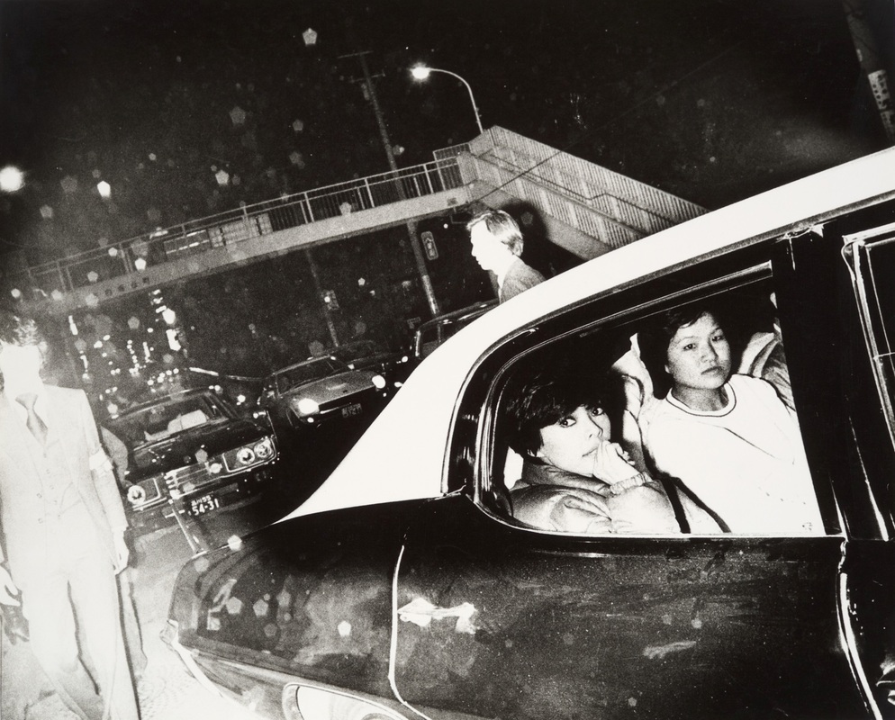
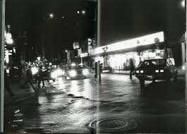
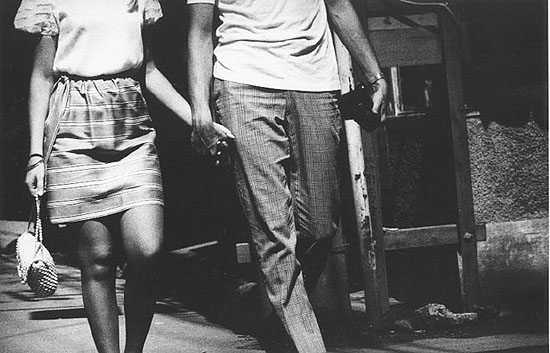
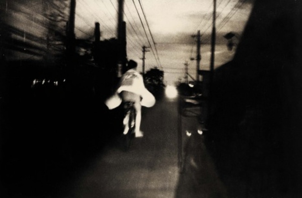
Daido Moriyama
Daido Moriyama is a Japanese street photographer and known as one of the most influential photographers of 20th century. He originally trained as a graphic designer however later became more interested in photography moving to Tokyo in 1961 to join a photographers group known as 'vivo' before becoming a freelance photographer. One of his biggest inspirations was William Klein, an American born street photographer who began as a fashion photographer for vogue. In particular Moriyama was inspired by Klein's photobook 'New York'-‘I was so touched and provoked by Klein’s photo book, that I spent all my time on the streets of Shinjuku [one of Tokyo’s wards], mixing myself in with the noise and the crowds, doing nothing except clicking'. As well as Klein the author Jack Kerouac had an impact on Moriyama's work in particular Kerouac's book on the road as Moriyama was interested in the idea of the journey his photographs documenting his journey walking all over a city. His photos have a distinct quality they tend to be grainy , un focused and not framed perfectly he didn't stick to the conventional norms of photography, his photographs are often of grimy , urban areas. Moriyama was also part of a Japanese street photography magazine known as provoke.
Experimenting with chance in photography
First experiment
For the first experiment we had to 'Delegate the creation of a series of photographs to a classmate, describe what you want them to do but allow them plenty of choice in their interpretation, claim those pictures as your own.' This experiment left plenty of room for chance as all I gave harvey was the theme of angles and lines to take photos of and the rest was up to him how and what he took the photos of. I think the experiment was very successful and I was pleased with the photos Harvey produced and I feel like they met the theme perfectly.

Second experiment
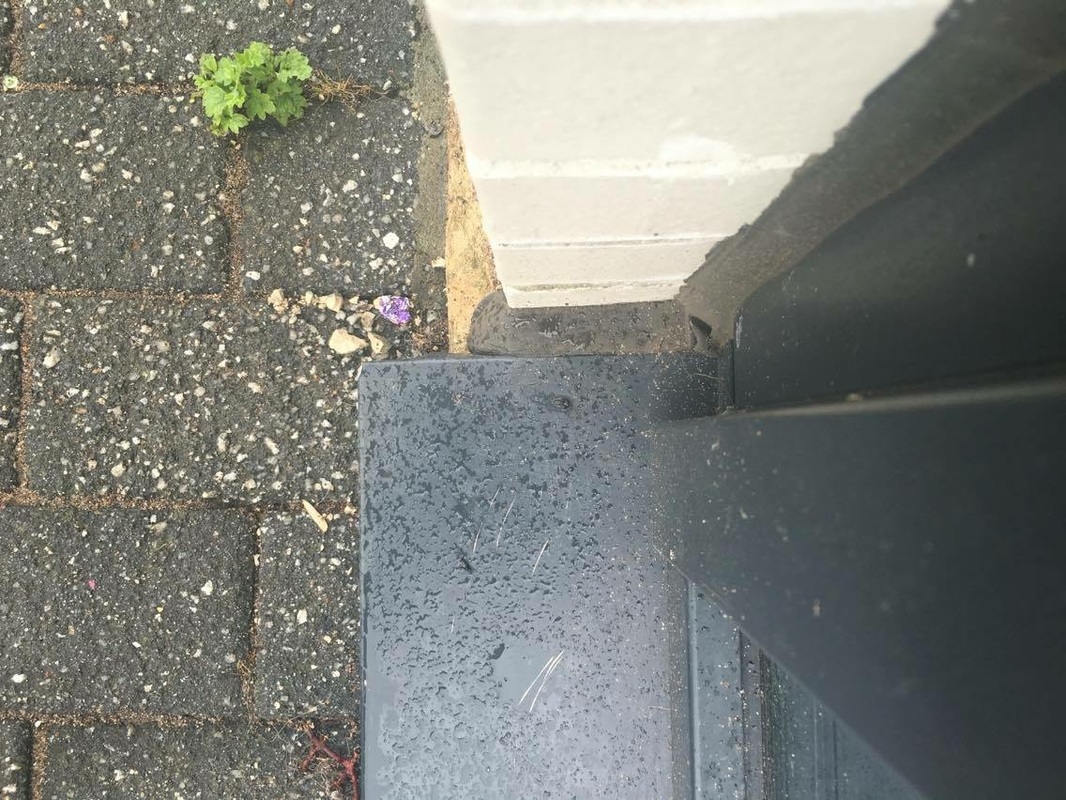
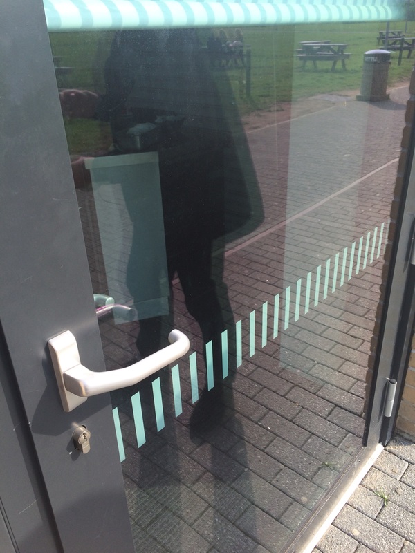
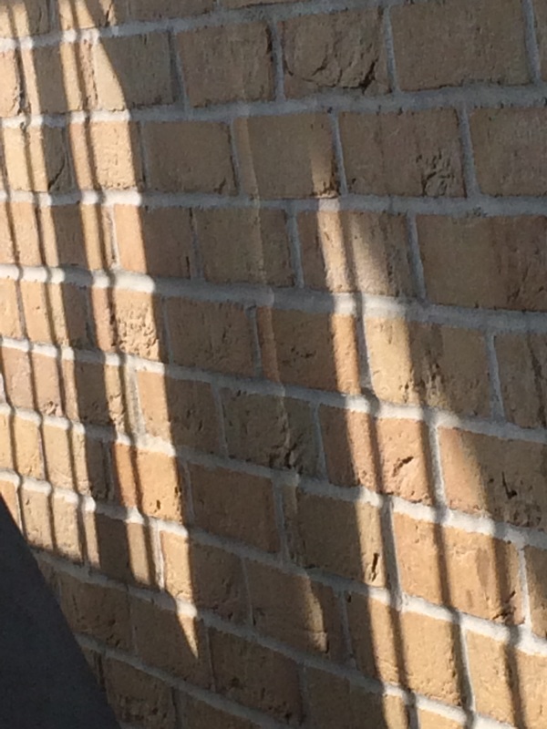
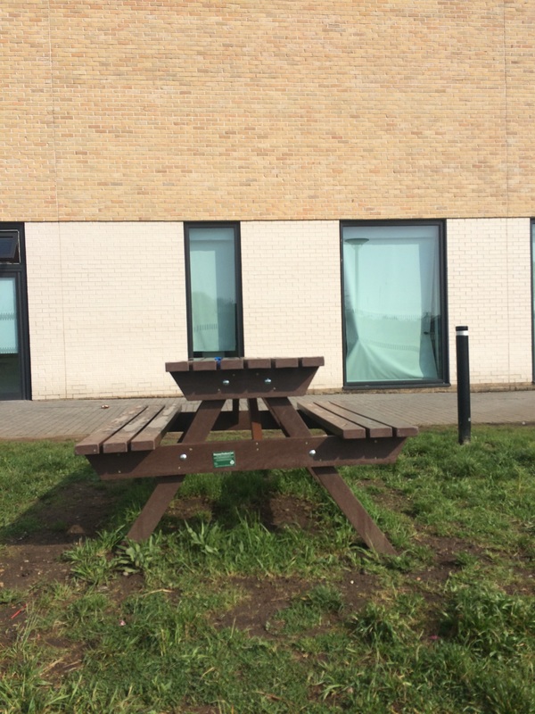
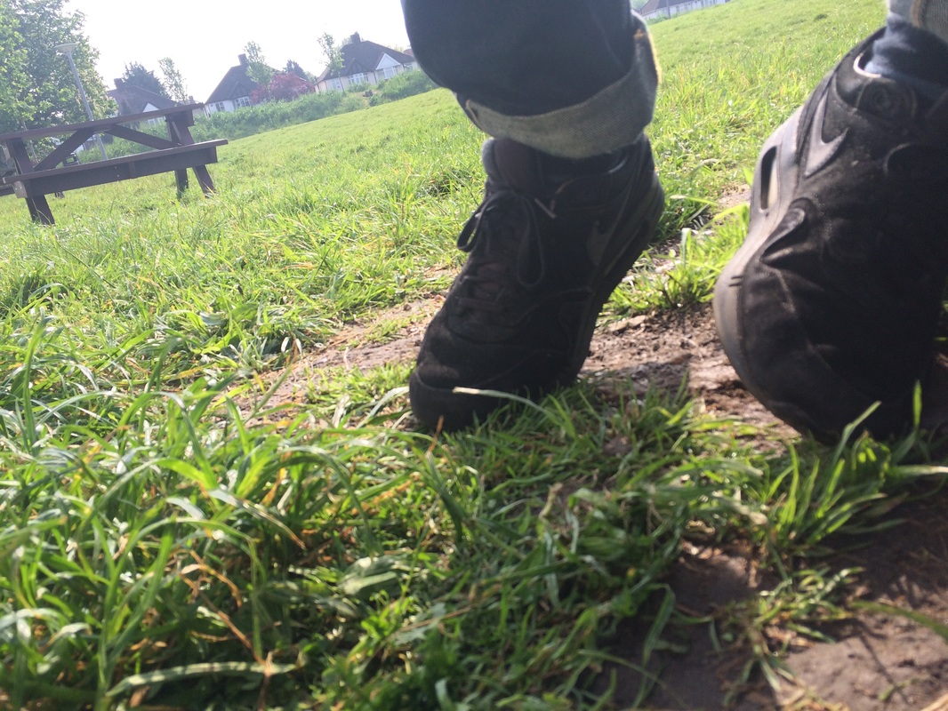
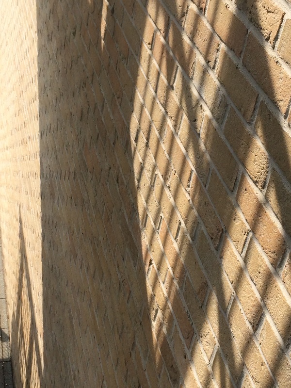
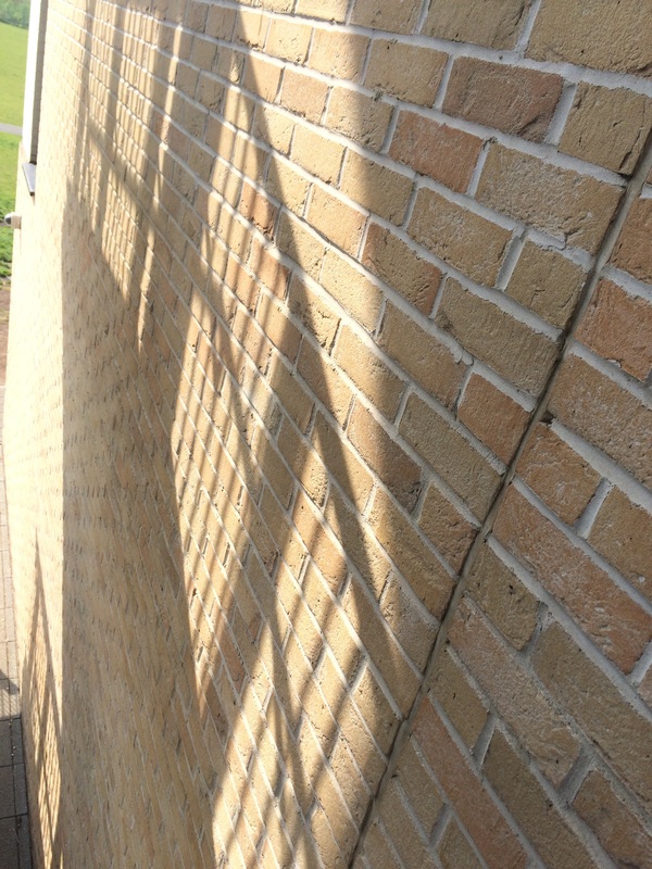
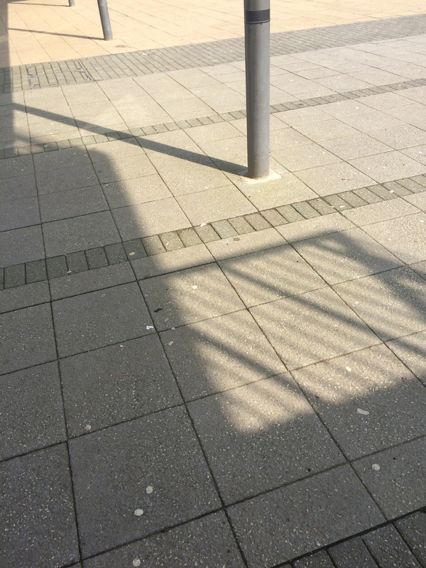
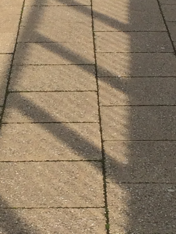
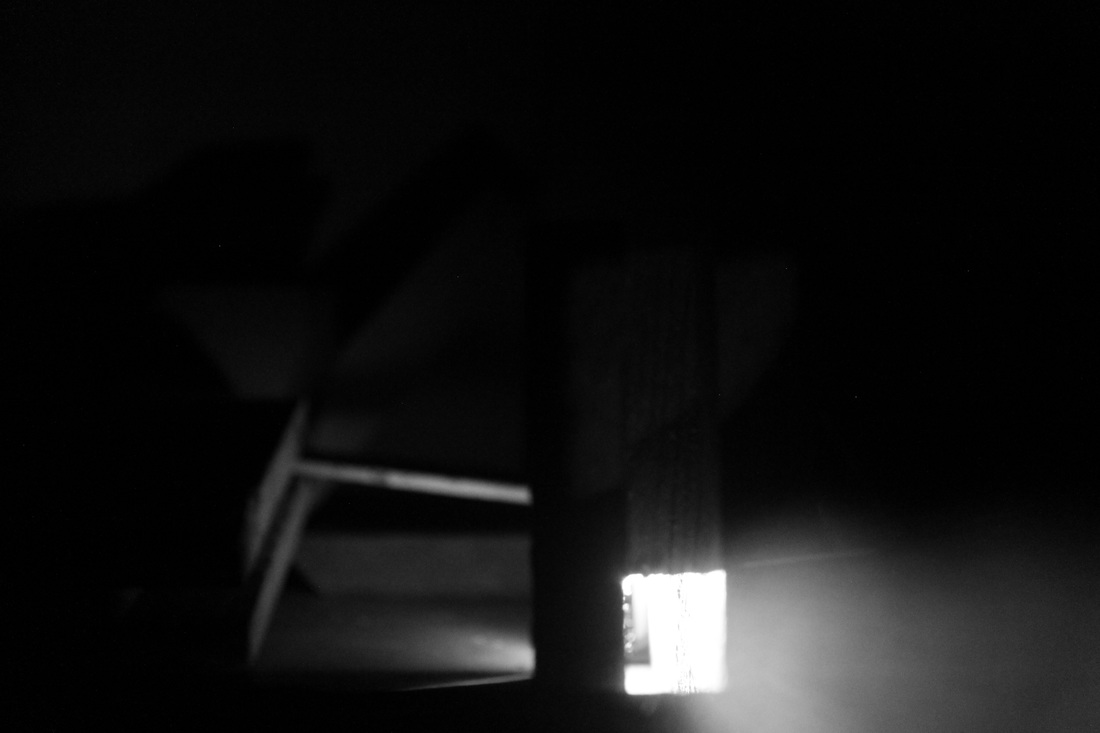
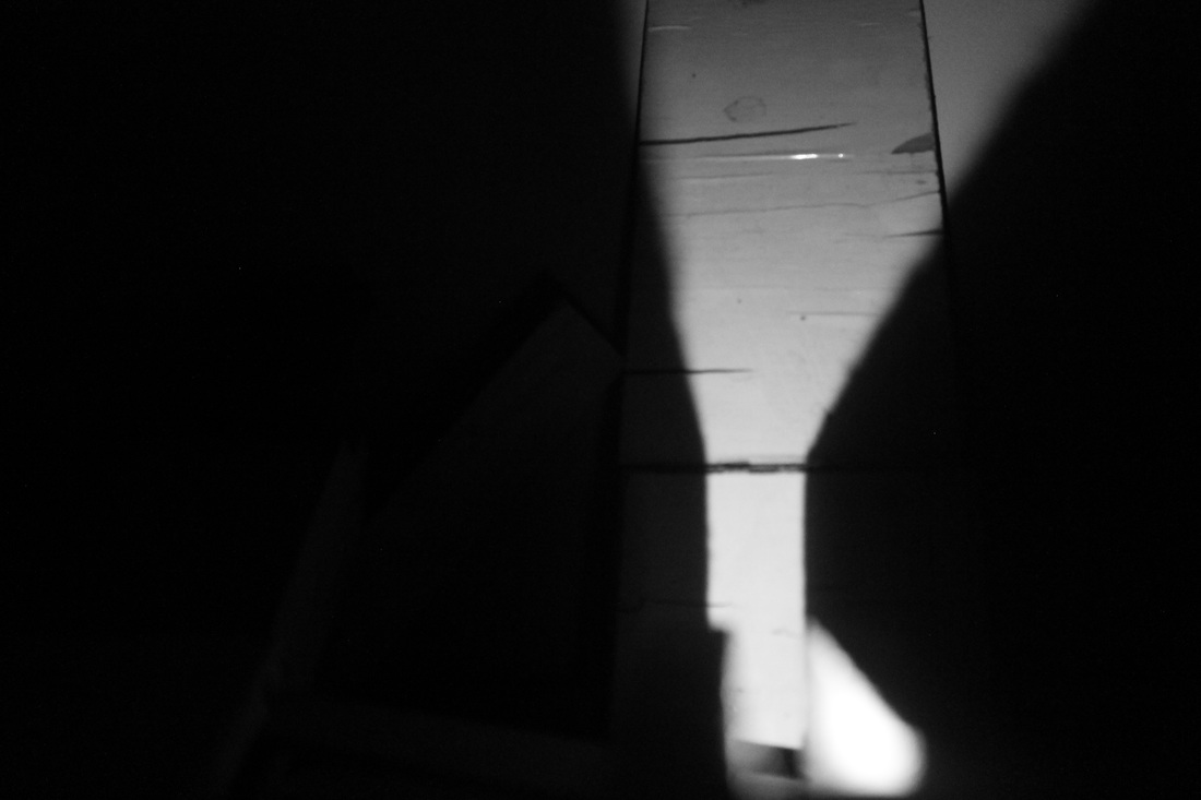
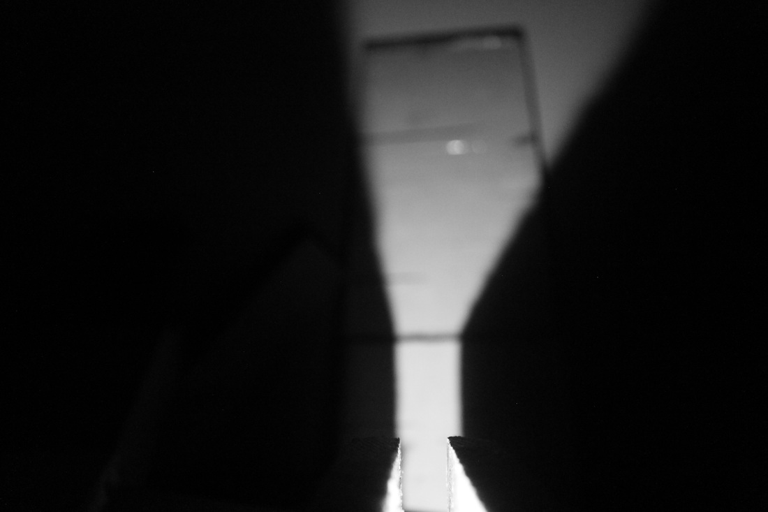
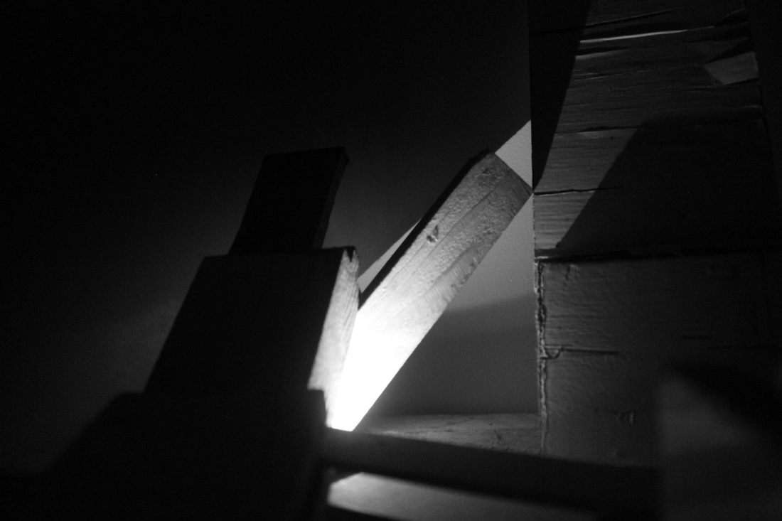
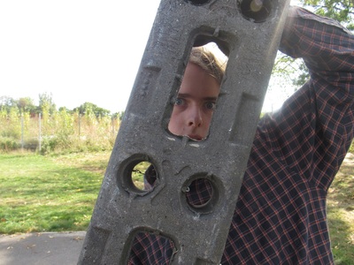
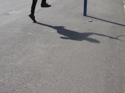
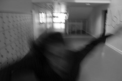
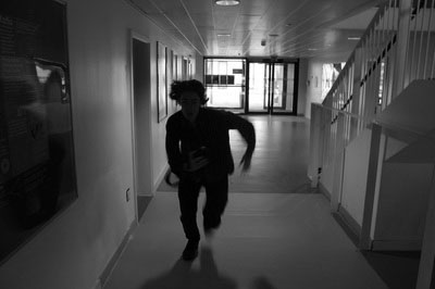
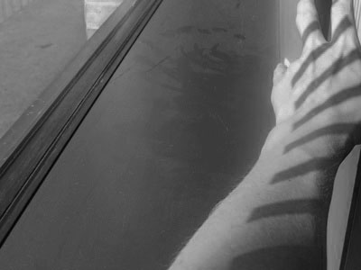
For this experiment we had to 'create photographs in which one element in the process was left entirely to chance, for example make a list of steps you might usually take to create a photographic image 1. take camera 2.choose a subject 3.point camera at subject 4.press shutter 5.review image etc. what happens when you disrupt this process and allow chance a role?'. When taking these images I would prepare to take a photo then before i take the photo either turn around 180 degrees or flip to the front camera or zooming in all the way and photographing whatever was there.I feel like this experiment also went quite well as it created some images I wouldn't usually have taken if I didn't disrupt the process like I did for this experiment. Out of all the images my favourite is the one of the light and shade on the bricks as I like how simplistic it is.
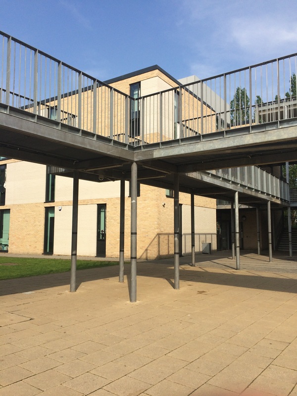
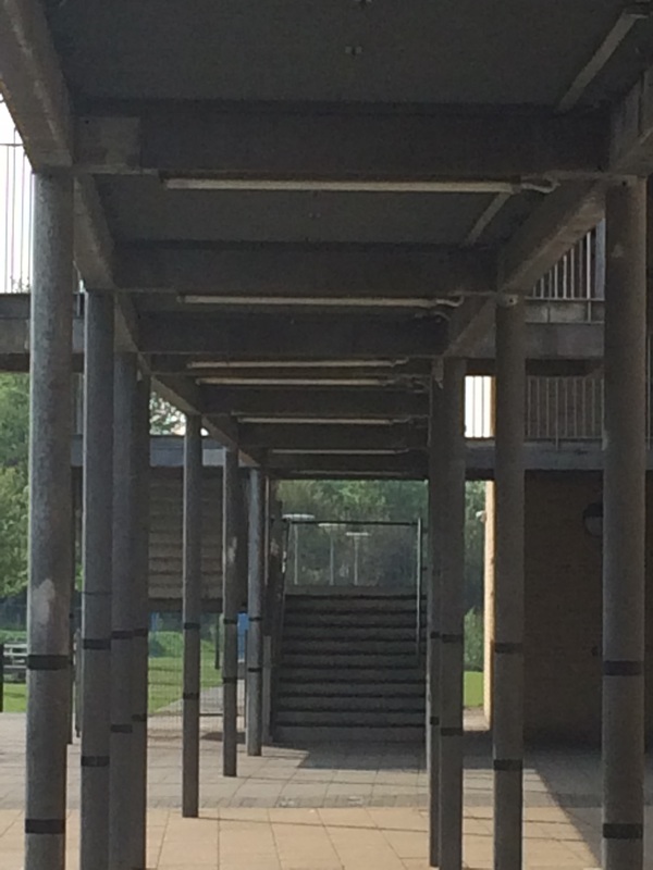
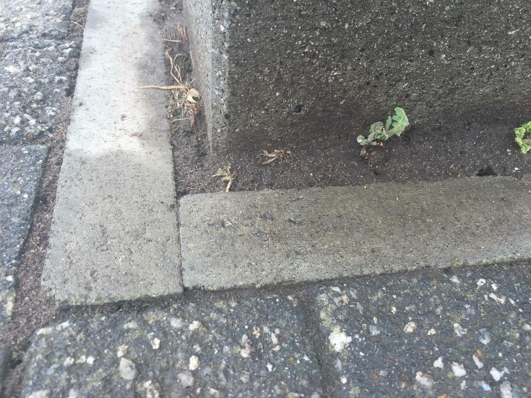
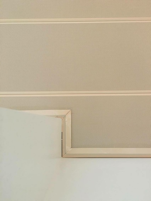
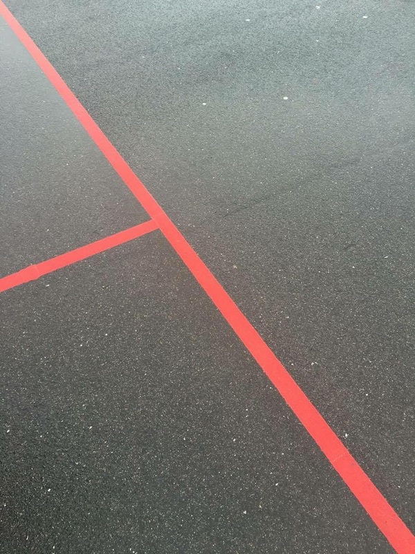
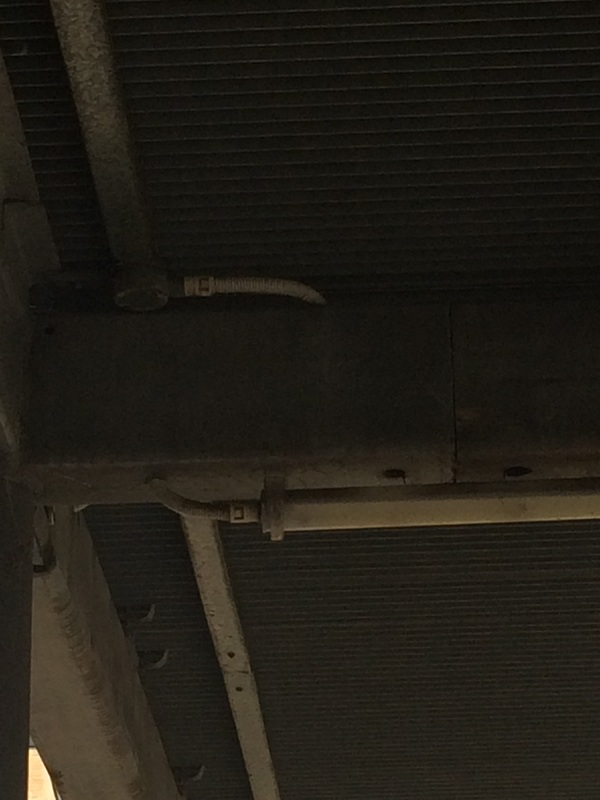
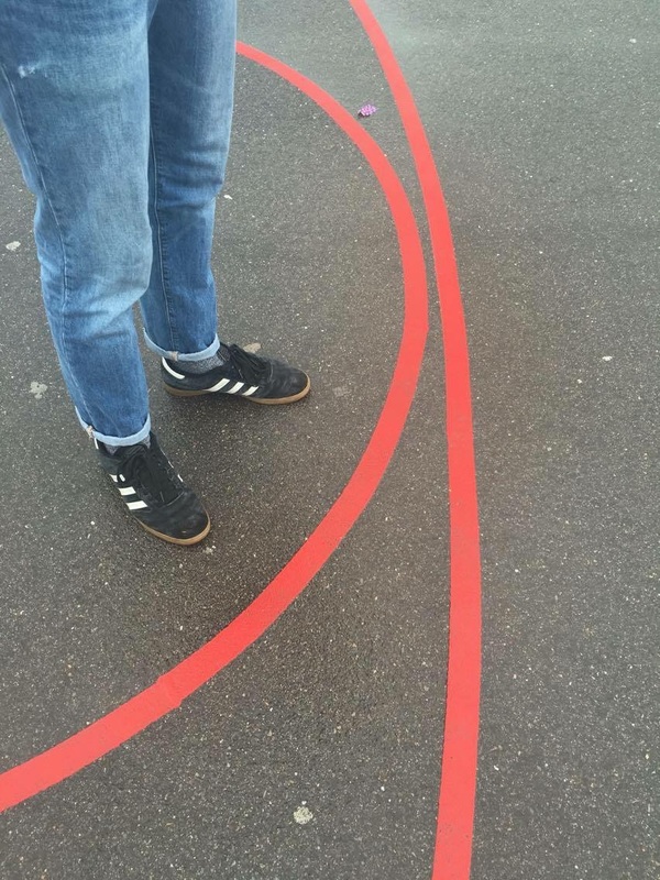
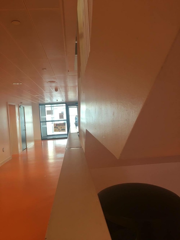
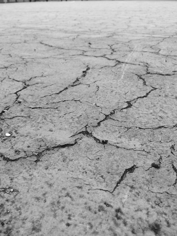
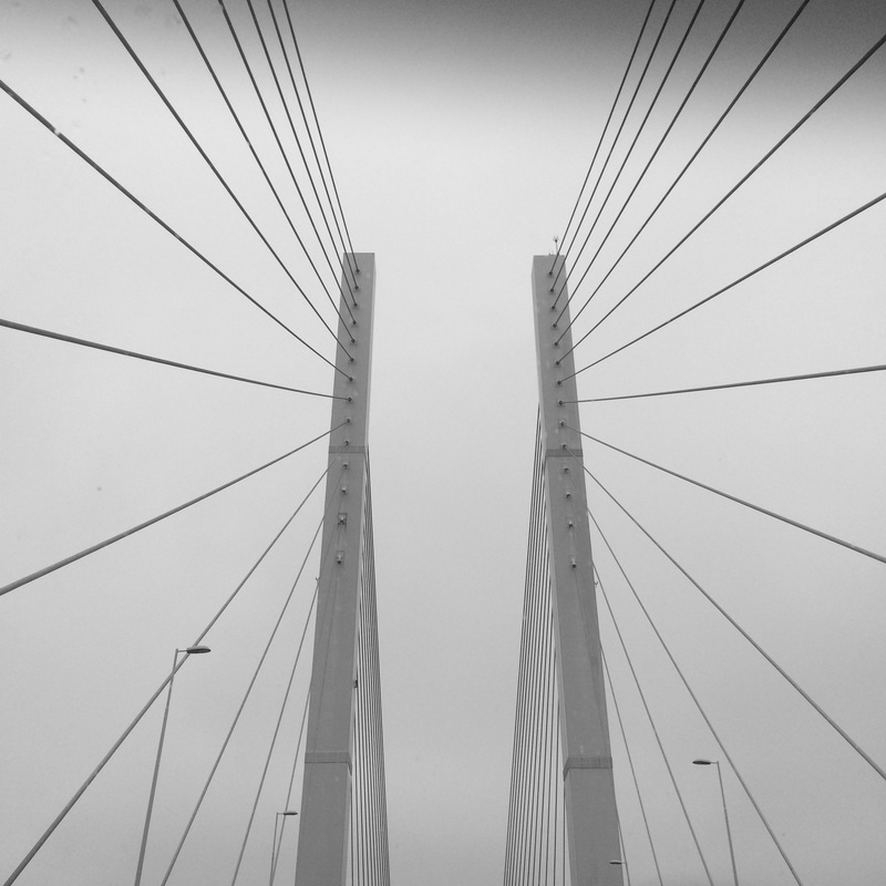
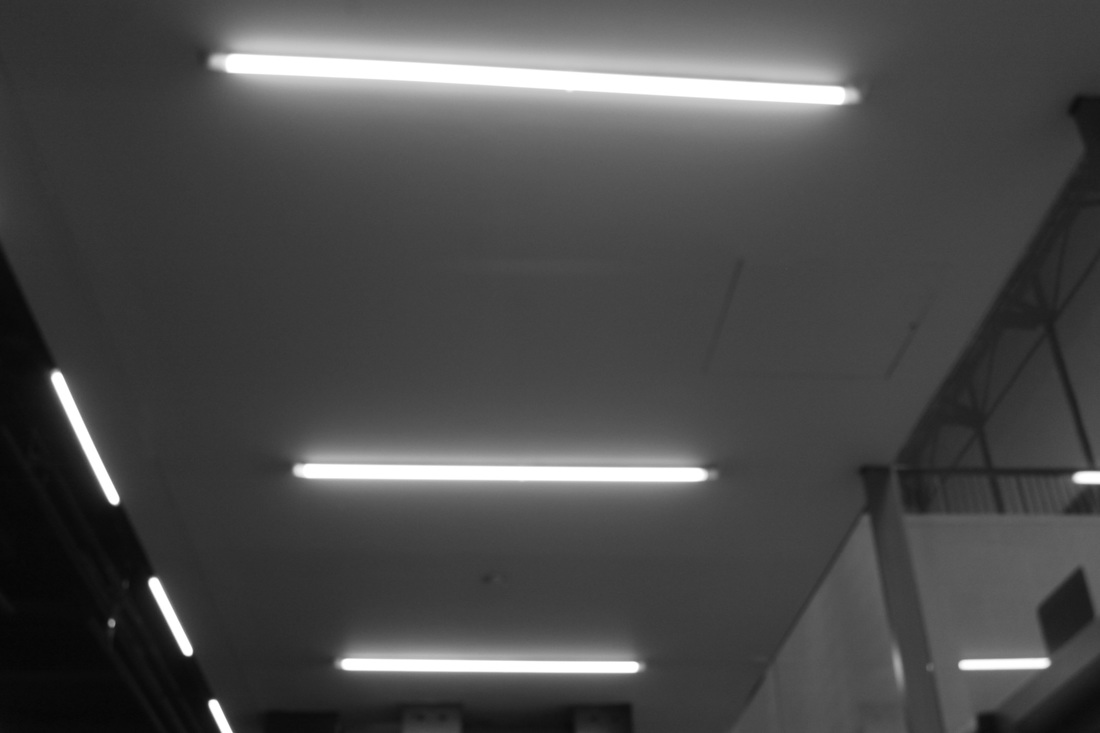
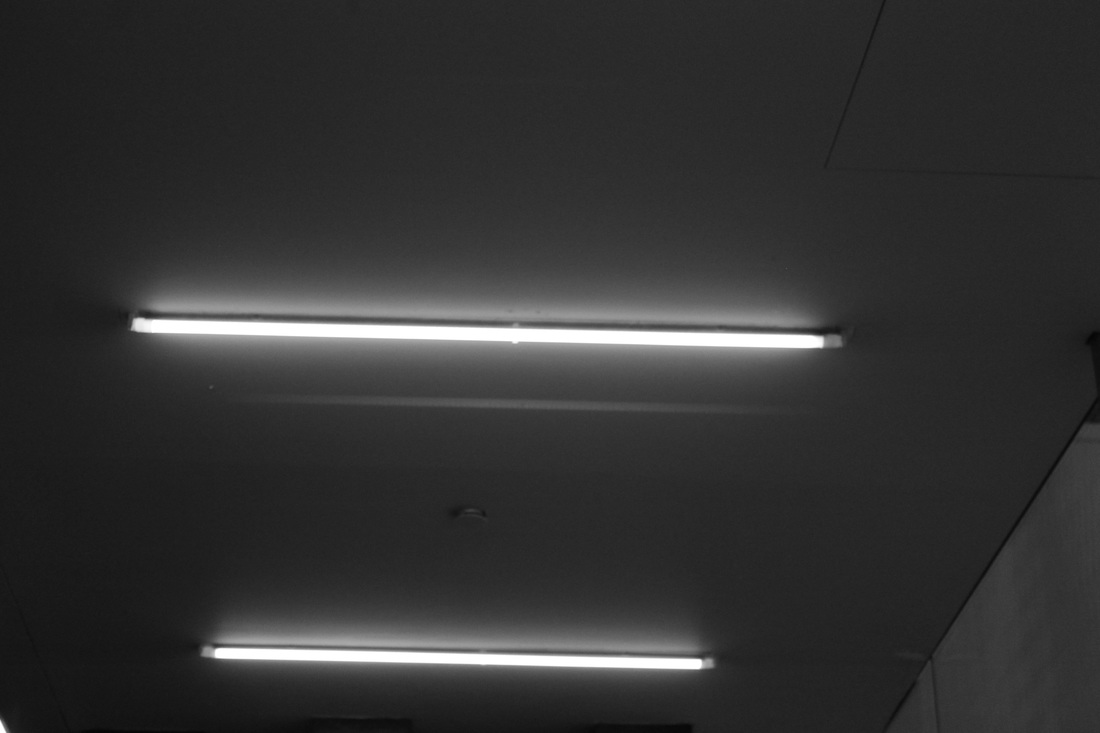
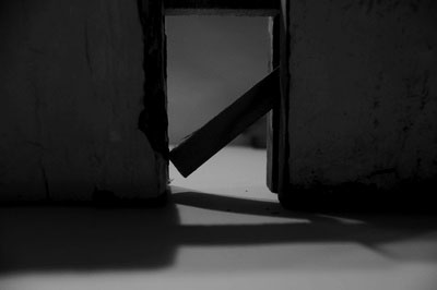
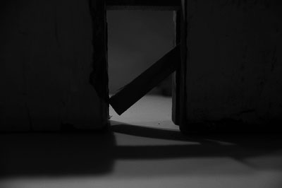
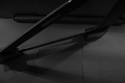
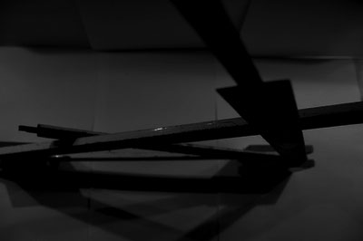
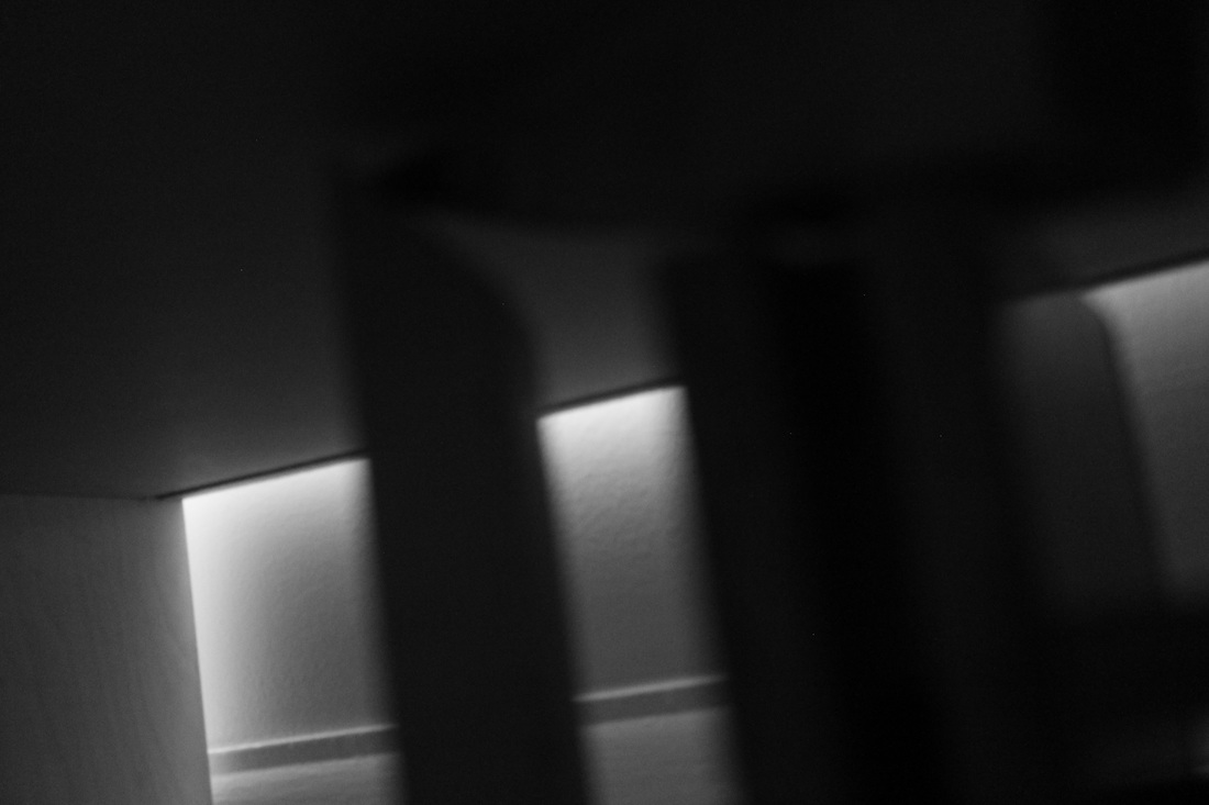
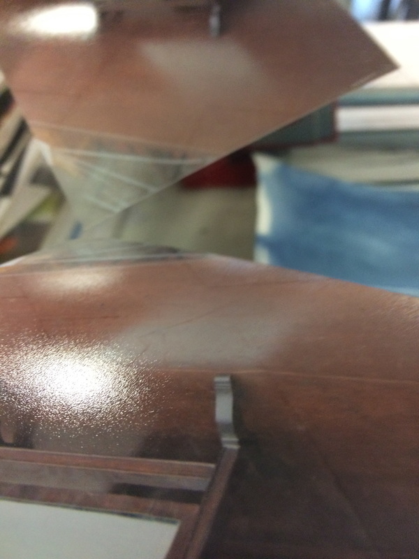
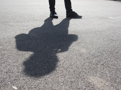
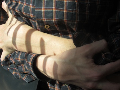
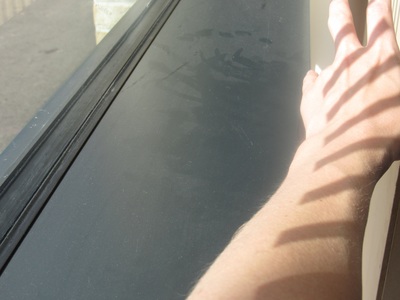
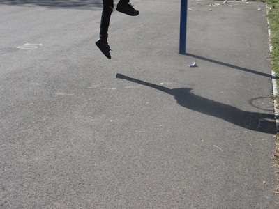
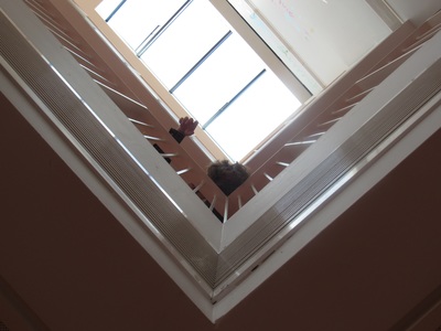
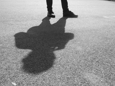
Photos of angles , lines and shadow.
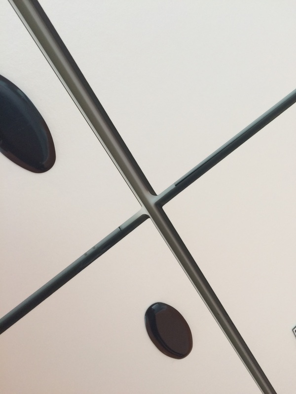
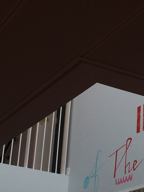
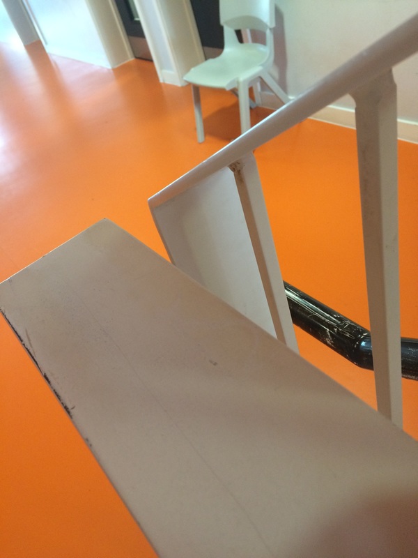
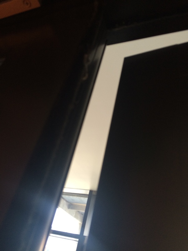
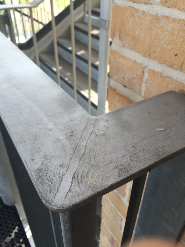
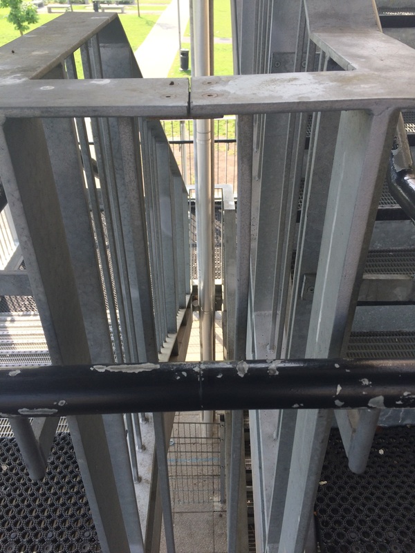
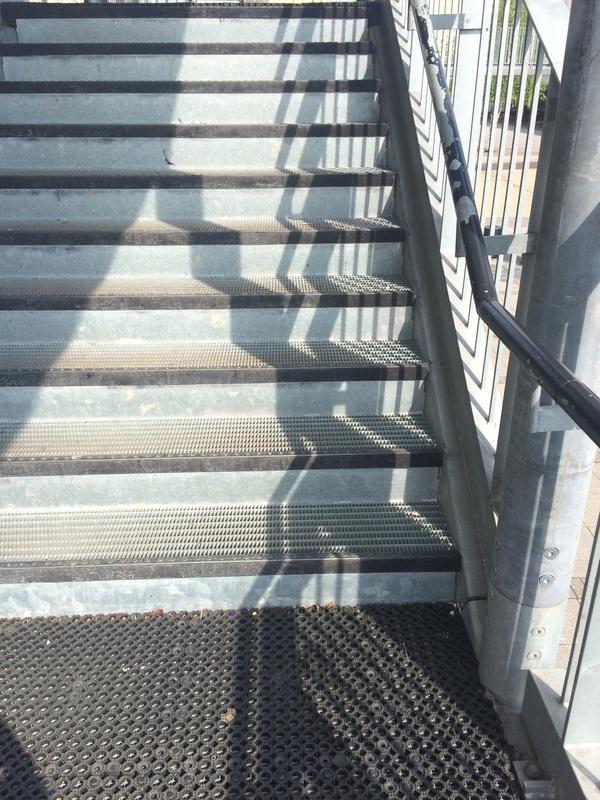
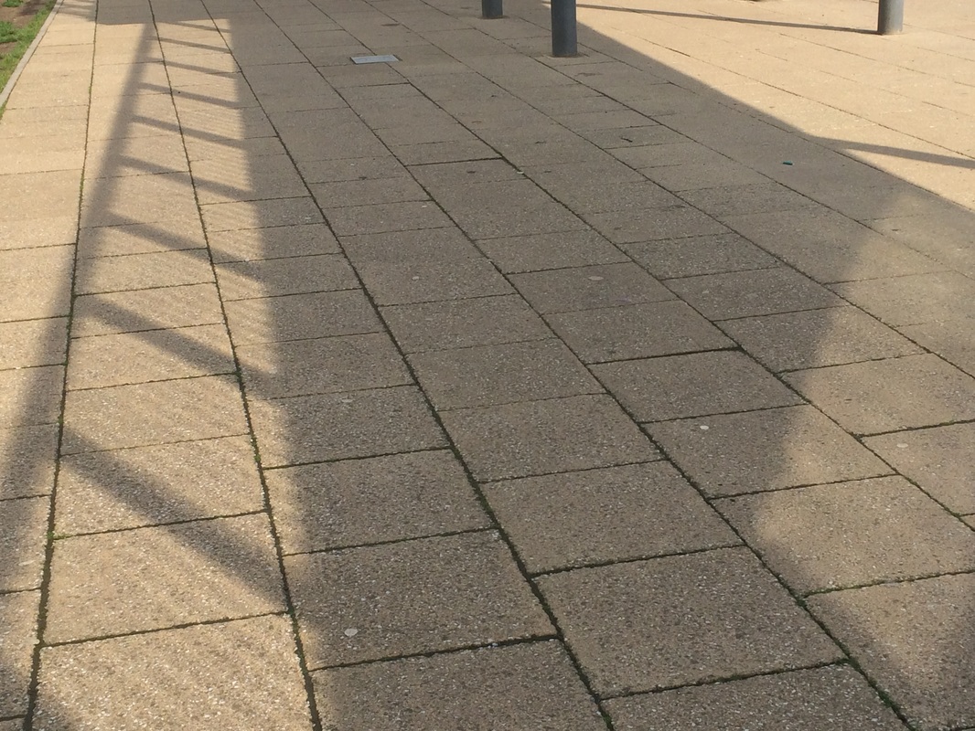
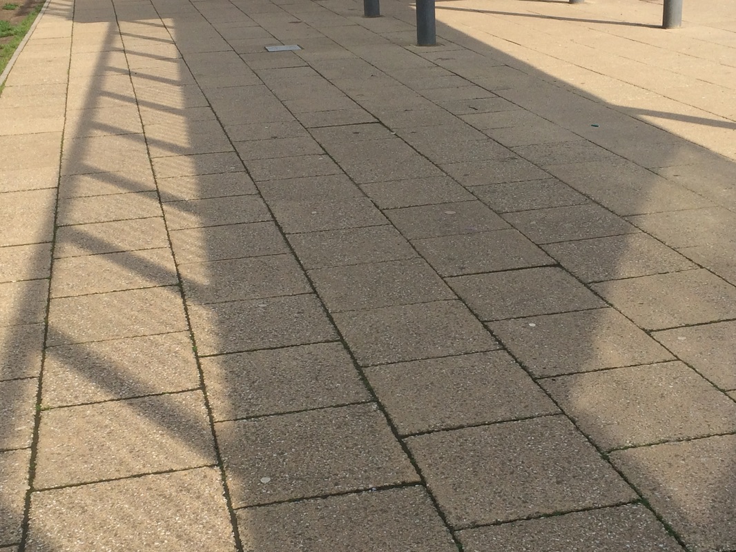
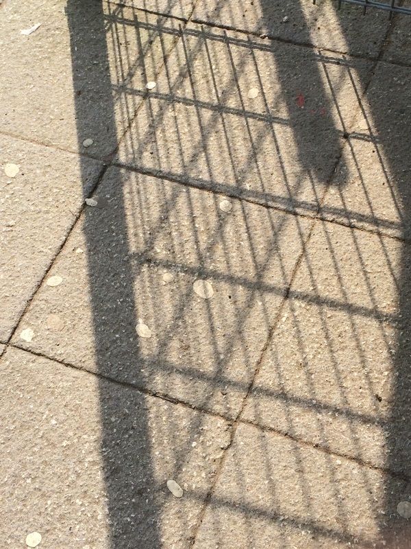
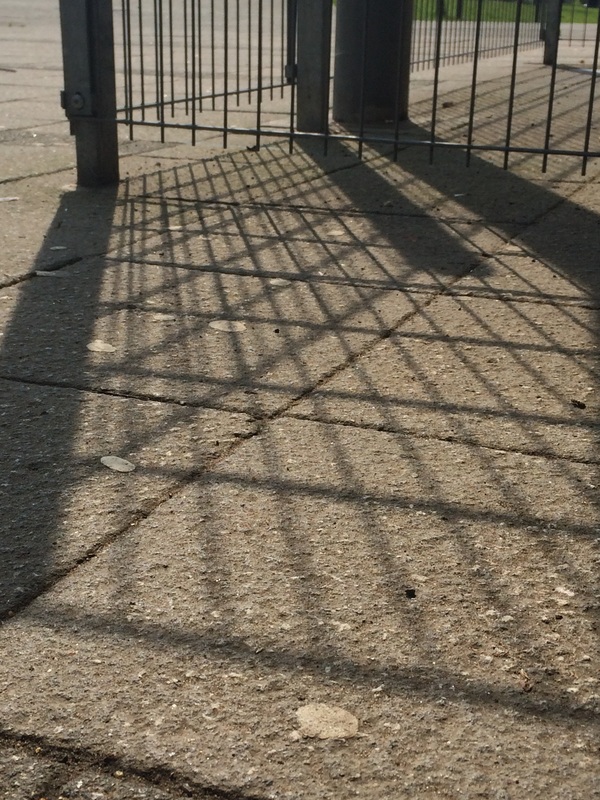
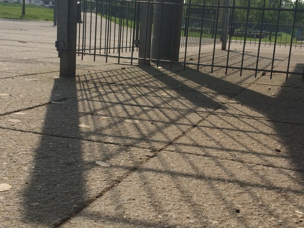
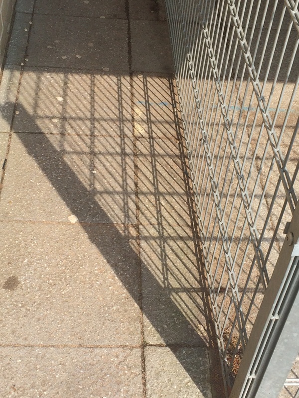
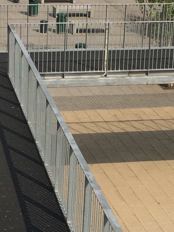
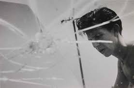
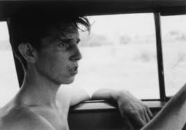
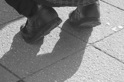
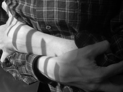
I took this set of photos based on the theme of lines, angles and shadows basically and amalgamation of me and Harvey's first experiment as he set me the challenge of taking photos of shadows and reflections and i set him the challenge of taking photos of lines and angles.
More photos


Insider/Outsider photography
Abigail Solomon-Godeau published an essay in 1994 titled 'inside/out' it discusses the two different ways of taking photos and questions if all photographs fall in to these two categories or if there is some middle ground. 'Inside' photographs are taken from a position of trust and there tends to be a sense of intimacy in the photographs between the photographer and the subject. Where as 'outside' photographs are more observational where theres more of a distance between the photographer and the subject theres no emotional connection between the two. In the essay she compares photographers she feels take outsider photographs like Ed Ruscha and Insider photographers like Larry Clark. Insider photographers produce images that seem much more sentimental and sometimes warm due to a personal connection with the subjects. Where as Outsider photographers produce images that feel more like they are documenting the subject rather than trying to create a personal image or reflection of the subjects character.
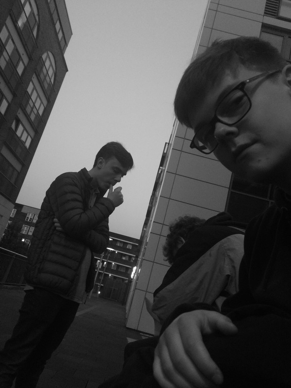
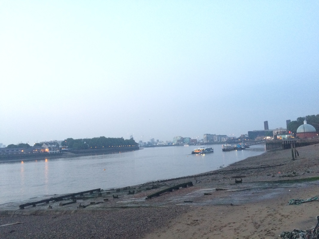
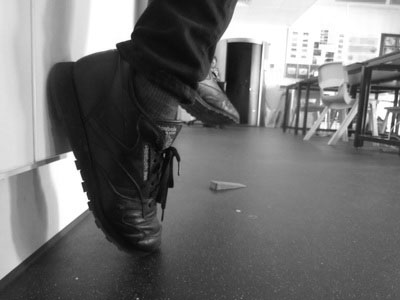
Are my Photographs inside or out ?
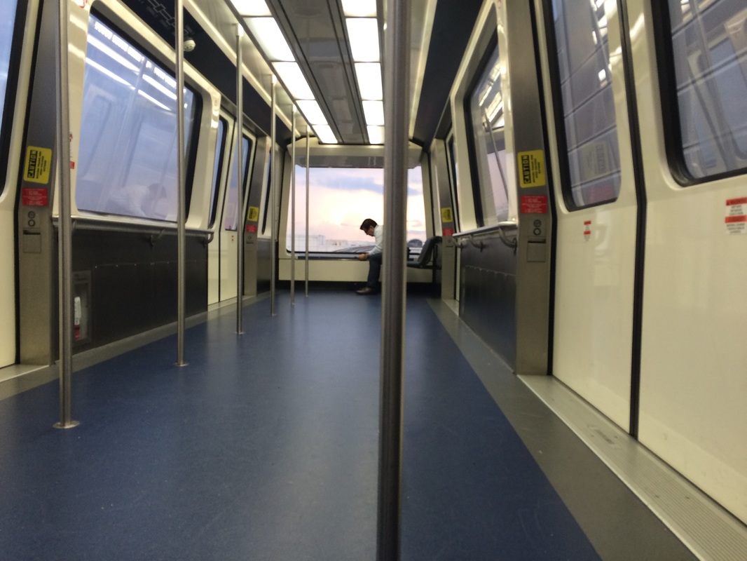
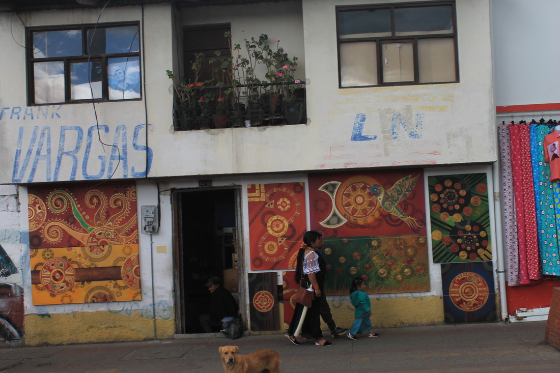
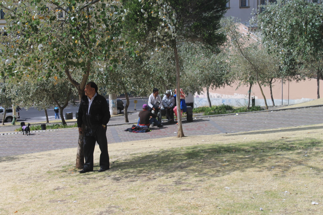
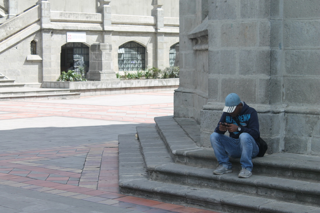
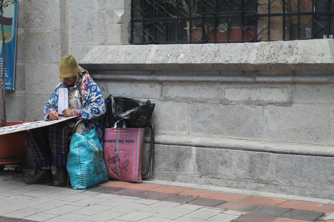
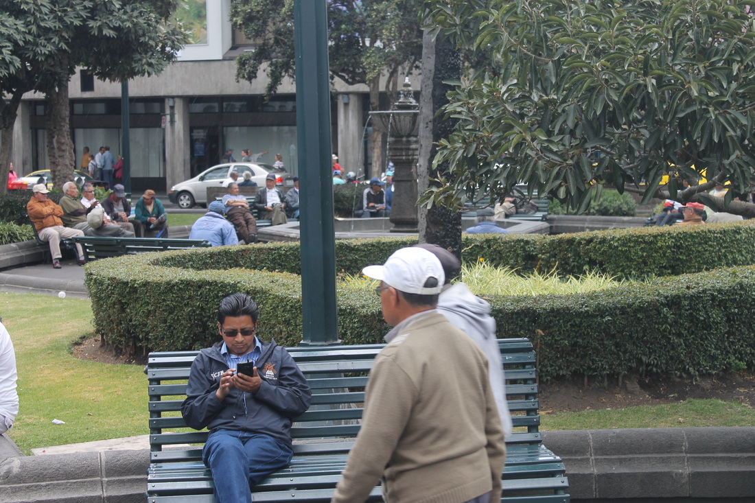
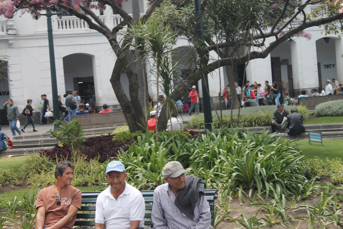
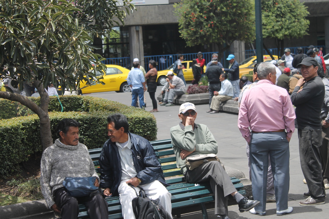
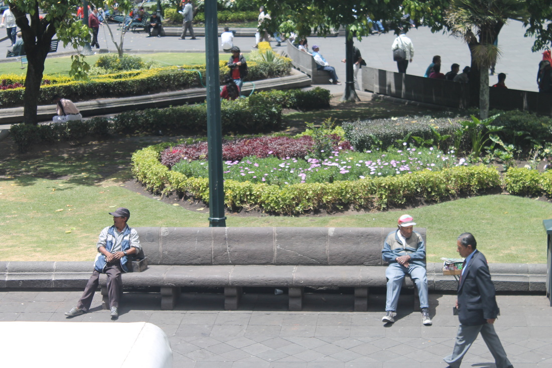
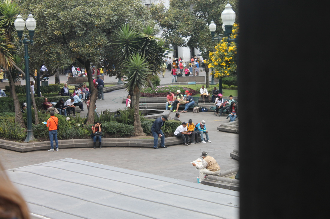
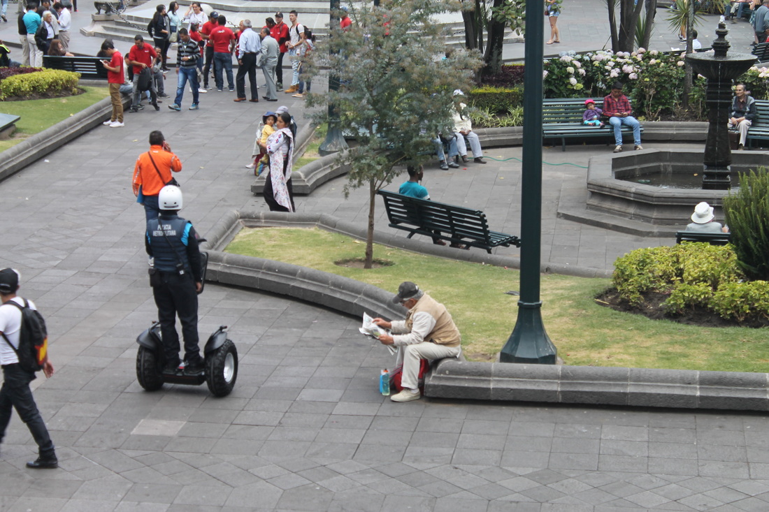
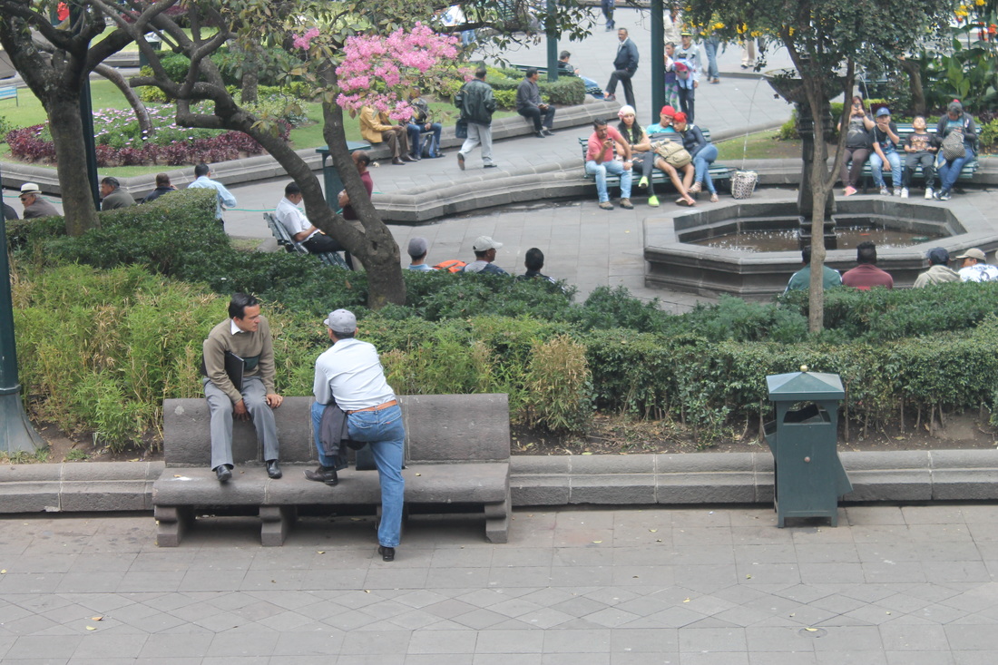
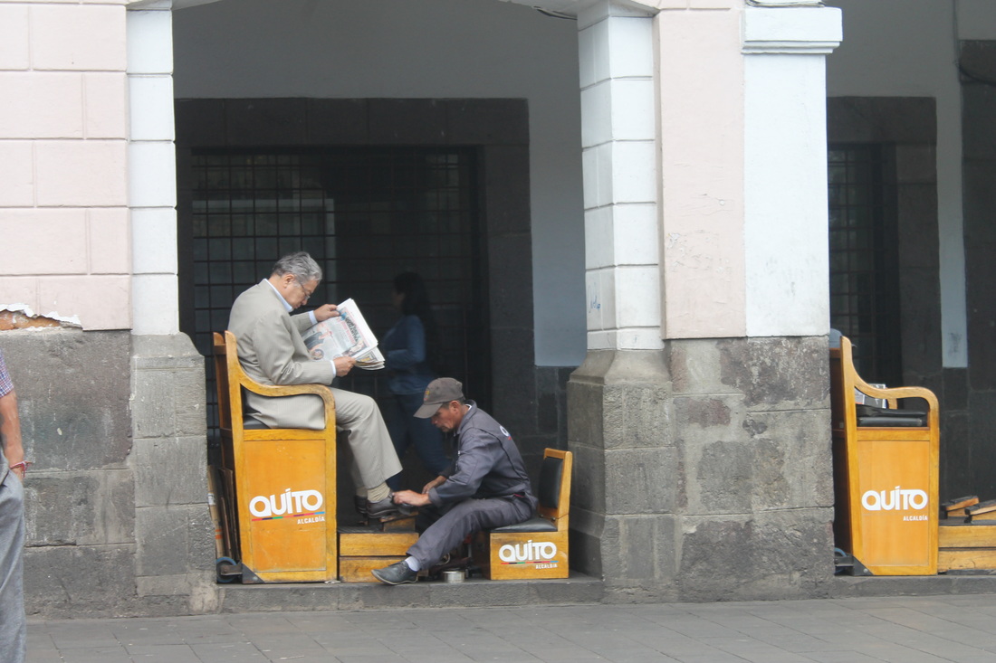
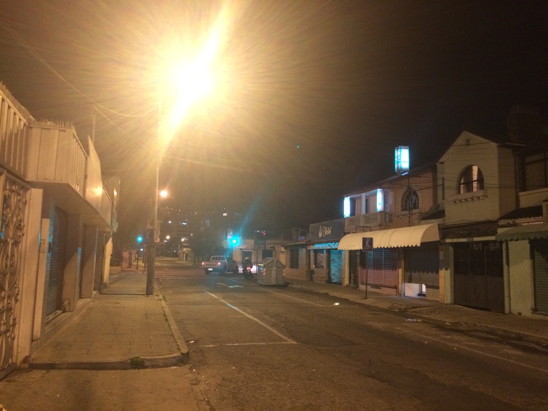
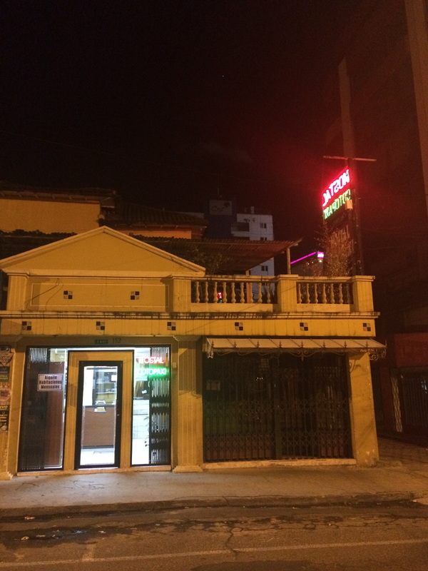
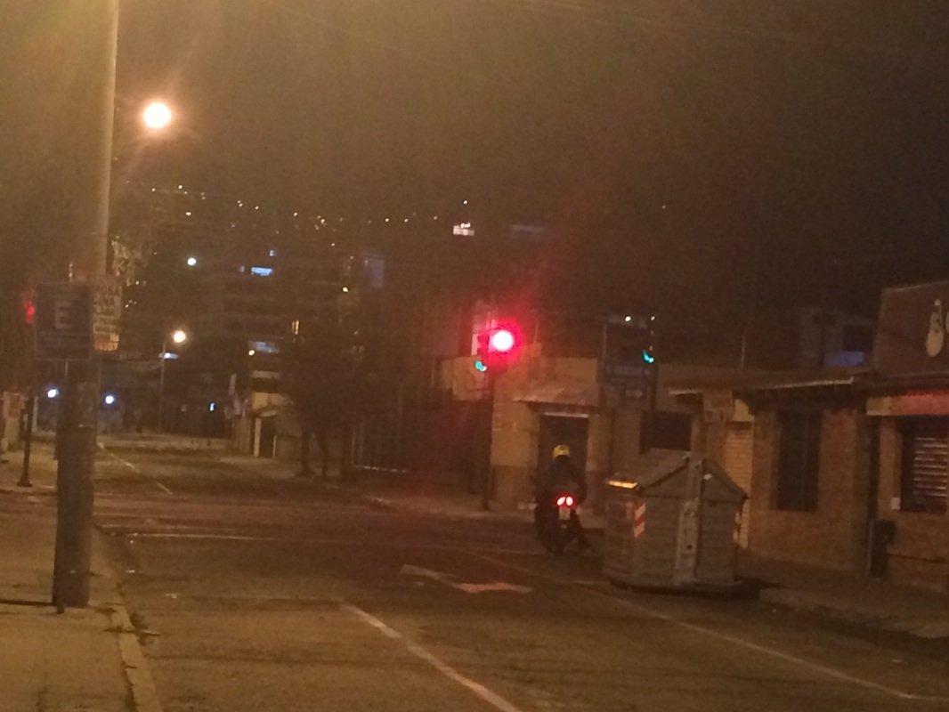
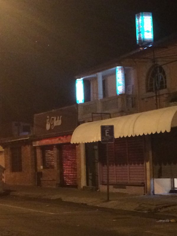
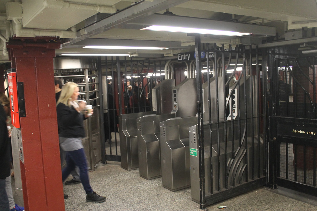
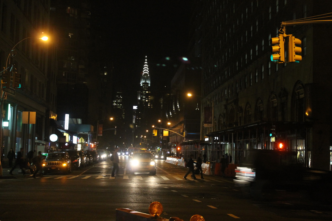
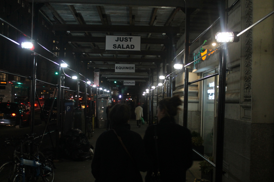
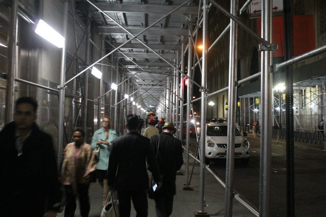
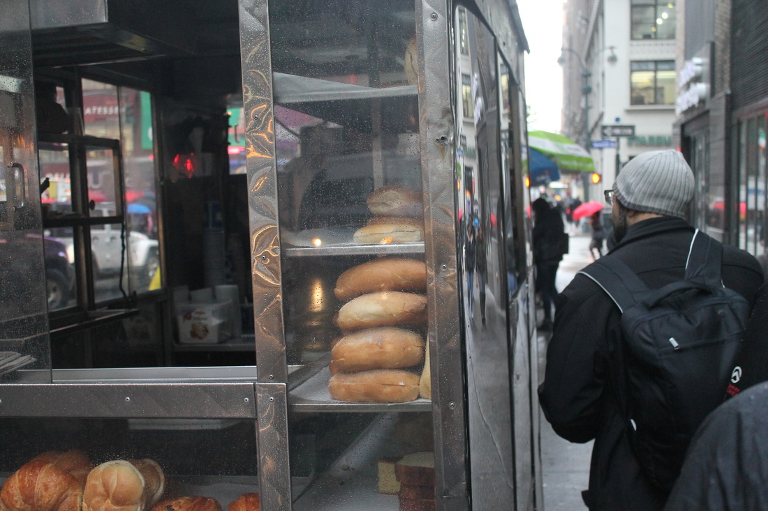
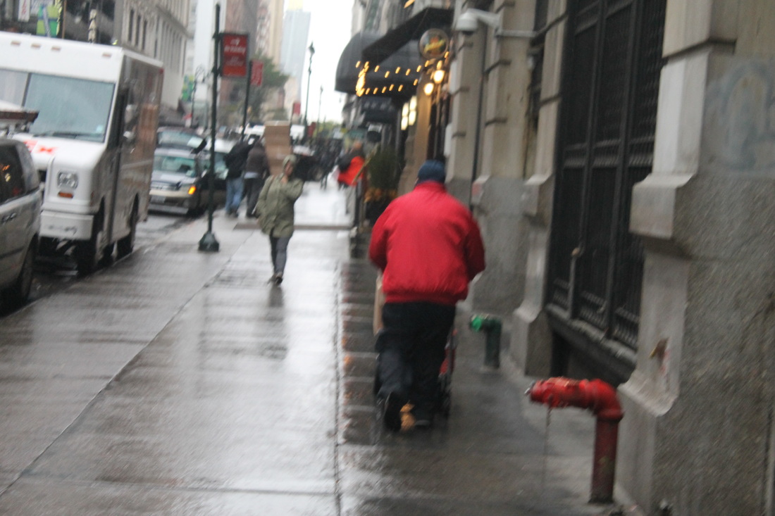
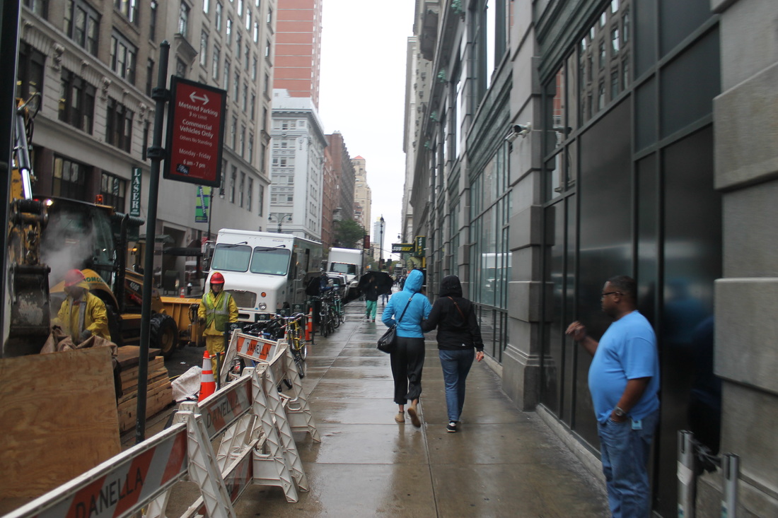
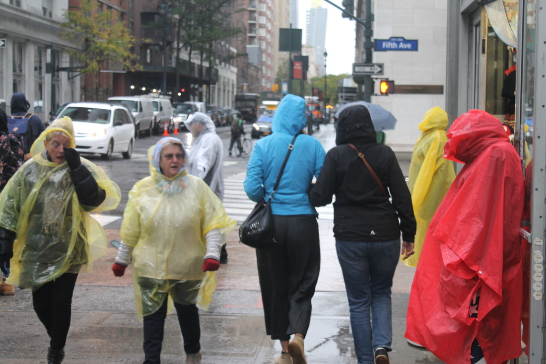
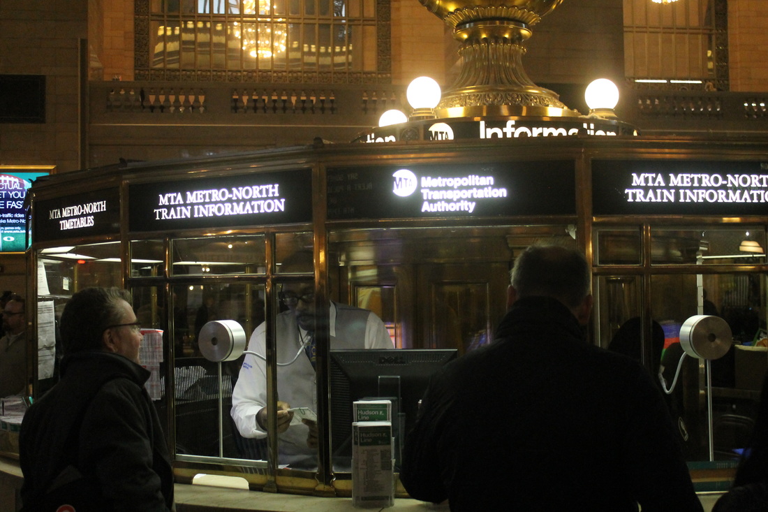
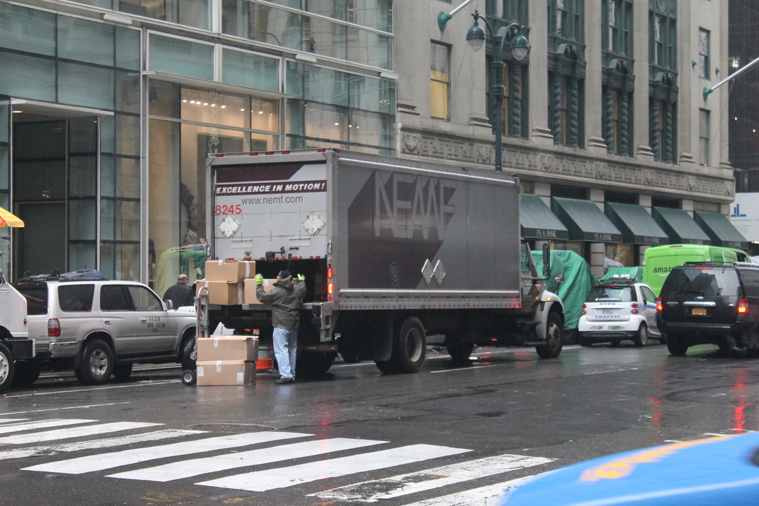
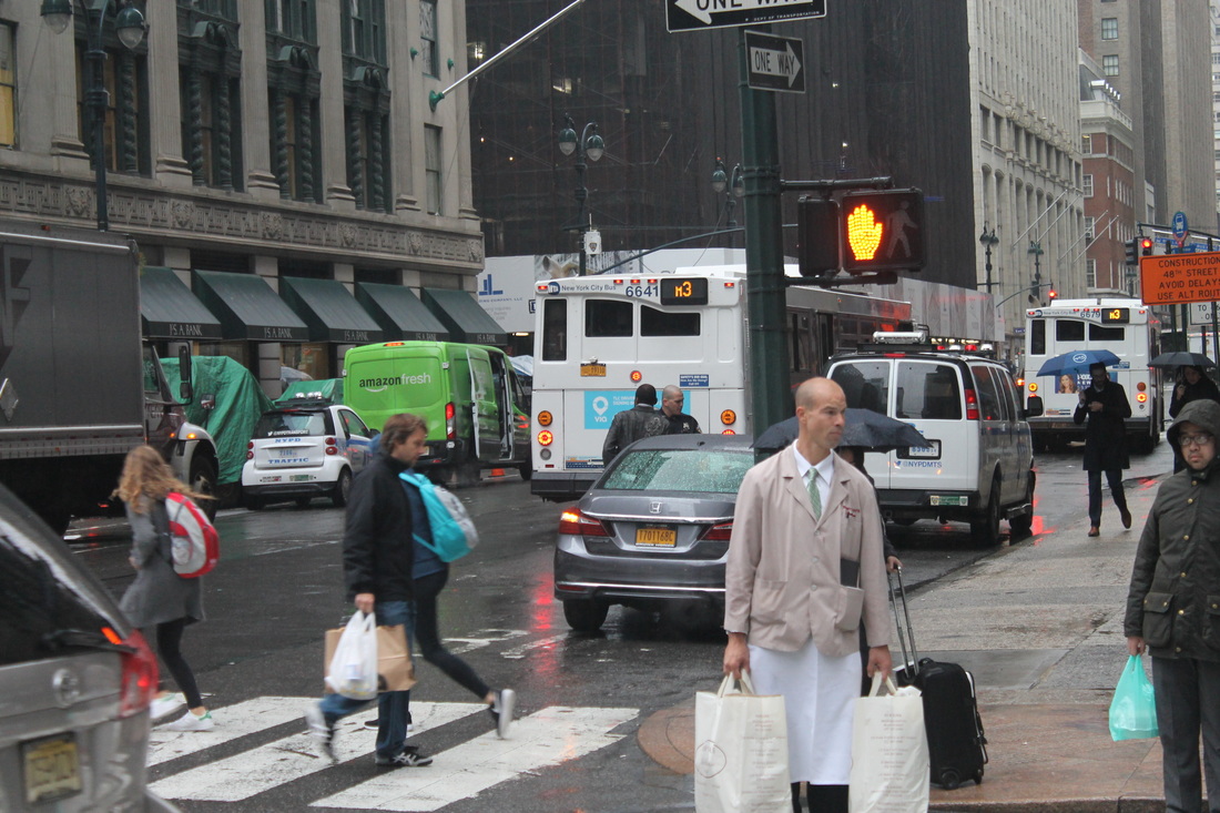
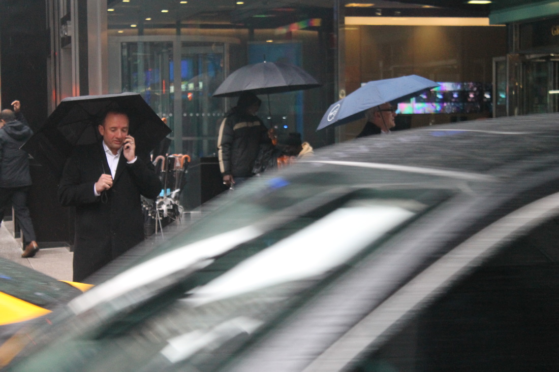
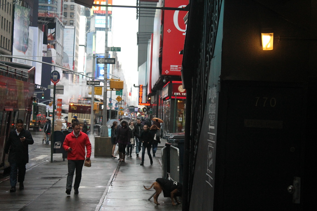
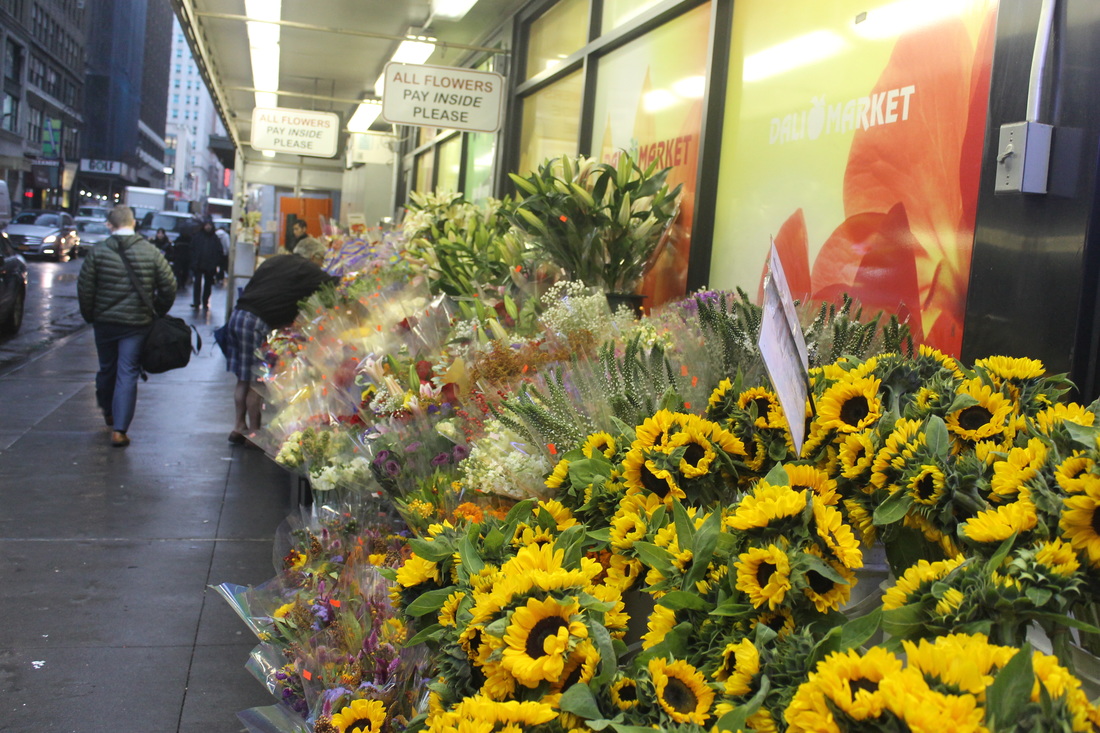
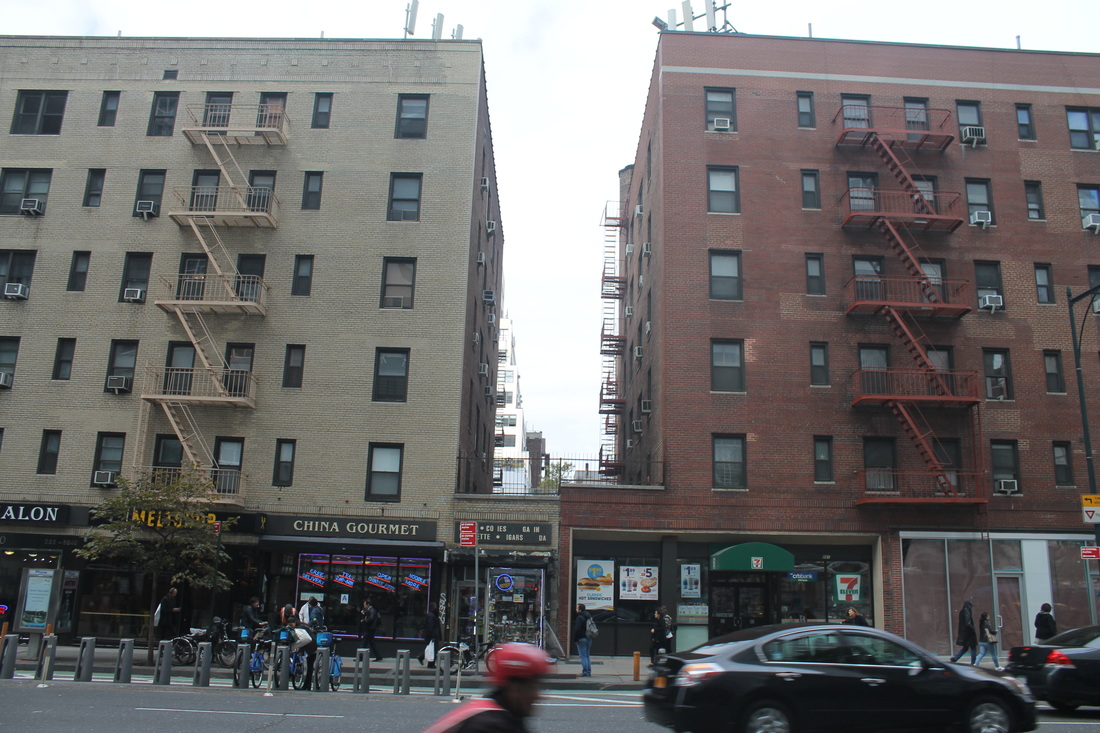
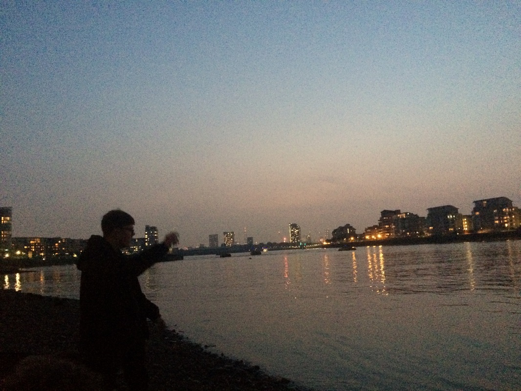
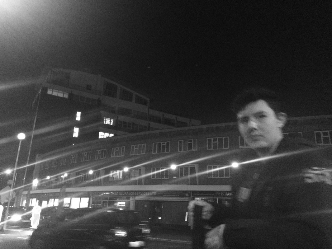
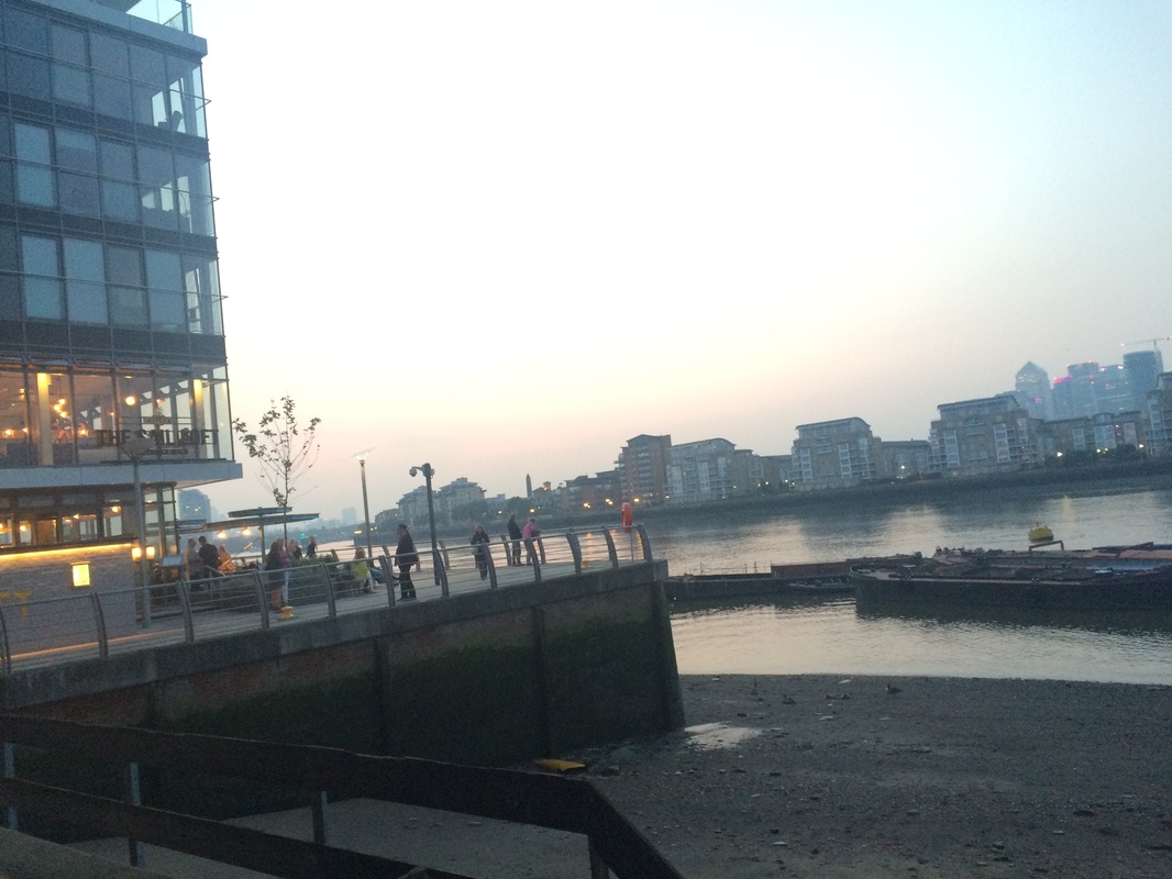
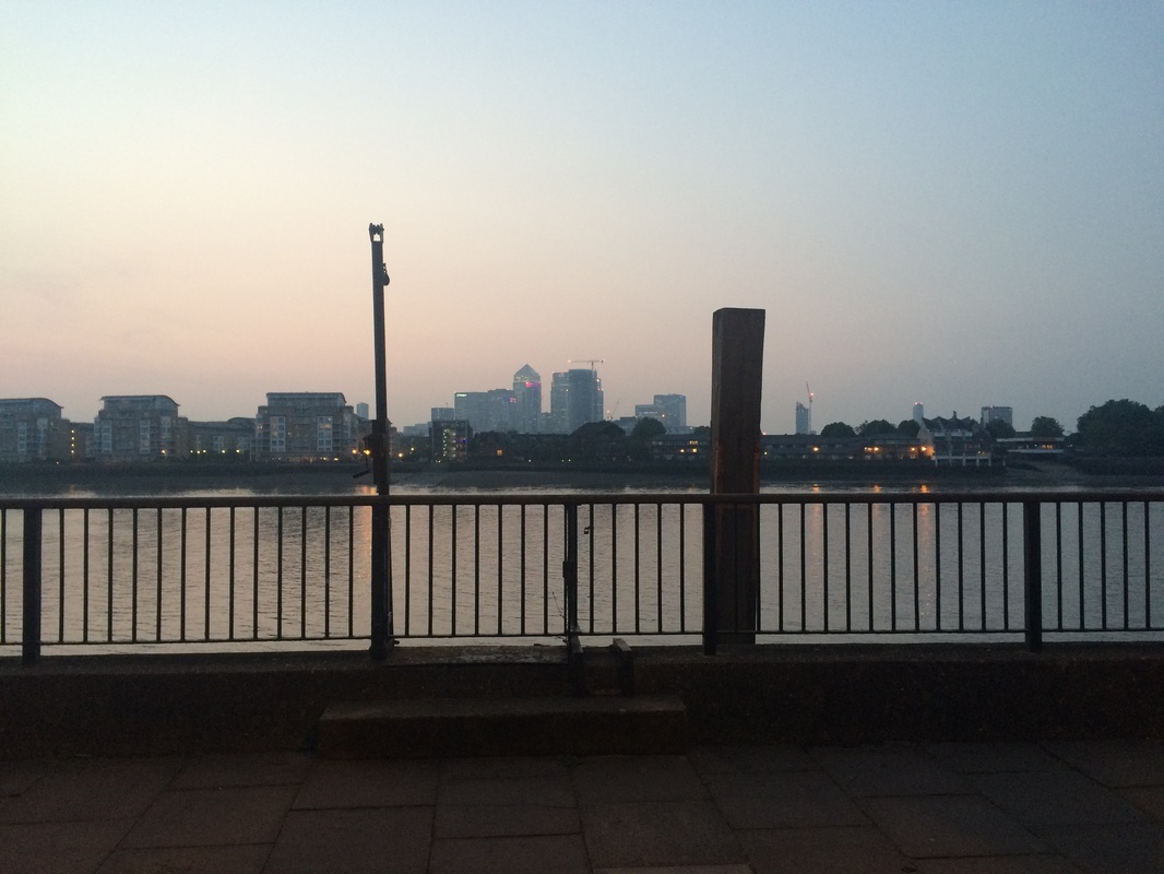
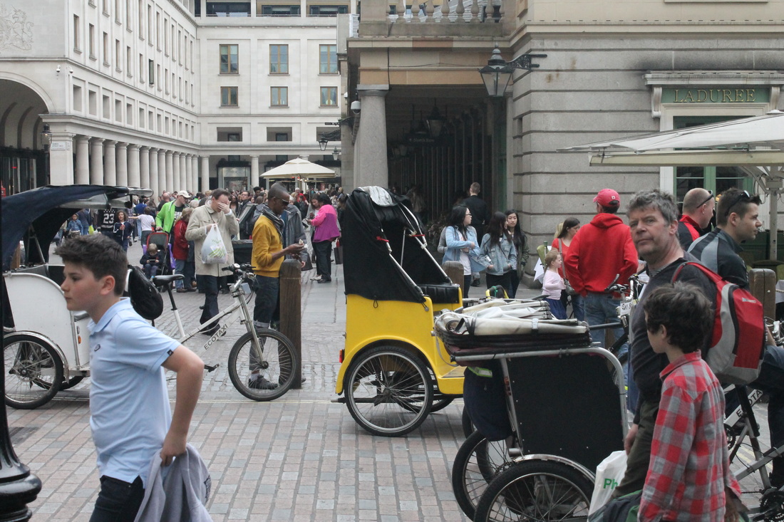
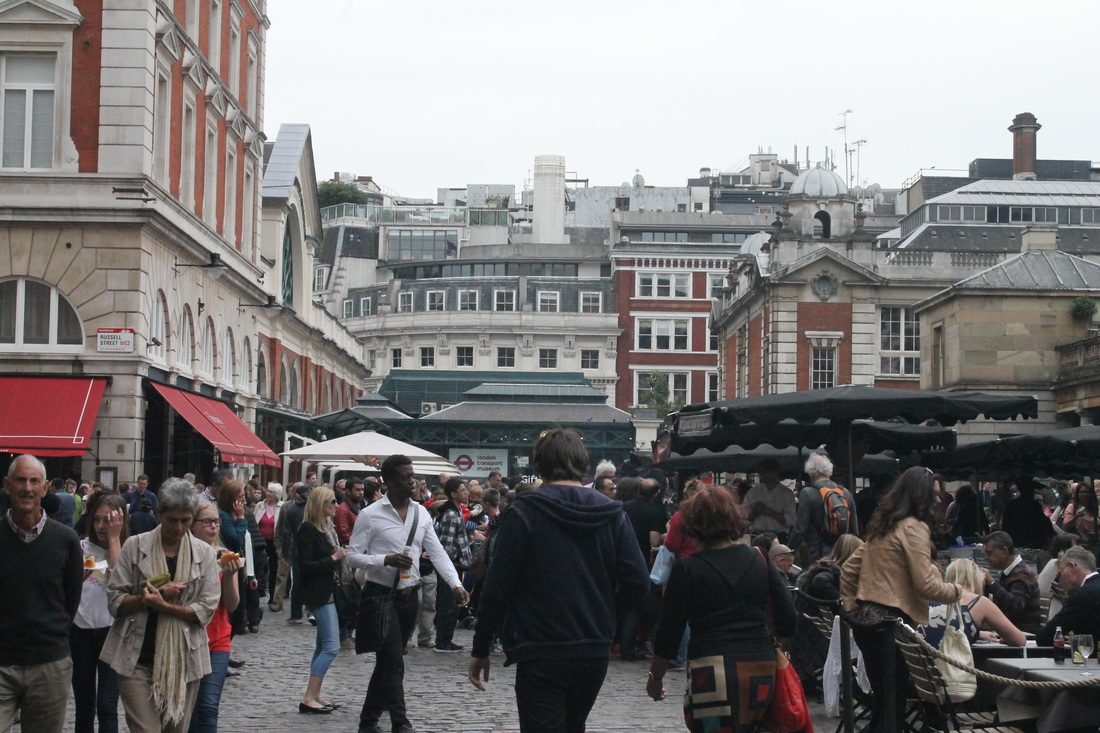
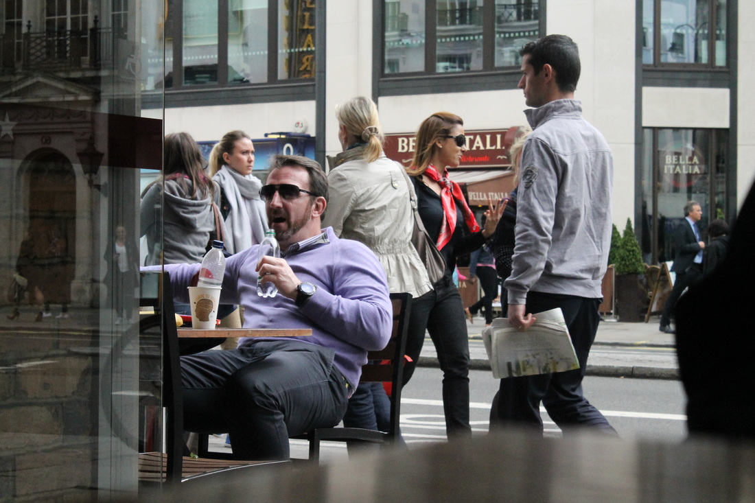
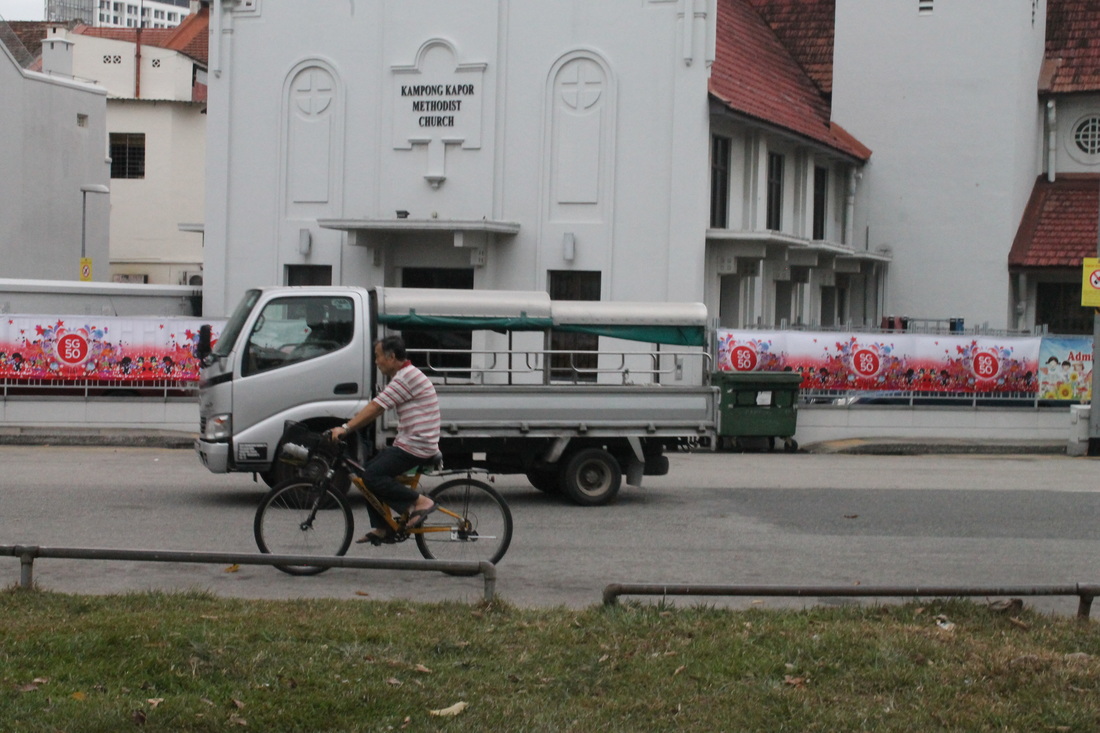
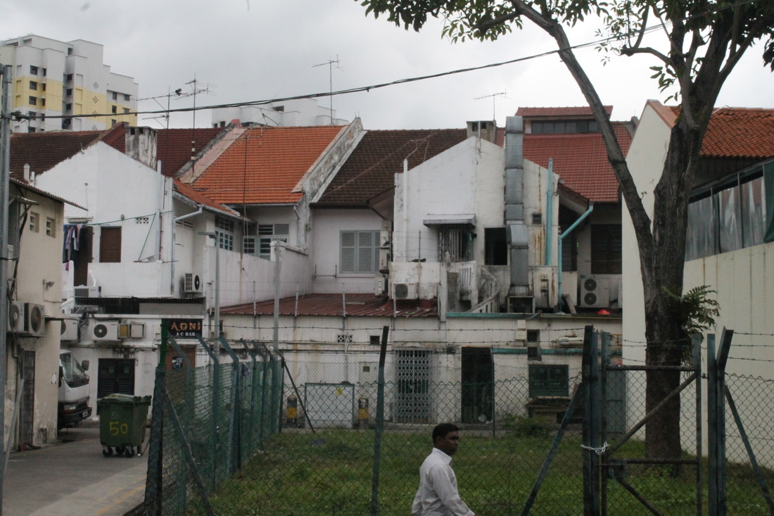
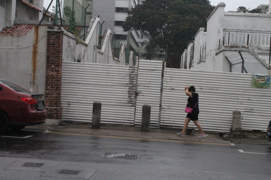
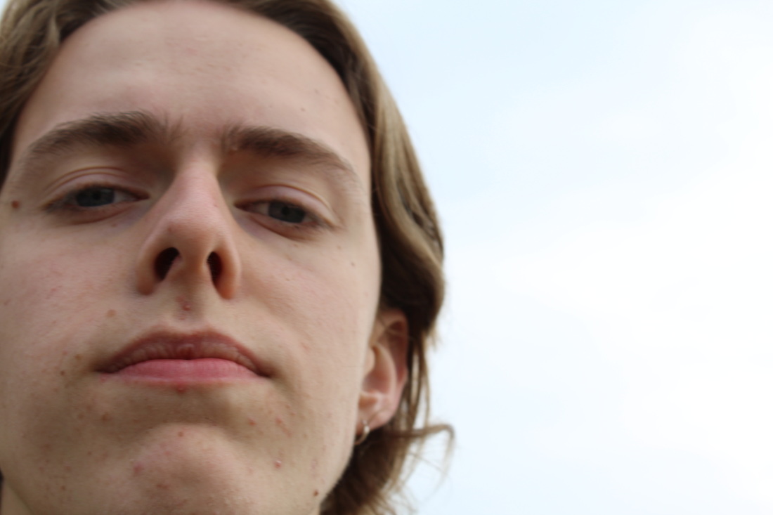
I would say the photographs I tend to take are outside images, however it's hard to say as I don't take photos of people very much but when I do they are always outside images. As I don't usually ask for permission they are often from more of a distance and never really have the purpose of conveying something about the subject or making any connection with the subject they are just another part of the photo. Below are some examples of my photographs that are outside images the top 3 I took in London and are busier packed with people the bottom 3 I took in Asia and are taken from more of a distance with one person in each image and they blend in with the surroundings. None of them really show any connection between the photographer and anyone in the images and they don't really convey anything about any one in the images.
Diane Arbus (outside)
Diane Arbus was a photographer from New York born in 1923, her photos are seen as outsider images. Abigail Solomon Godew is very critical of her images which she believes objectify the subjects, she describes Arbus herself as a "voyeuristic and deeply morbid connoisseur of the horrible".
Larry Clark (inside)
Larry Clark produced a photobook titled 'tusla' which is a perfect example of insider photography. The book contains a series of photos (examples of which are below) that document a his own gang which explains the intimate up close and personal feel of all the people being shot. The advantage of his insider view is that it allows him to catch much more natural photos of the subjects taking photos while they are at ease and unaware of the photos being taken.
Is there an inbetween ?
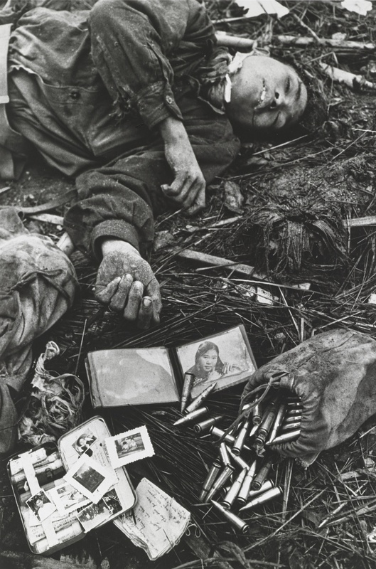
Don McCullin
If there is any evidence for the argument that there can be an image that is both inside and outside in my opinion it would be the image below. Taken by war Photographer Don McCullin during the war in Vietnam the image is of a young vietnamese soldier who has been killed the man has his possessions laid out in front of him including pictures of his family. In an interview McCullin explained he took this photo after some American soldiers had mocked the dead soldier, and by laying out his possessions in front of him it gives him more of an identity and humanises him. The debate whether this image is inside or out in my opinion is between the fact this has been taken as a war photograph which are documentary style photographs always taken from an outsider view point. However in this image by showing the photos and possessions he was carrying the photographer has given us an insight, although very small insight, into this mans life and by doing this the photographer has attempted to make a connection with the subject of the photograph which in my opinion also puts it in to the insider photography category.
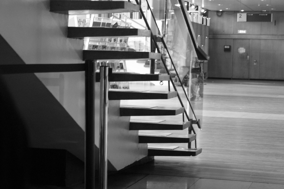
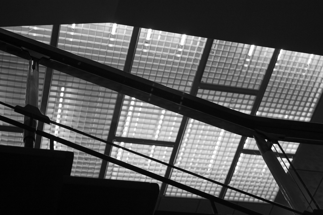
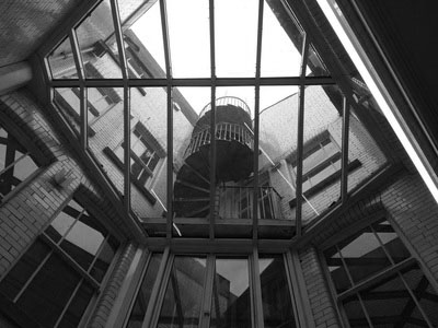
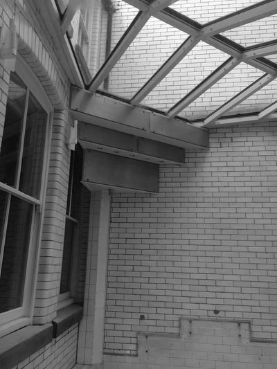
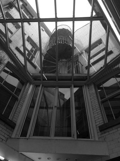
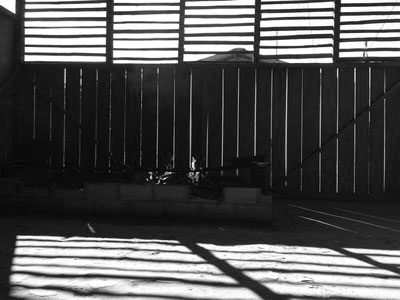
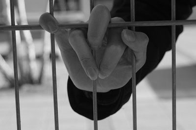
Divisions


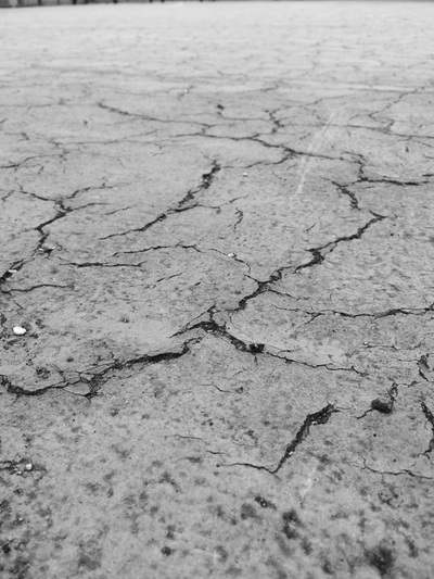
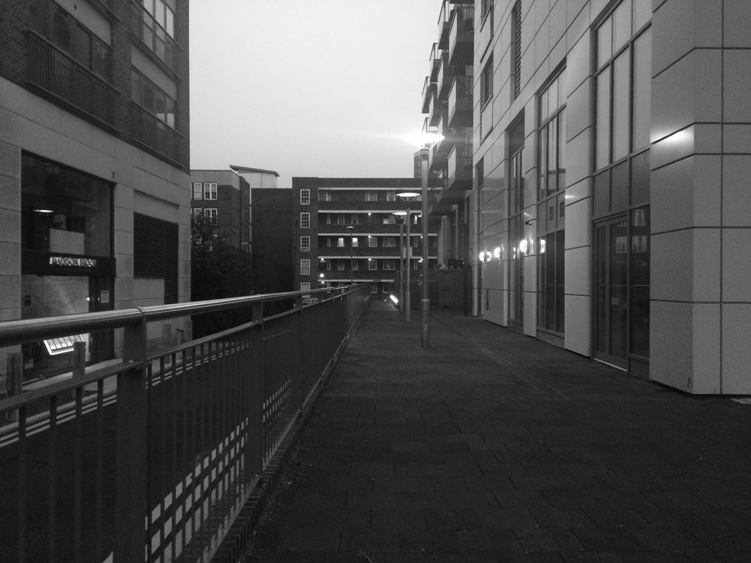
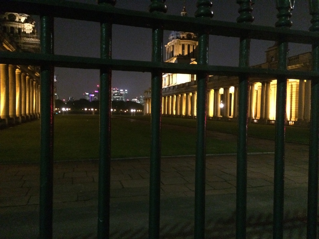
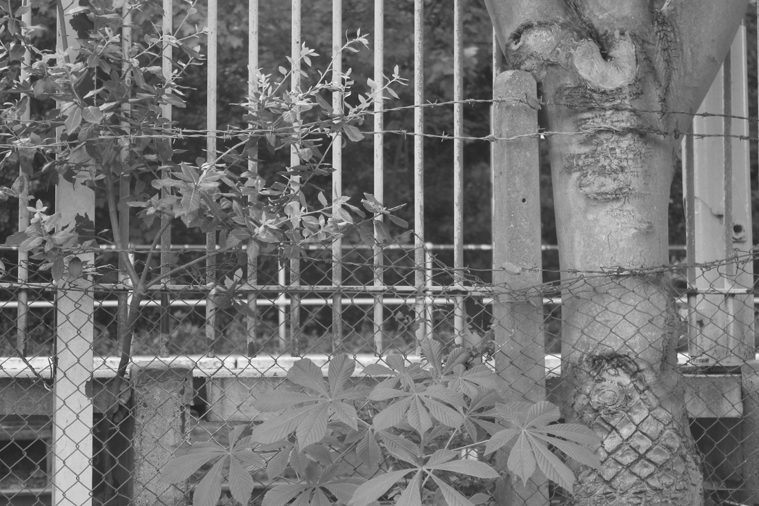
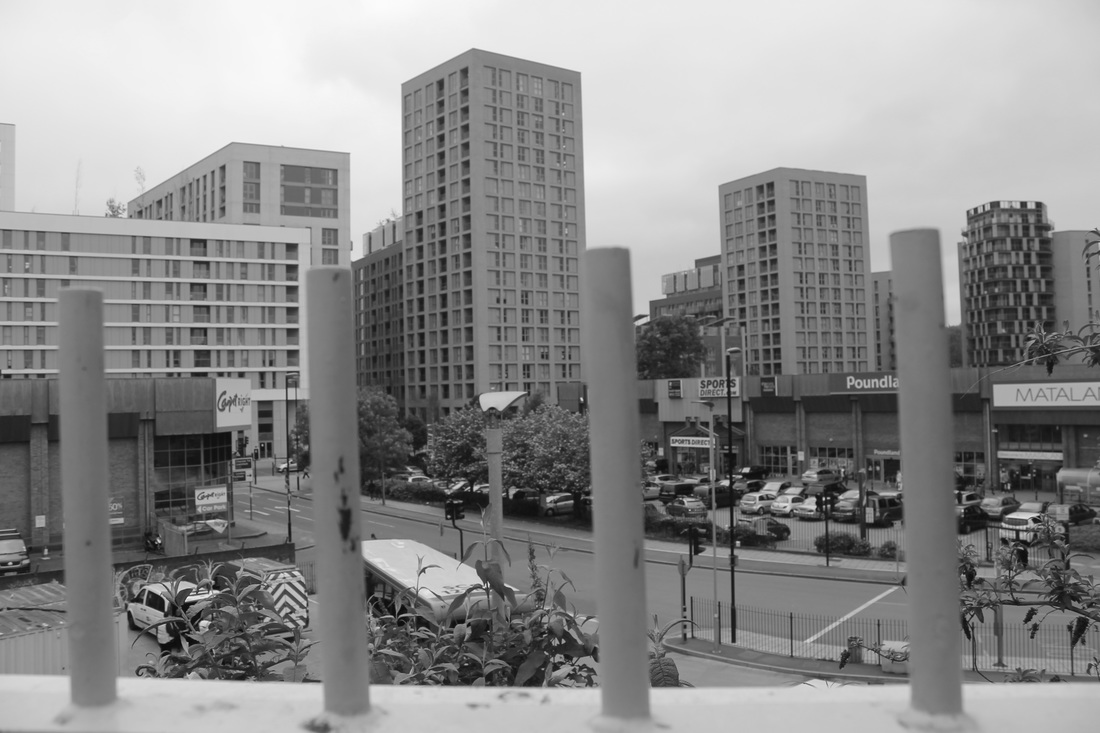
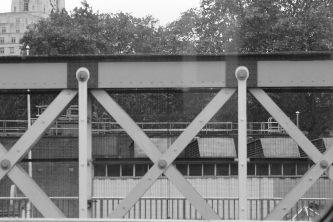
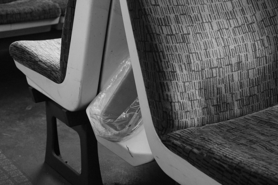
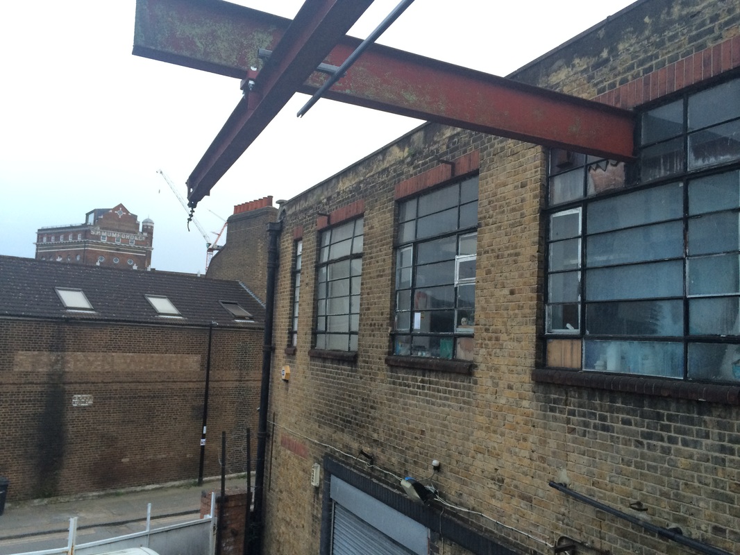
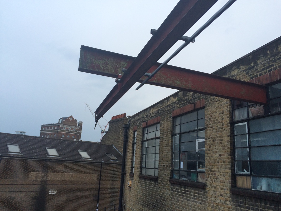
I decided to select 5 images from my recent set of images that I thought linked and use a single word that links them as a title. The title I selected was 'divisions' I picked this because I see all of these images as being divided up into parts by lines running through them. All of the images are in back and white which is another link between them and in my opinion makes them work better as a collective rather than being in colour.
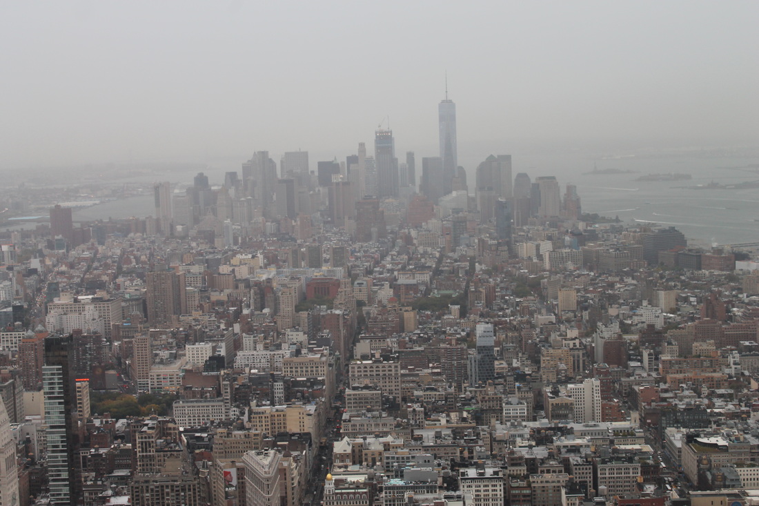
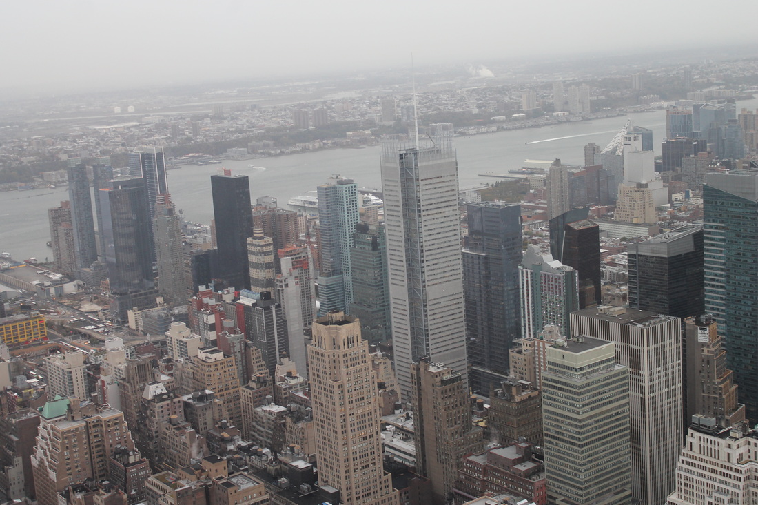
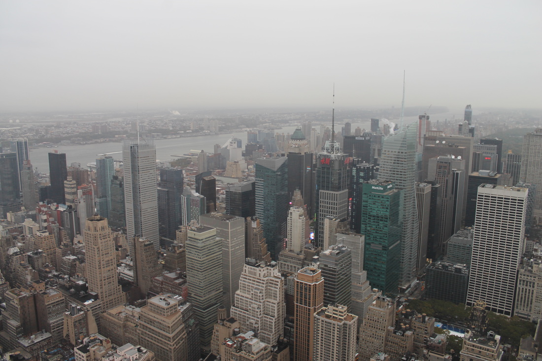
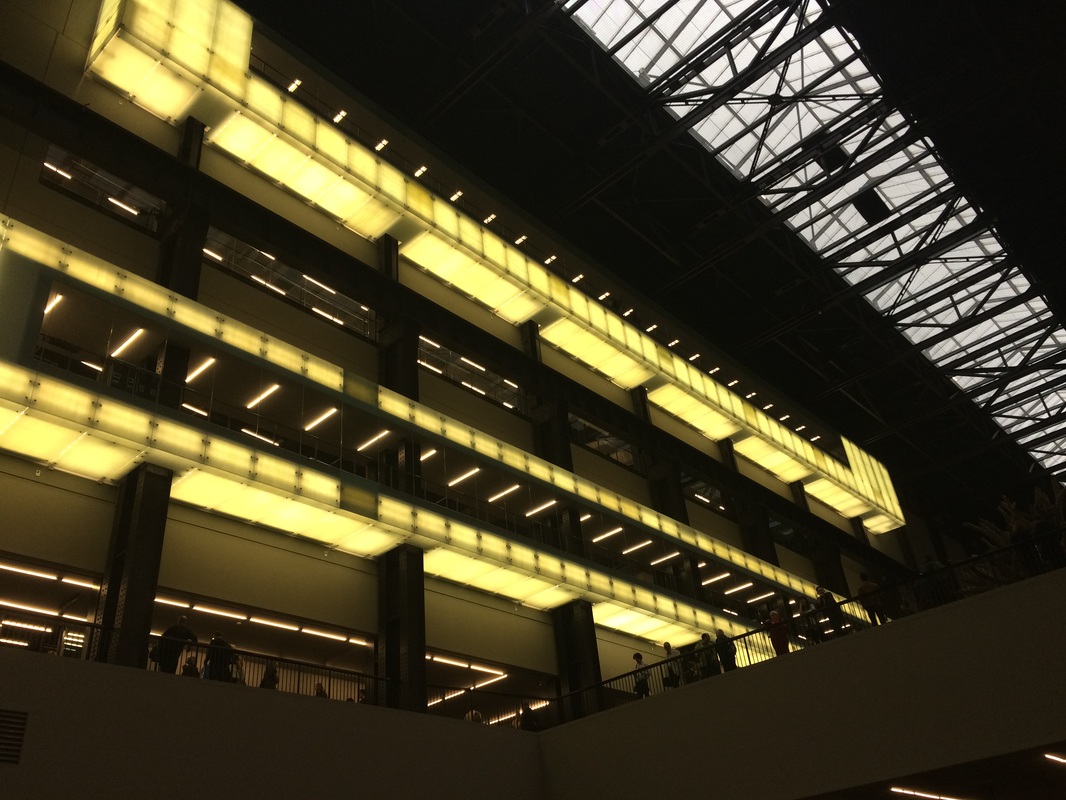
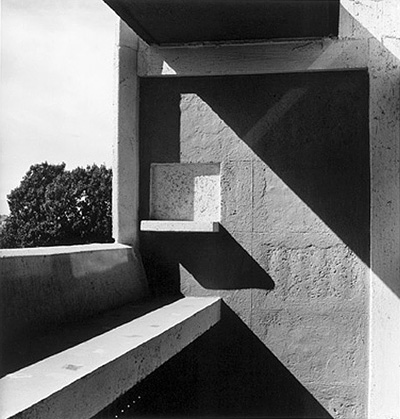
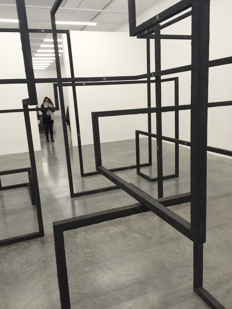
Barbican exhibition constructing worlds
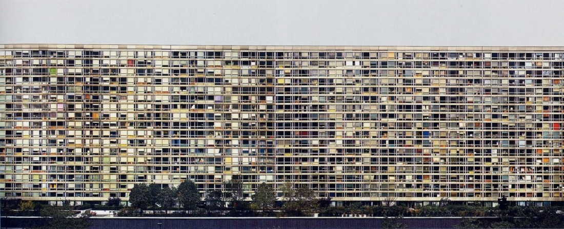

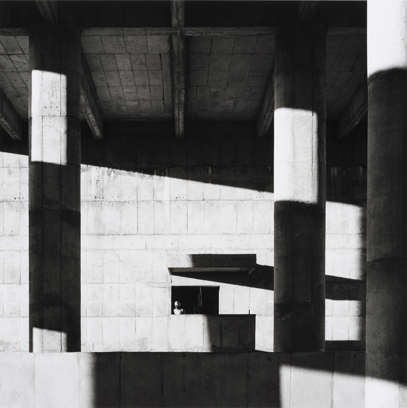
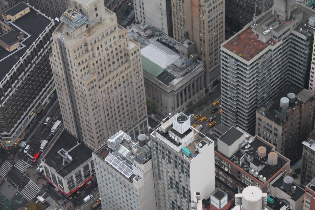
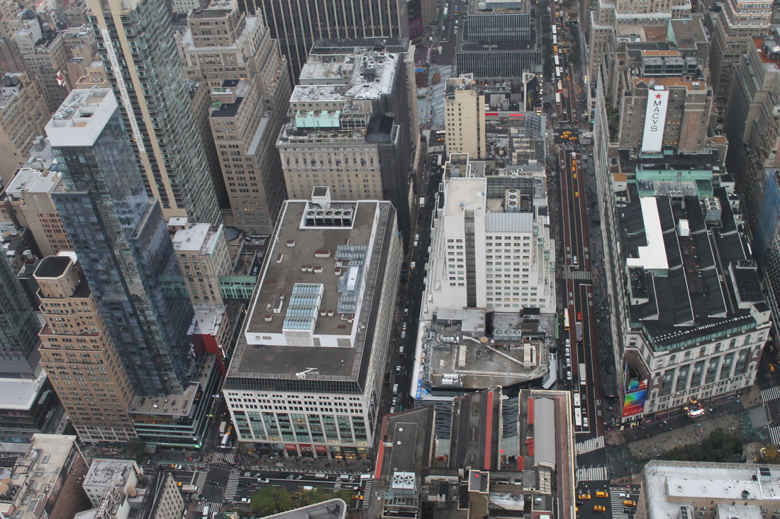
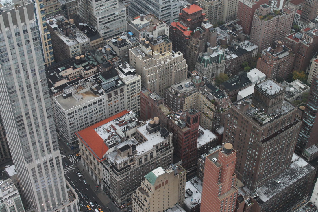
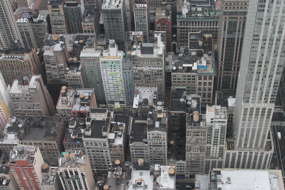
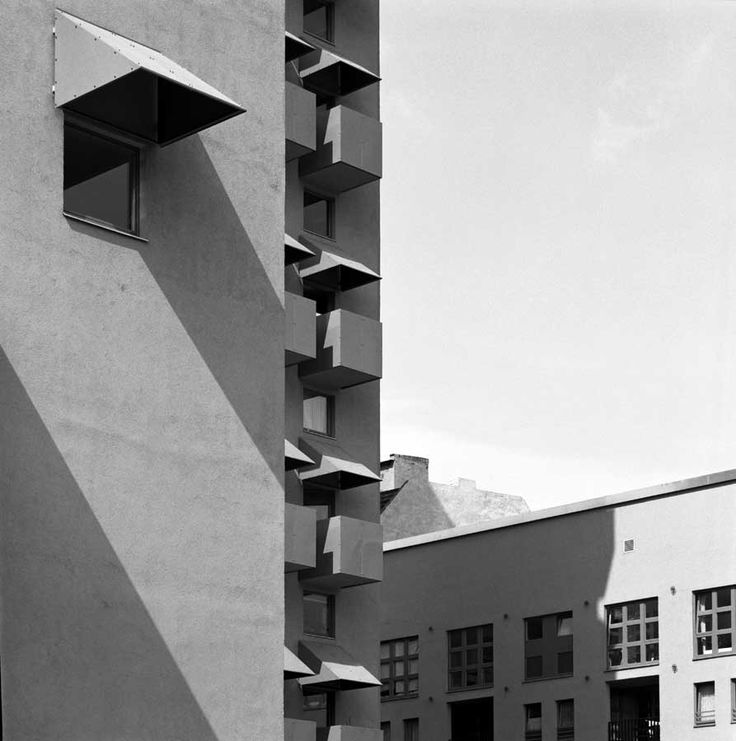
The constructing worlds exhibition featured 250 pieces of work produced by 18 photographers. The focus of the exhibition evident from the name and images above was architecture. It included images of 20th and 21st century architecture from all over the world the images above are the work of Lucien Herve, Andreas Gursky and Bernice Abbott all of their images are of tower blocks which are quite a common occurrence as a subject of images in the exhibition as brutalist architectural photography seems to be a common theme. In keeping with the brutalist theme running through the exhibition there are a few images of the architecture of Erno Goldfinger including the Balfron tower. The images in the exhibition aren't simply meant to be documenting architecture they are also exploring the idea of how photography of architecture in this case can comment on and reveal things about our society.
own photos
Lucien Herve
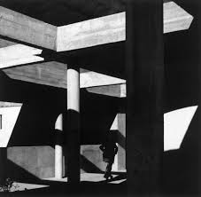
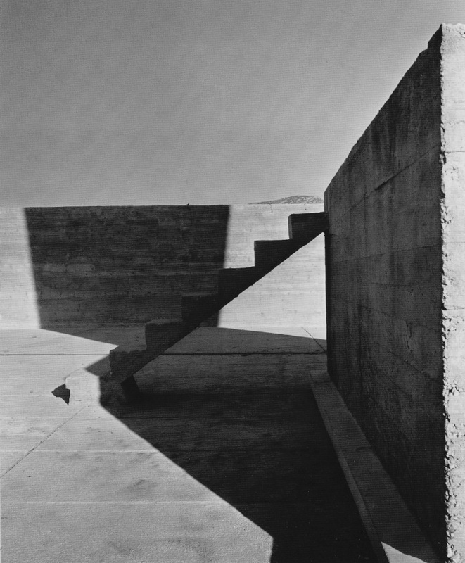
Lucien Herve was Hungarian photographer who spent most his life in France. He is best known for his architectural photography, although his photos weren't conventional architectural shots that were rejected by some magazines Swiss architect, designer and painter Le Corbusier loved his work and claimed he had the 'soul of an architect'. In my opinion his work is quite simplistic photographing already grey concrete structures in black and white the only stark contrasts in his images are between the shadows and light areas. His work is very geometric and neat which would be in keeping with the traditional perception of architectural photography. However I would say his images aren't traditional architectural photographs the way he picks out small parts of the building to photograph and the angle he takes them at and shadows in the image can sometimes obscure the structure he's almost picking out ready made sculptures out of a building.
Bernice Abbott

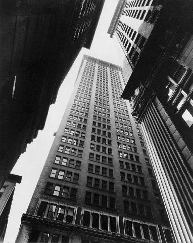
Bernice Abbott was an American photographer who had started taking architectural photos in New York just before the wall street crash and onwards into the 1930's. The series of photos she took was titled 'changing New York' she began taking photos in 1929 before the crash during the construction boom of the Art Deco era. But shortly after the city plunged into the great depression and everything changed, she had an interest in the link between science and photography and this can be seen in her images they are almost scientifically documenting the change in the city.
Helene Binet
Helene Binet is a architectural photographer born in Switzerland and currently based in London. Her images are of contemporary architecture and only ever shot in film, never digital which she described as 'disturbing'. I see a similarity between her images and Lucien Herve's both geometric, black and white with almost a washed out quality, shadows feature effectively in a lot of her images. The horizontal lines going through her images give them a sense of flow which is different to Herves which have more sharp edges and corners theres also a difference in the shadows between Binet and Herve, the shadows in Herves images are darker and more defined which adds to the sharp edges and divisions already in his images.
My photos edited
I decided to edit some images I had taken previously and make them black and white in the style of Herve to see if it would improve or change how i saw the image greatly. Some images looked better than others in black and white but at the moment I feel theres two much detail and to much going on in my images for black and white to have the same effect of Herve some begin to look cluttered. Although I would still say the out come was reasonably successful.
Bill Leslie
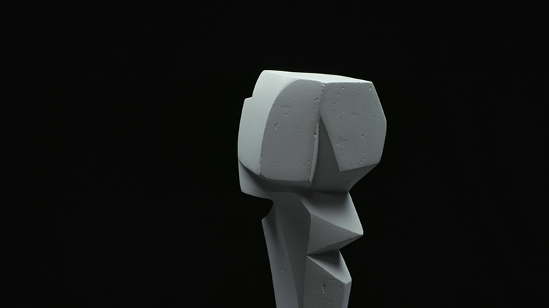
Bill Leslie is a English photographer and film maker who is interested in sculpture. I am interested in his work as I want to expand on the idea of Lucien Herve's images finding sculptures with in architecture not photographing the building as a whole. After looking at leslie's work I thought I could photograph sections of buildings in the style of Herve and then try to recreate the same kind of shapes from that image in small sculptures with light shining on them to create shadows and take the images in black and white. I like how simple leslie's images are with the plain black background and one sculptural centre piece.
Paper Sculptures
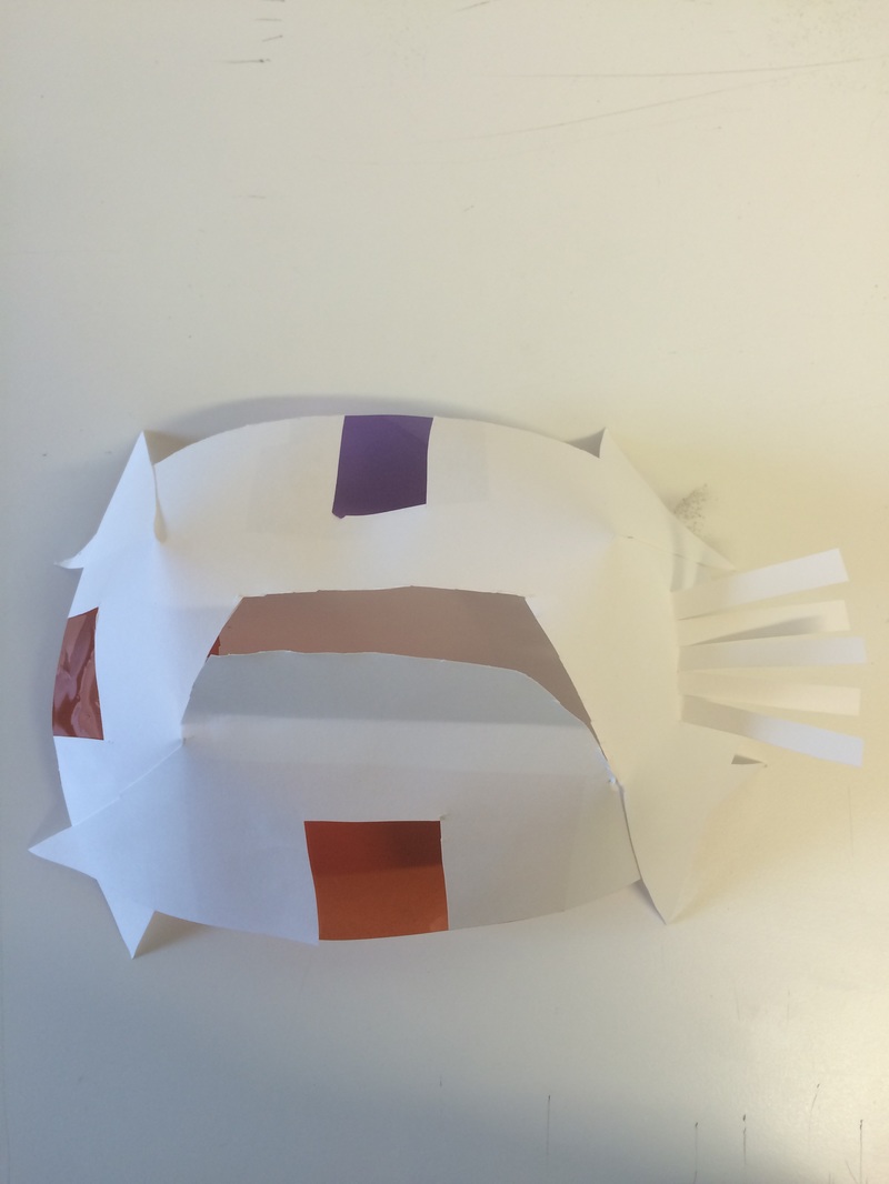
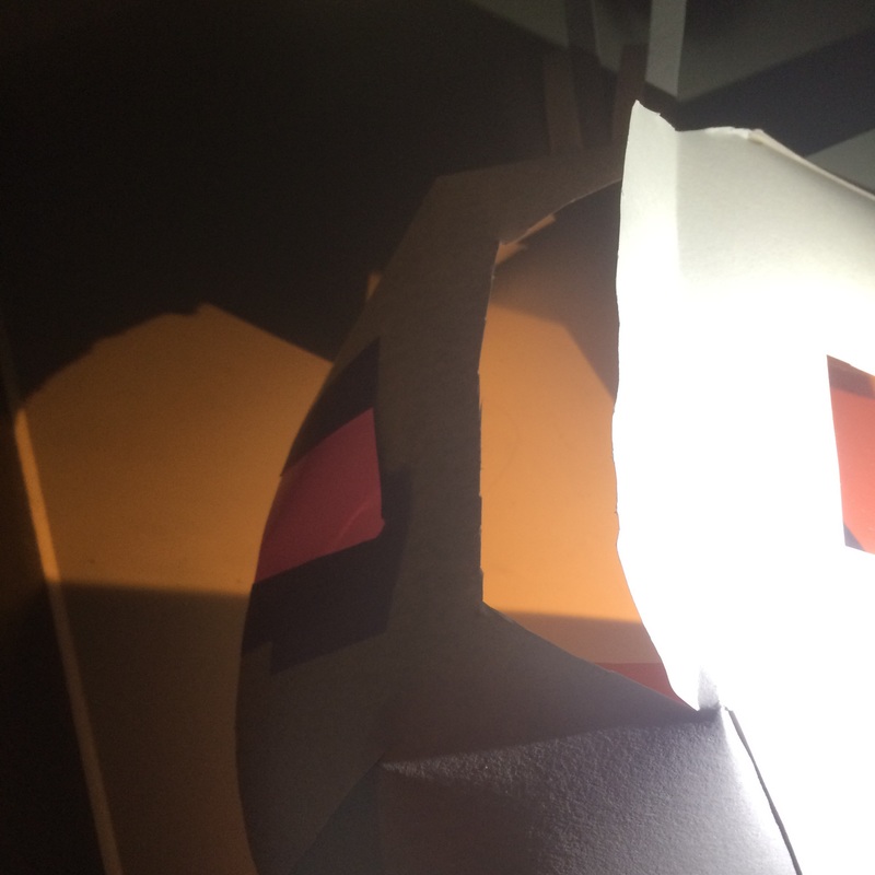
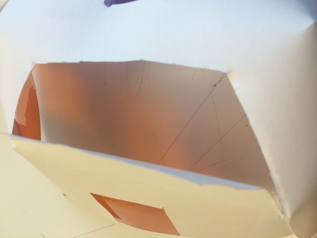
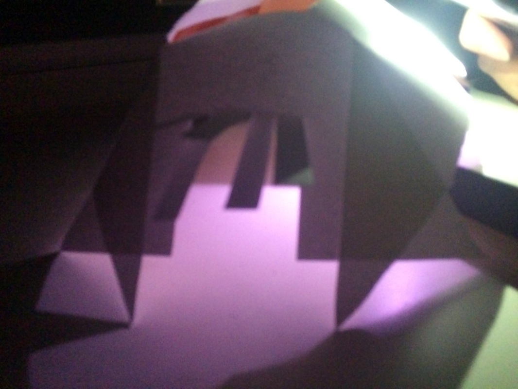
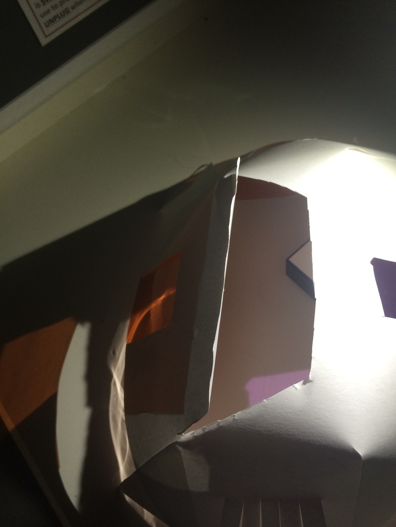
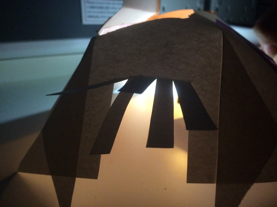
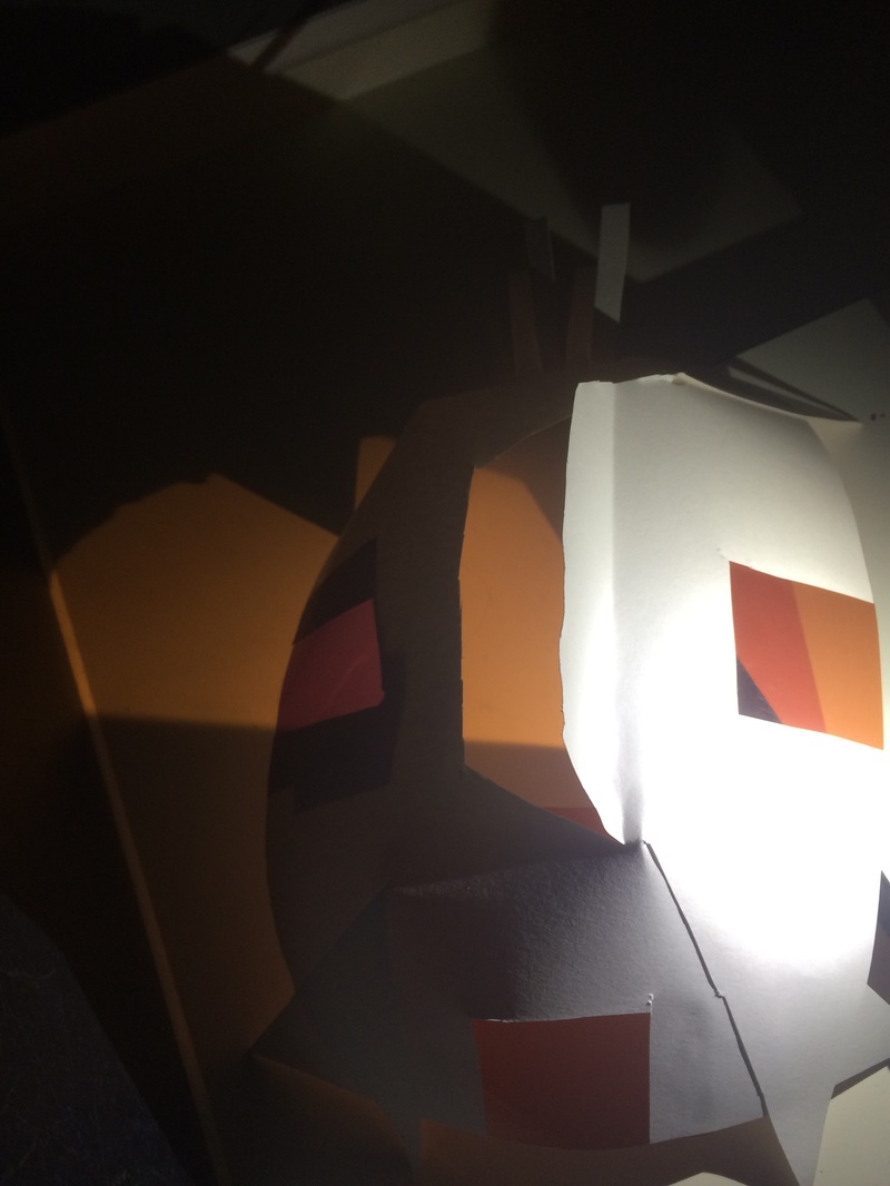
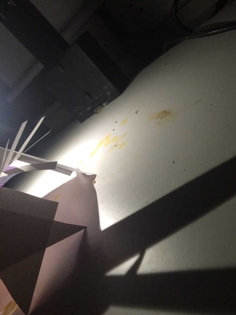
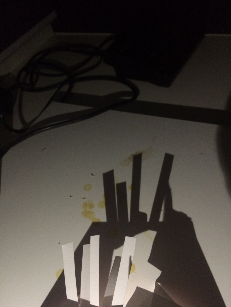
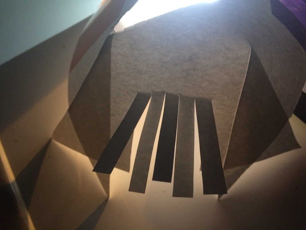
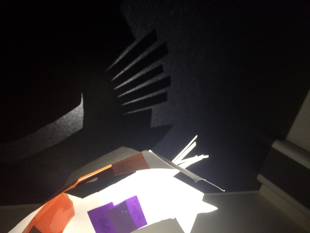
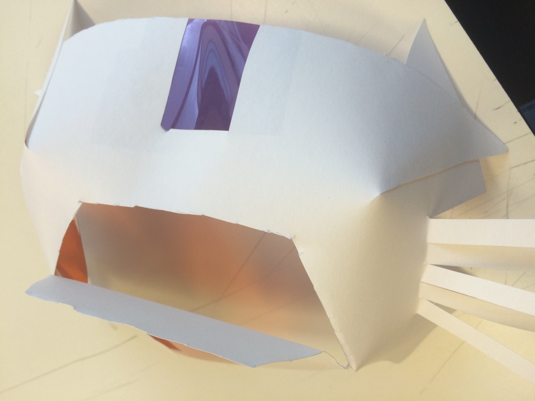
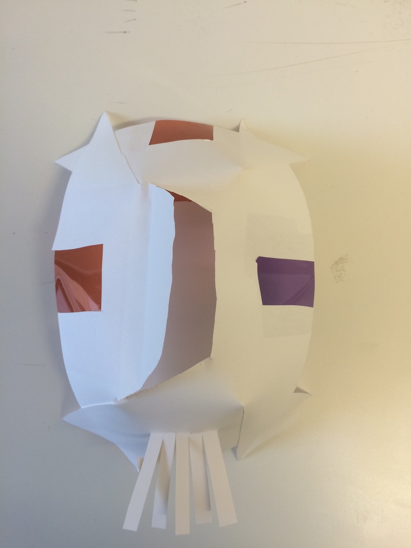
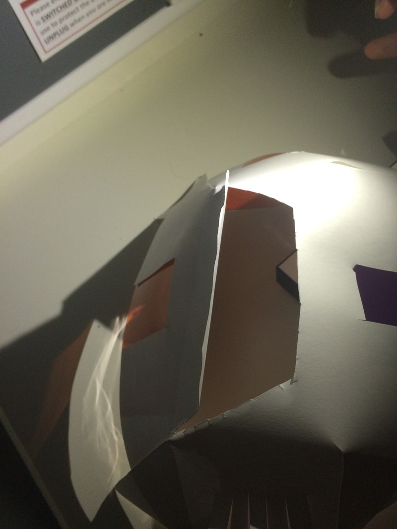
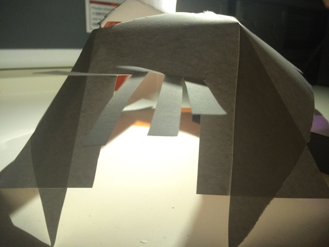
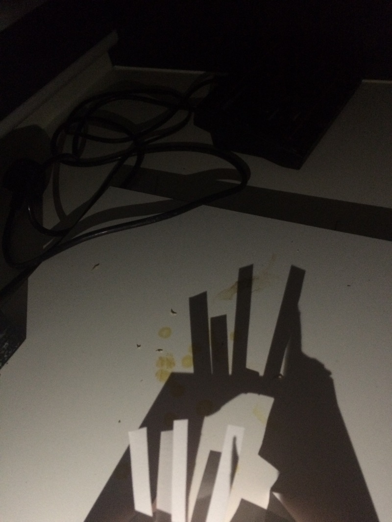
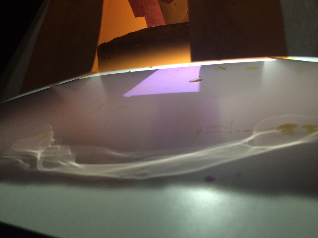
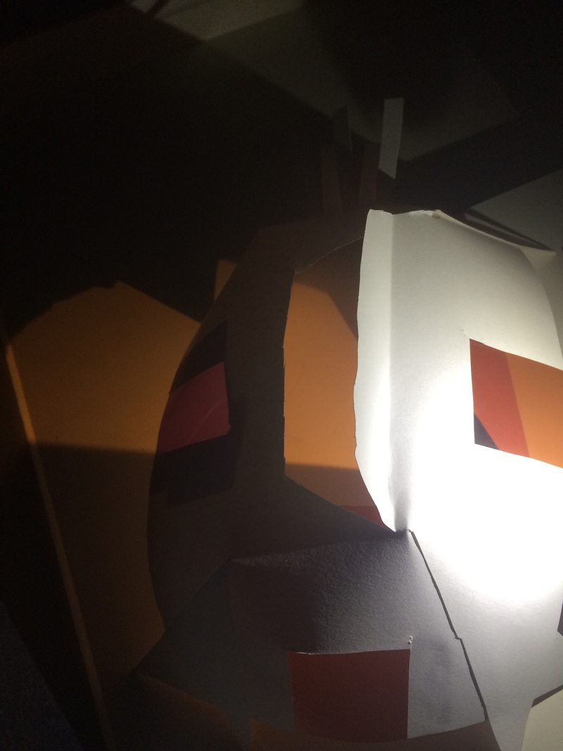
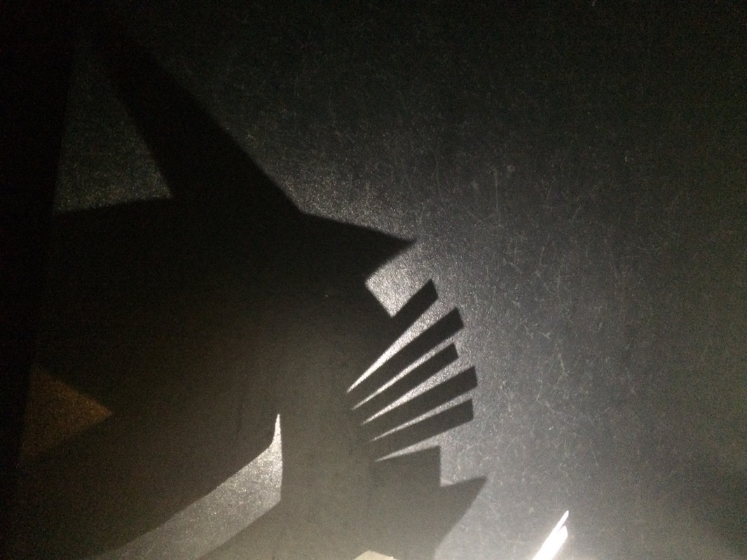
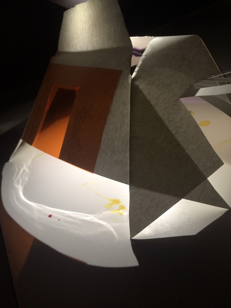

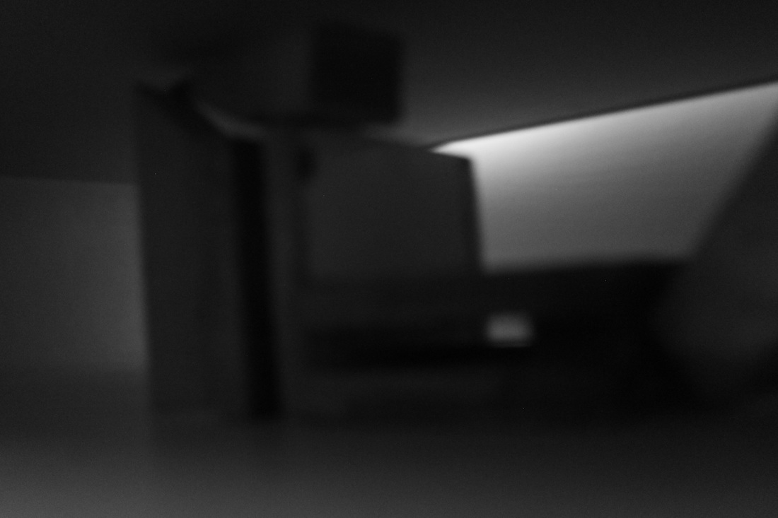
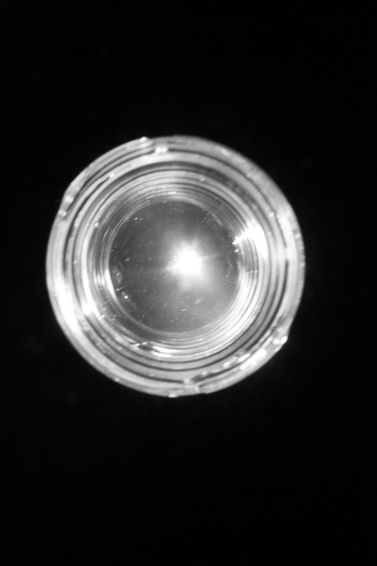
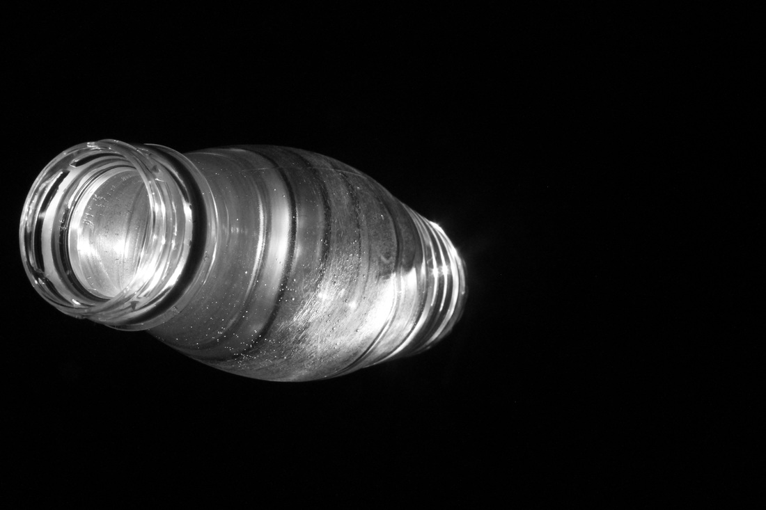
We carried this experiment out in class, we had to create and document our own paper sculptures I was interested in creating a object that could produce the most interesting lights and shadows. I included some screens of clear coloured plastic as I thought it would produce some really interesting results inside the actual sculpture as the coloured light would all converge inside, thats the reason I cut the top as I thought it would almost act as a viewing slot. However this didn't quite go to plan the light didn't all converge inside the sculpture as I had hoped but more projected light out through the paper depending on the angle which I thought was quite effective. As well as that there was some very interesting swirls of light that appeared on the table which happened just by chance which I thought produced the best images. After a while I started experimenting with the shadows the sculpture could produce so i cut out another piece and cut it into strips which produced some quite interesting shadows.
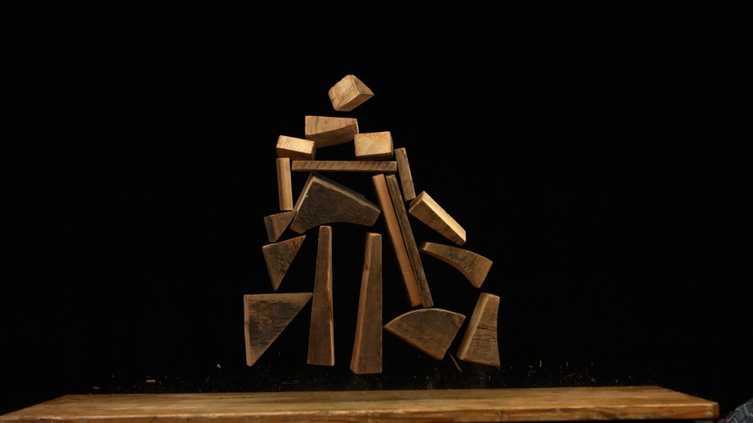
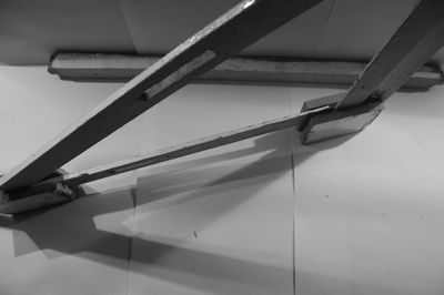
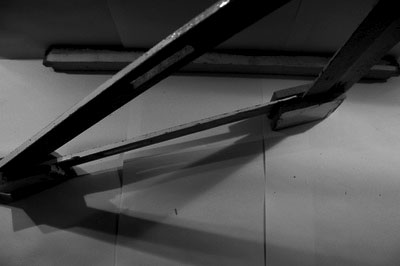
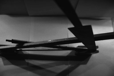
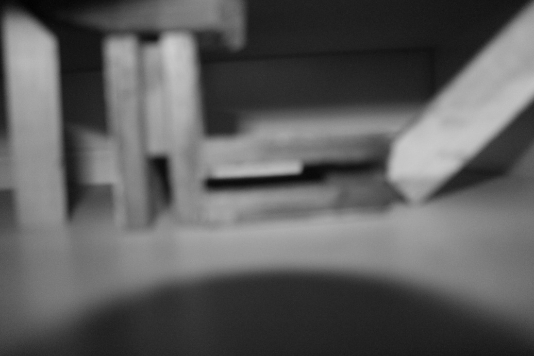
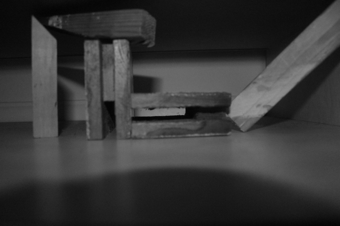
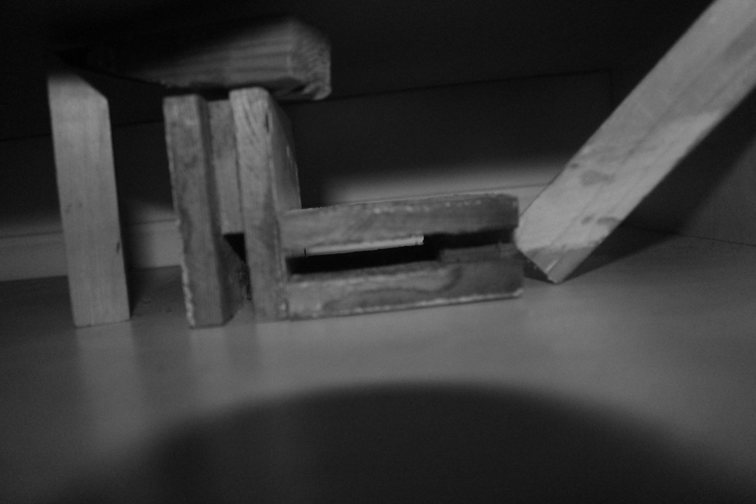
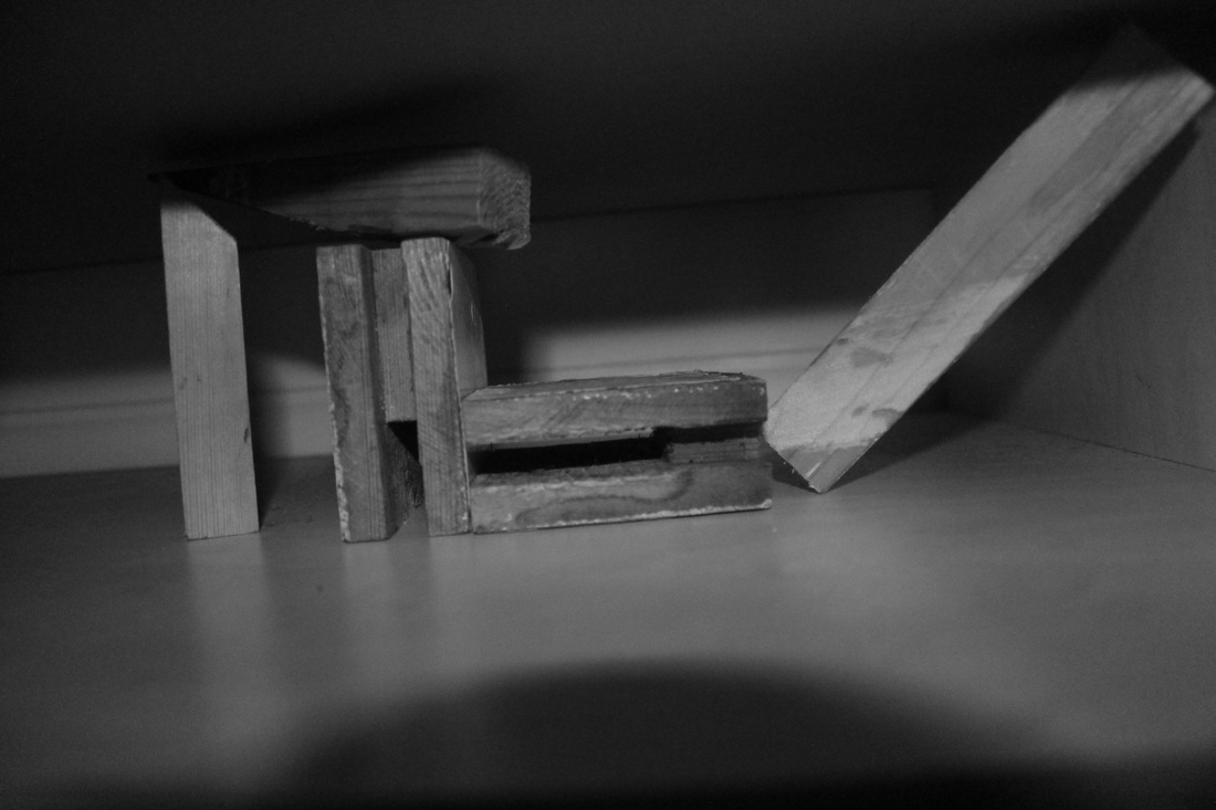
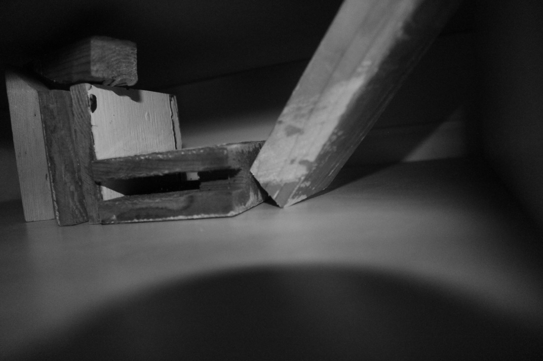
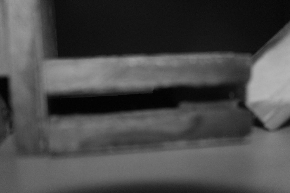
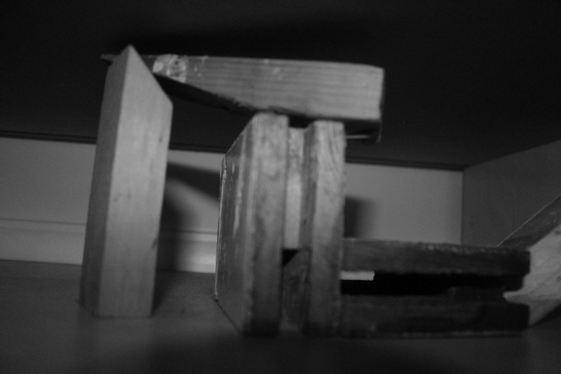
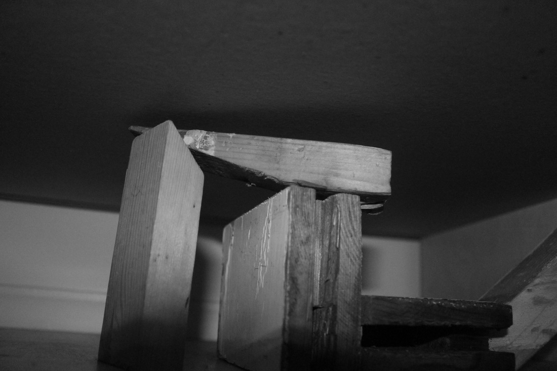
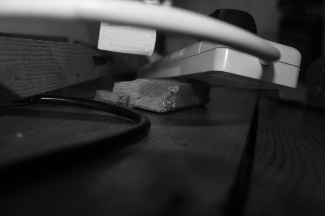
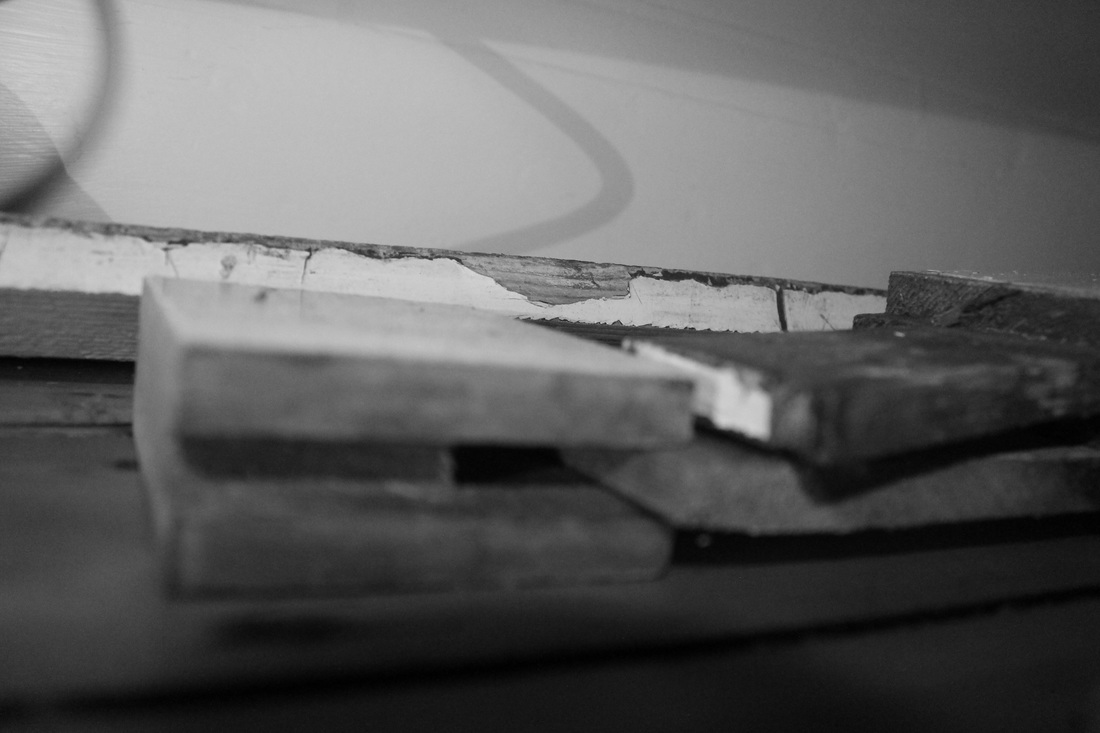
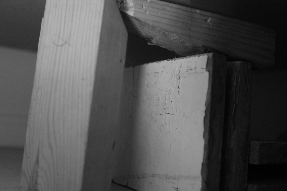
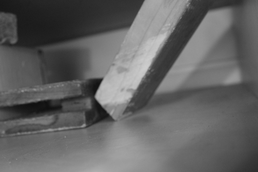
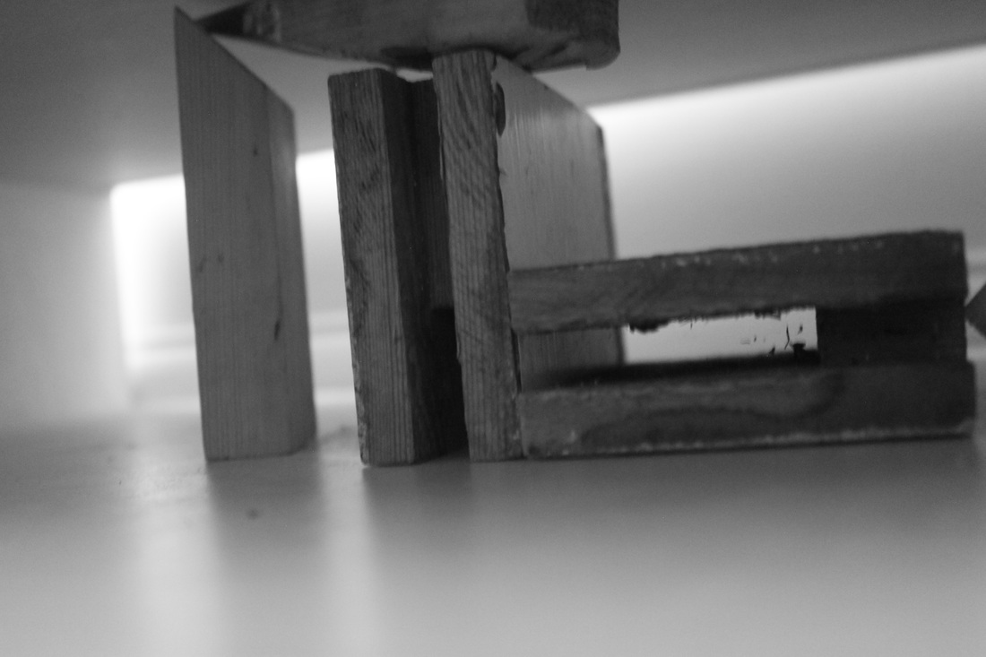
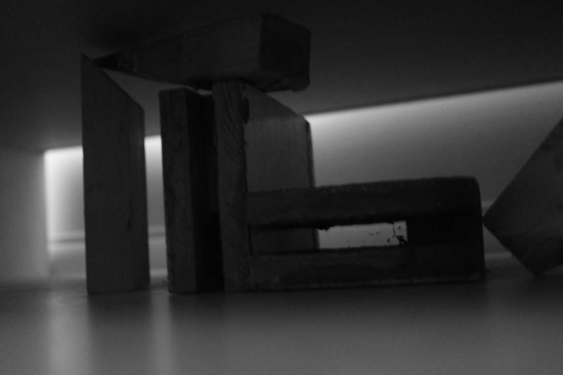
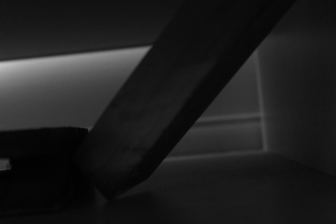
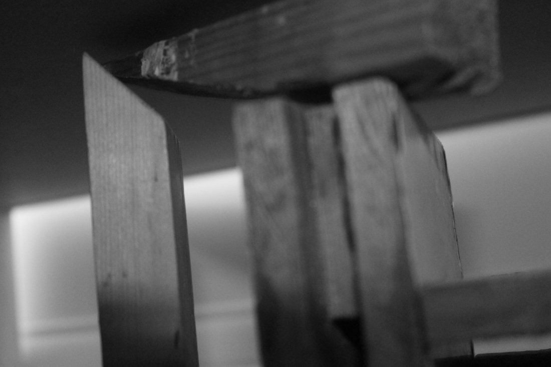
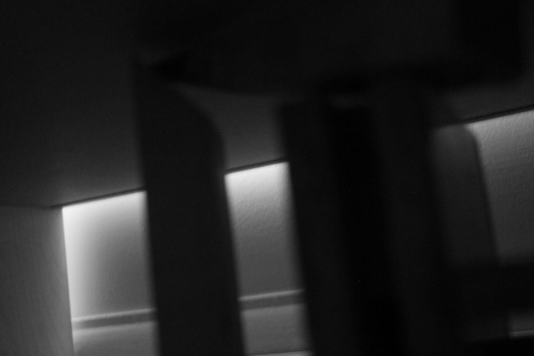
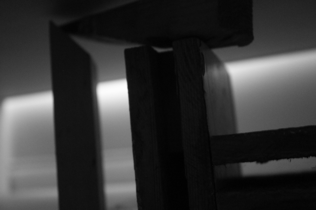
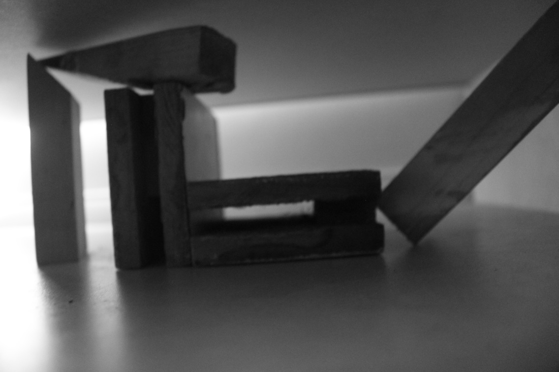
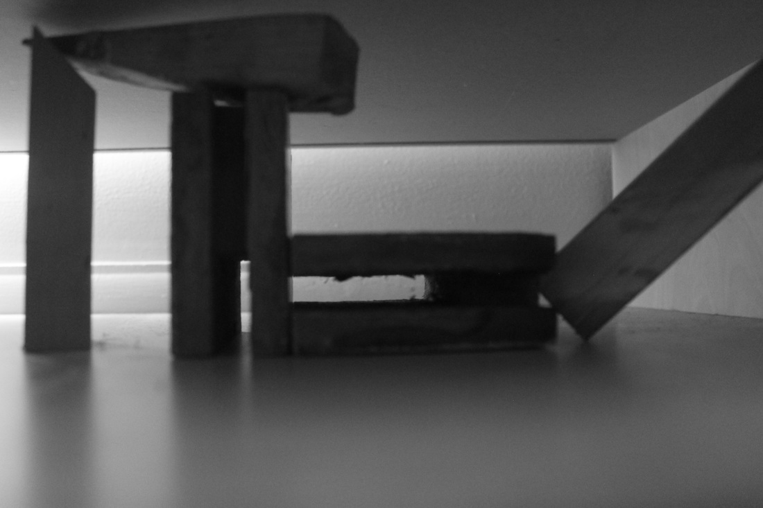
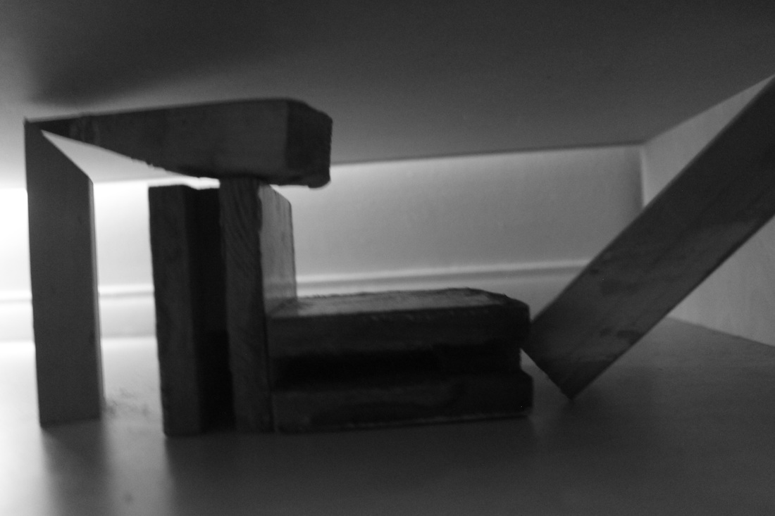
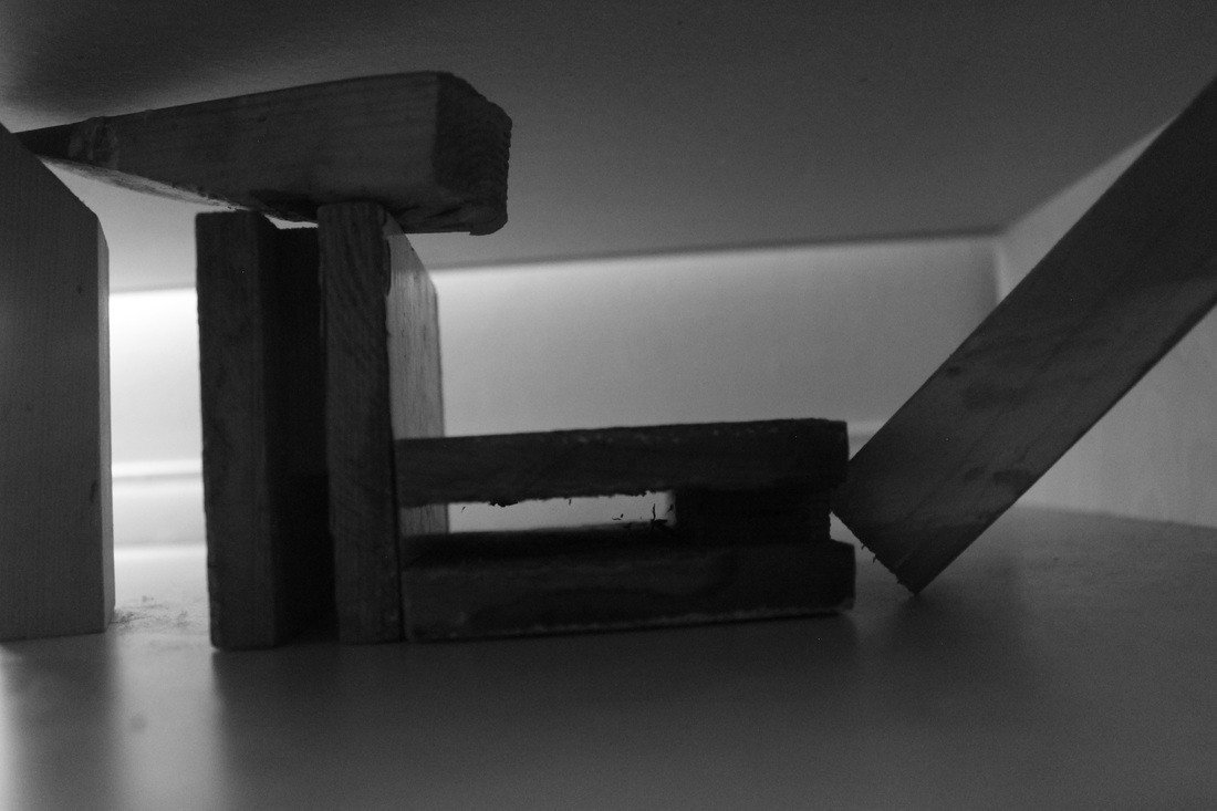
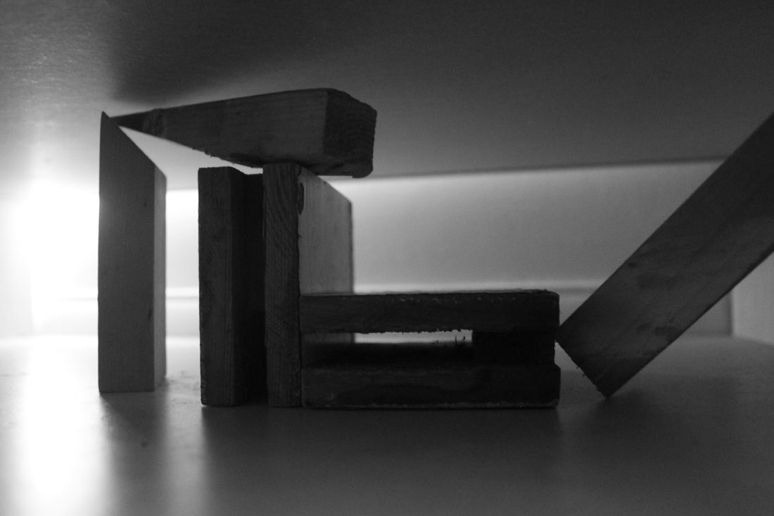
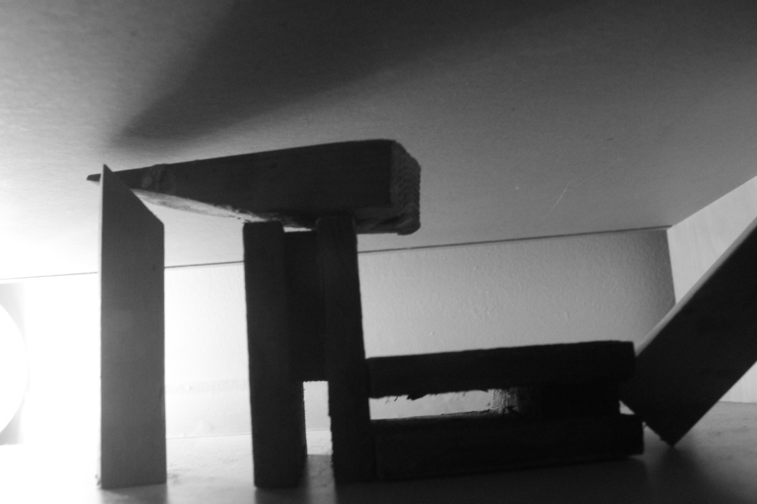
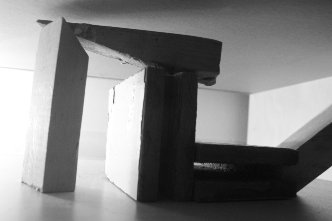
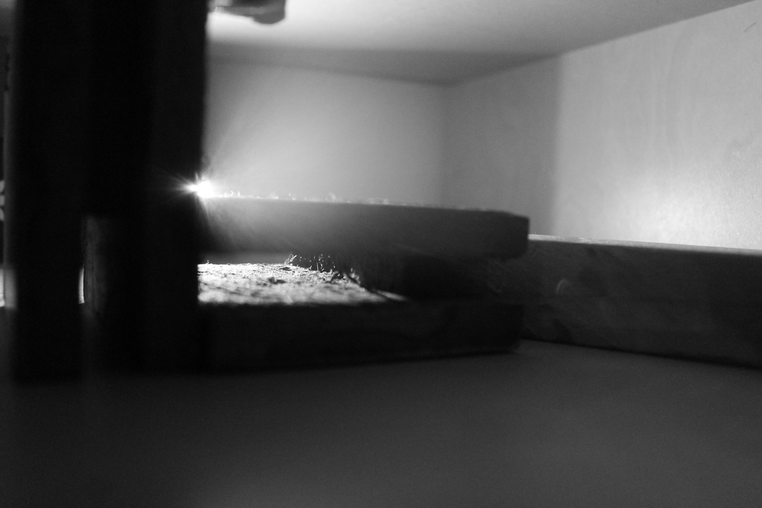
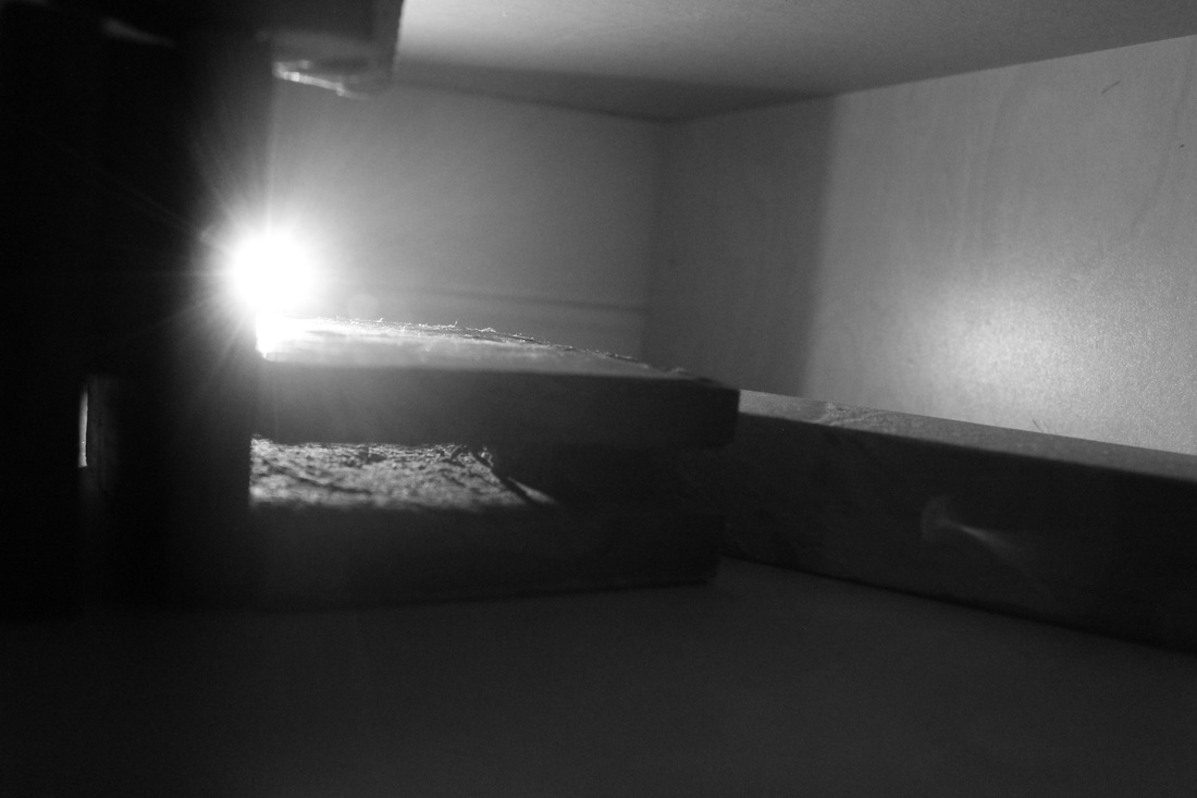
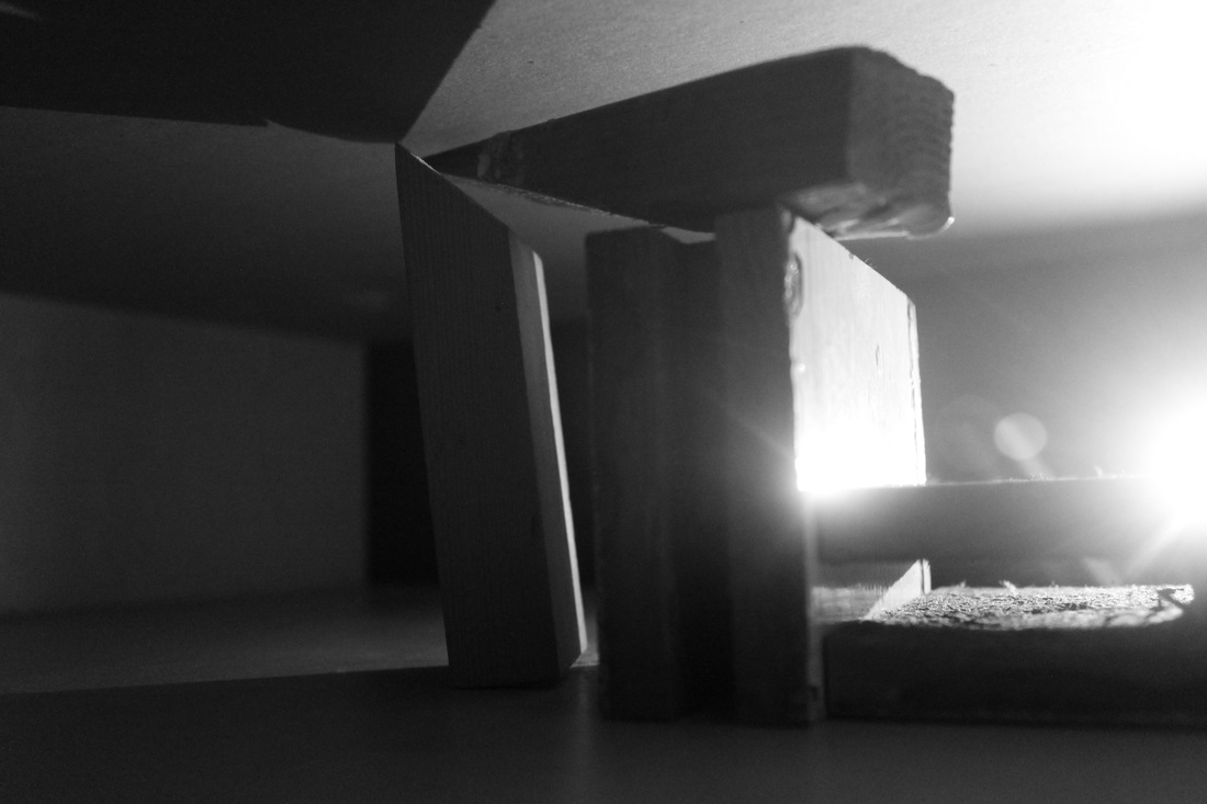
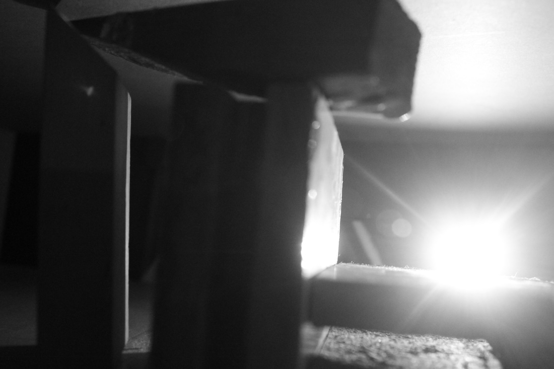
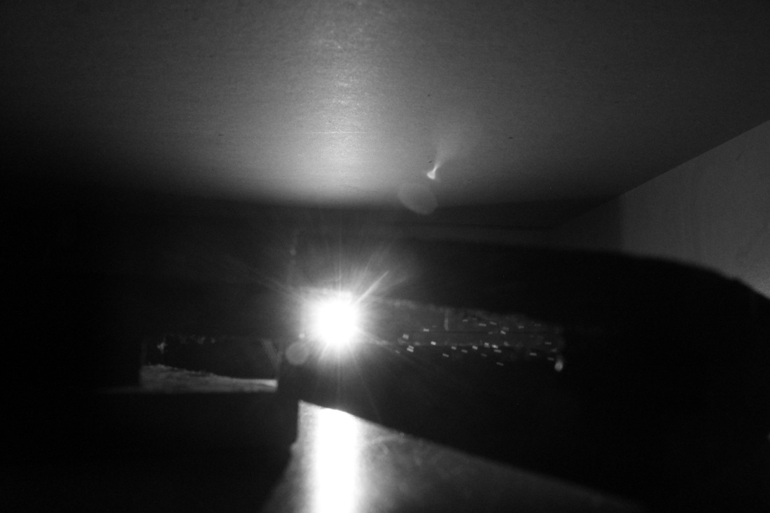
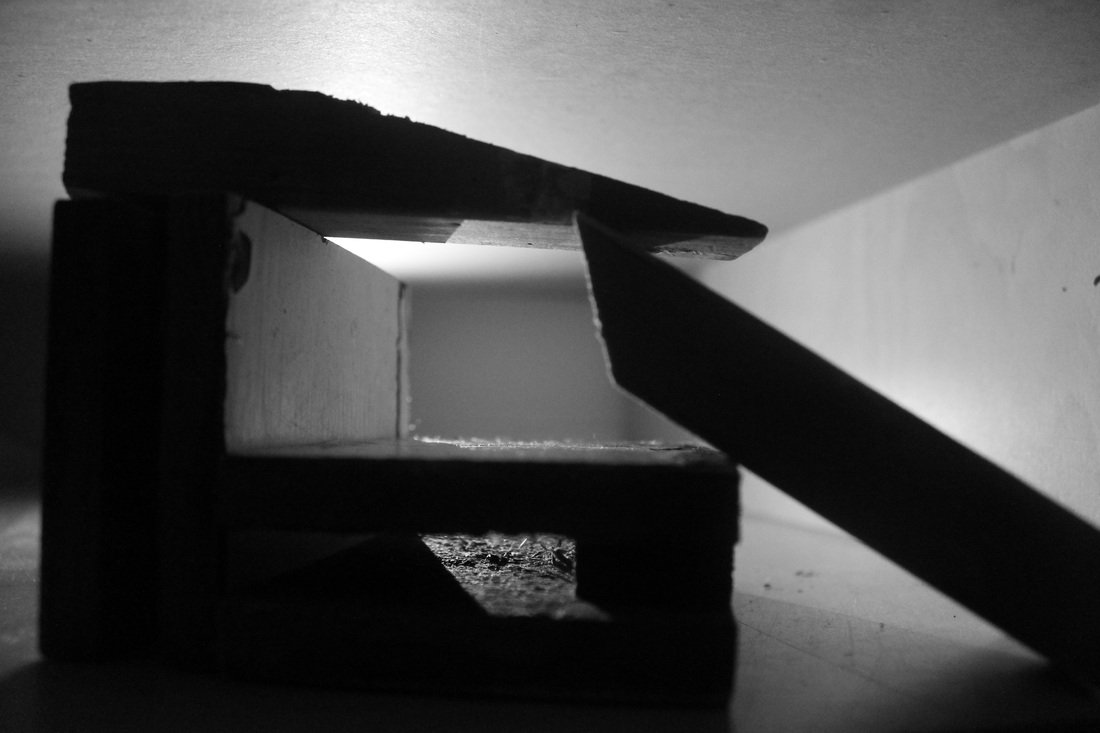
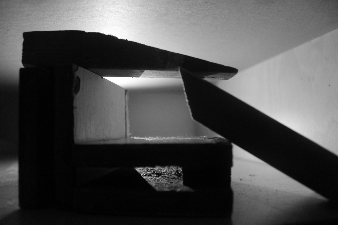
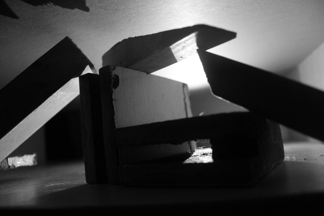
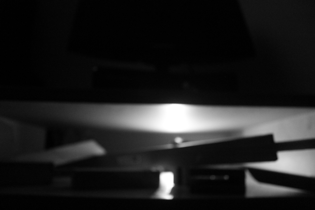
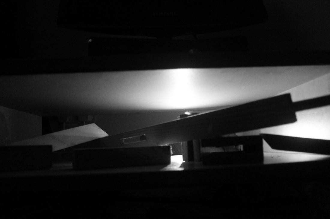
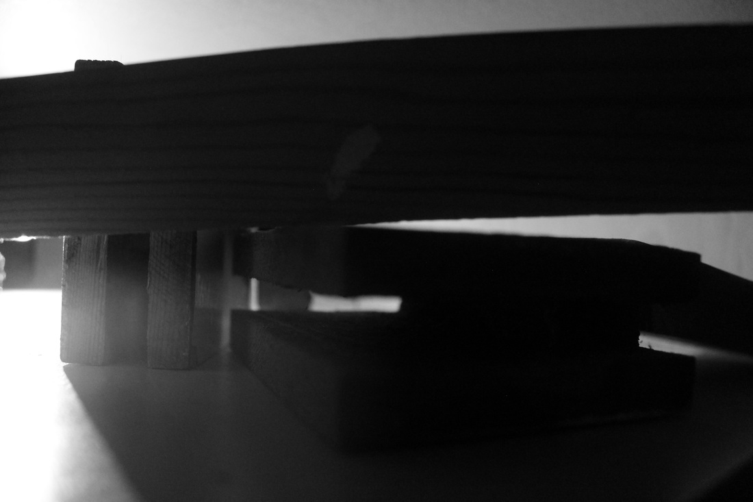
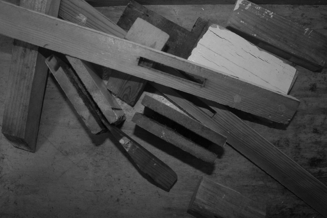
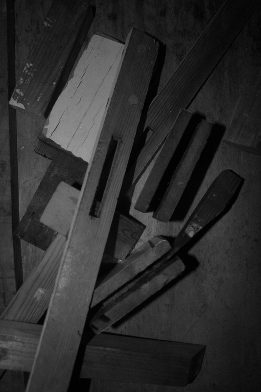
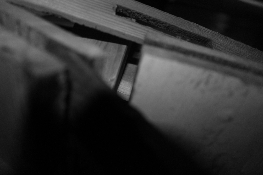
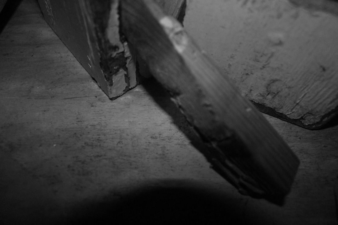
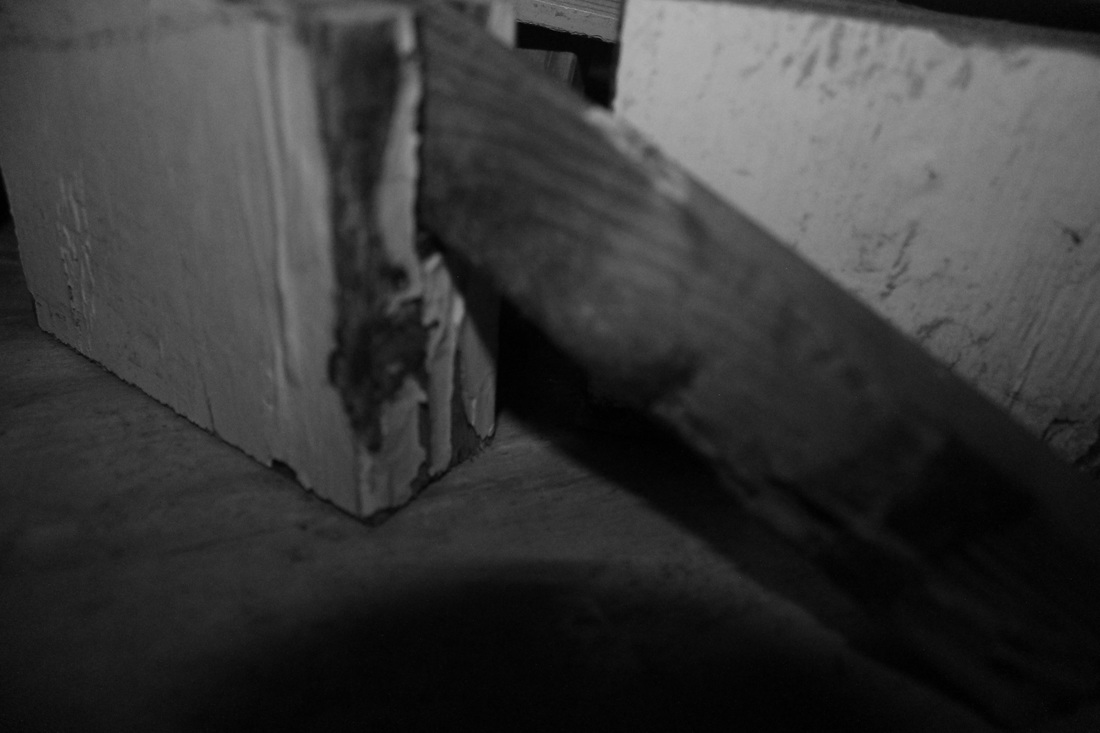
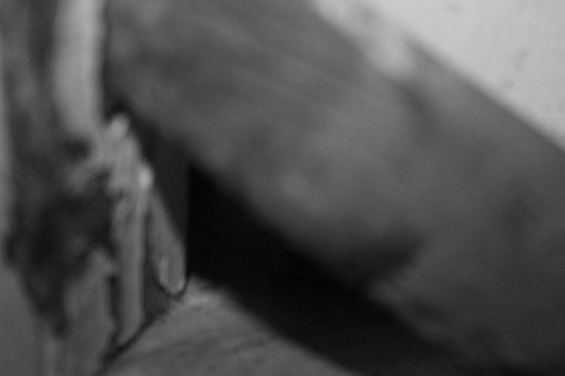
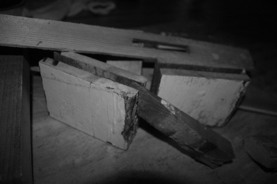
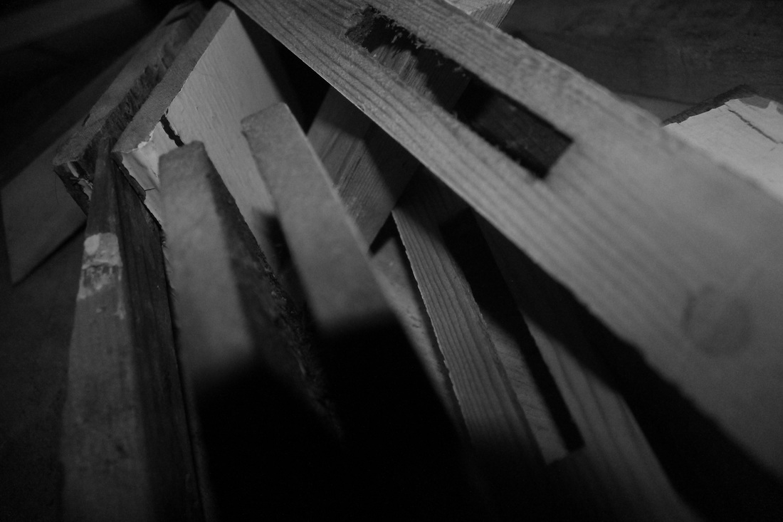
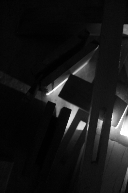
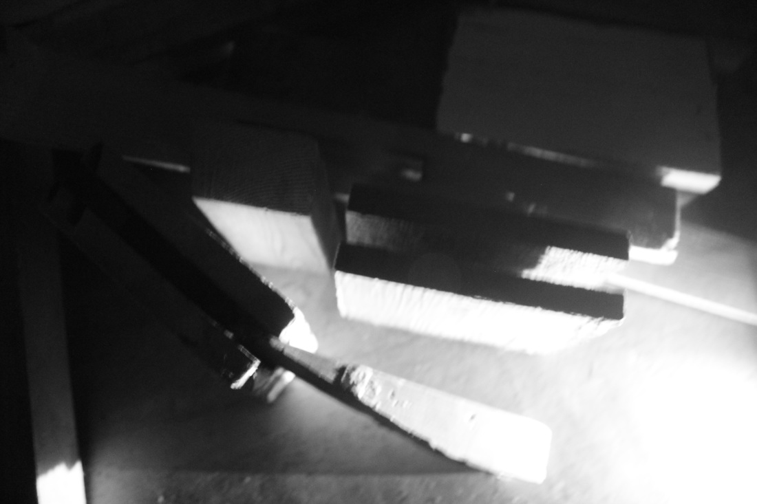
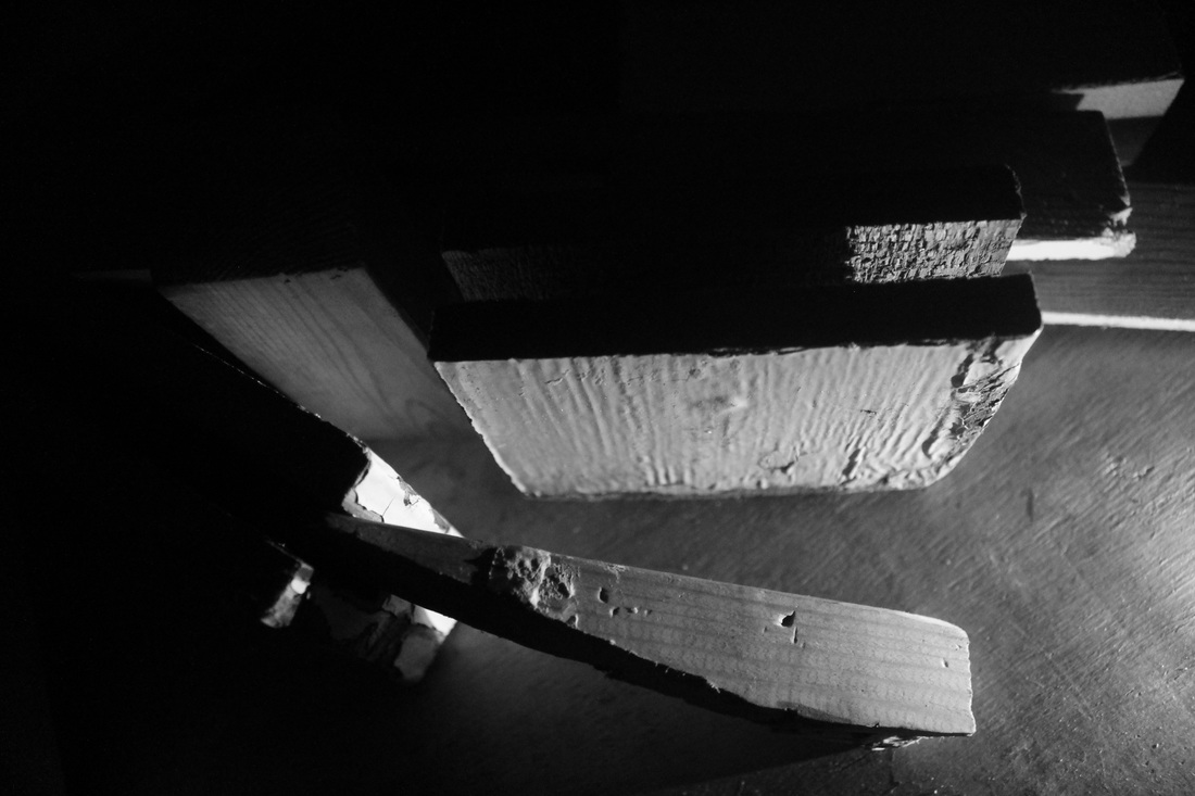
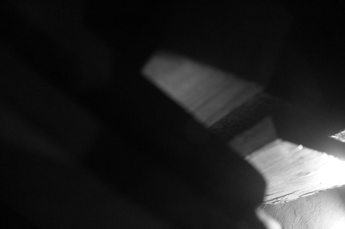
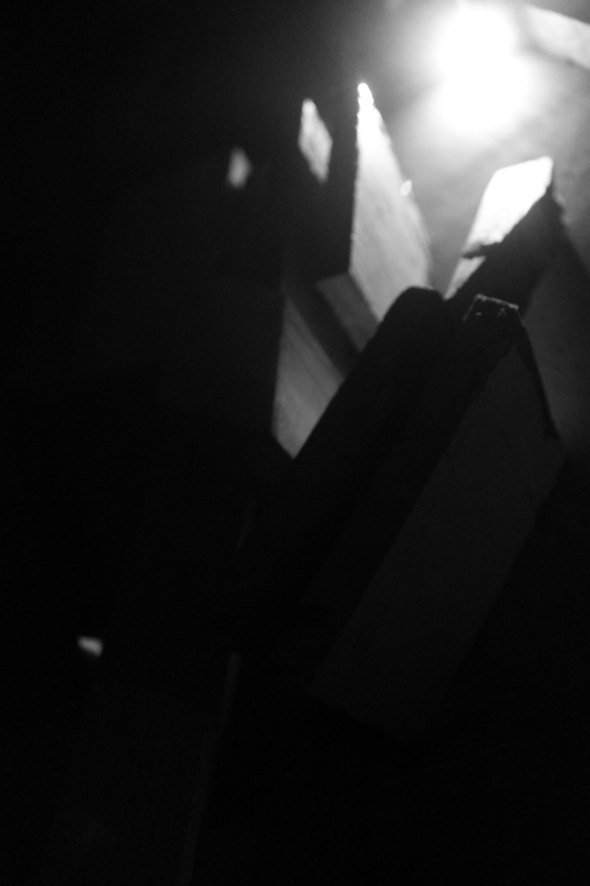
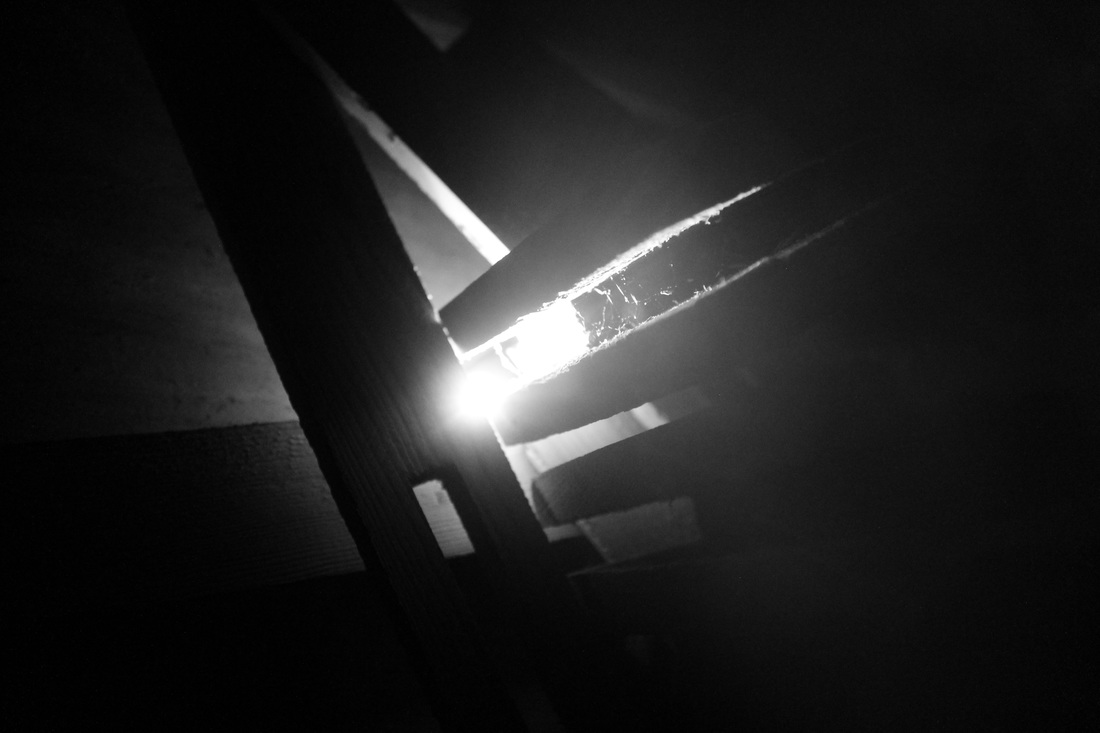
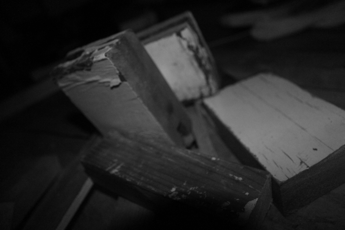
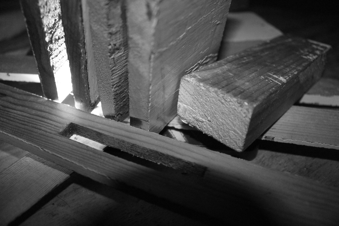
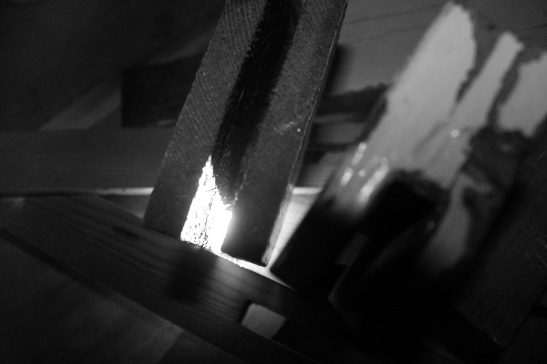
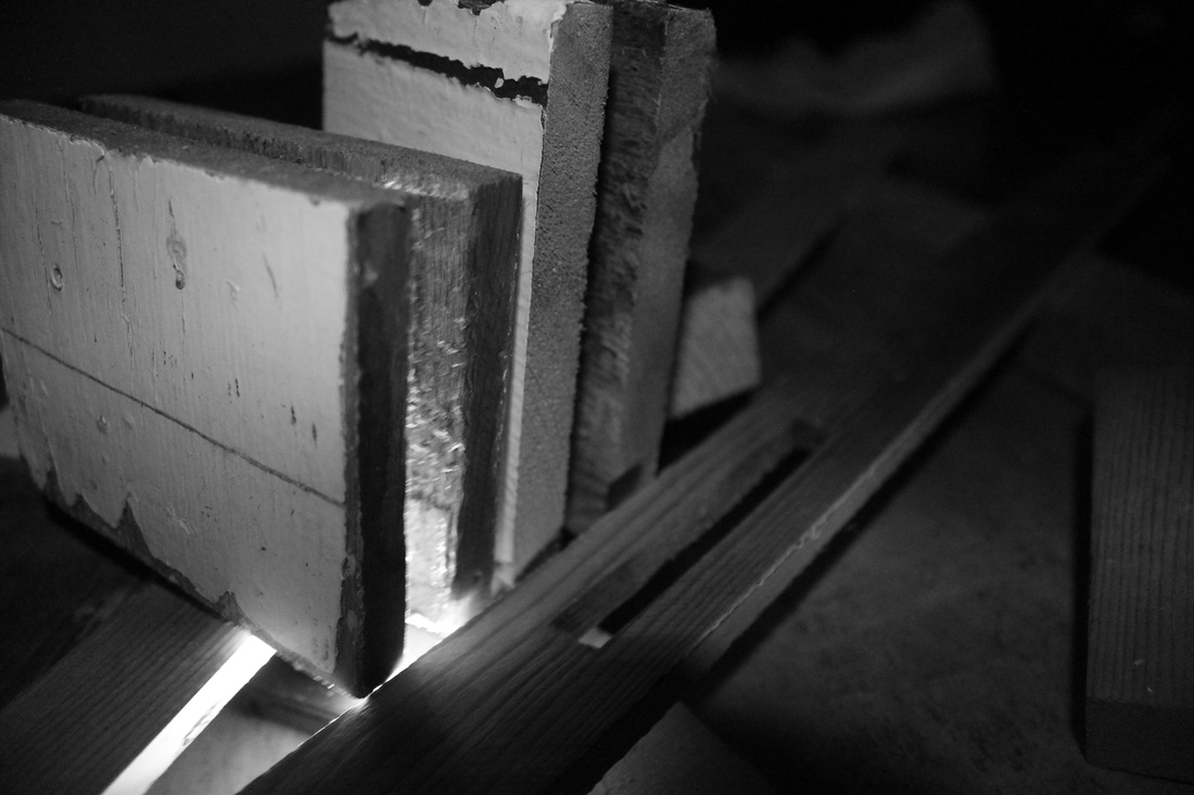
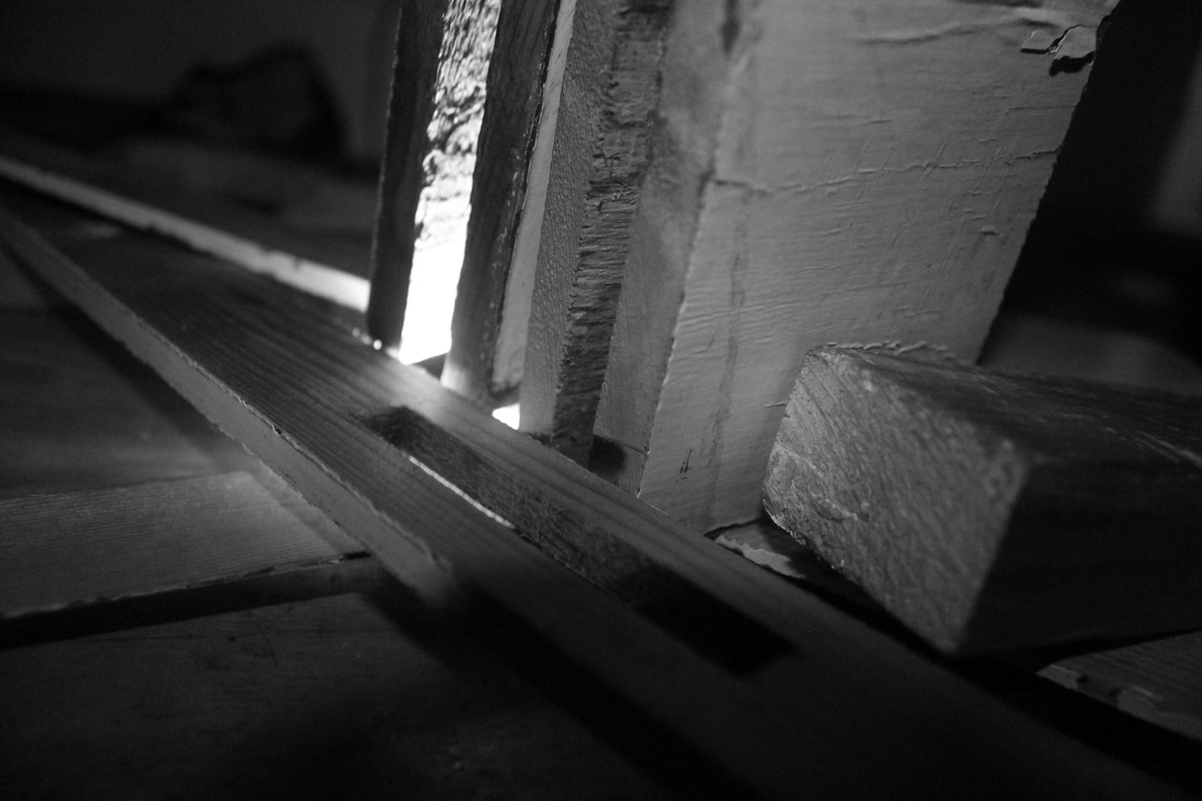
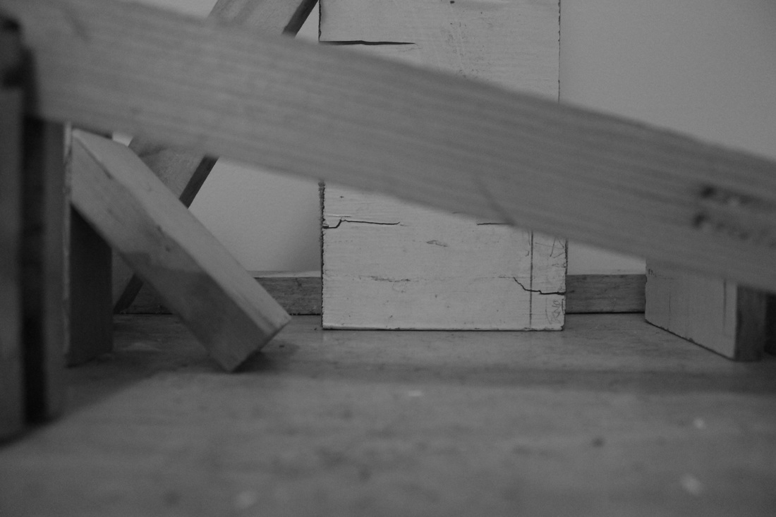
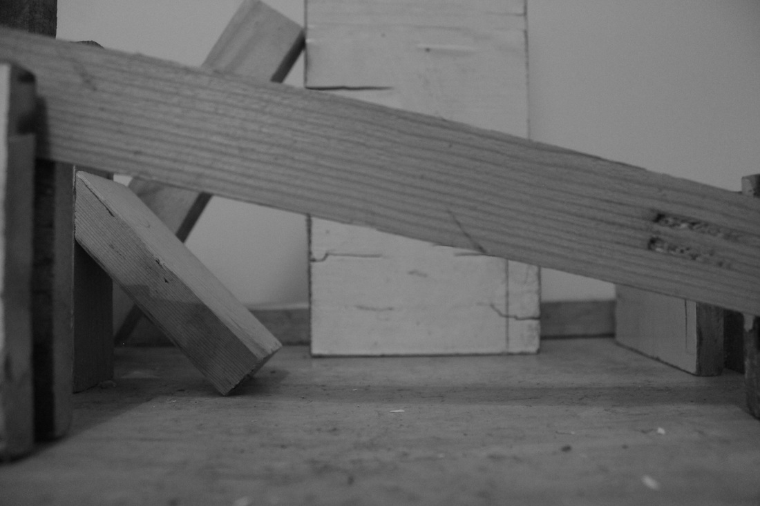
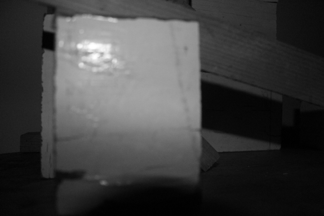
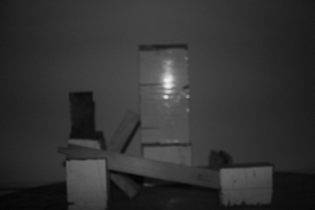
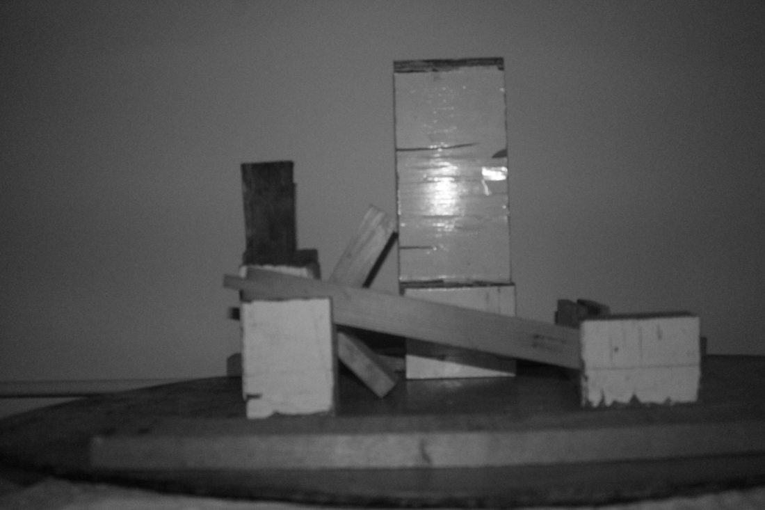
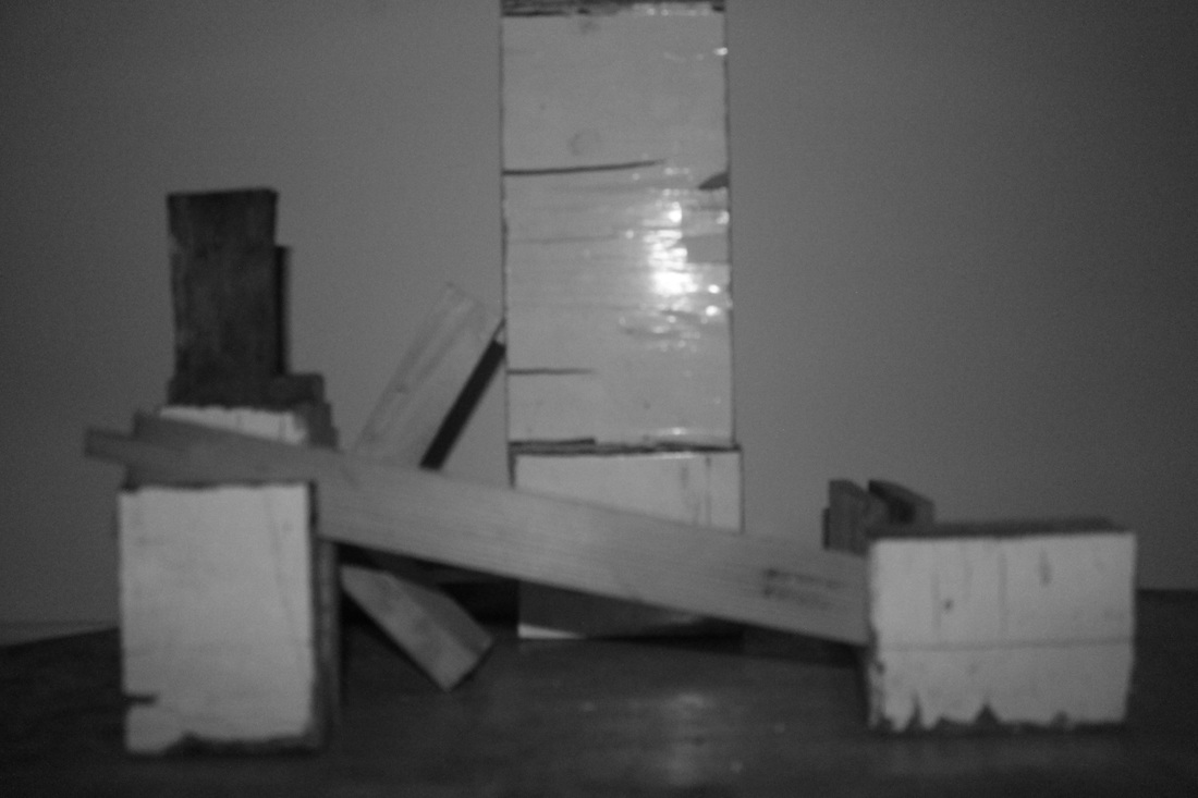
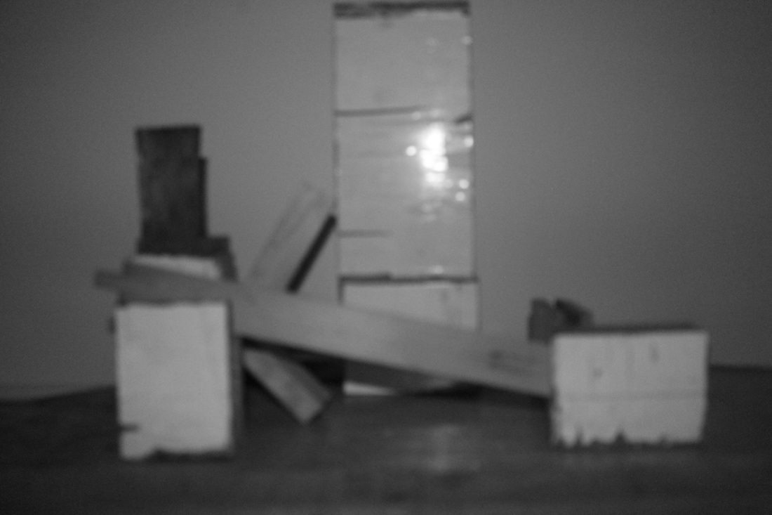
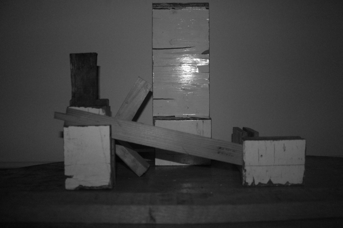
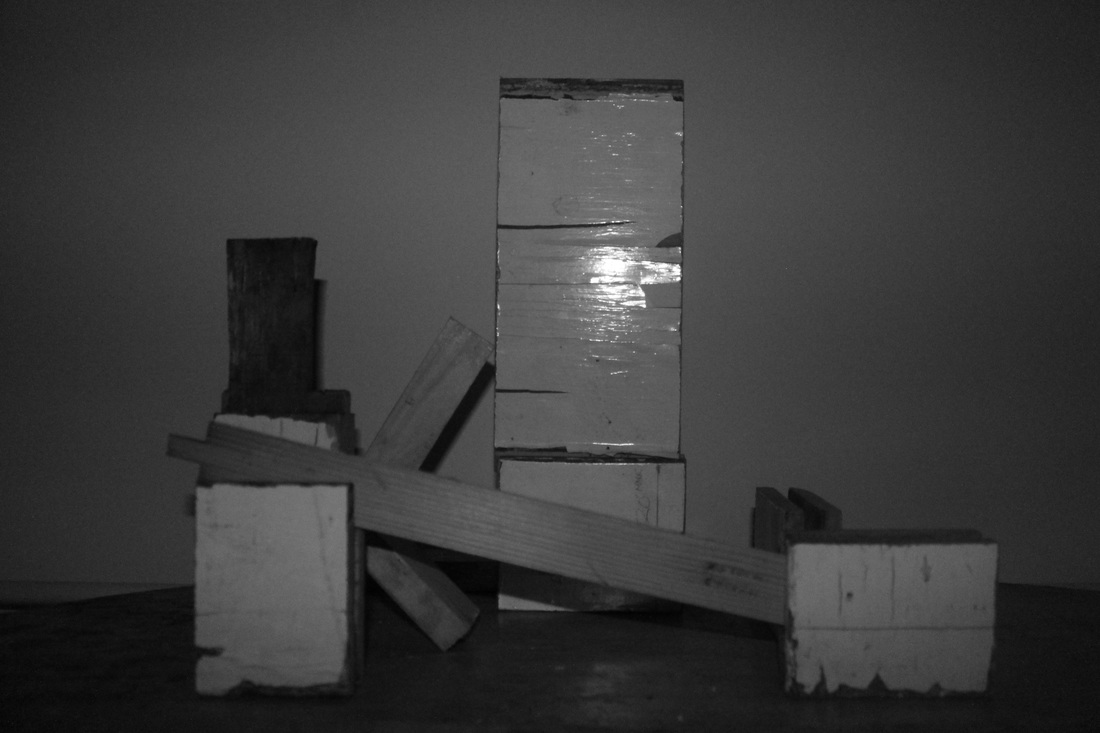
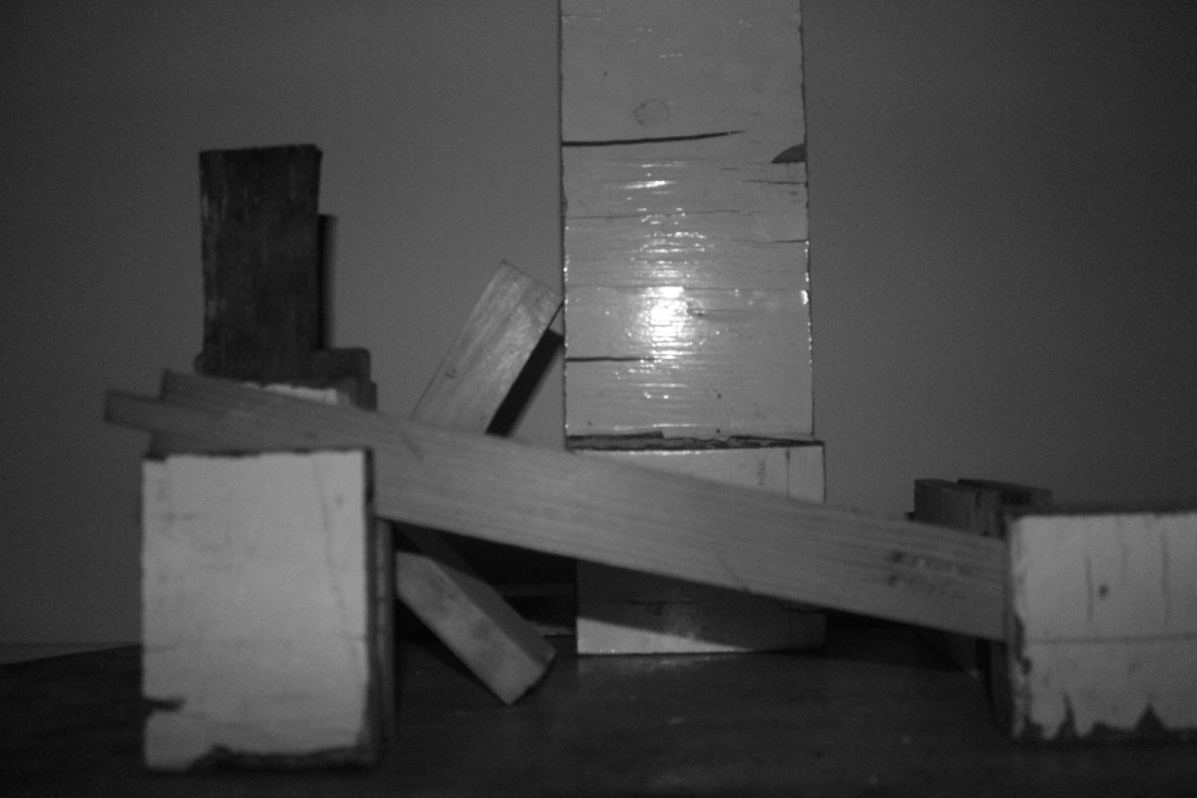
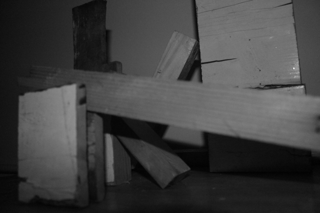
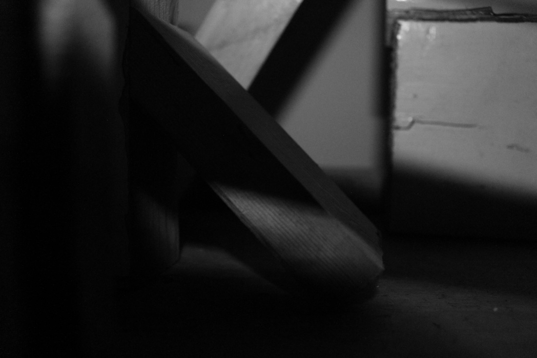
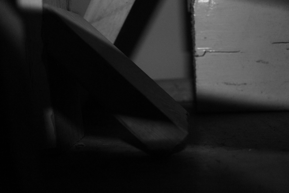
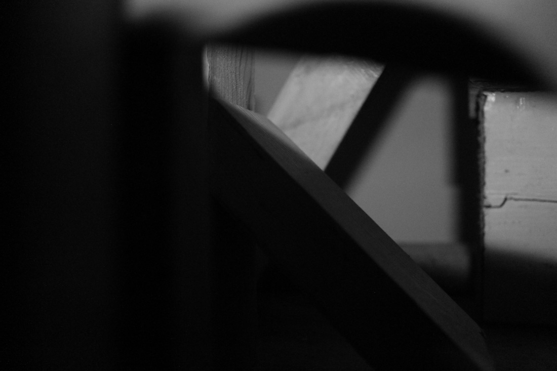
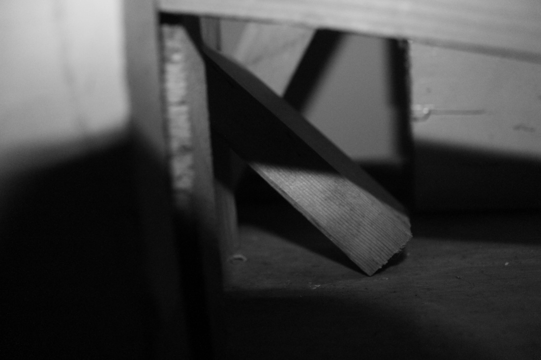
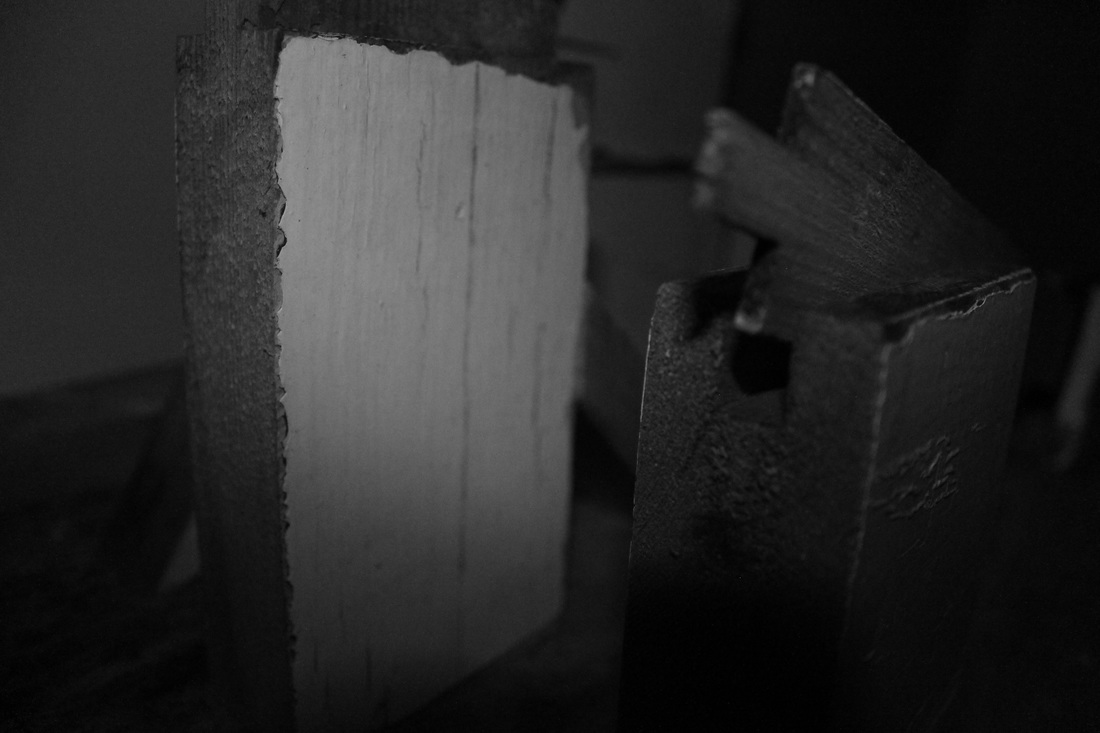
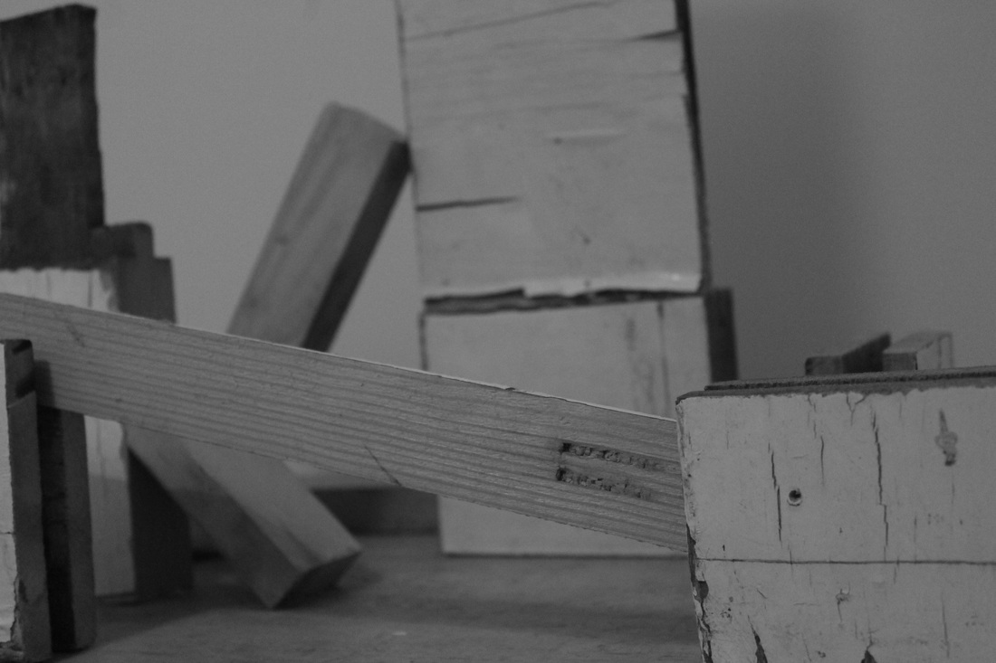
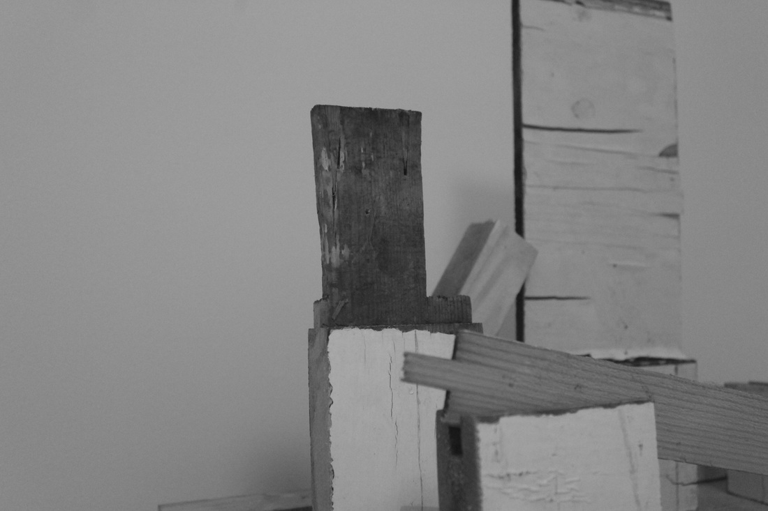
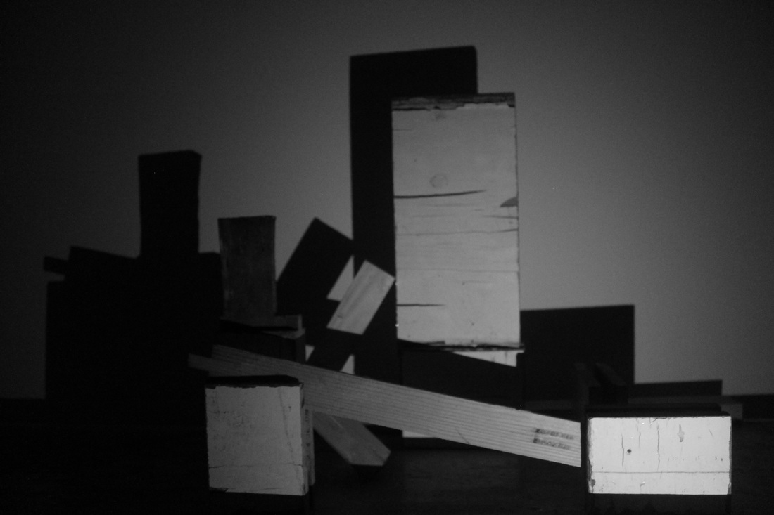
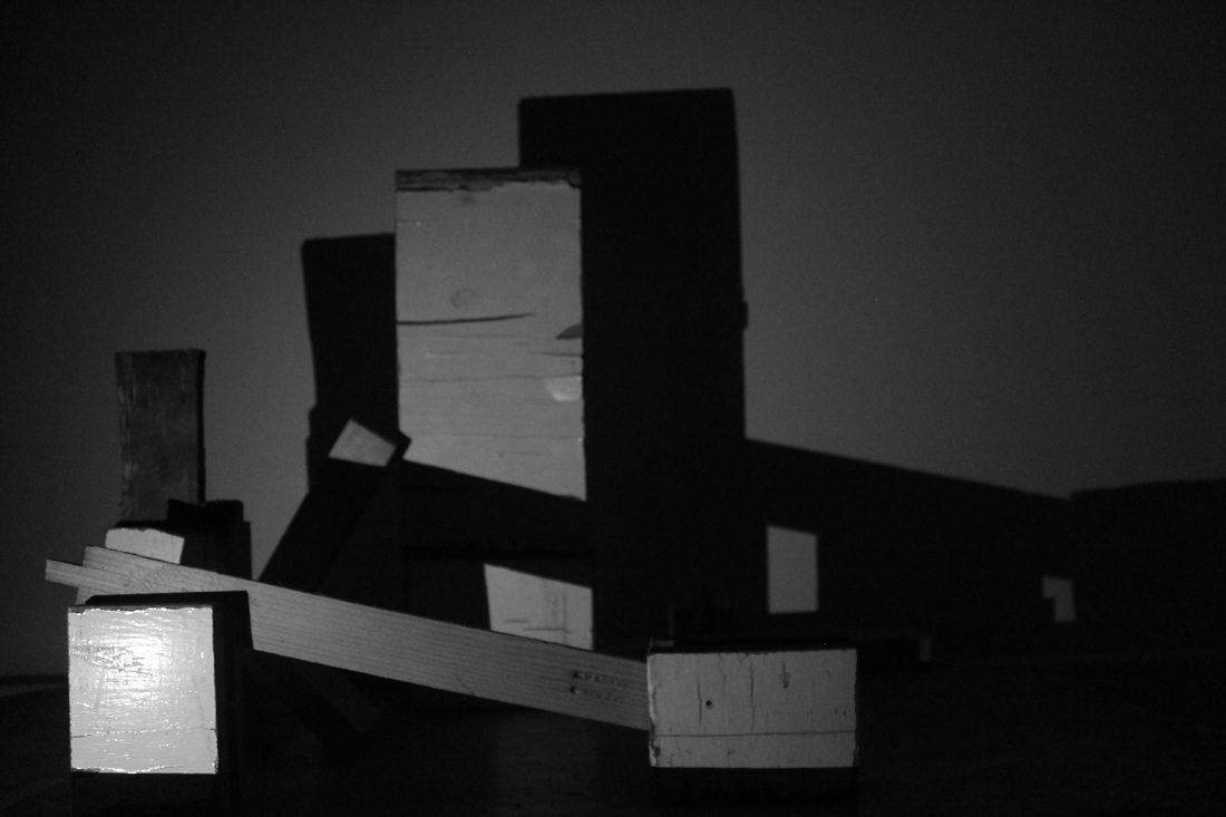
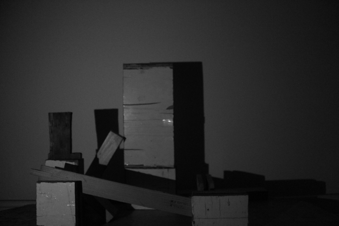
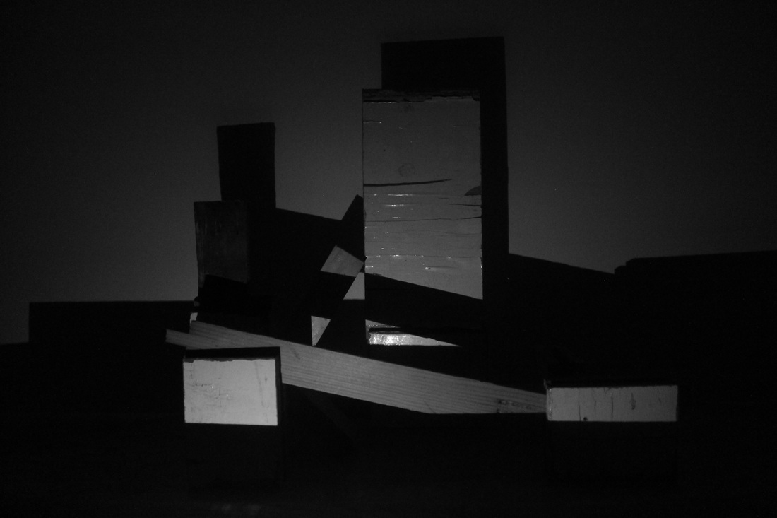
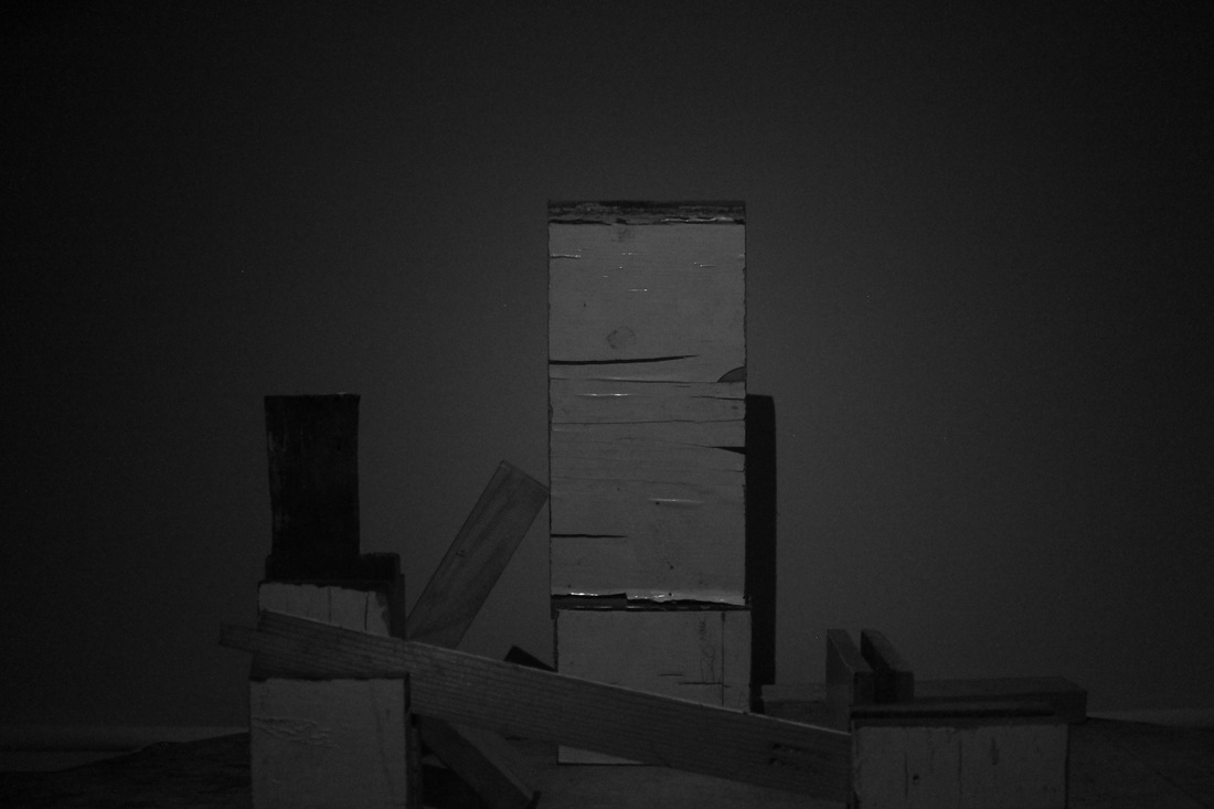
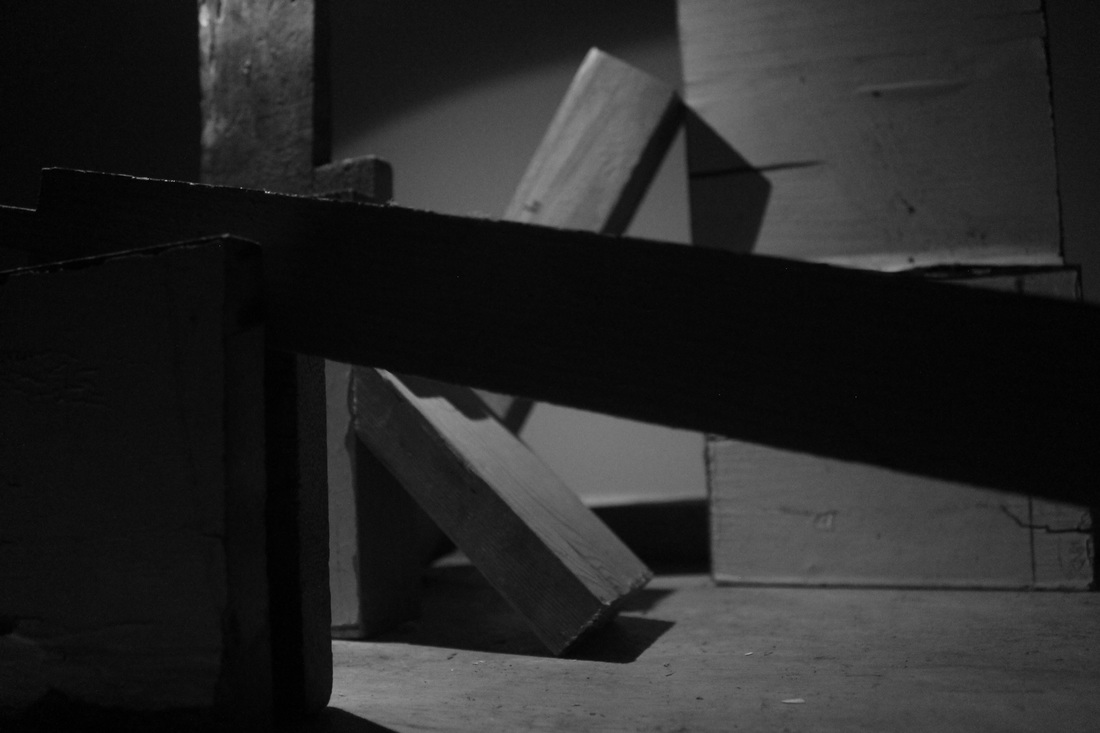
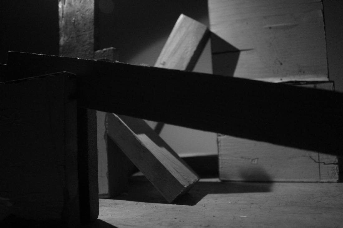
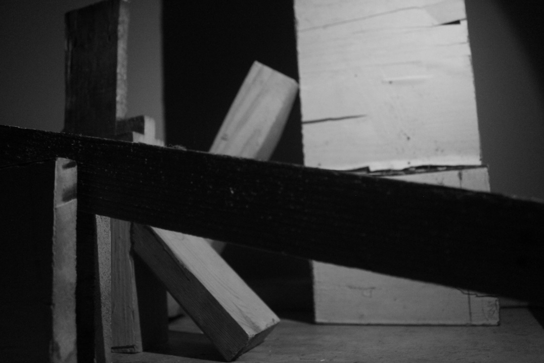
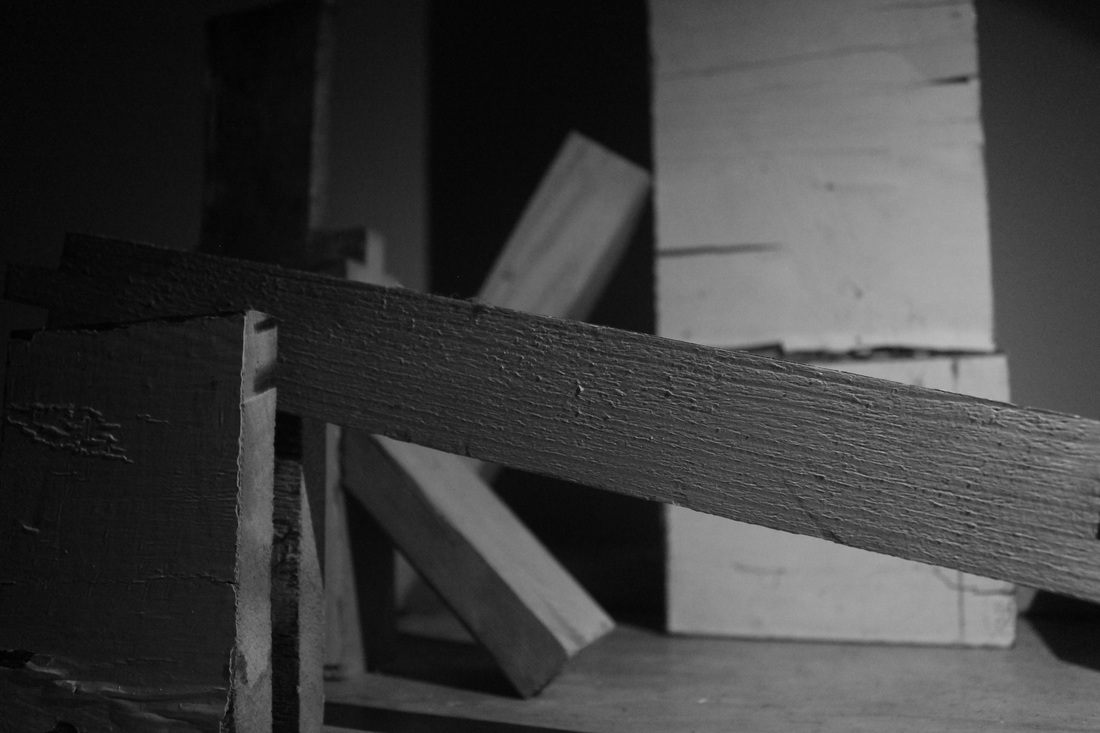
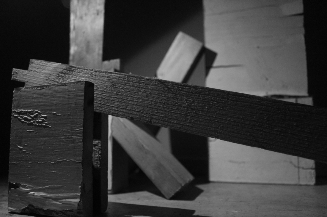
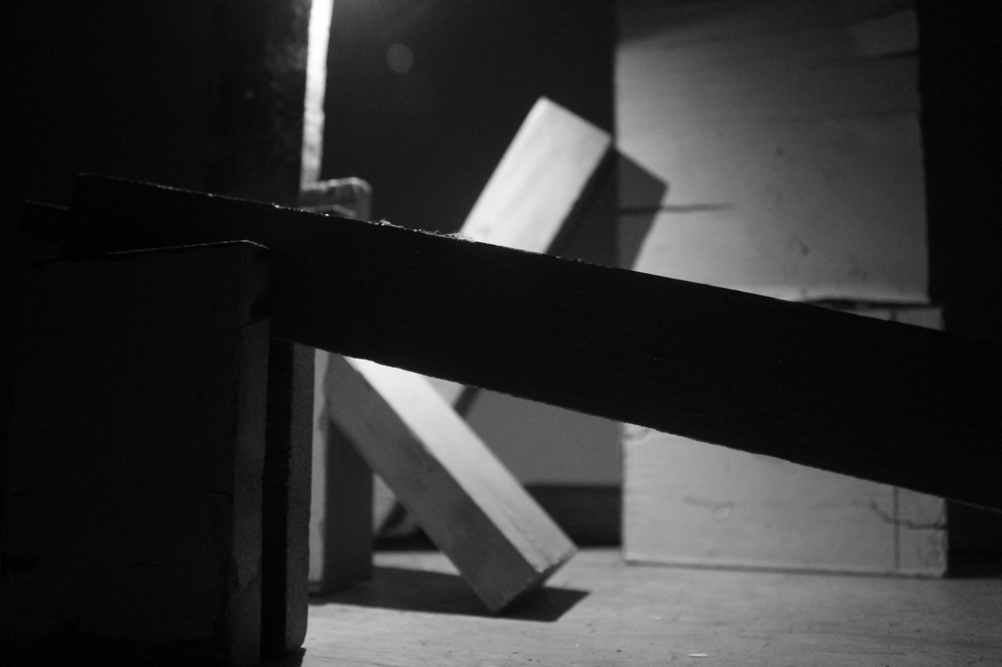
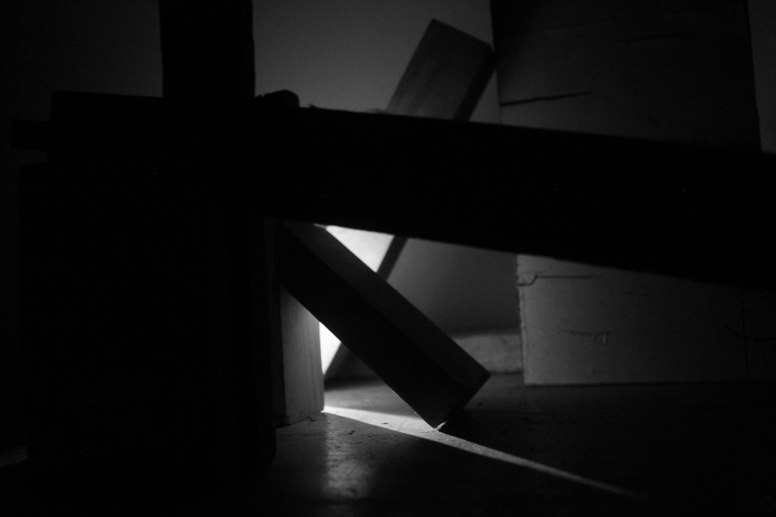
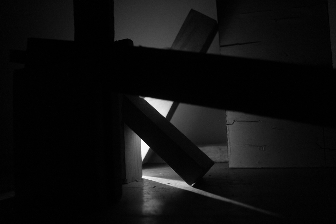
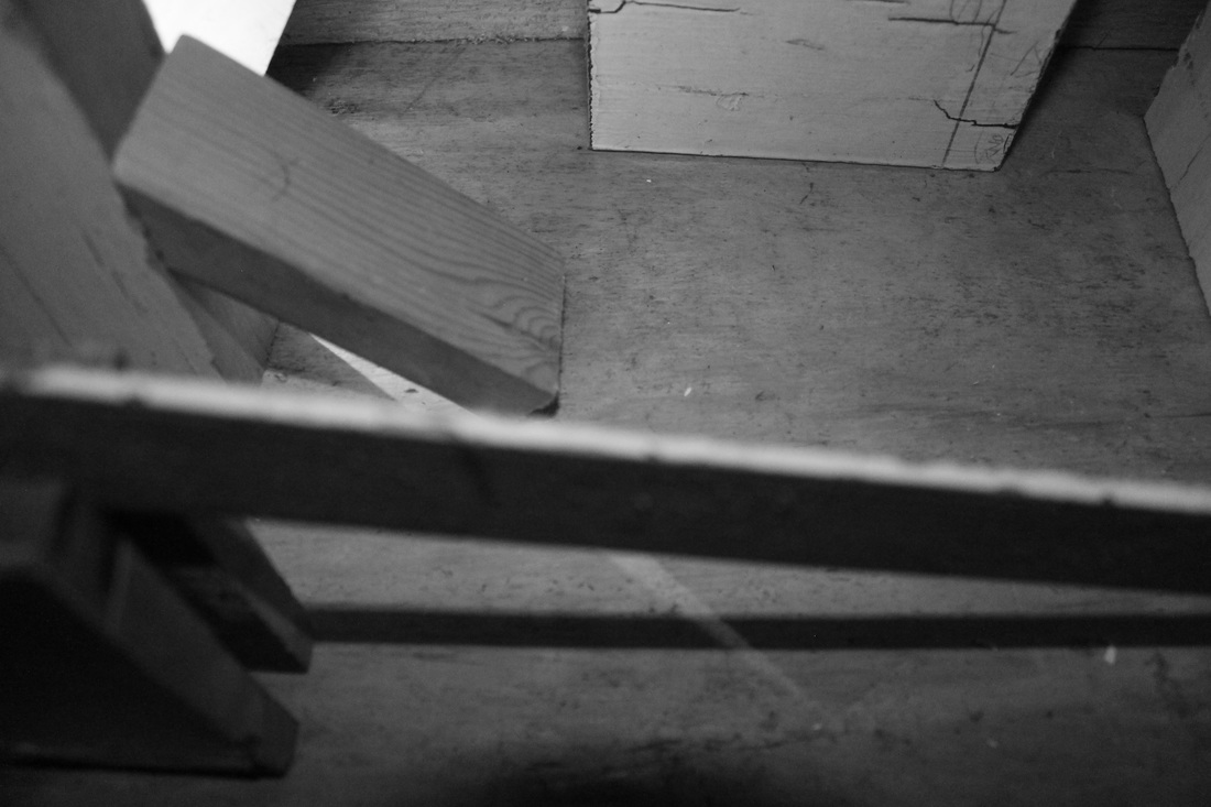
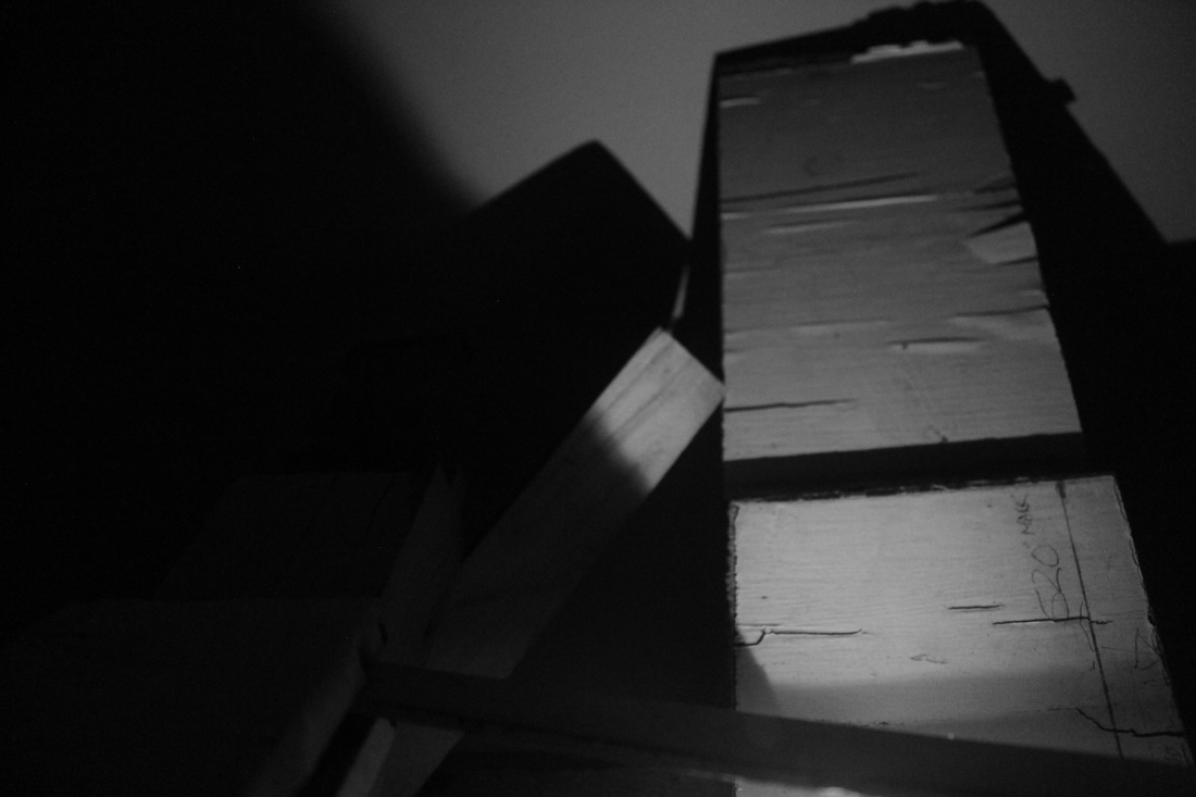
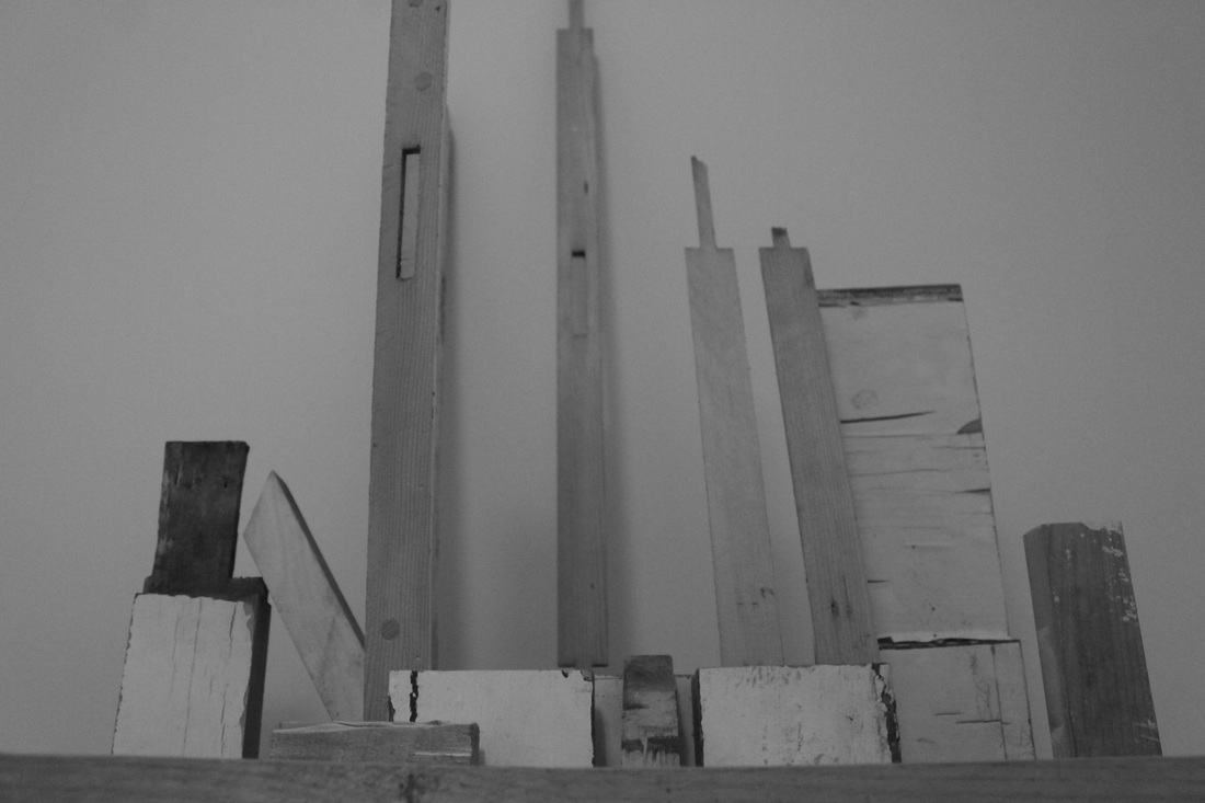
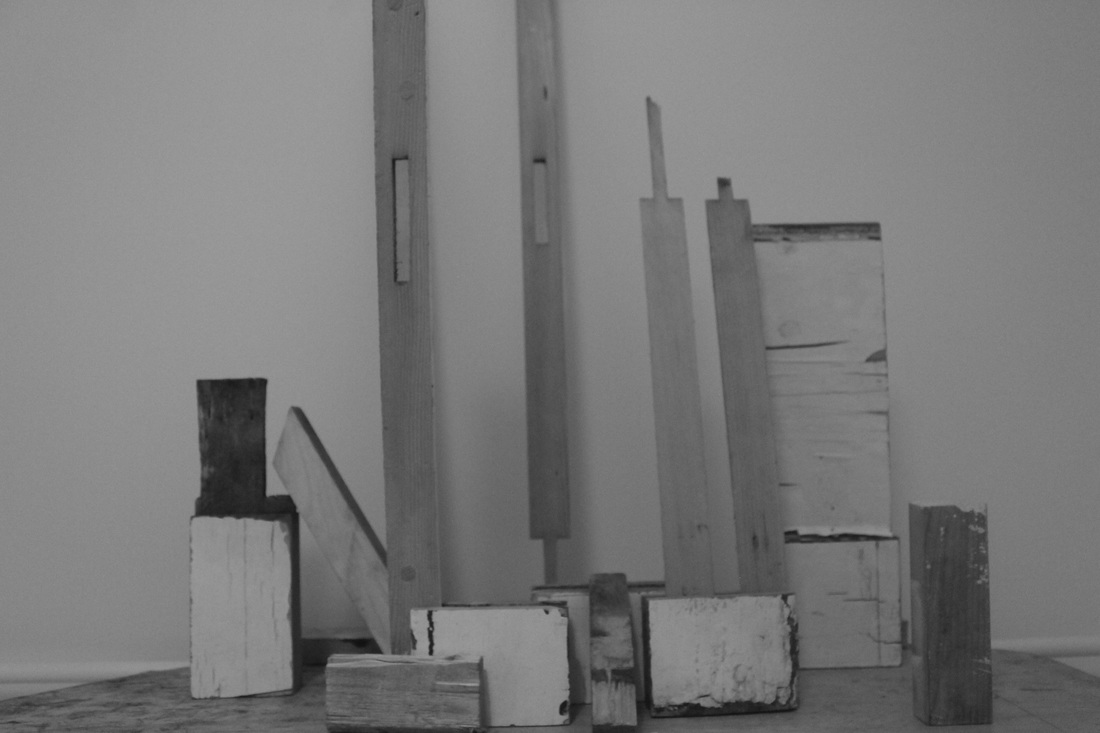
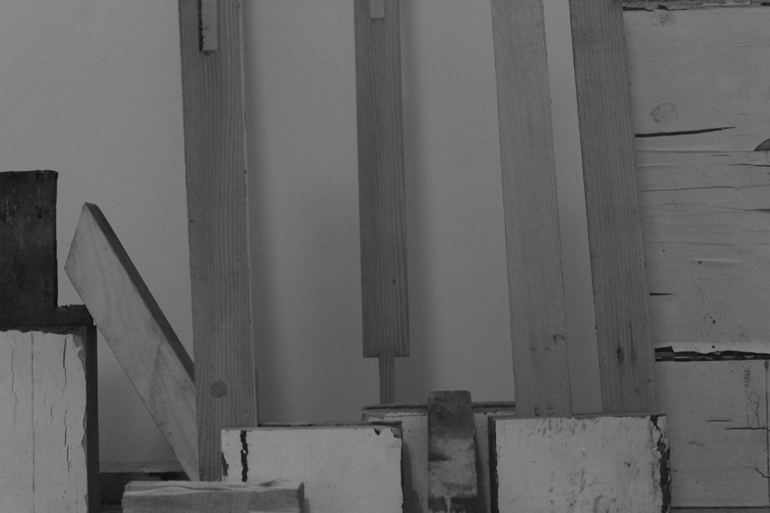
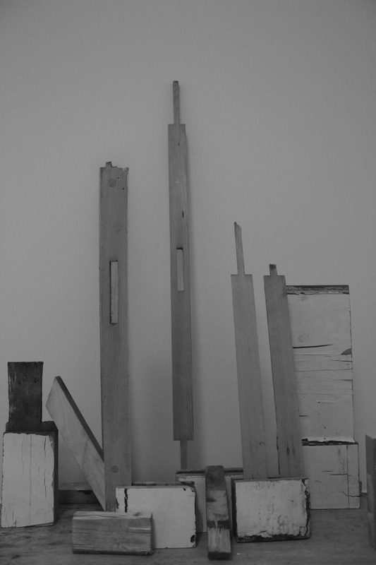
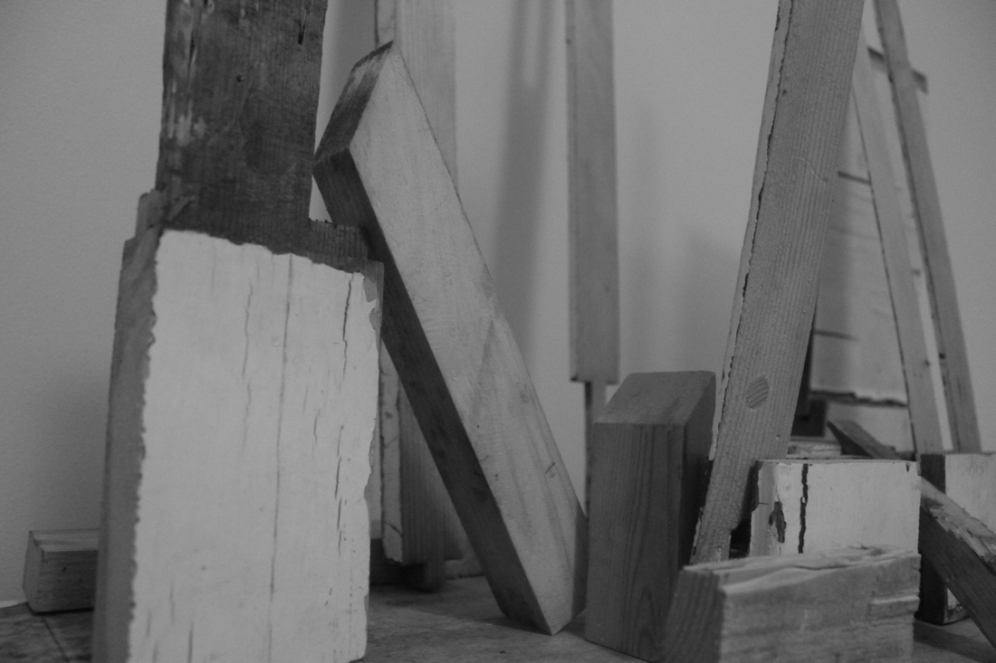
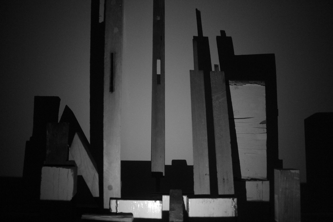
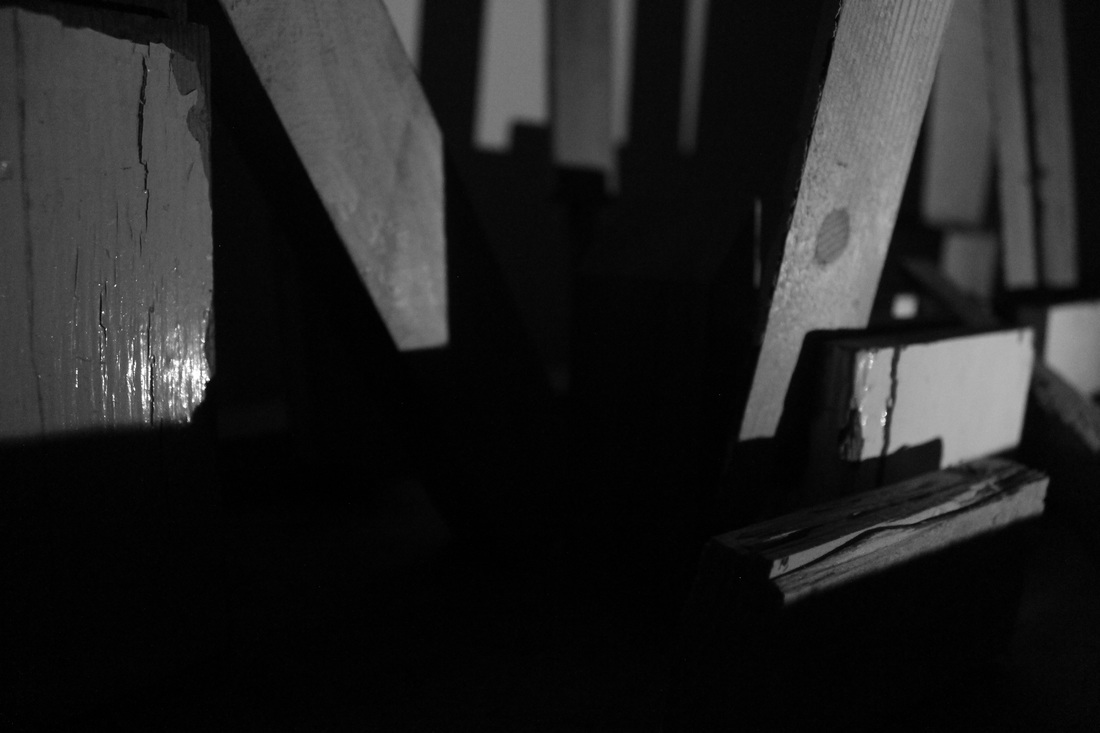
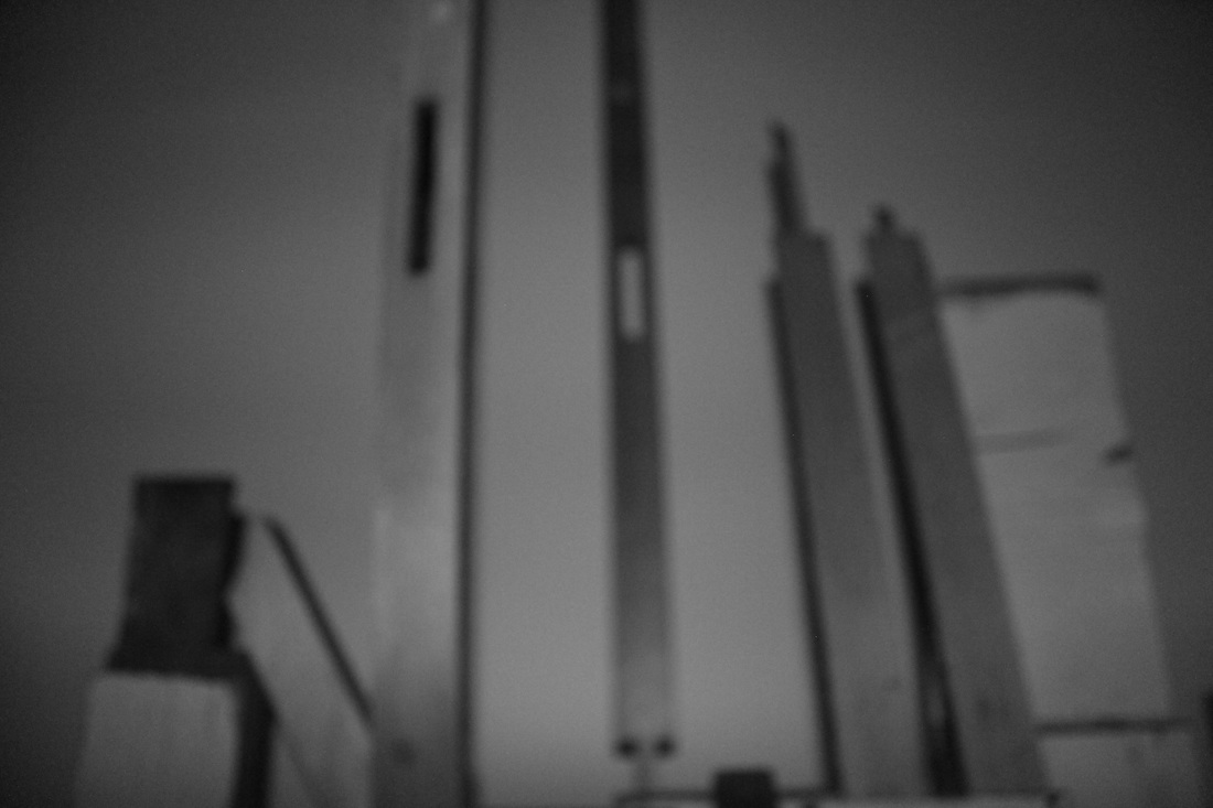
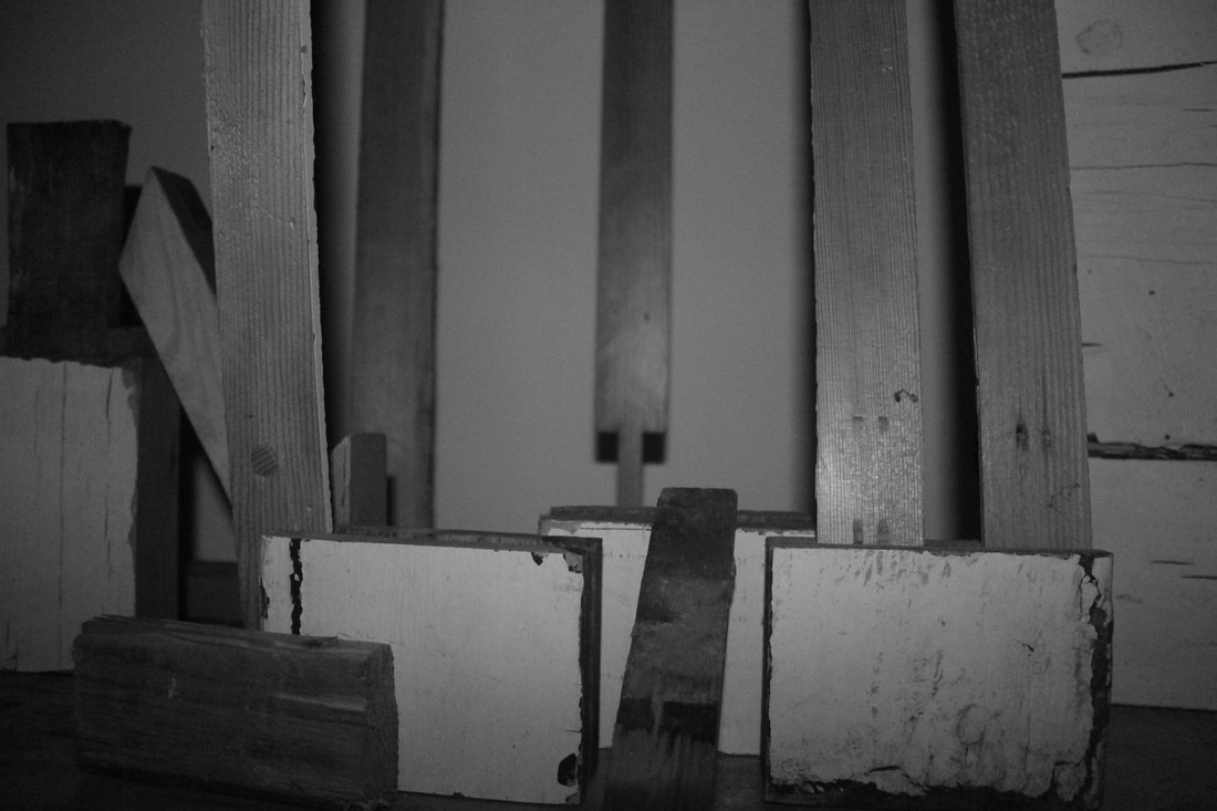
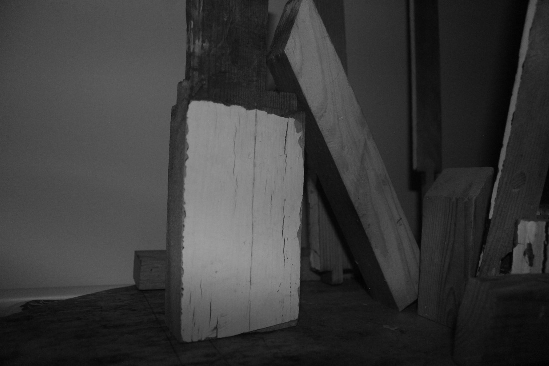
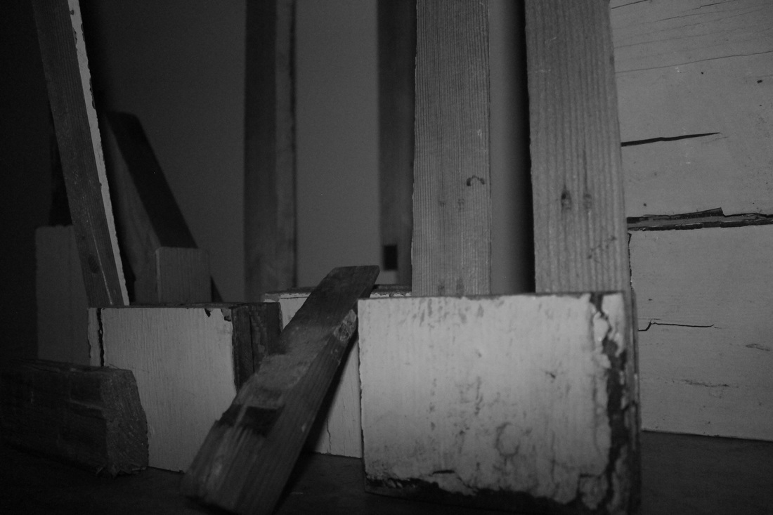
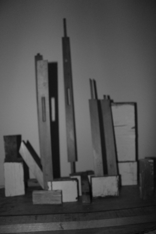
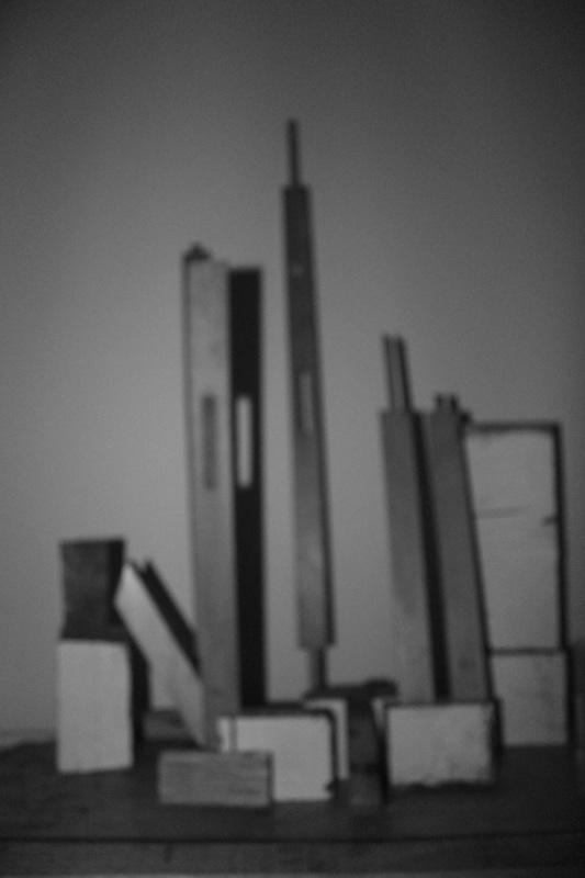
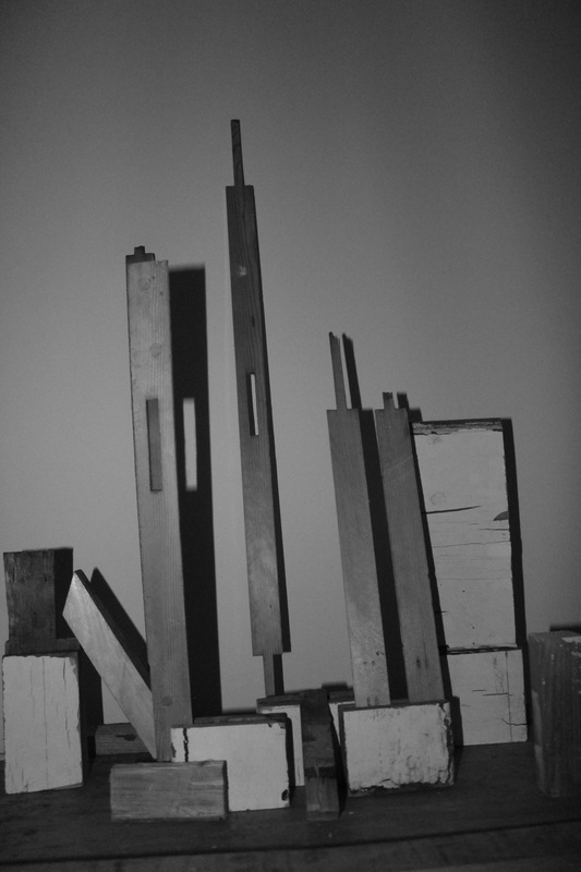
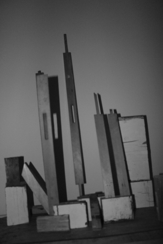
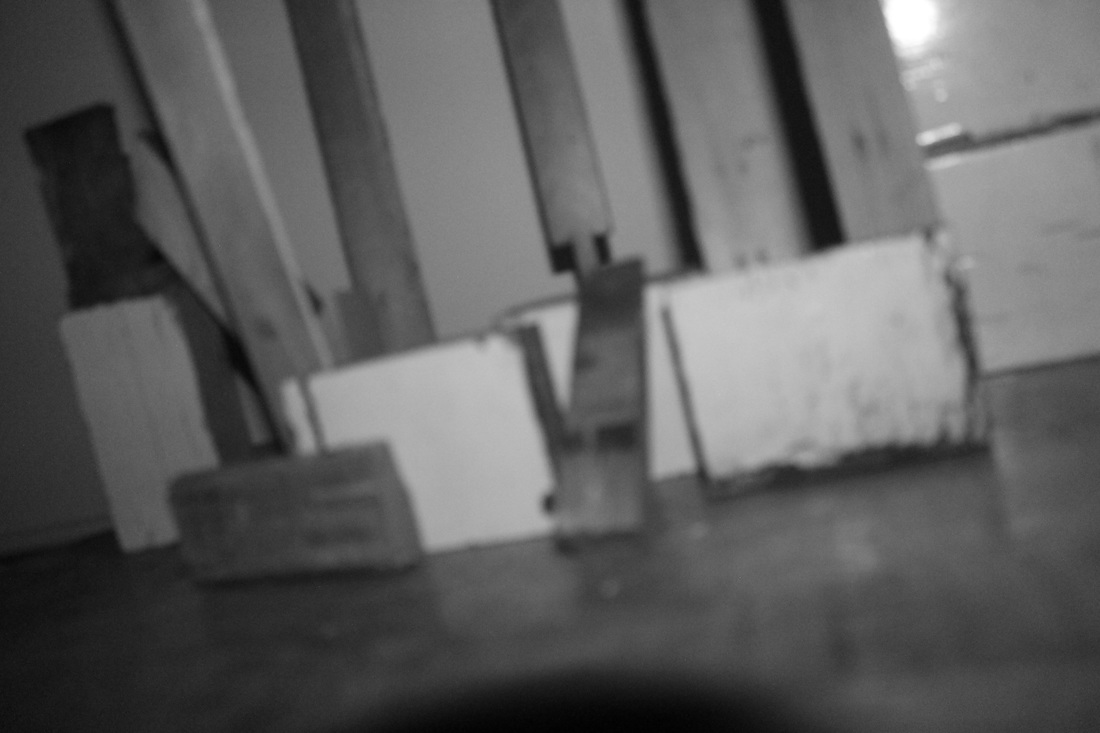
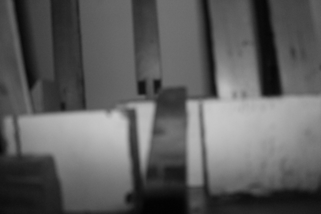
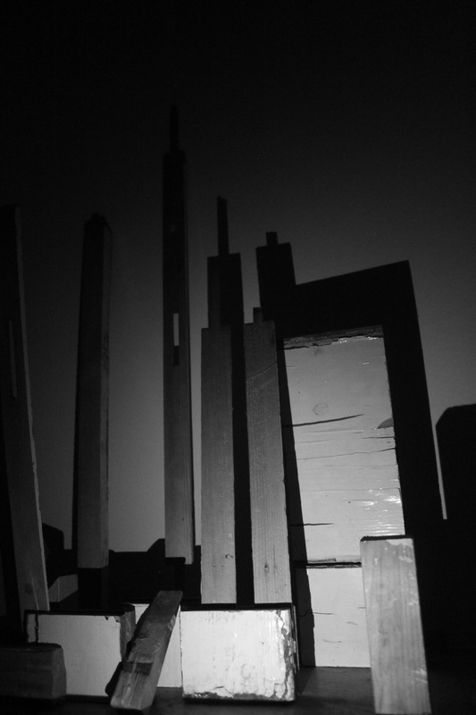
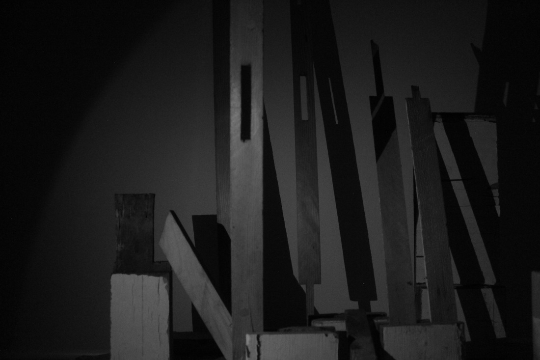
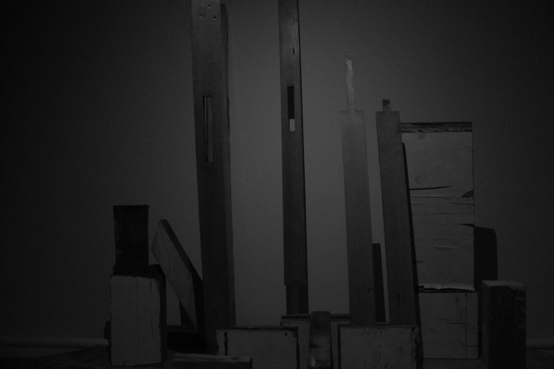
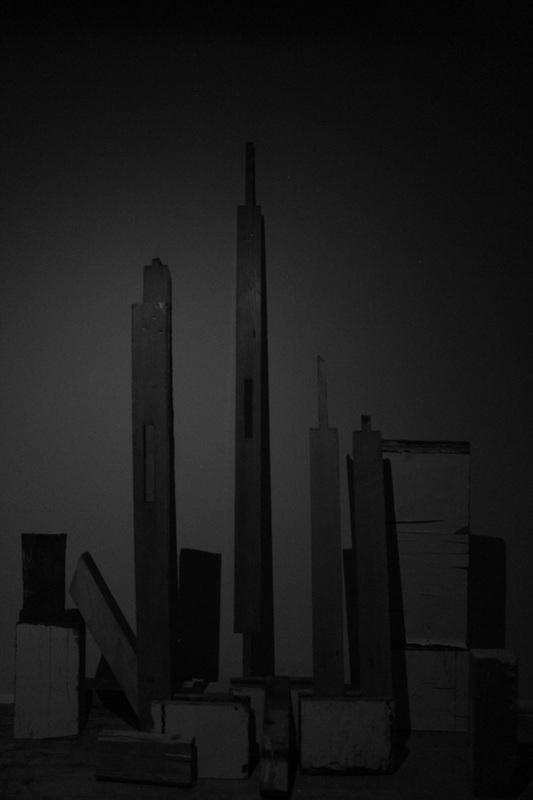
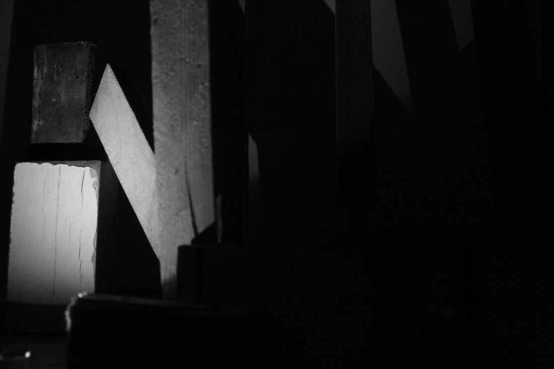
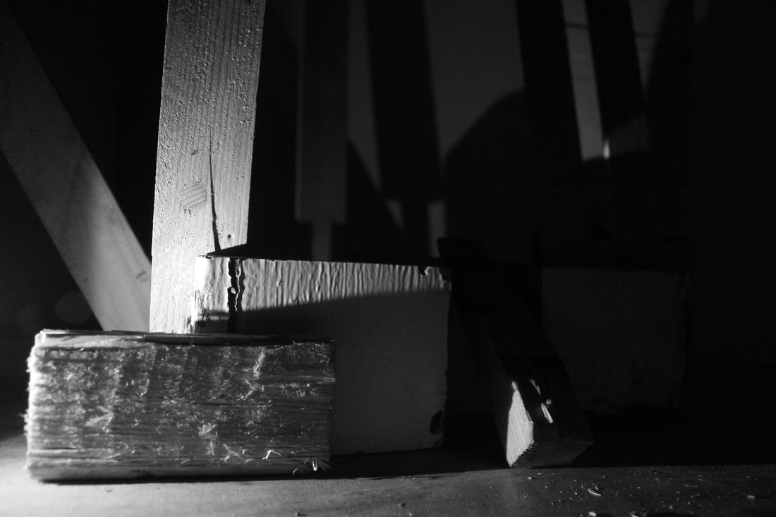
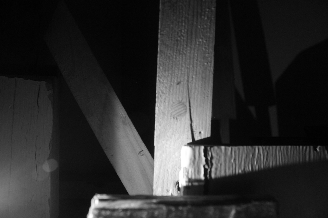
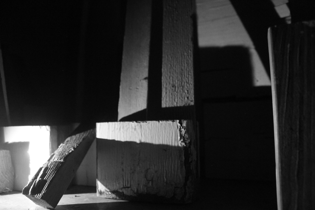
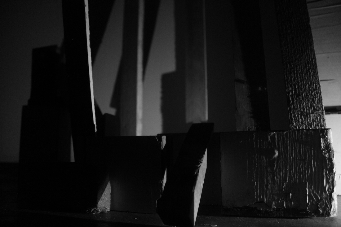
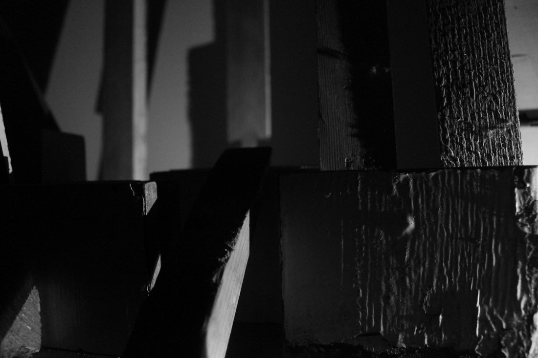
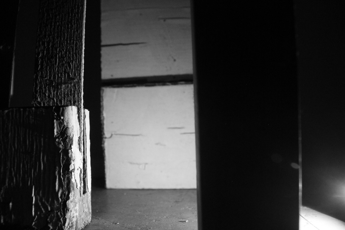
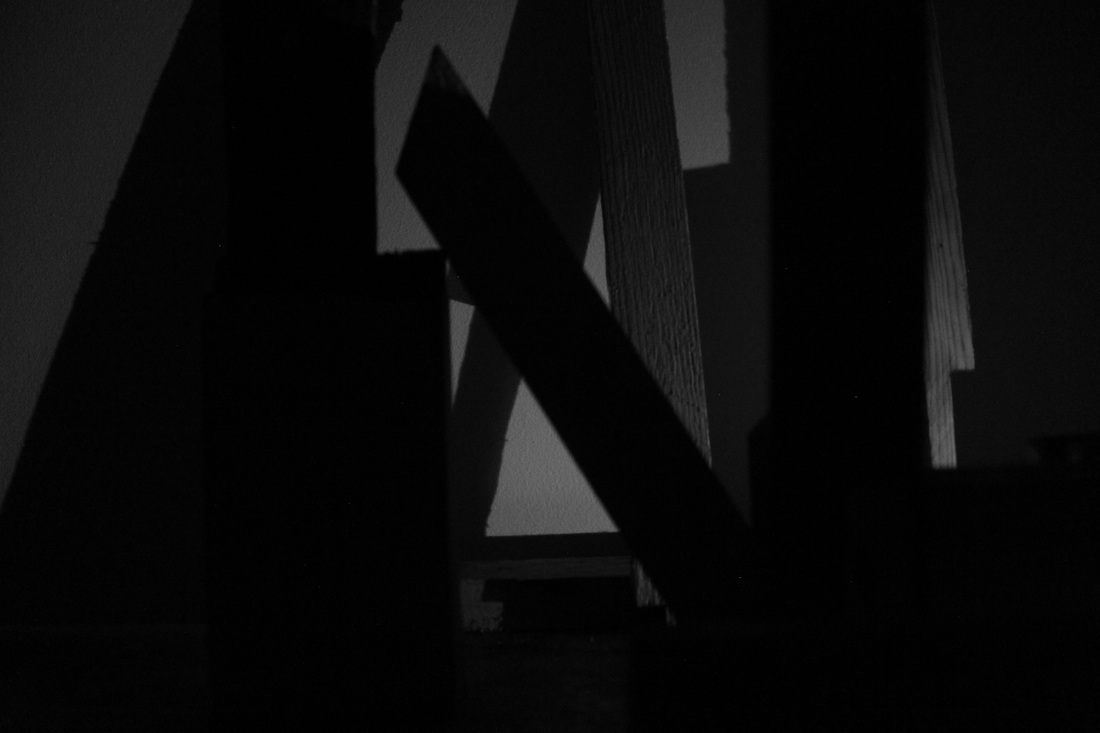
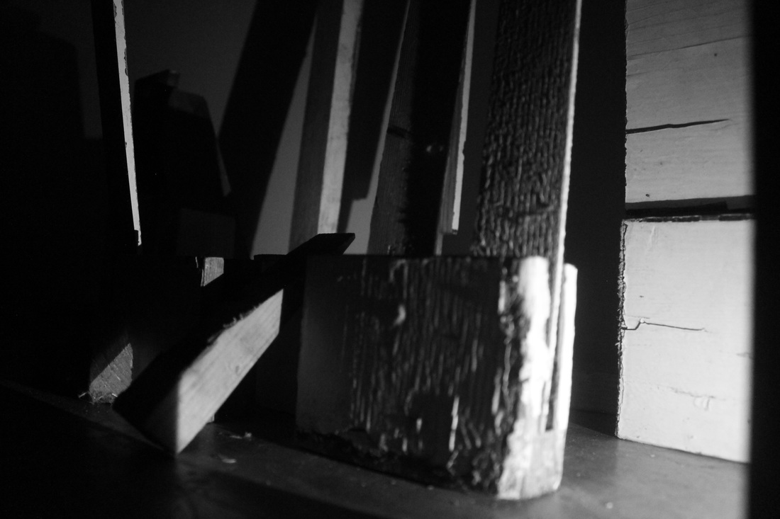
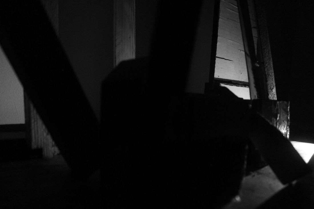
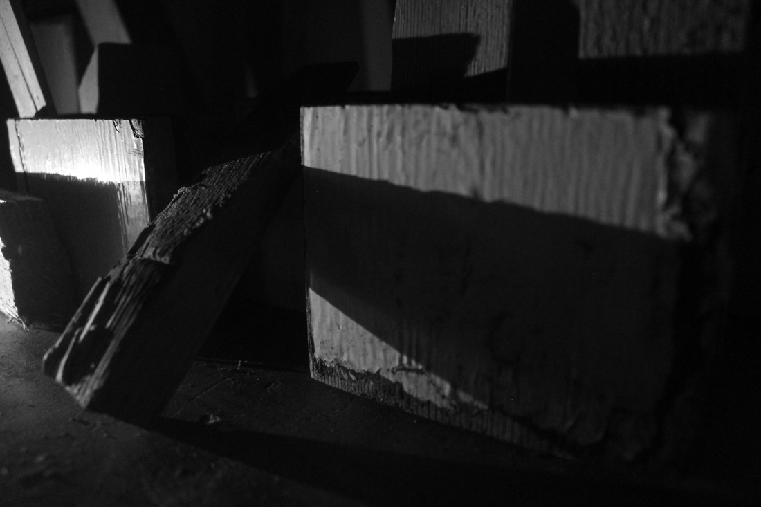
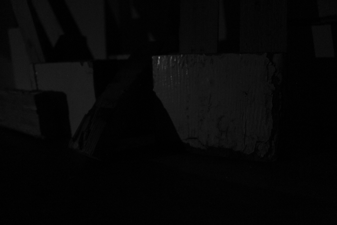
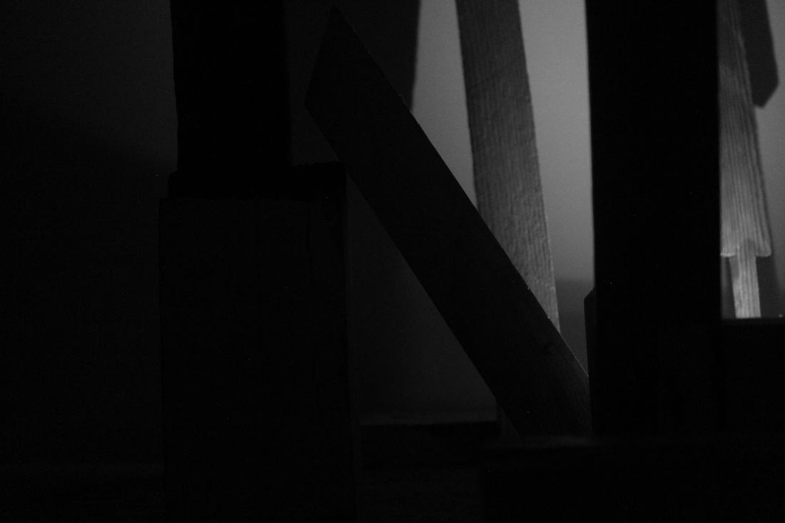
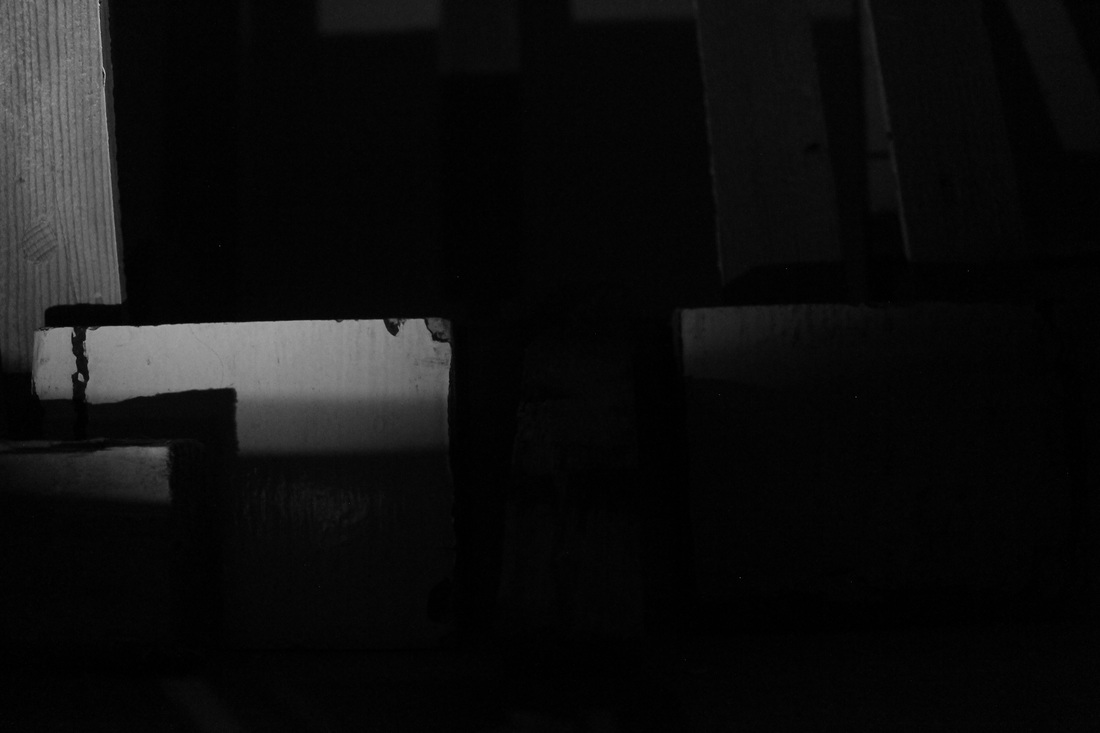
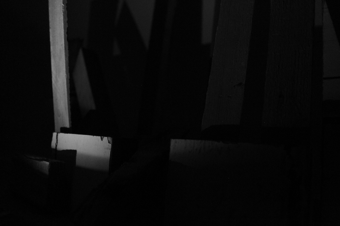
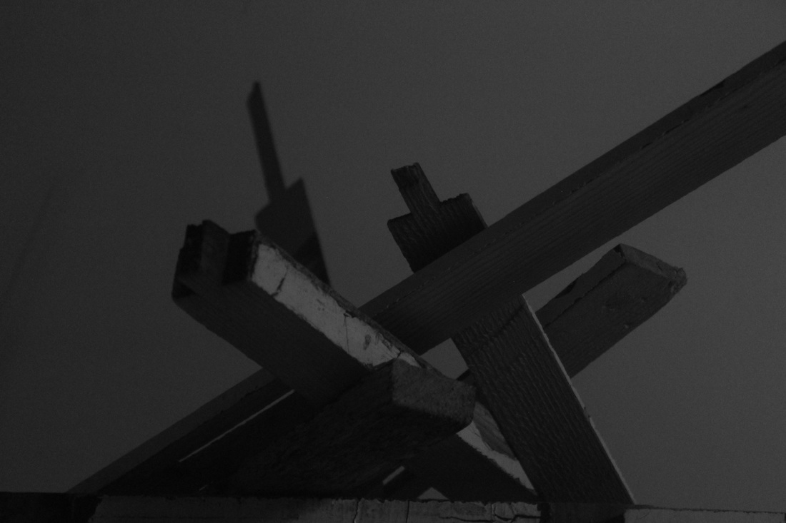
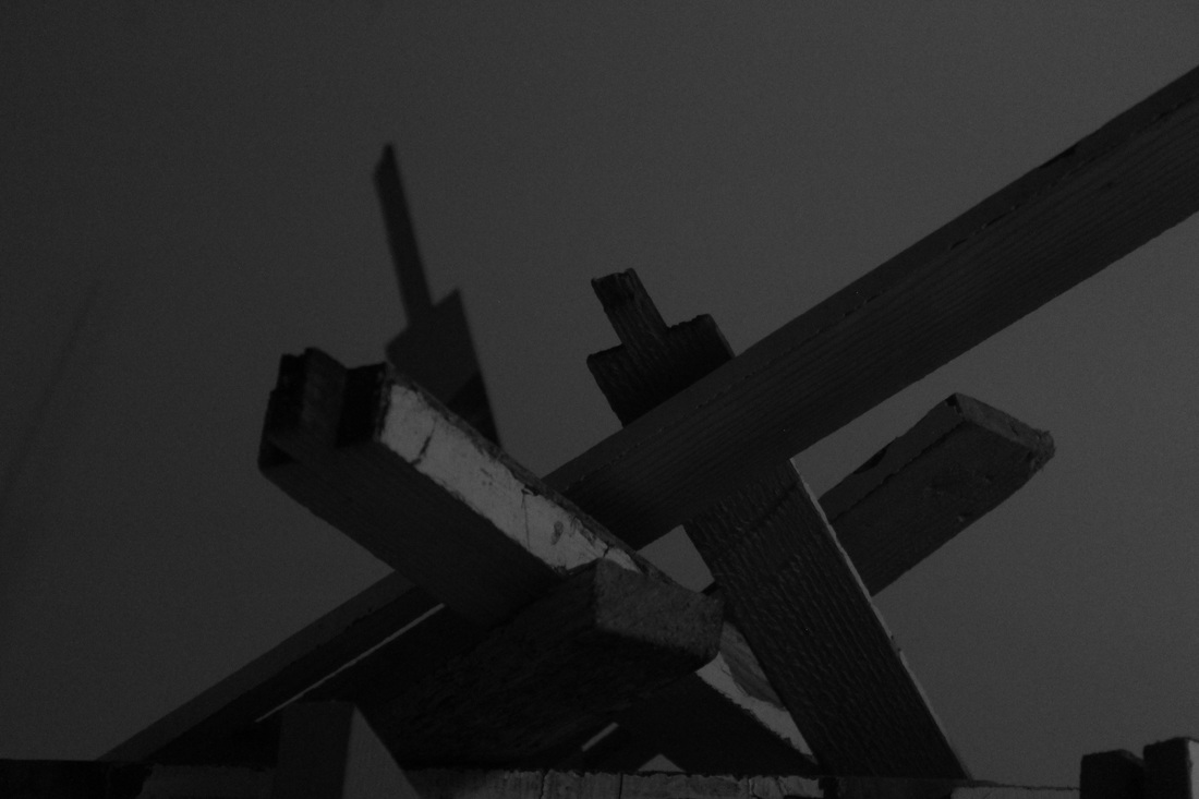
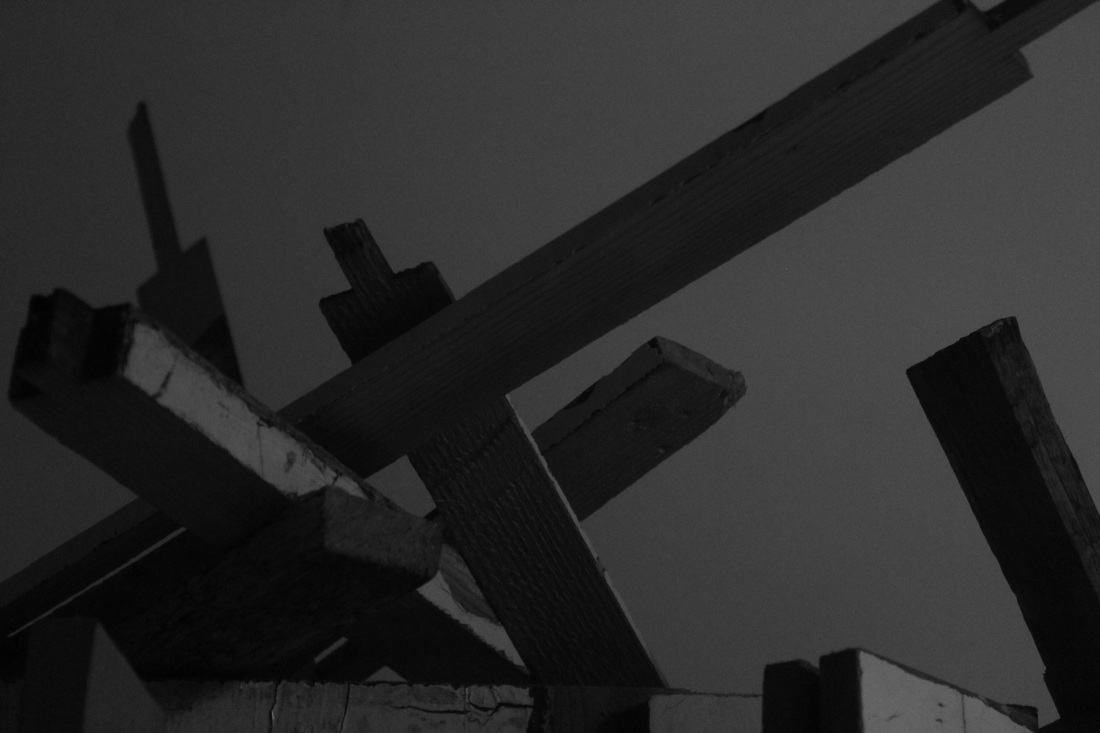
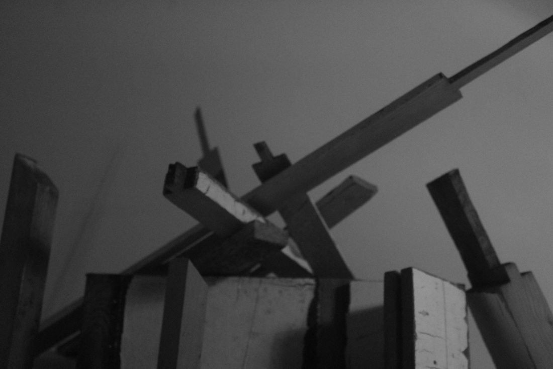
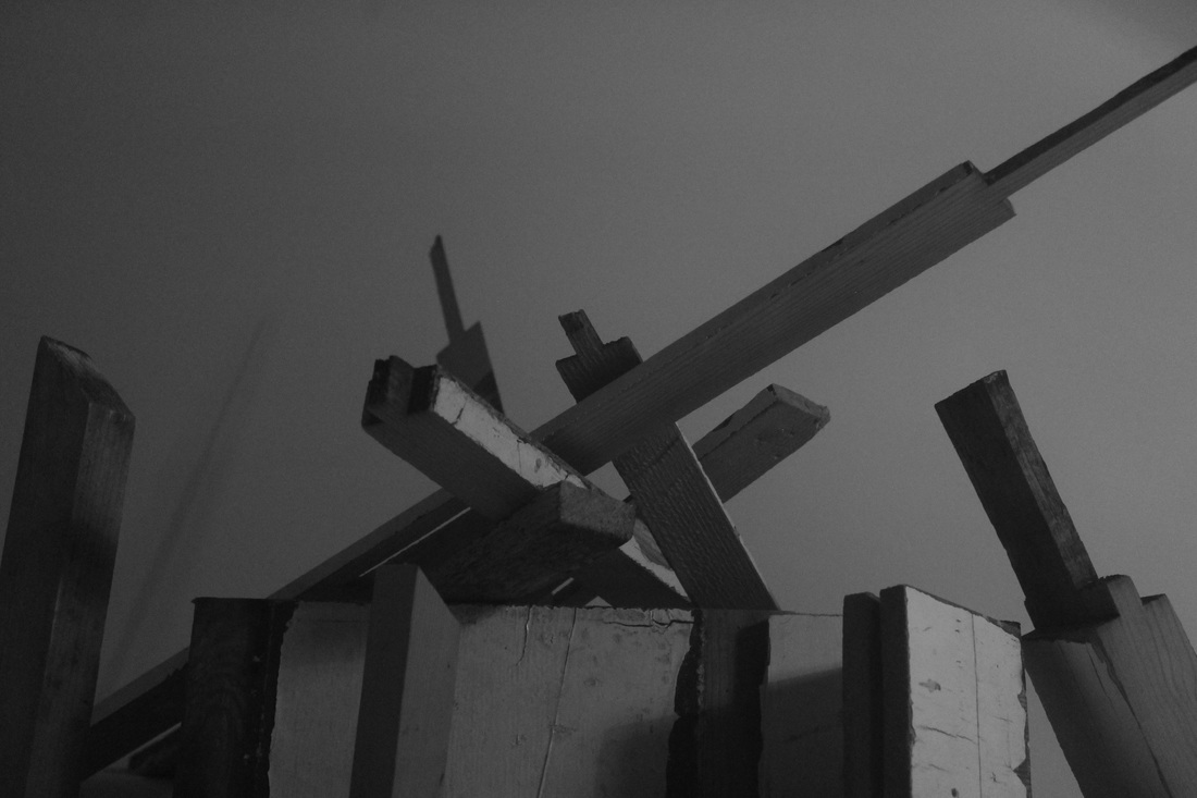
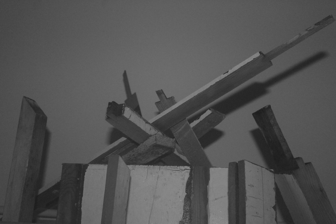
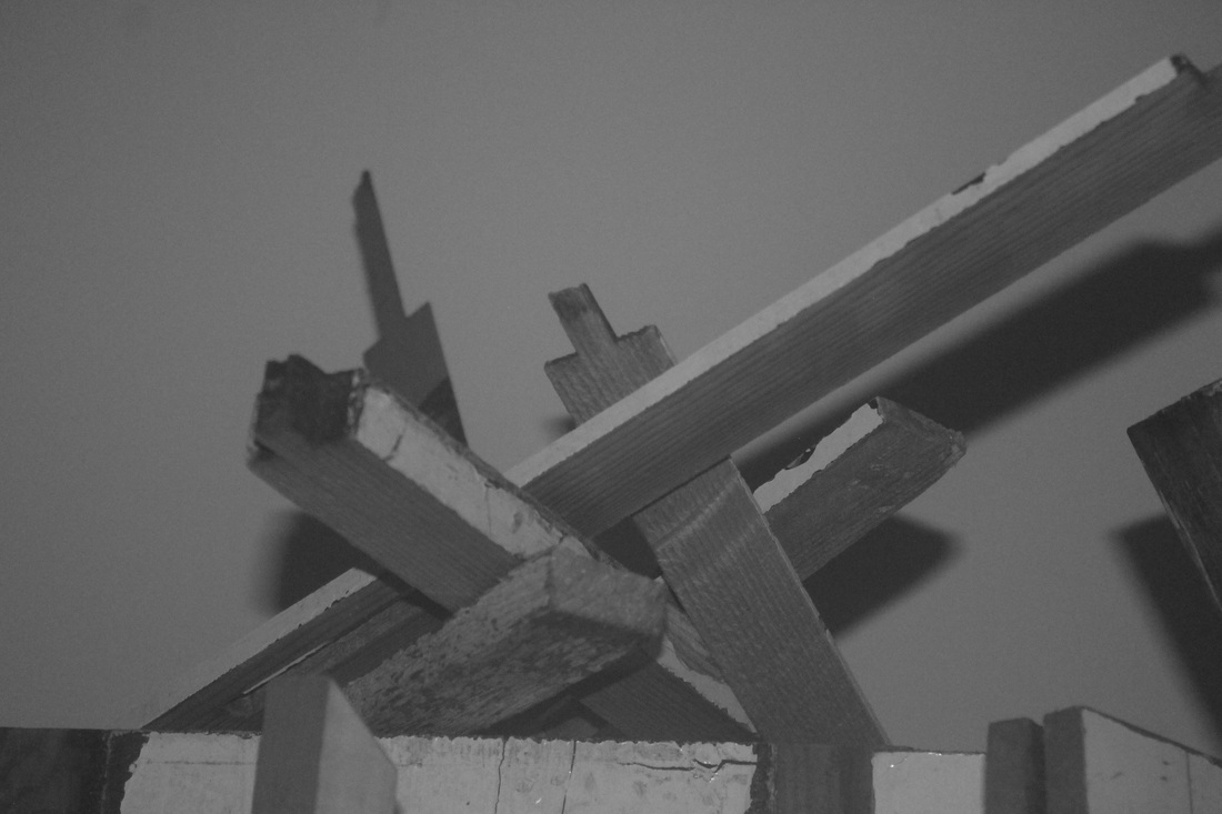
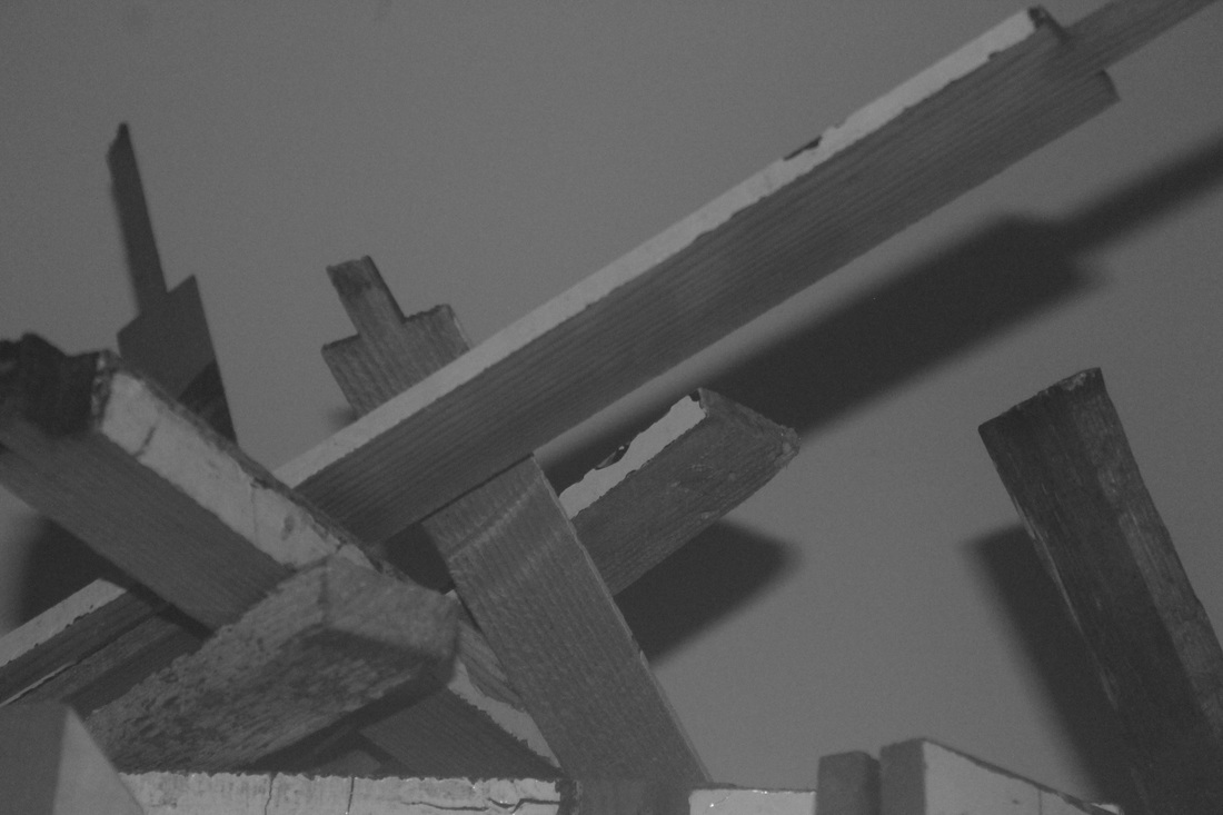
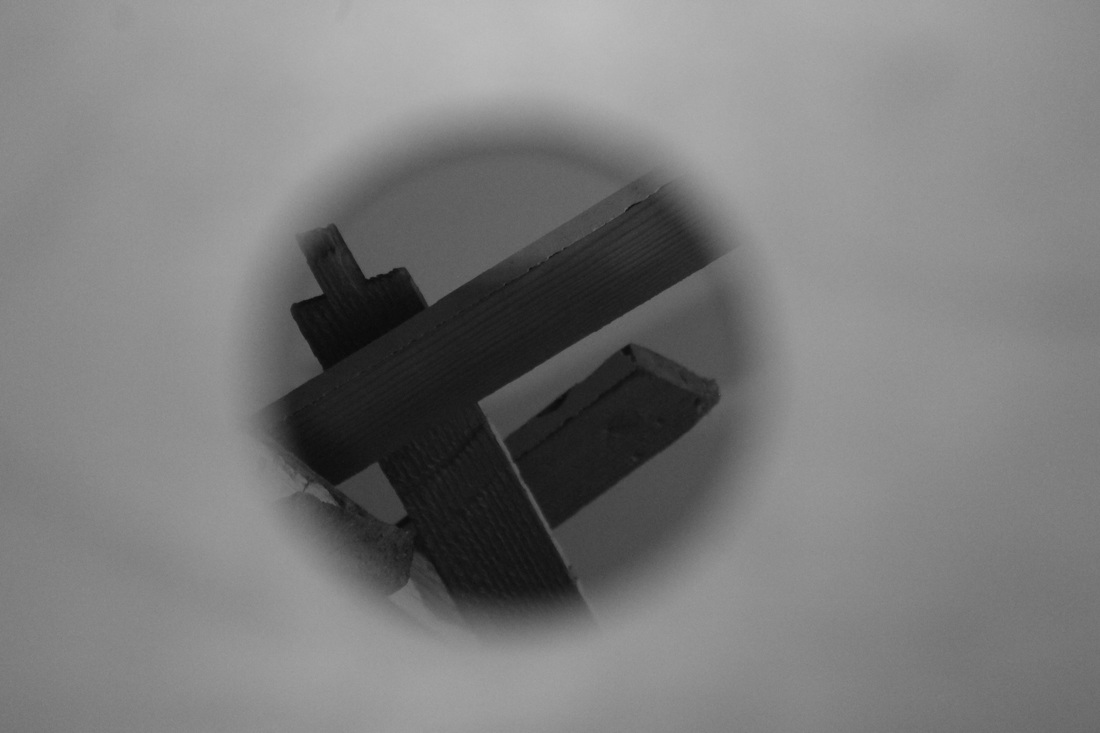
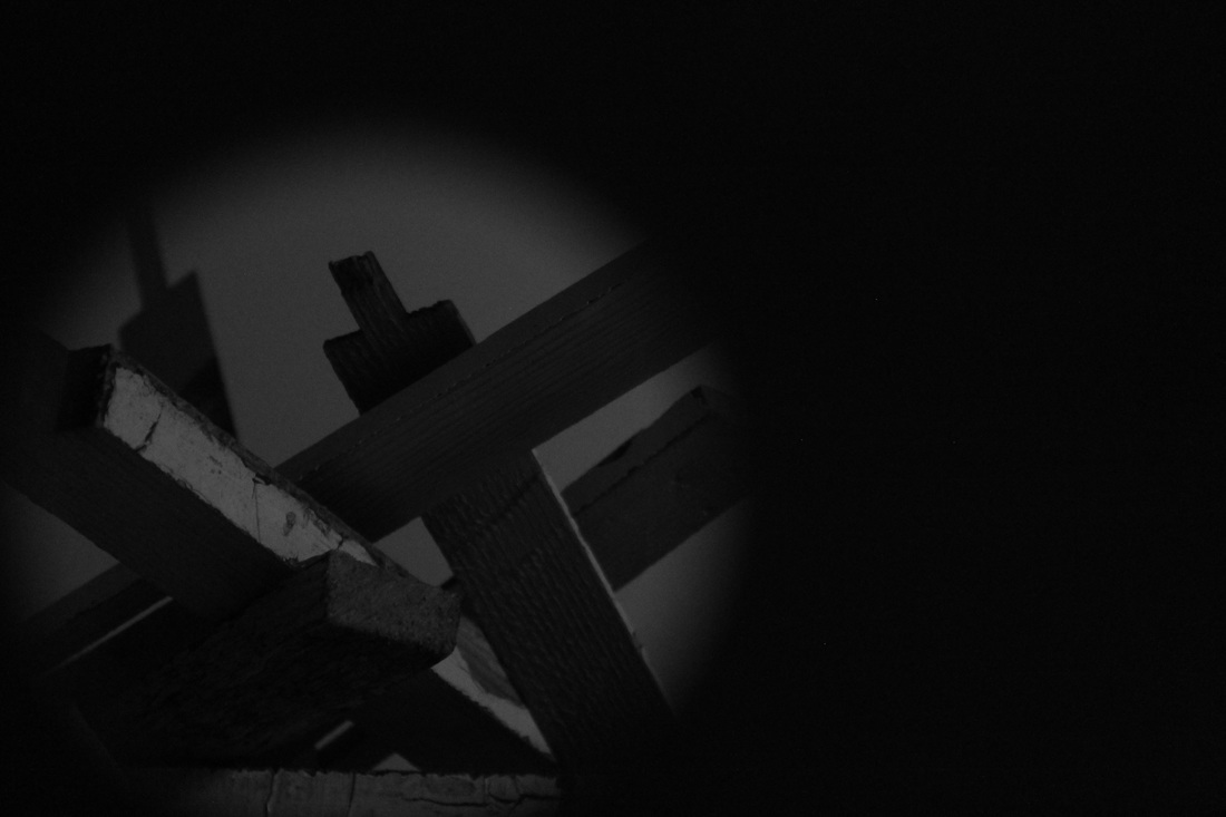
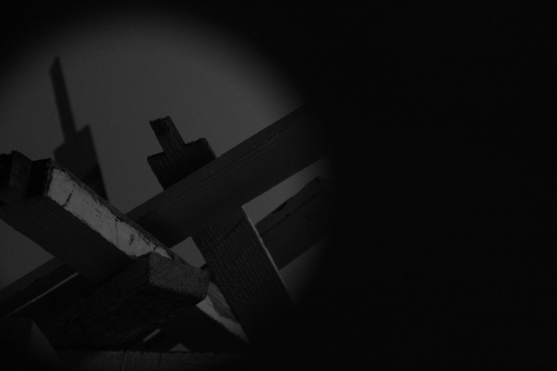
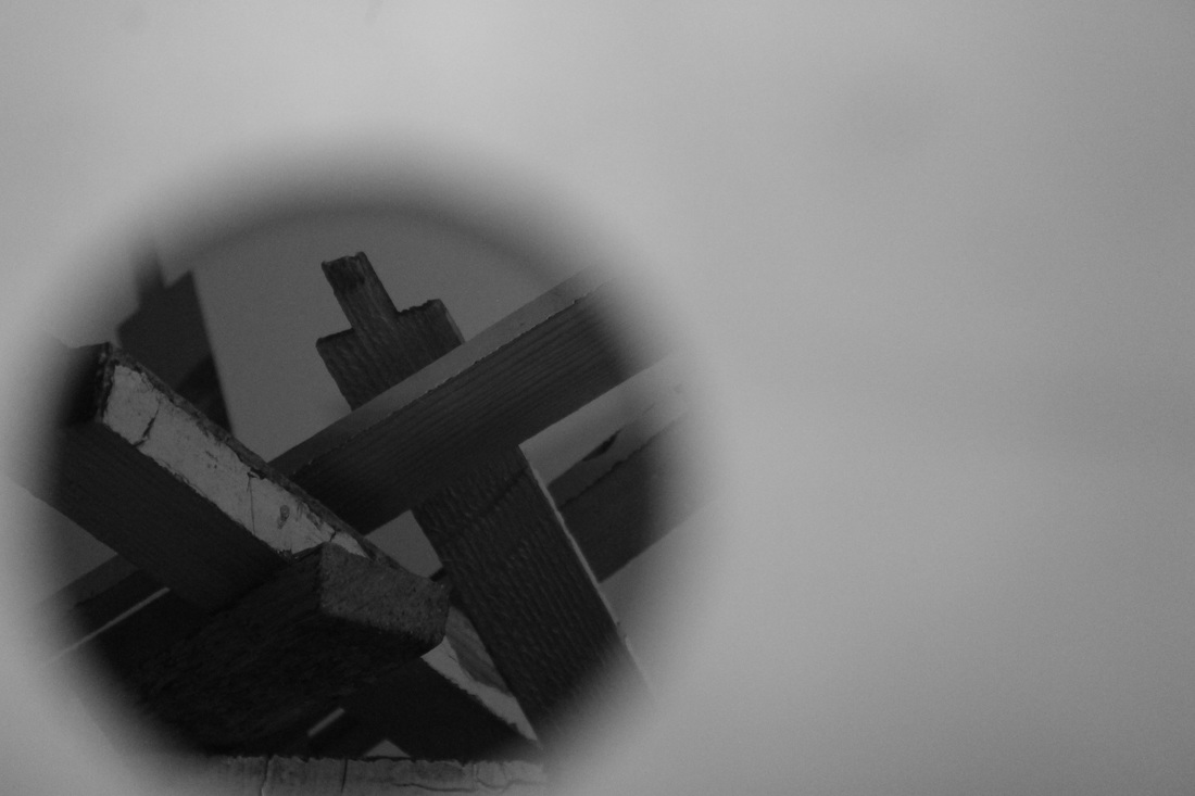
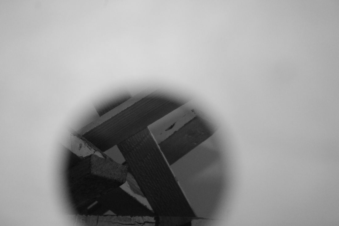
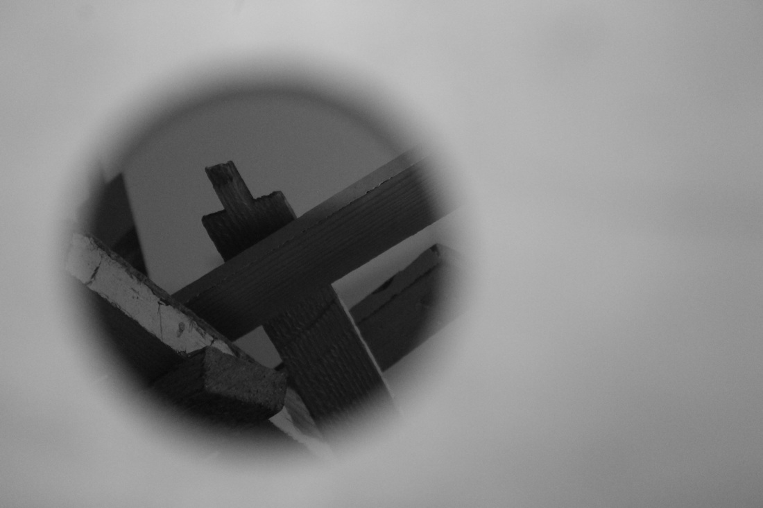
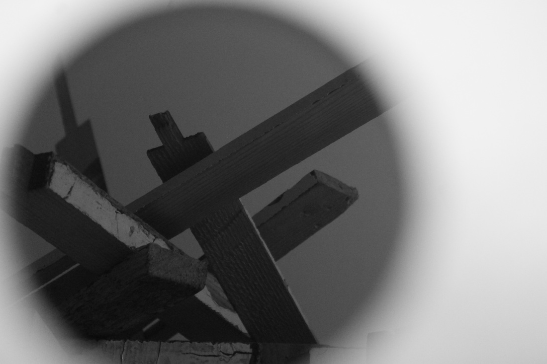
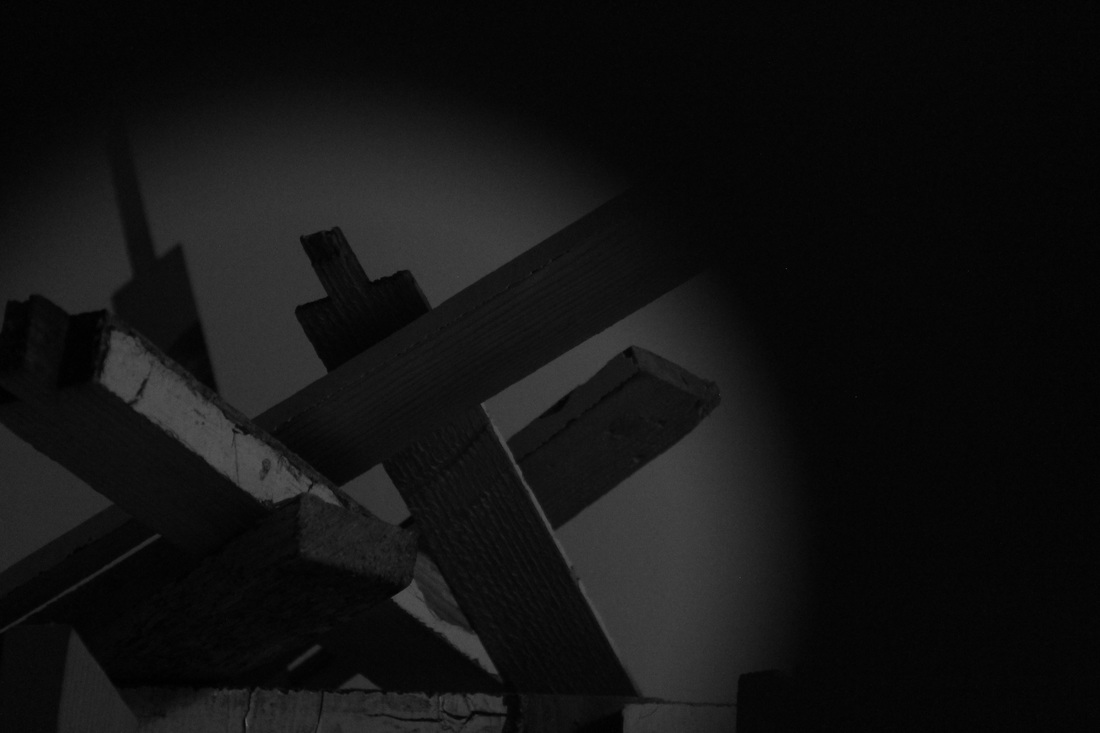
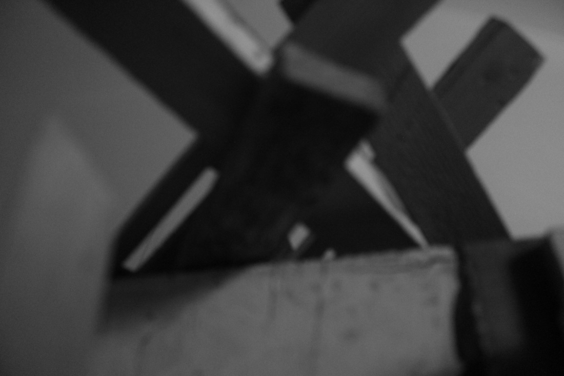
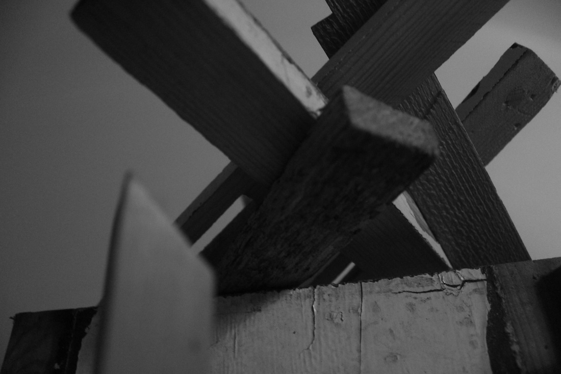
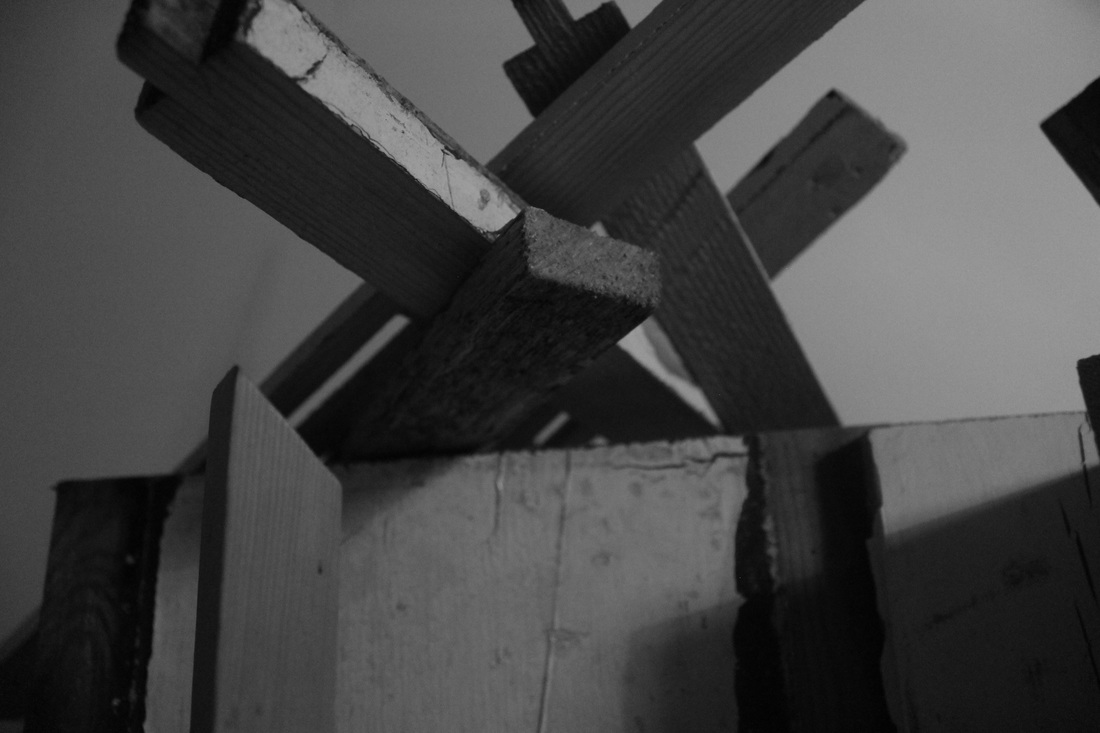
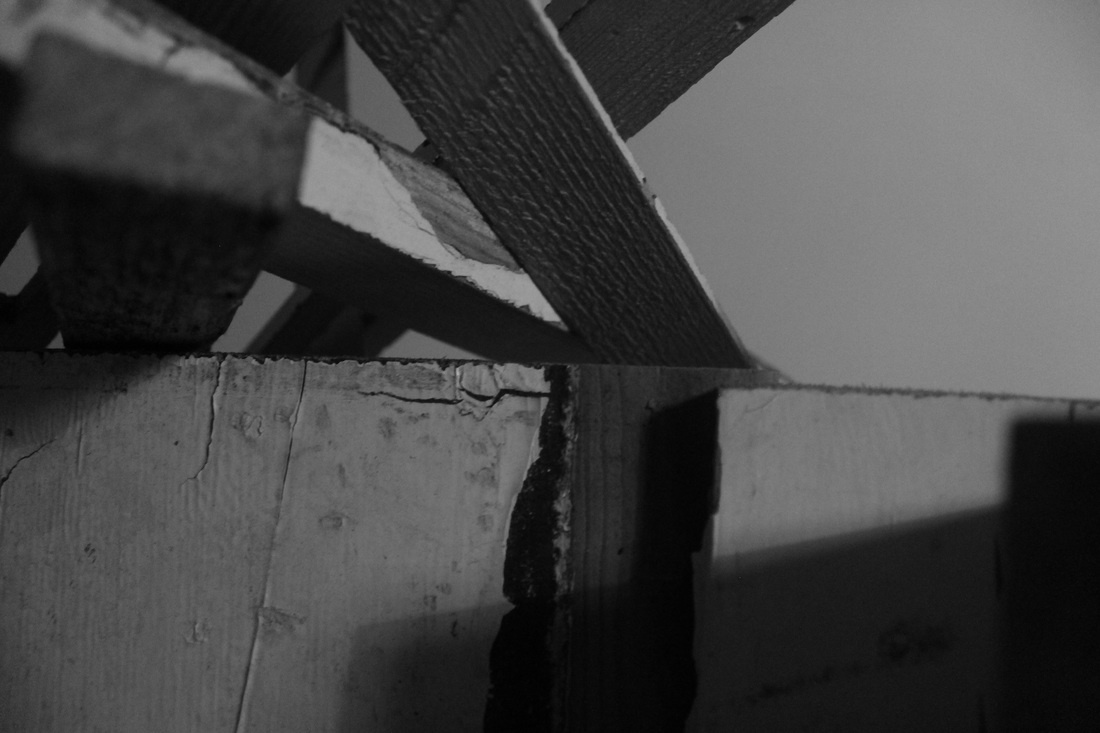
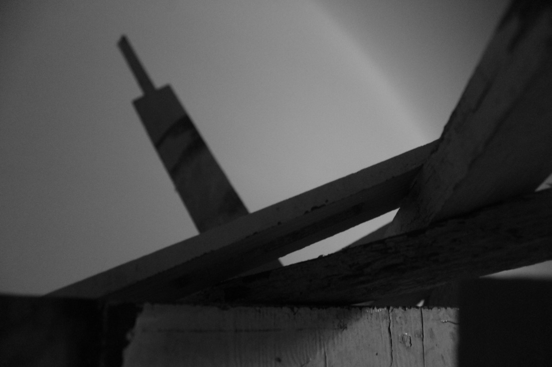
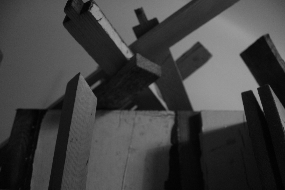
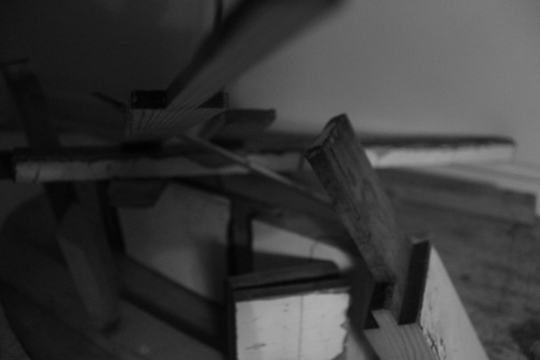
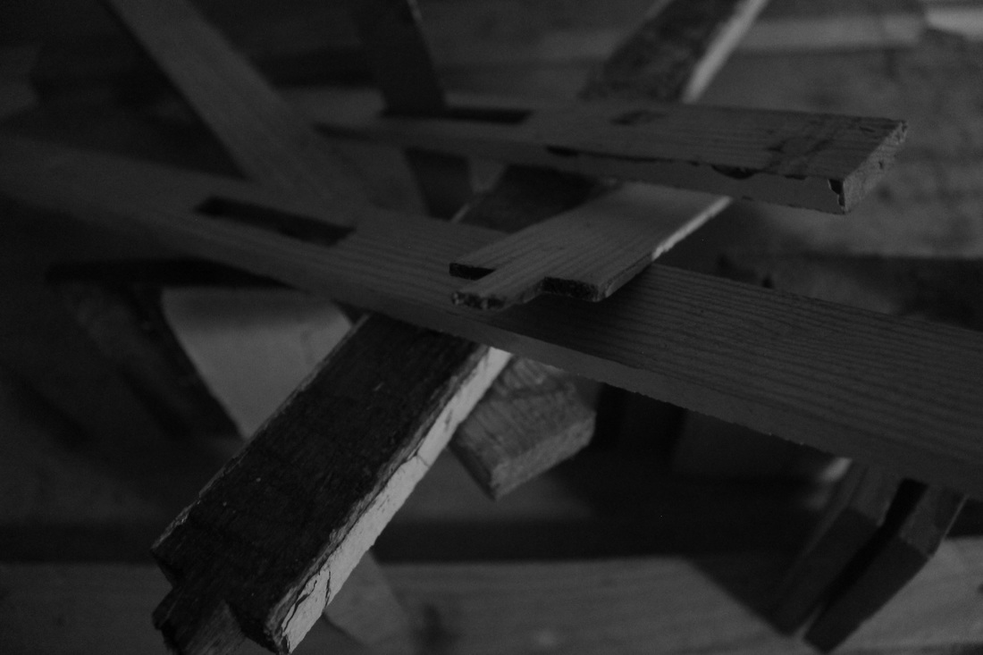
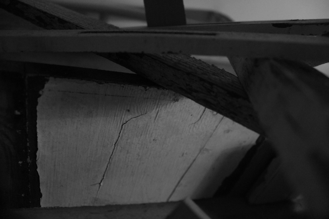
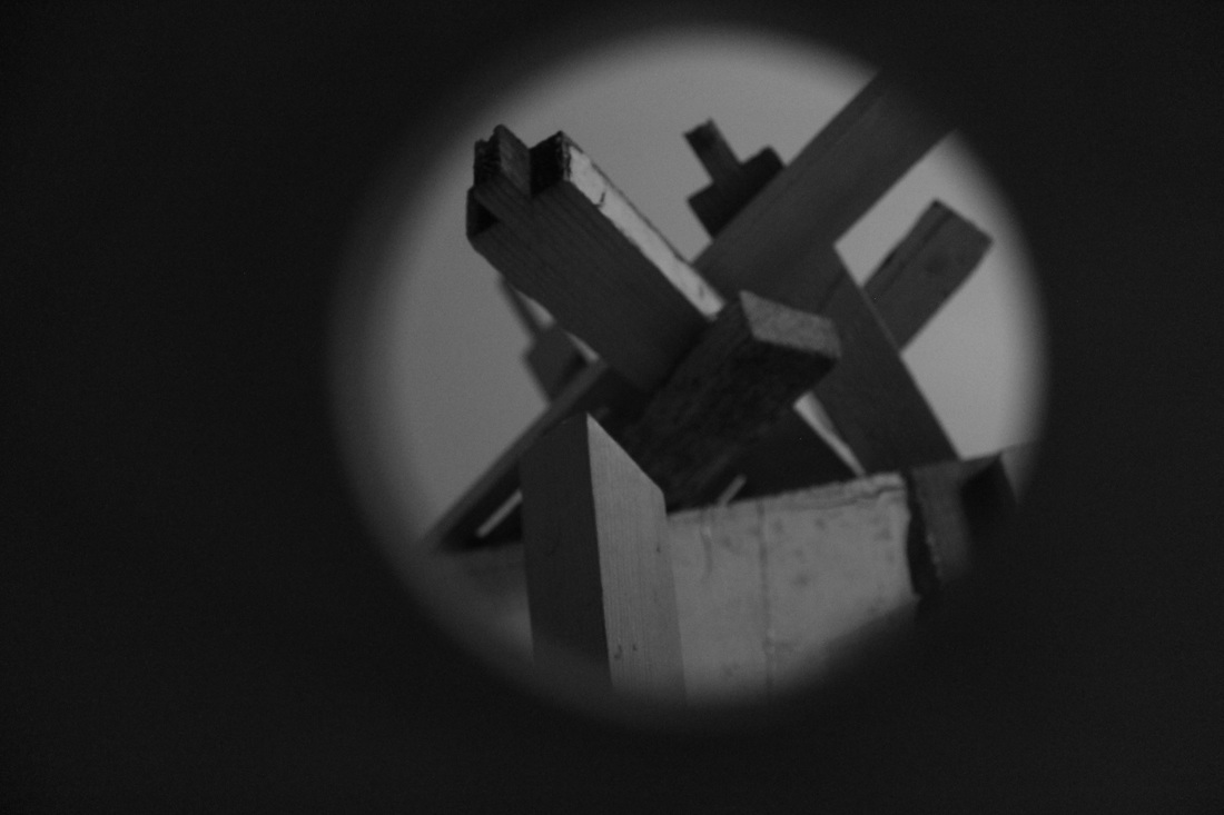
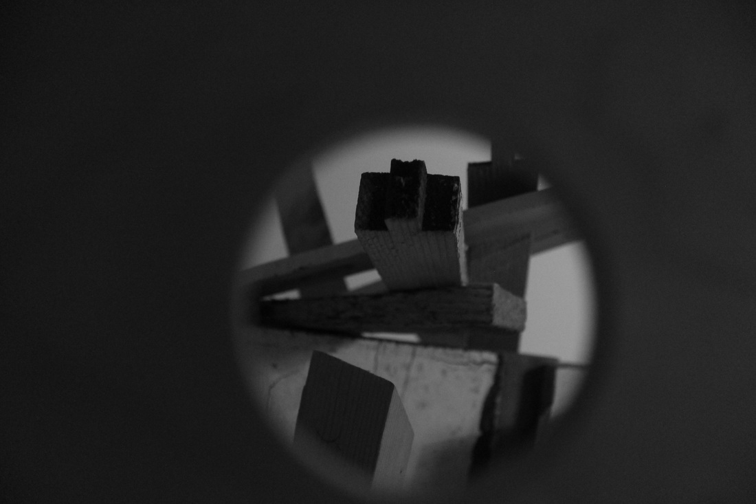
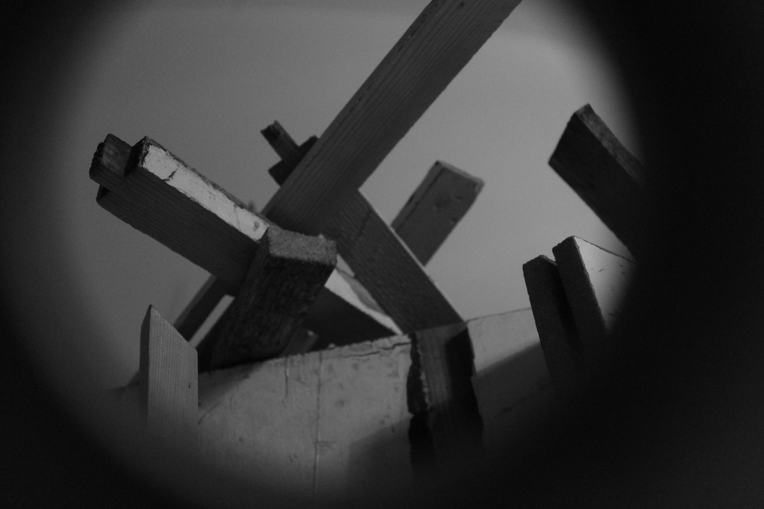
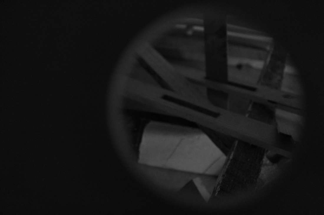
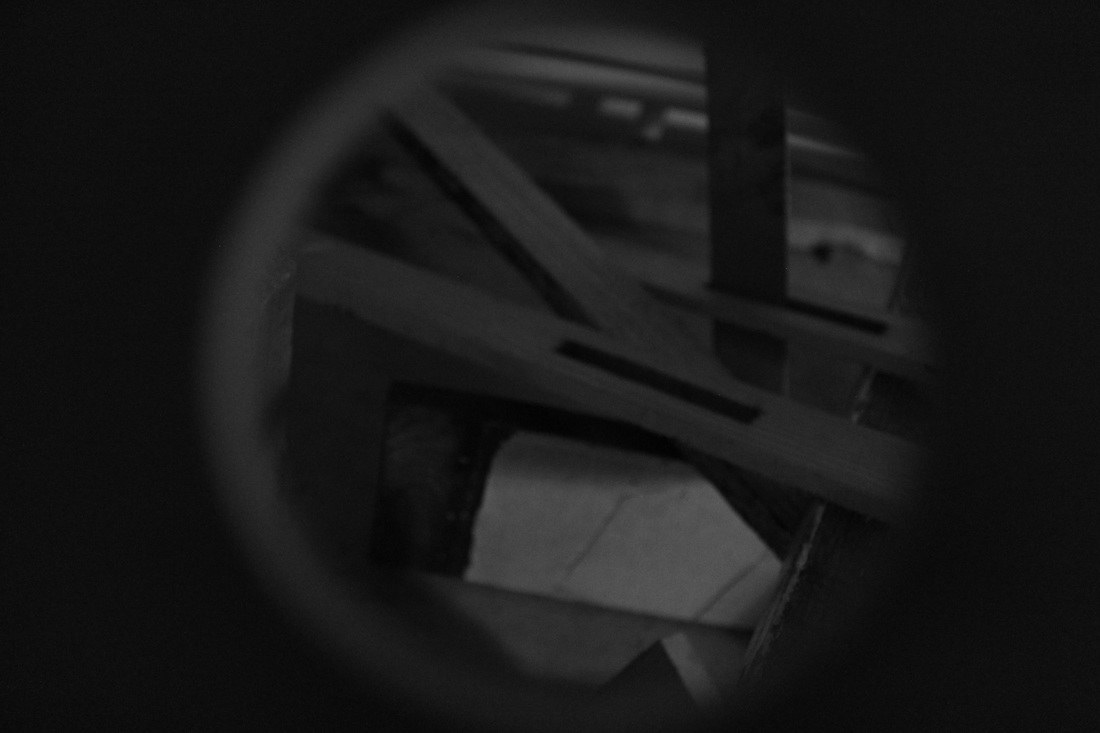
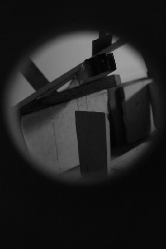
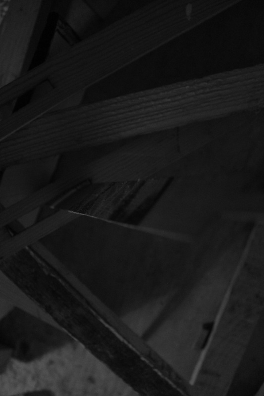
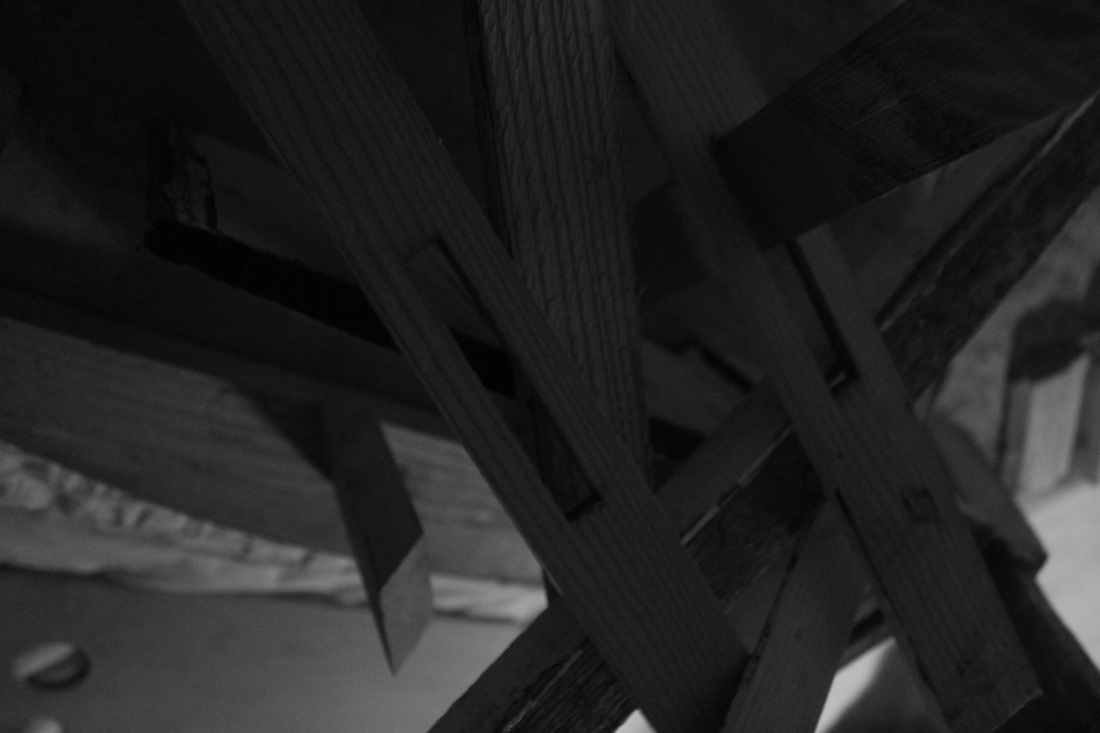
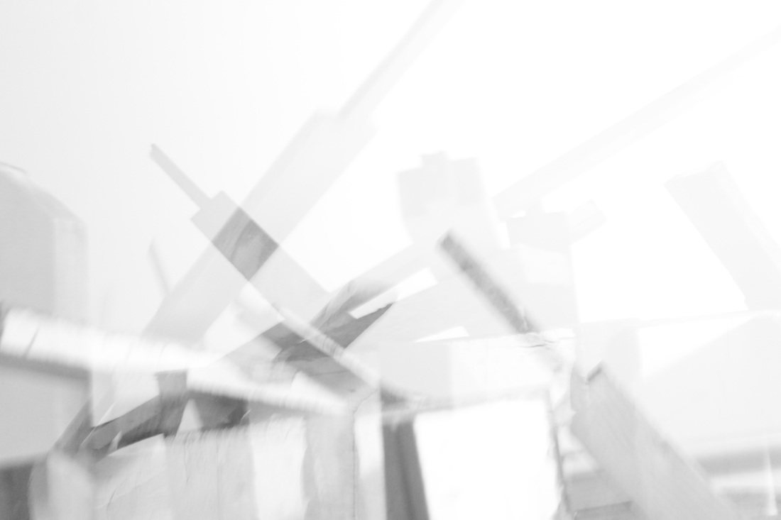
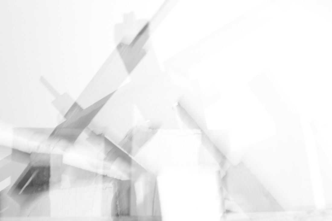
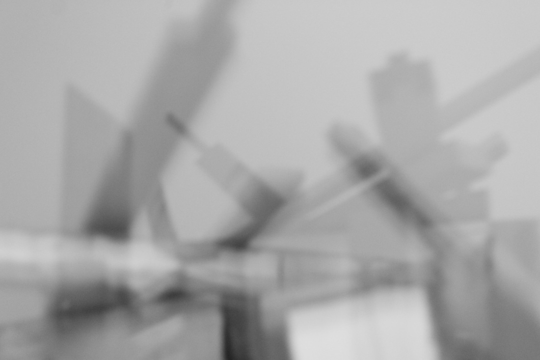
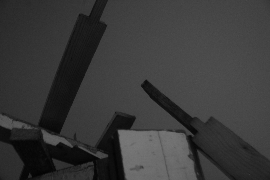
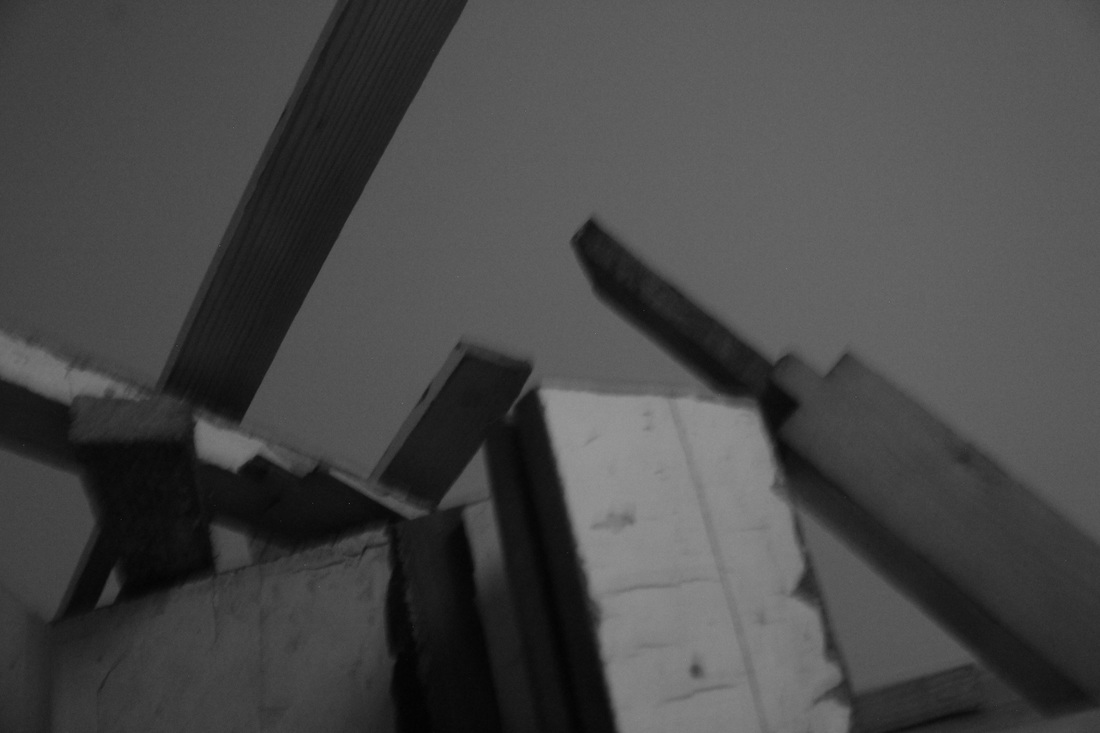
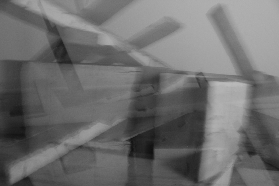
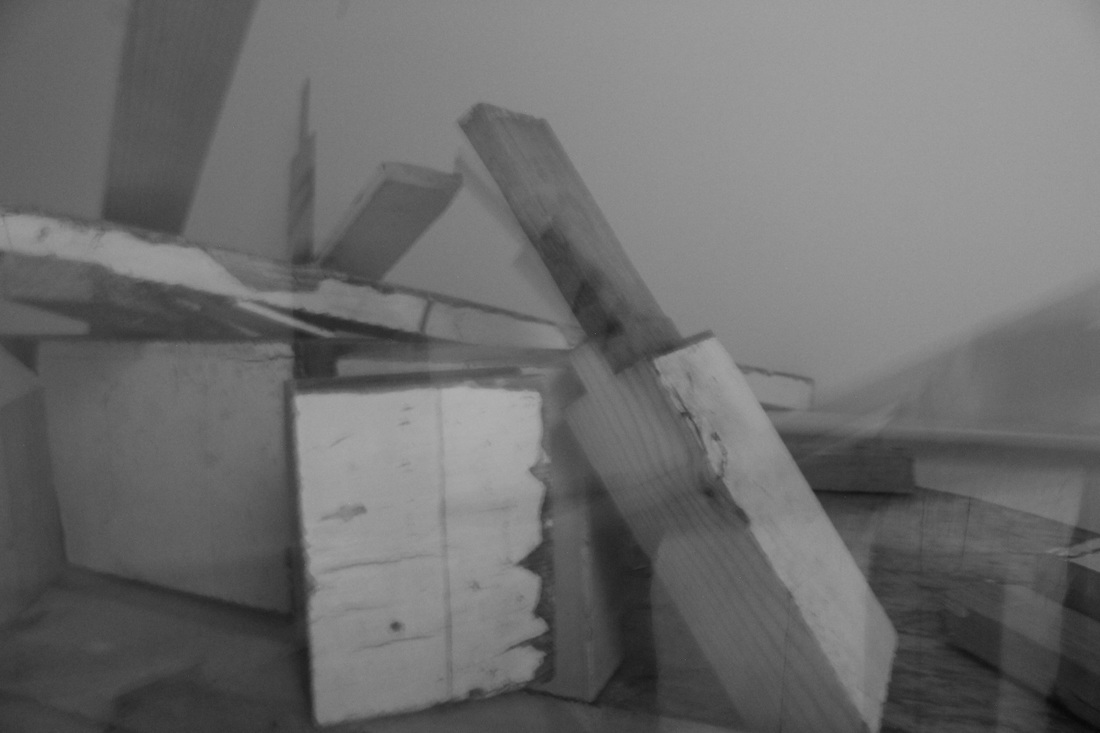
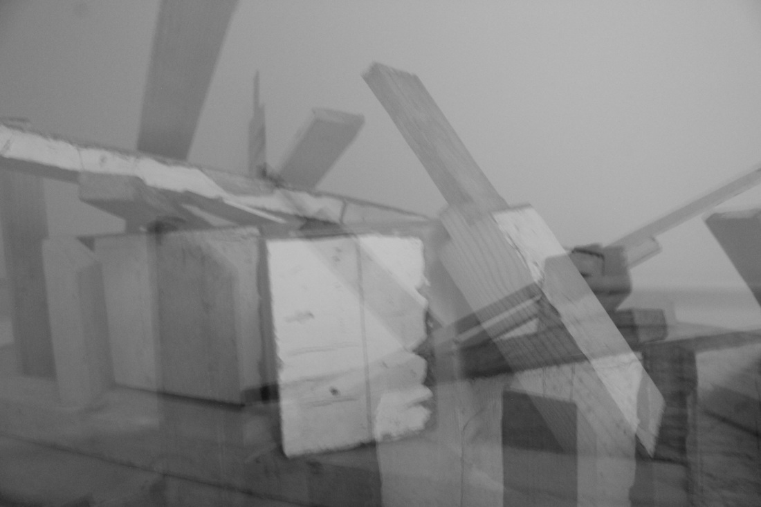
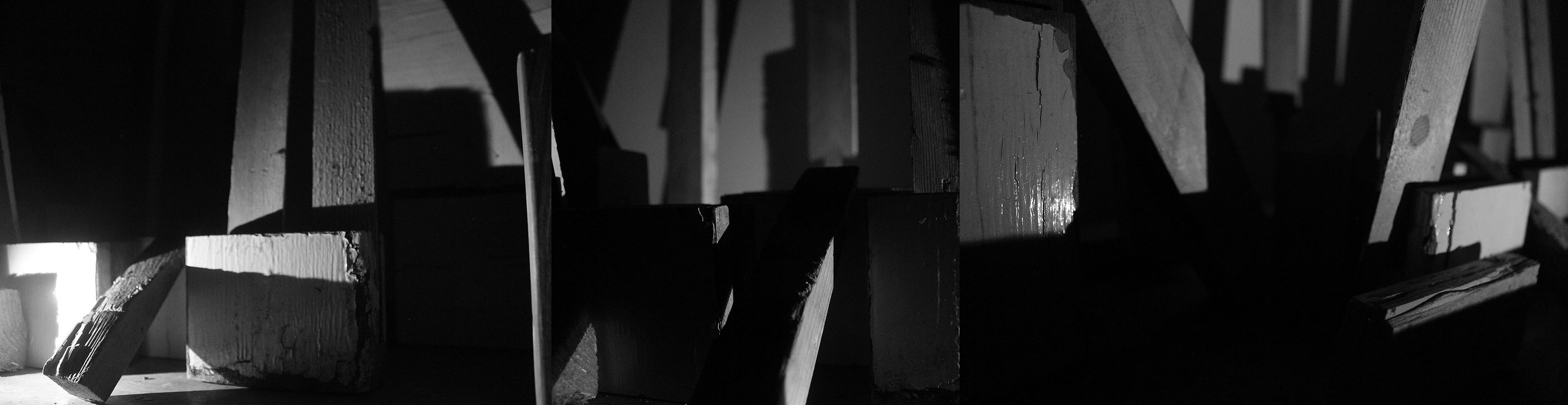
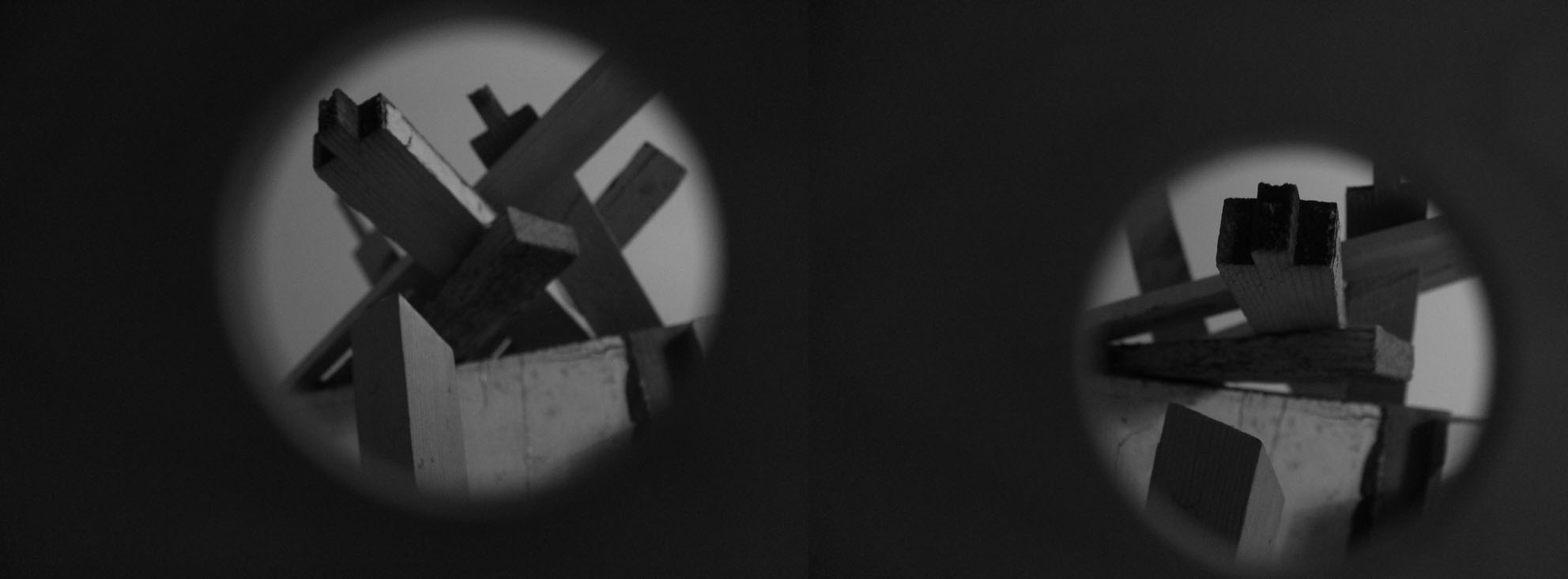
Wooden sculptures
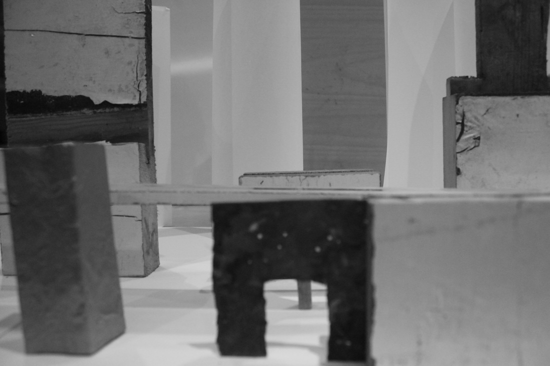
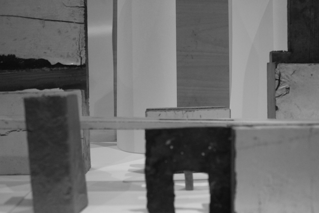
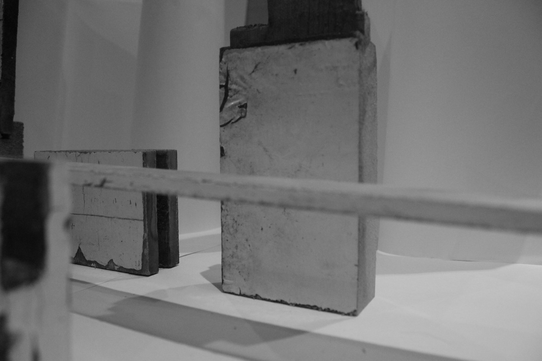
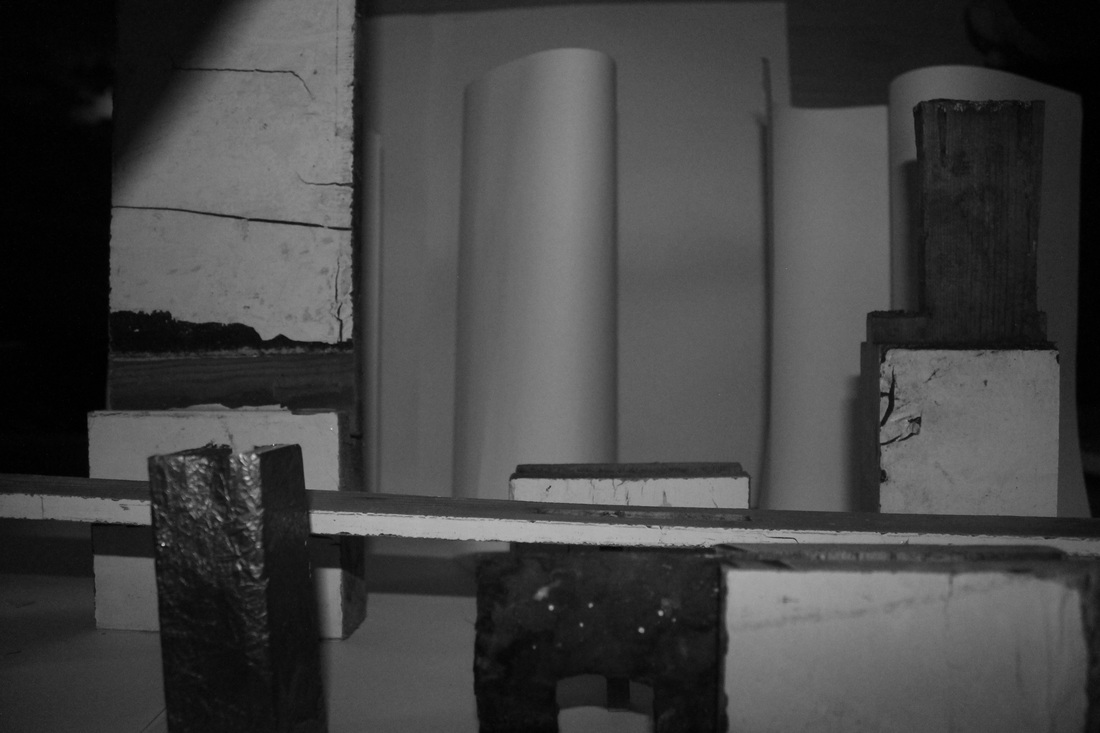
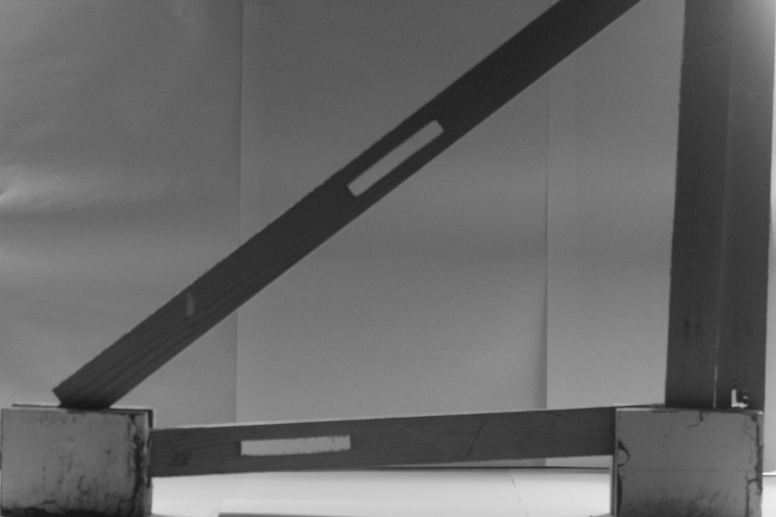
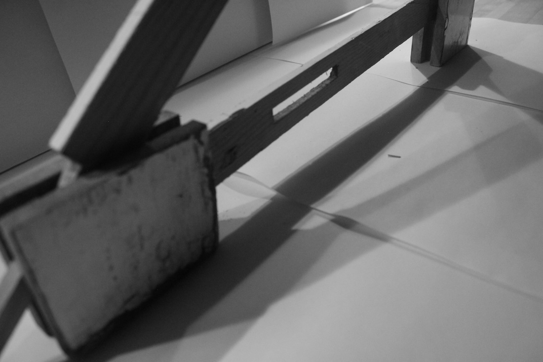
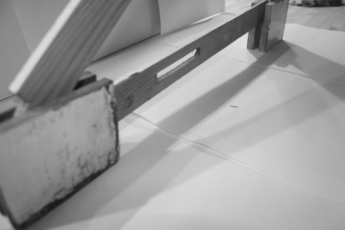
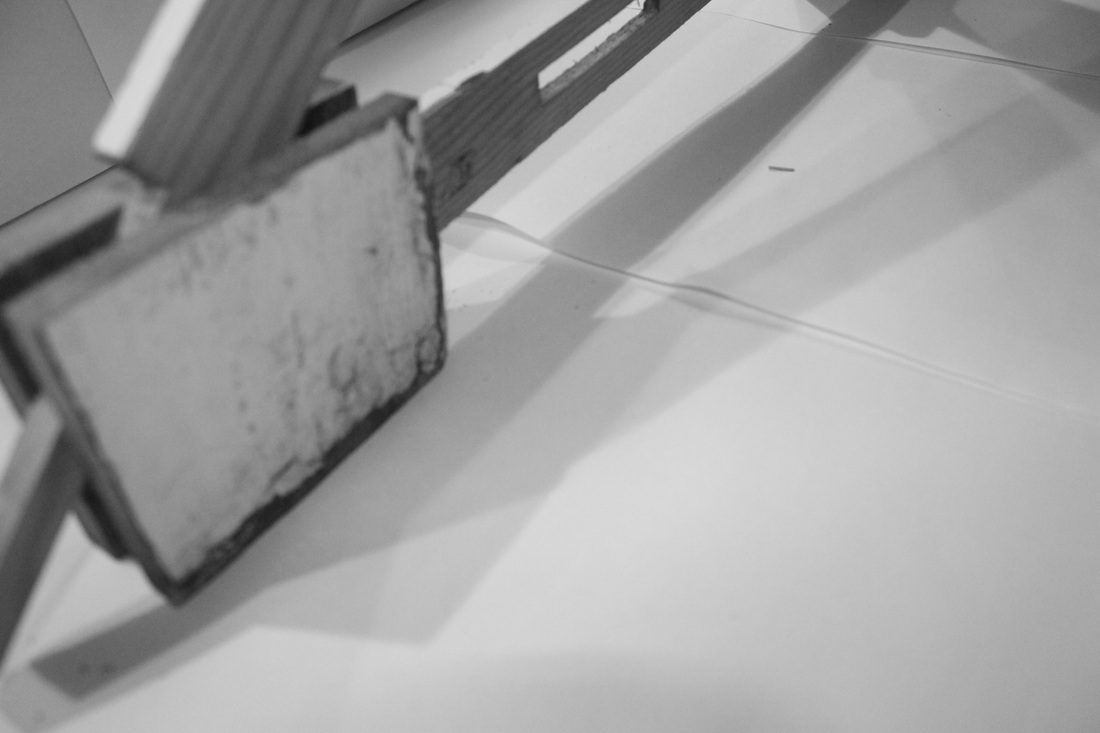
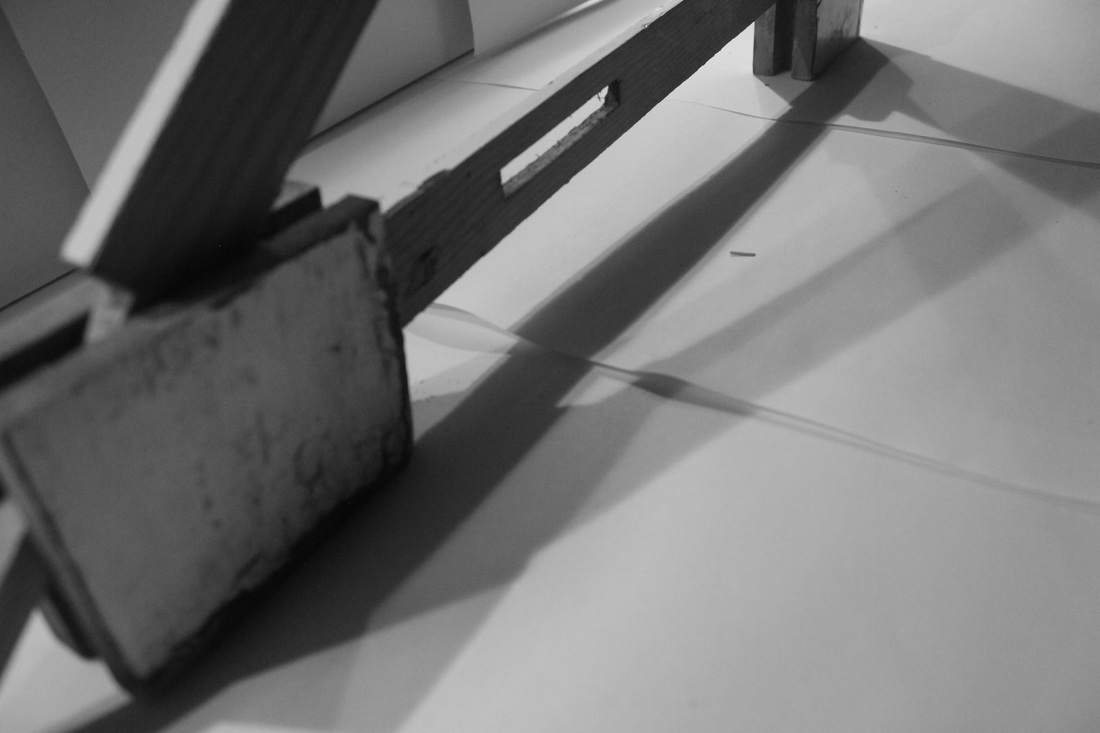
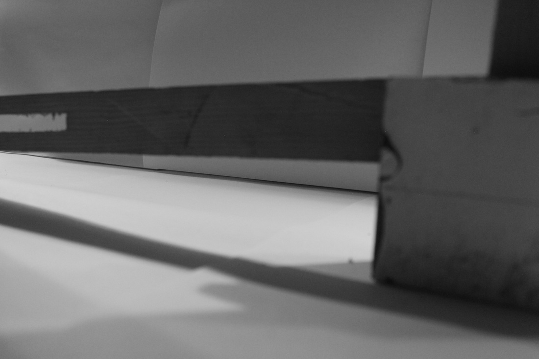
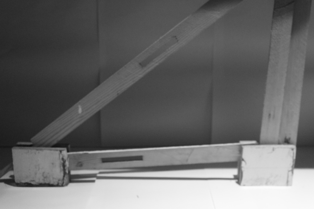
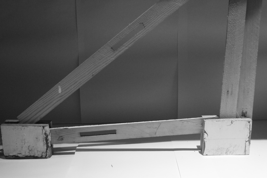
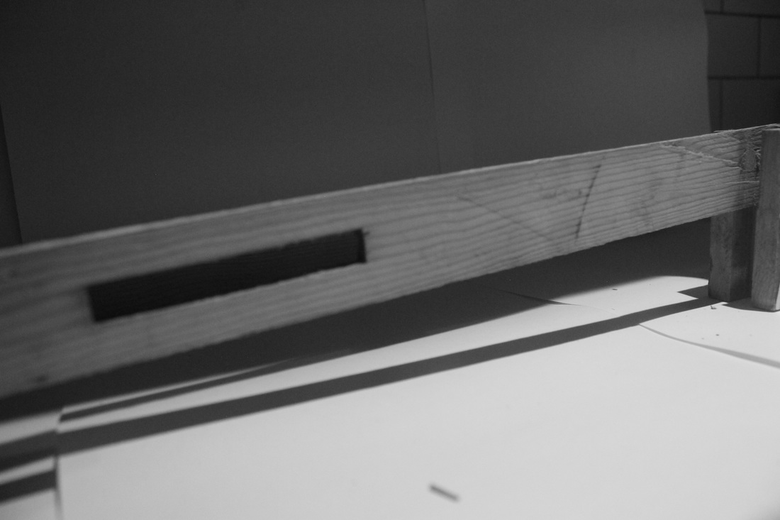
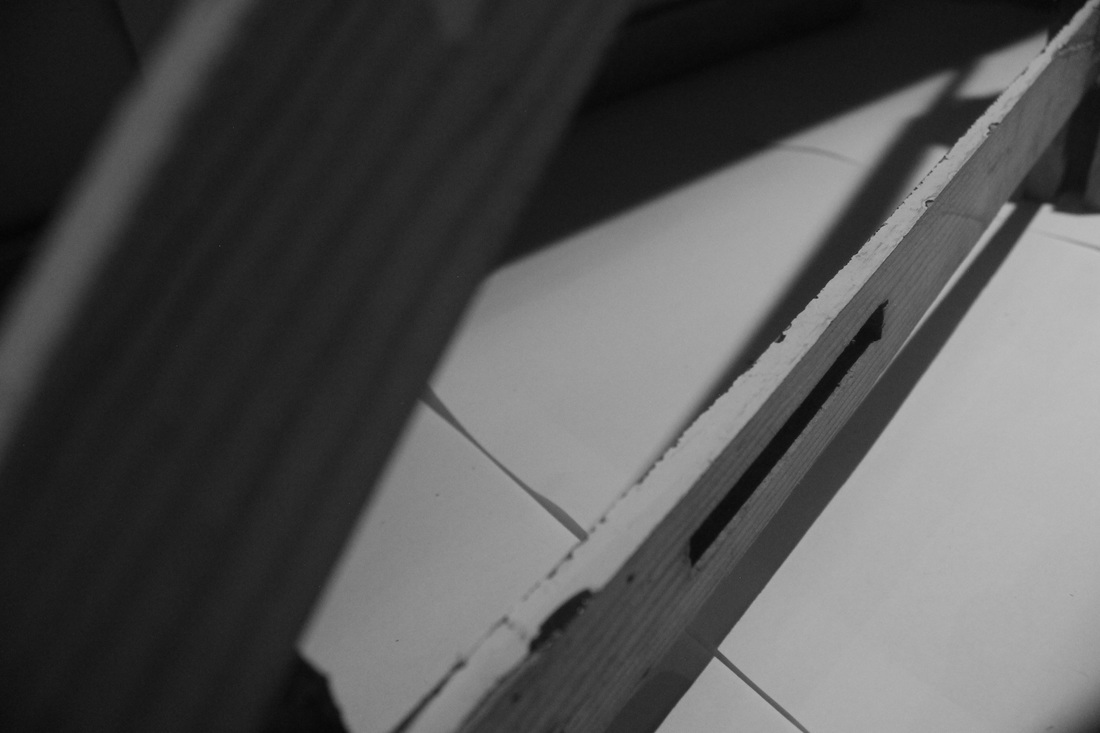
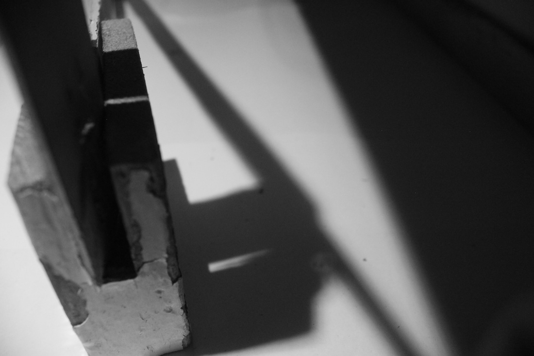

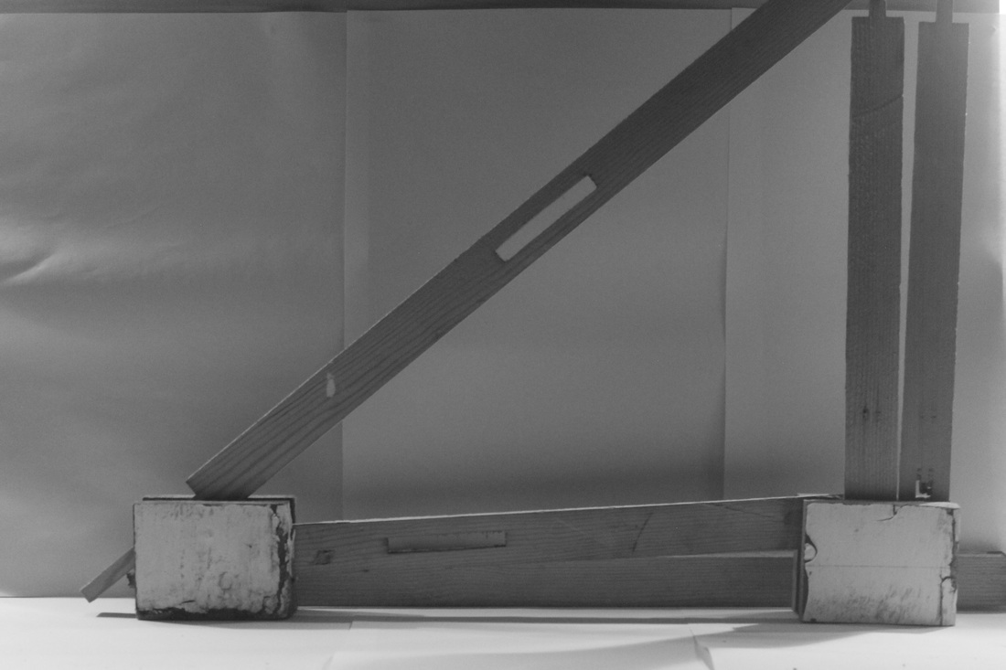
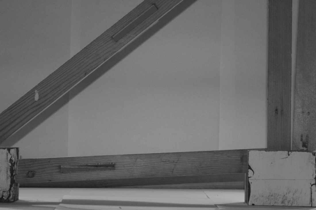
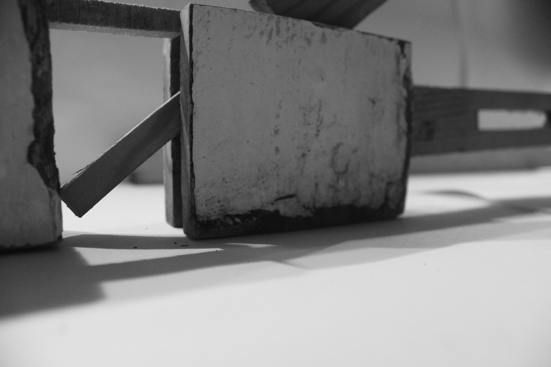
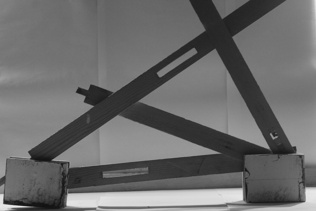
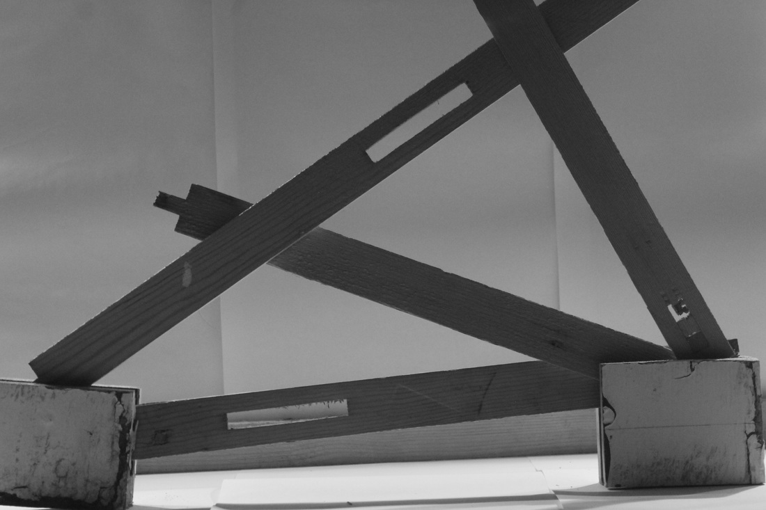
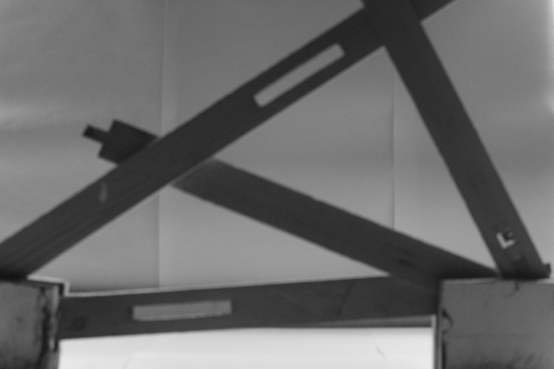
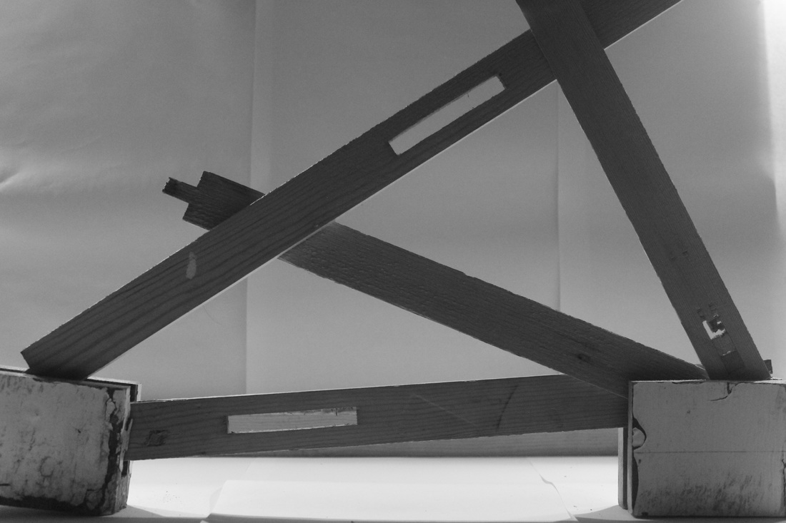
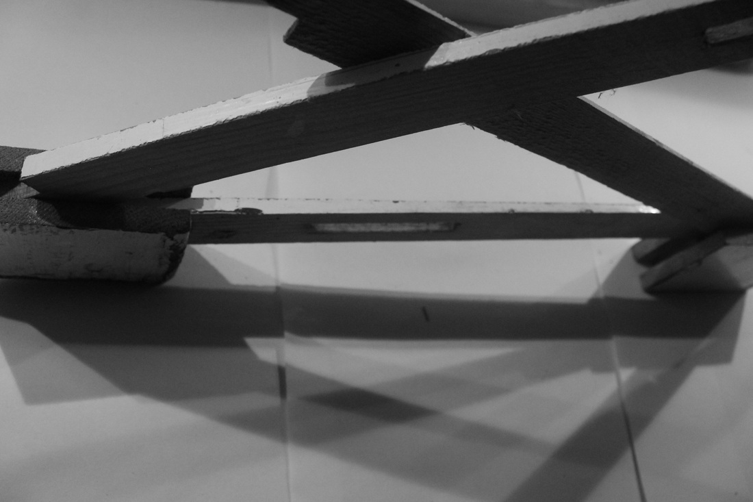
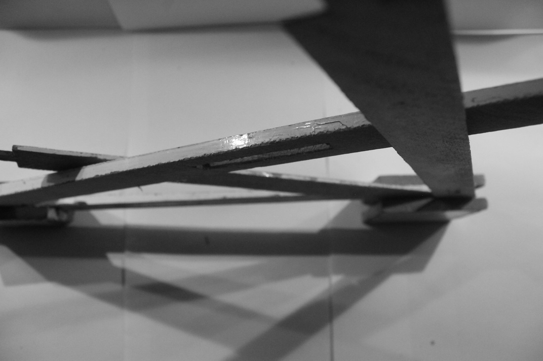
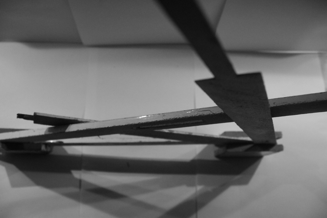
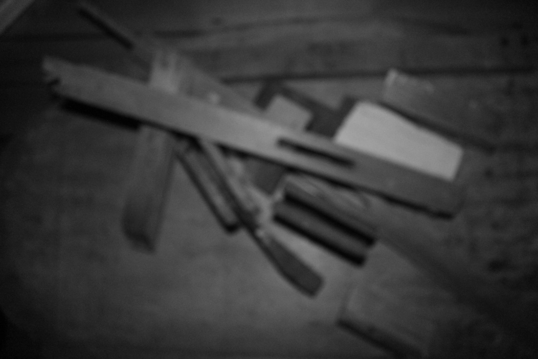
After looking at Bill Leslie's images I was inspired to create and photograph some of my own sculptures. I was using scrap pieces of wood and paper initially I was arranging the wood to replicate the shape of a skyline and taking the images up close to try and obscure and with different lightings to obscure the shapes. After doing this for a while I moved on to creating some more abstract single sculptures and photographing them as interestingly as possible adapting the light, angle and focus I was using to take the image. After photographing the whole object I started to concentrate on smaller parts of the object and changing the light and angle which was producing nice shadows and some interesting shapes.Next time I do this I'd like to do it on a bigger scale and concentrate on how a photograph affects and alters a sculpture.
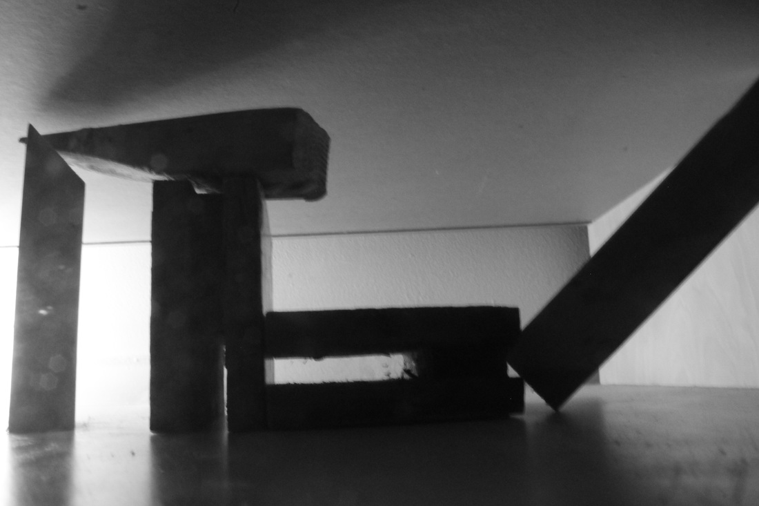
Experimenting with editing


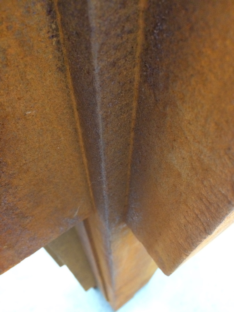
I decided to experiment with the images in photoshop to see how I could improve them. I increased the contrast and lowered the brightness of all of the images the three rows I increased the contrast and they become progressively darker. I think the darker it gets the more shapes and forms of the sculpture and the shadows it produces become the main focus of the image as it no longer becomes clear the material the object is made out of you can only really see the shapes produced. However it worked a lot better for some images than others and I don't really think that this drastically improves the images as I liked seeing the detail of the grain, cracks and dirt on the wood as it adds another layer to the image and the shape of the object and shadows are still able to be the main focus of the picture.
Keld Helmer Petersen style edits
I edited these images inspired by the style of Keld Helmer Petersens work 'black noise' where he made the white black contrast so high that there were no other shades or colours in the image. I did this to expand upon the edits I did previously where I lowered the brightness and increased the contrast this time I went on adjustments and thresholds and made the pictures completely black and white . This completely eradicates the aspect of the image of looking at what the sculptures made of or any other tones or colours in the image it makes the images only focus be the shape of the sculpture and the shadows it produces . Some look more abstract than others like the image on the right is much less clearly marked out than the image on the left where there is just blocks of black and white space.
Brassai involuntary sculpture
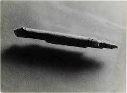

Brassai was a Hungarian surrealist artist who worked through out the early to mid 20th century while living in Paris. He took a series of images titled 'Involuntary' sculptures where he photographed a few everyday items for example old screwed up train tickets, toothpaste and cotton. These objects that usually go unnoticed because of there everyday nature were used to make beautiful, atmospheric, mysterious images by magnifying them in detail and lighting them well. In some cases it isn't very clear what the objects are due to the fact they are taken out of their everyday context and photographed on their own, which could link in with the idea of me attempting to light and edit photos of my sculptures to take away from the aspect of what they are made from and just highlight the shapes and forms created. As well as that by photographing the objects on their own on and so close Brassai made it so it's hard to work out a sense of scale as theres nothing else in the image to compare it to adding to the mysterious atmosphere surrounding the images.
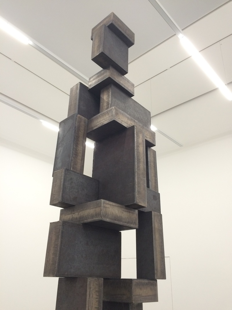
Antony Gormley, white cube exhibition
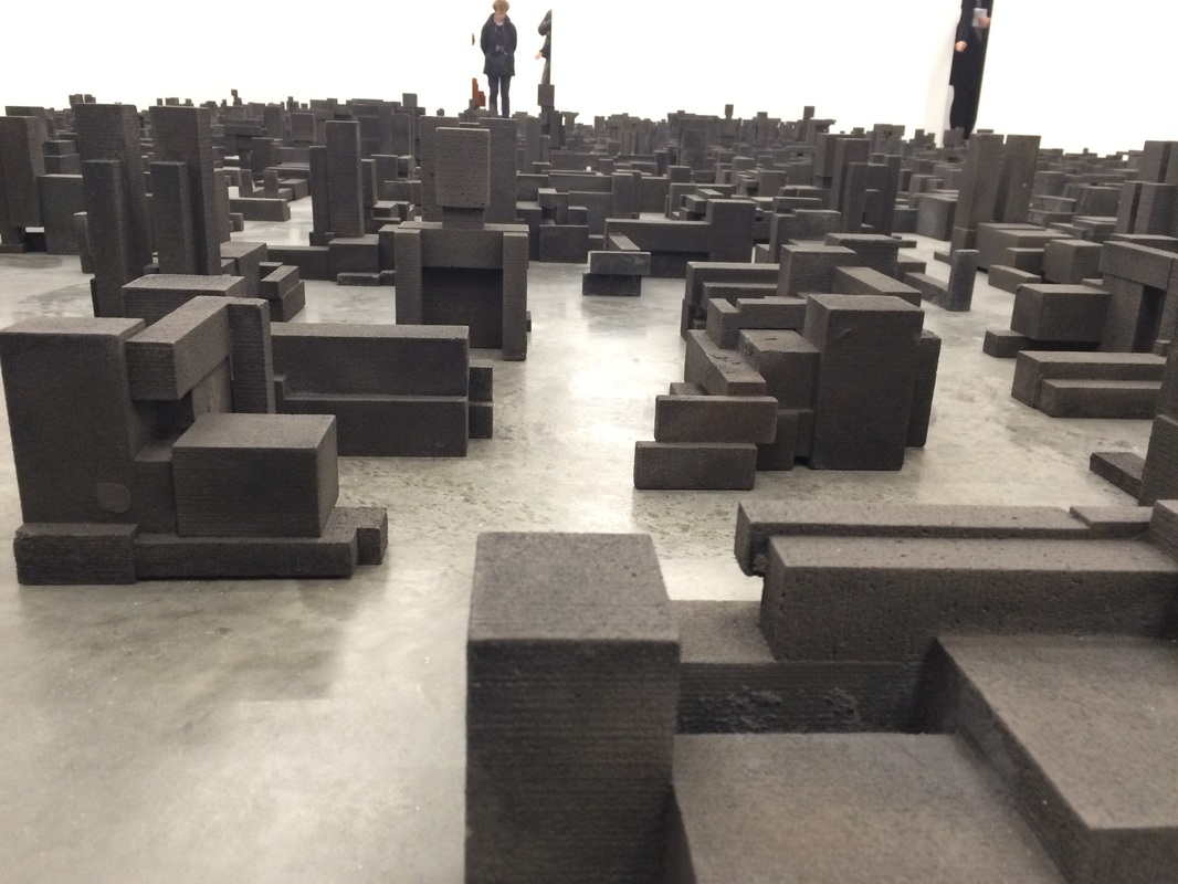
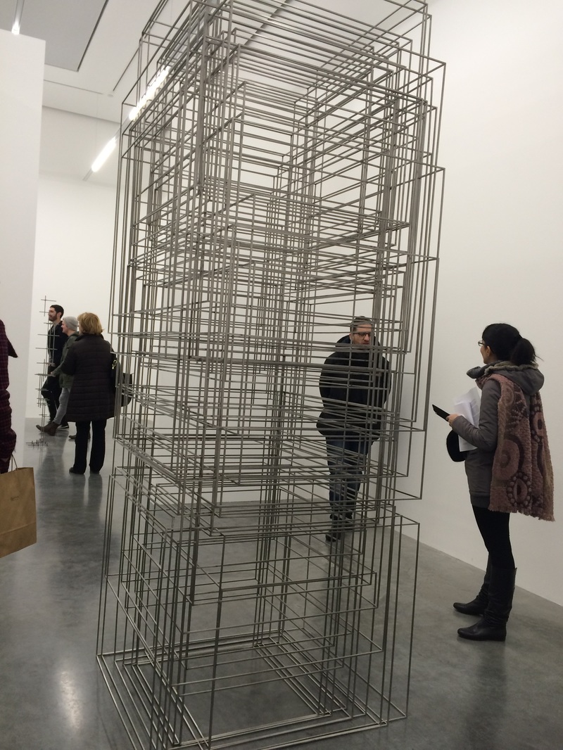
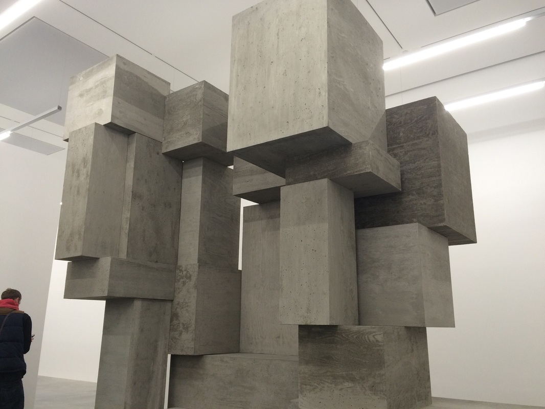
I went to see Antony Gormley's latest exhibition 'fit' at the white cube in Bermondsey, for some inspiration for my project photographing sculptures. The exhibition consisted of a mixture of large and small scale sculptures made from industrial materials like polished concrete and steel. The exhibition space was divided into quite a few different parts each section usually had one large sculpture apart from a couple. All of the sculptures where geometrical and could be comparable to architecture the large concrete and steel sculptures were almost comparable to buildings and foundations. The smaller sculptures especially the room filled with hundreds almost resembled a skyline. Seeing the exhibition gave me some ideas on my own project (photographing sculptures) I really want to experiment with creating some sculptures on a bigger scale.

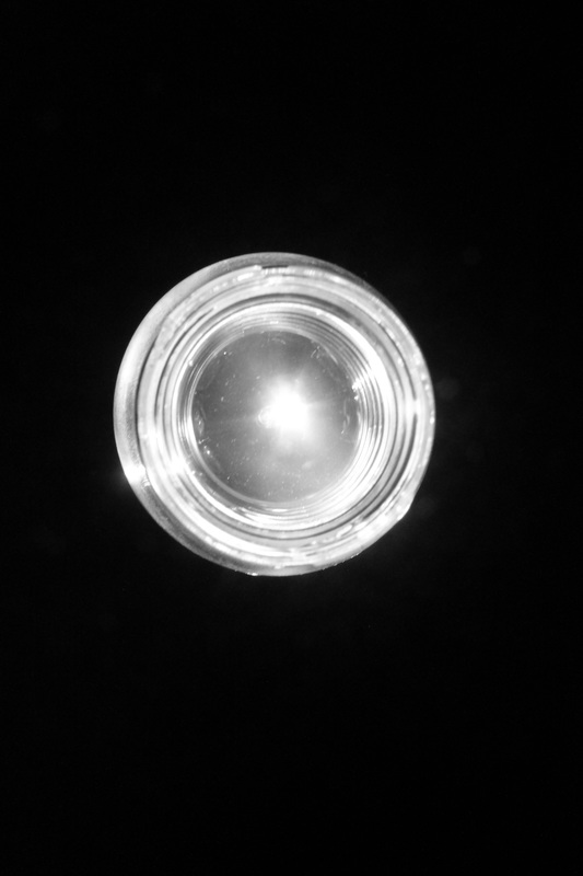
Jaromir Funke
Jaromir Funke was a early 20th century Czech modernist photographer. His use of lighting when photographing more sculptural subjects like in the images above interests me, turning a picture of some paper ,glass or a piece of tube into a really dramatic image, I think his use of lighting draws attention away from the quite ordinary subjects and really focus's on the abstract forms created by the reflections and shadows. I would like to try this with my images trying to recreate architectural shapes and structures with wood maybe even until the point when its unclear what the image is actually of but you can see the shapes and structures created by the wood . I would also like to include more paper and card in the sculptures I do next as there is more of an opportunity to cut and shape the paper more intricately and it would be nice to see what shadows and shapes could be produced from it .
Kurt Schwitters
Kurt Schwitters was a German born artist from Hanover he worked in several genre's including dadaism , surrealism and constructivism. Despite the fact that he was not a photographer and not all of his work is comparable to mine I am looking at one particular piece of his work known as the 'merzbau'. It could be described as a piece of installation art which he created in his own kitchen. Accumulating different pieces of wood and other materials and installing them into his kitchen until they created a big layered up sculpture converting his entire kitchen in to a piece of art. I like the way he used scrap pieces of material and made them fit into the rest of the sculpture rather than buying pieces of wood already made to size, I also am using scrap wood adapting my own ideas of the structures I want to make to fit the size and shape of the materials i'm using so I see kurt Schitters work as a useful point of reference for ideas.
suprematism
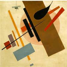
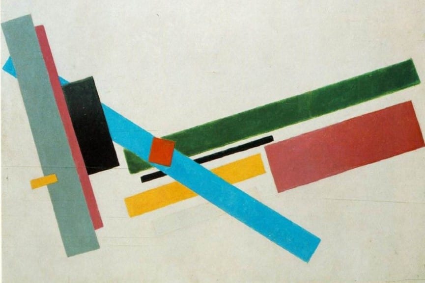
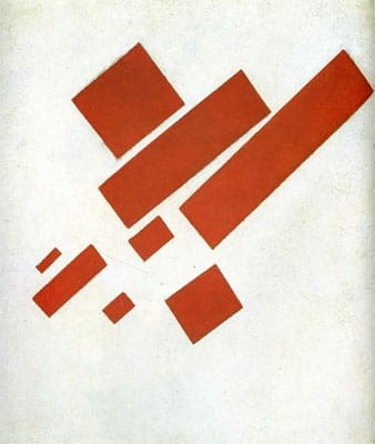
Suprematism was an art movement that started around 1913 and is focused on being very simple using basic geometric shapes. I thought the composition of these Suprematist pieces of work were quite similar to mine obviously they are paintings and mine are sculptures but the way the different lines and shapes are layered could be compared to the way the materials I used for my sculptures are composed and set up. A lot of the shapes although clearly defined do seem to merge into one bigger shape which I think happens when I photograph my sculptures some of the photographs present all of the wood as one large object rather than separate pieces.
Relationship between sculpture and photography.
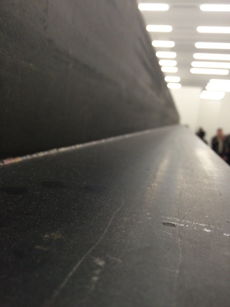
The relationship between photography and sculpture is odd, by taking a photo of a sculpture you are essentially flattening the sculpture making it 2d due to the fact whatever you are viewing the image on whether a screen or print it's flat. You are then seeing it in a completely different light as the whole idea of a sculpture is it being a very physical form of art something thats there right in front of you that you can feel and touch thats quite interactive almost, by creating a photo of it you are taking that aspect away from the sculpture it's no long a 3d physical object there in front of you the only thing physical about it is whatever the image is presented on which changes the interaction between the piece of art and the viewer. The idea of taking the 3d aspect away from the sculpture is interesting as recording an image rather than photographing it would allow you to pan around the sculpture showing every angle of the sculpture which would show the 3d nature of the object however what ever your viewing the image on is still flat. It would be interesting to experiment with how I can best photographing my sculptures to show the 3d nature of them with lighting and shadow despite the fact the finished product will always be flat.
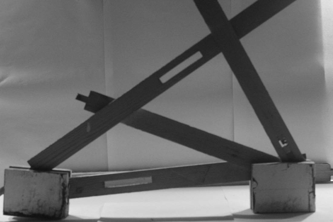
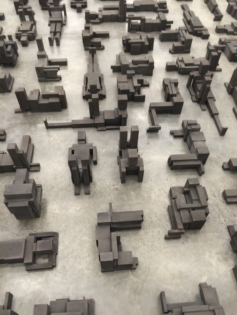
More sculptures
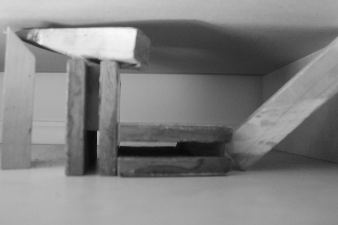
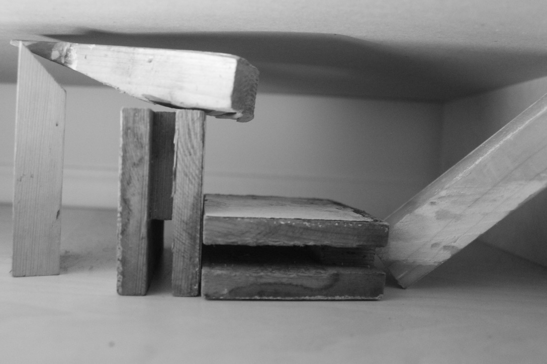


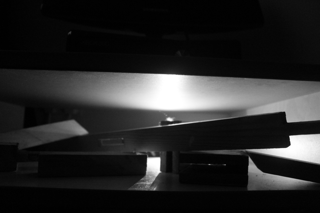
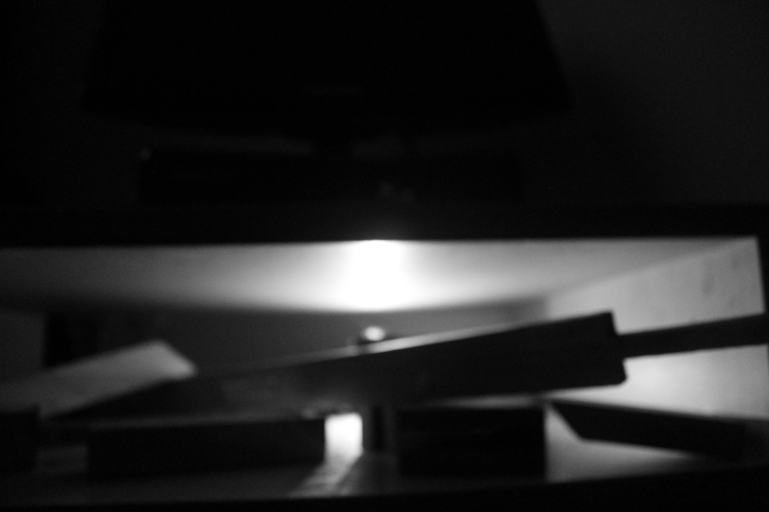
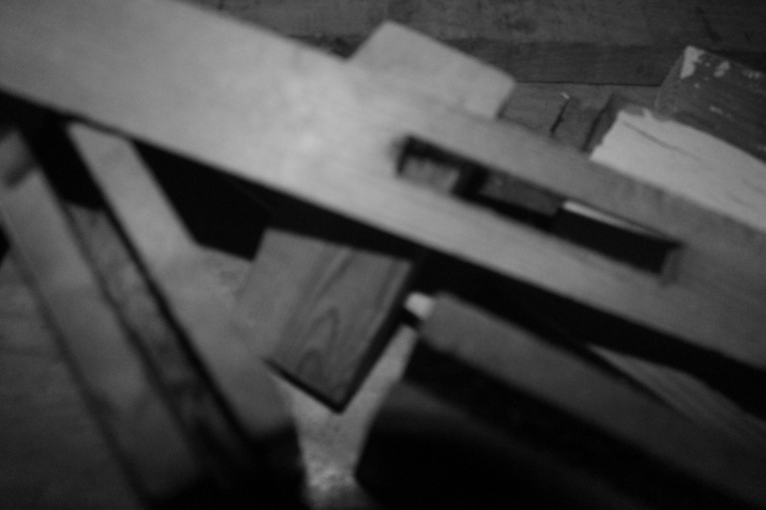
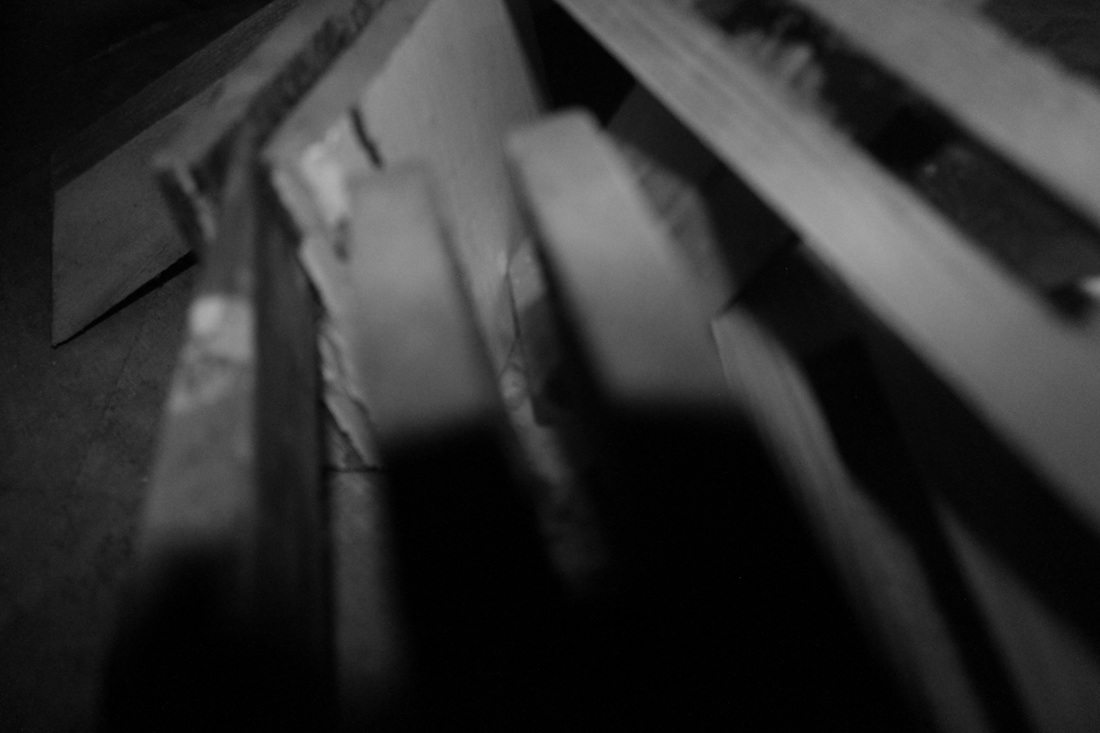

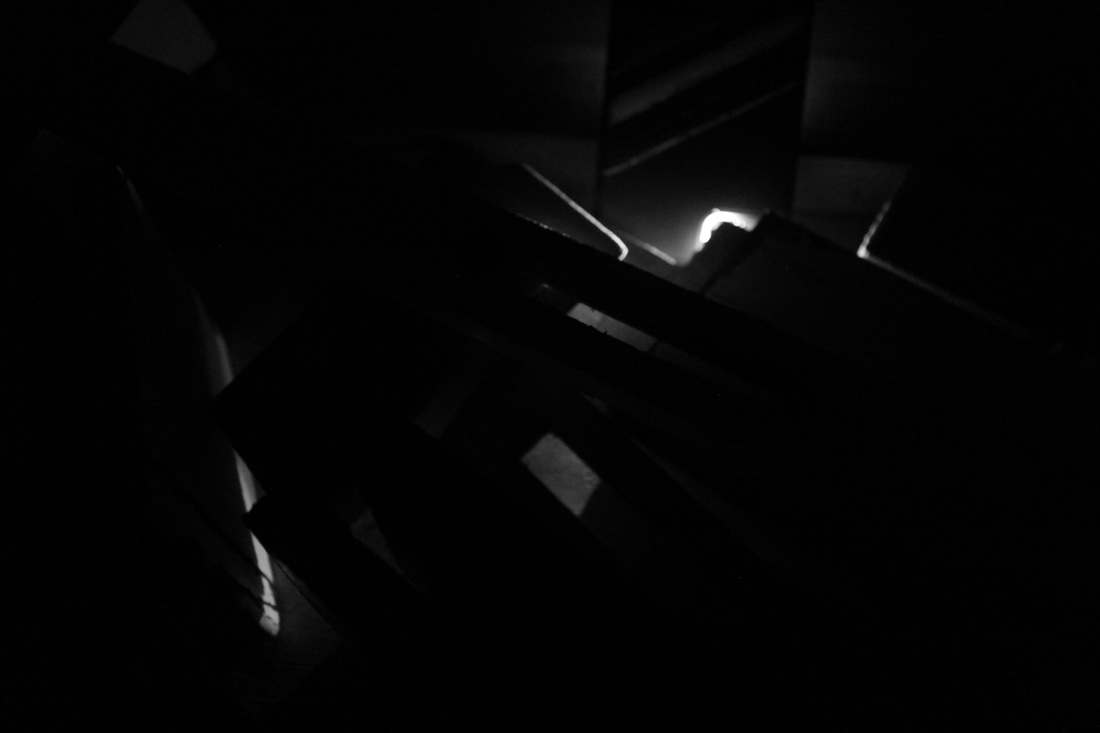
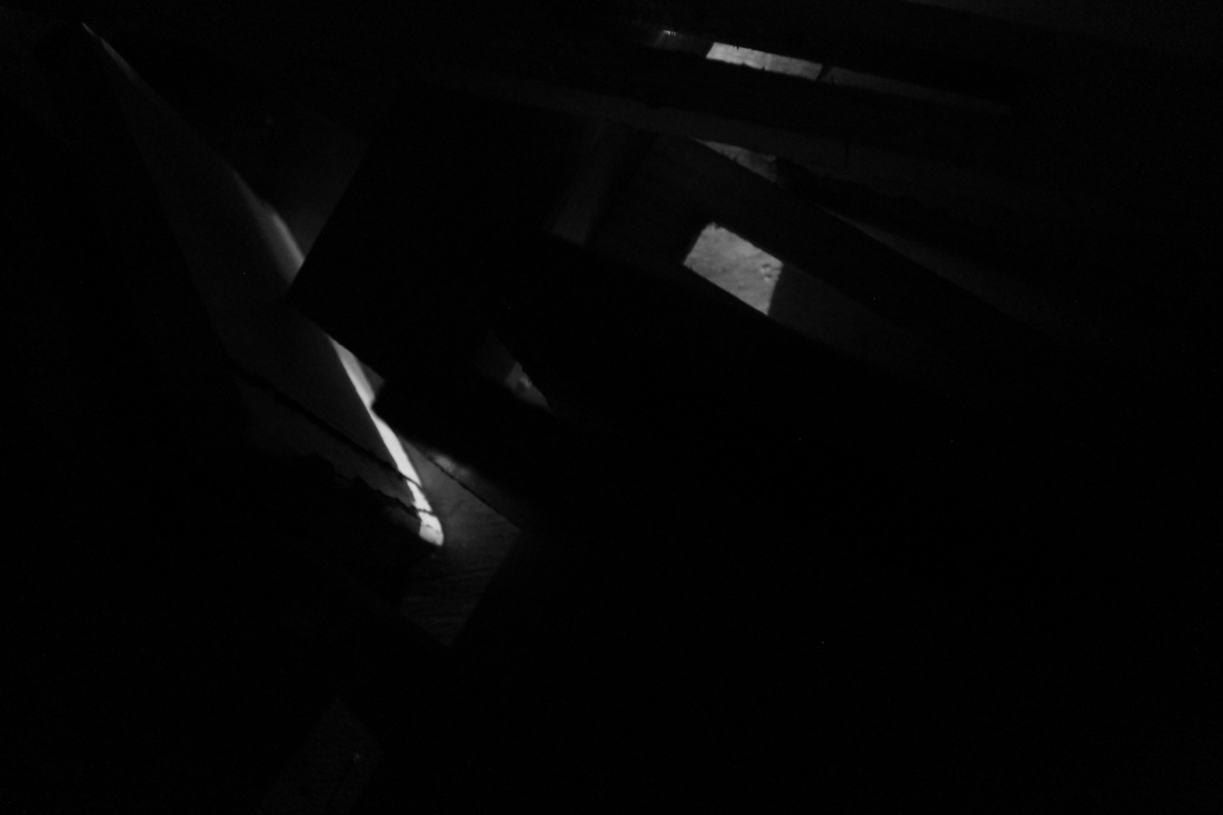
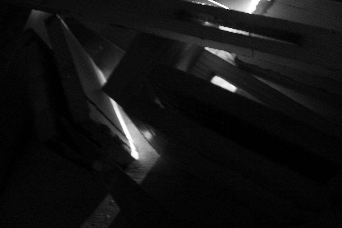
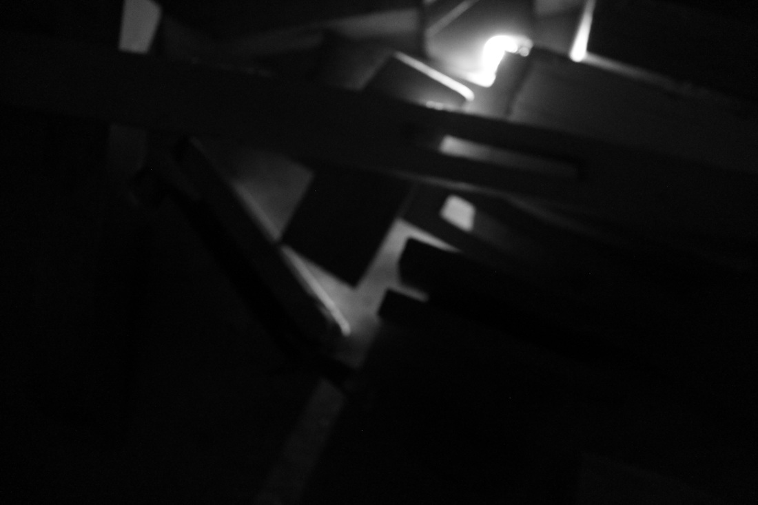
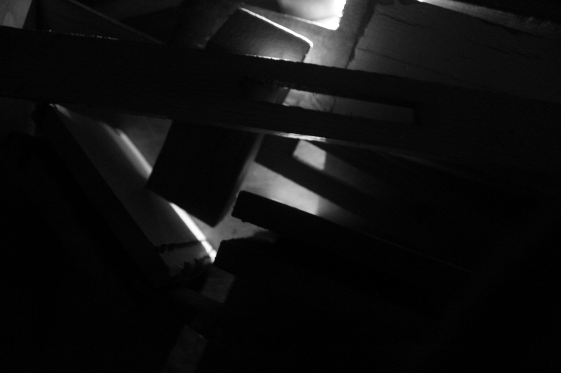
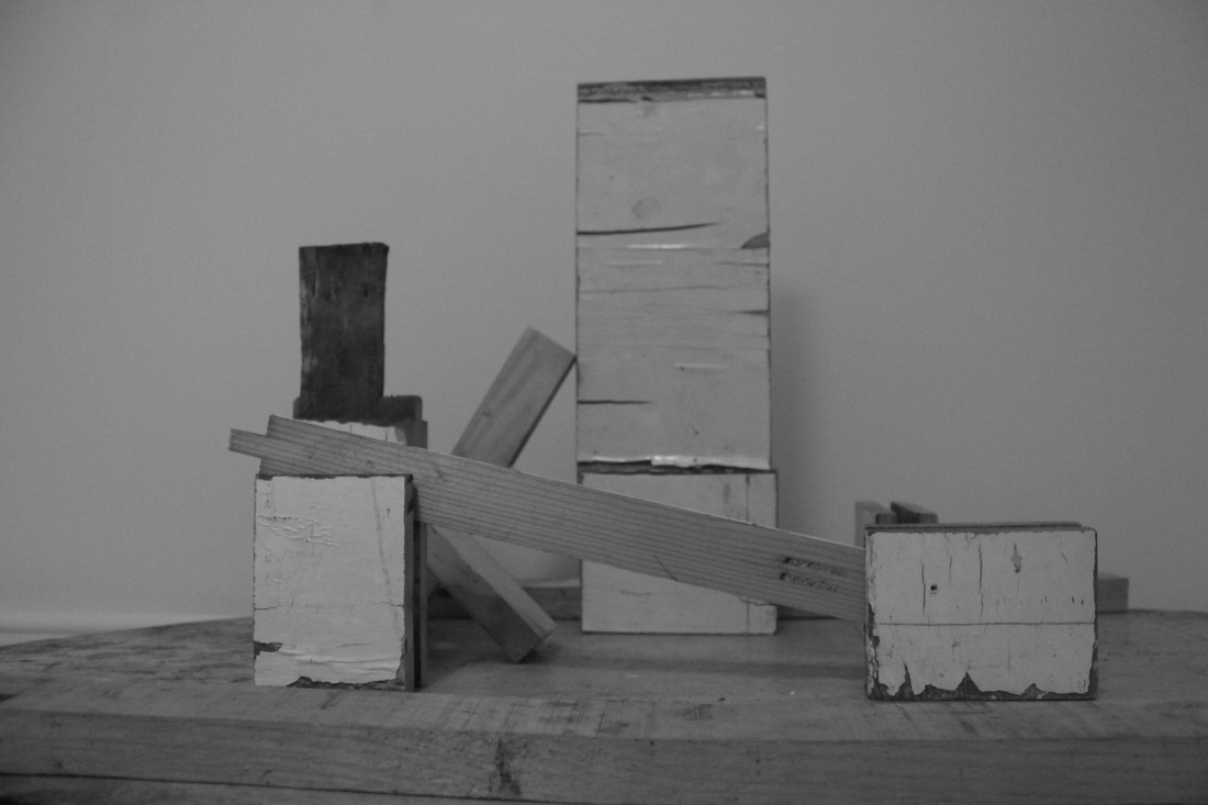


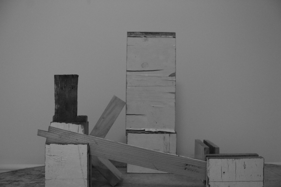
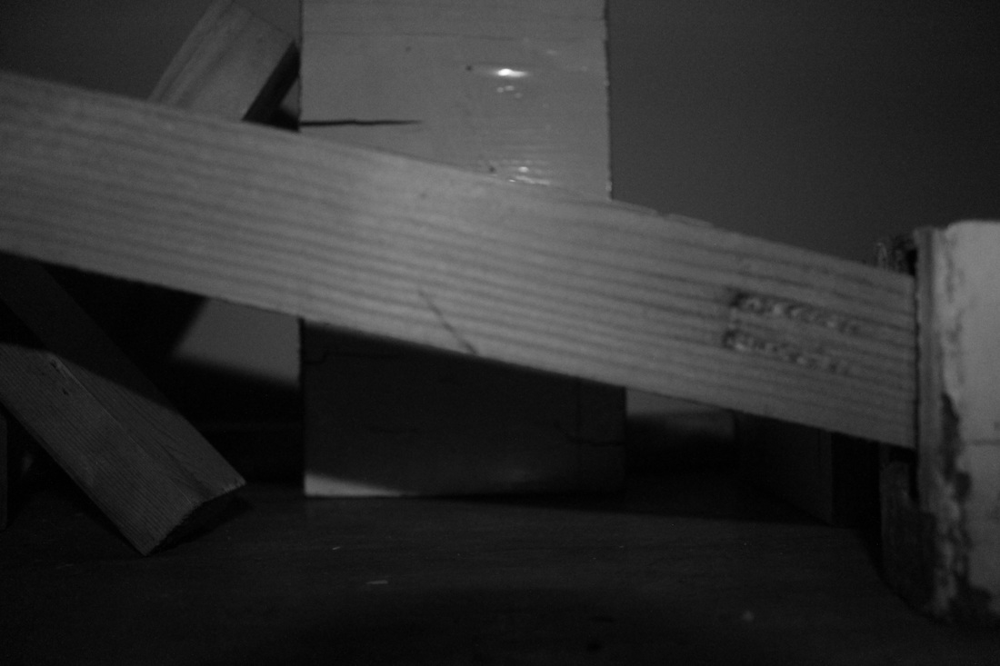
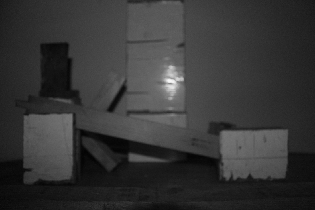
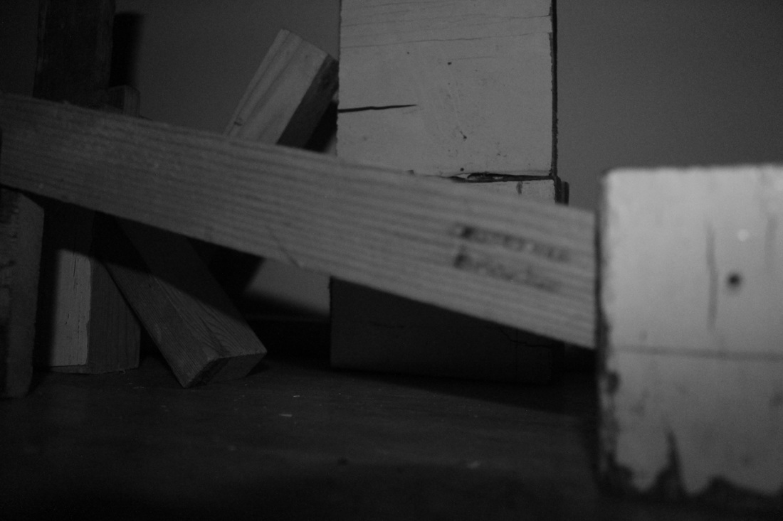
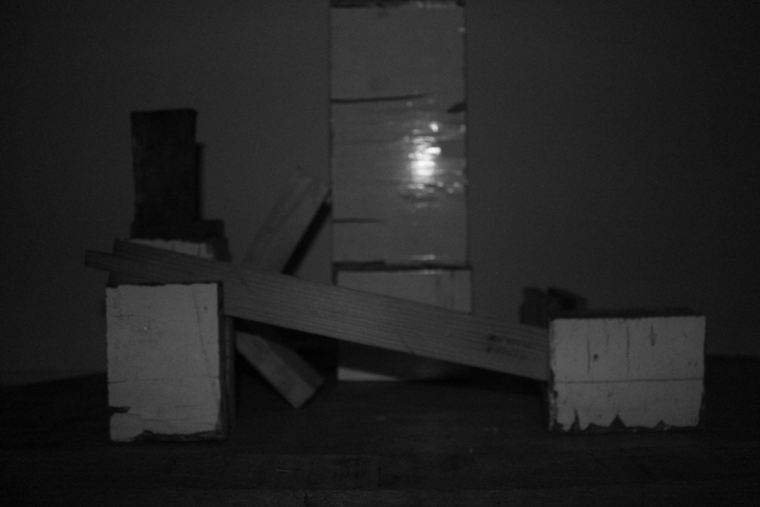
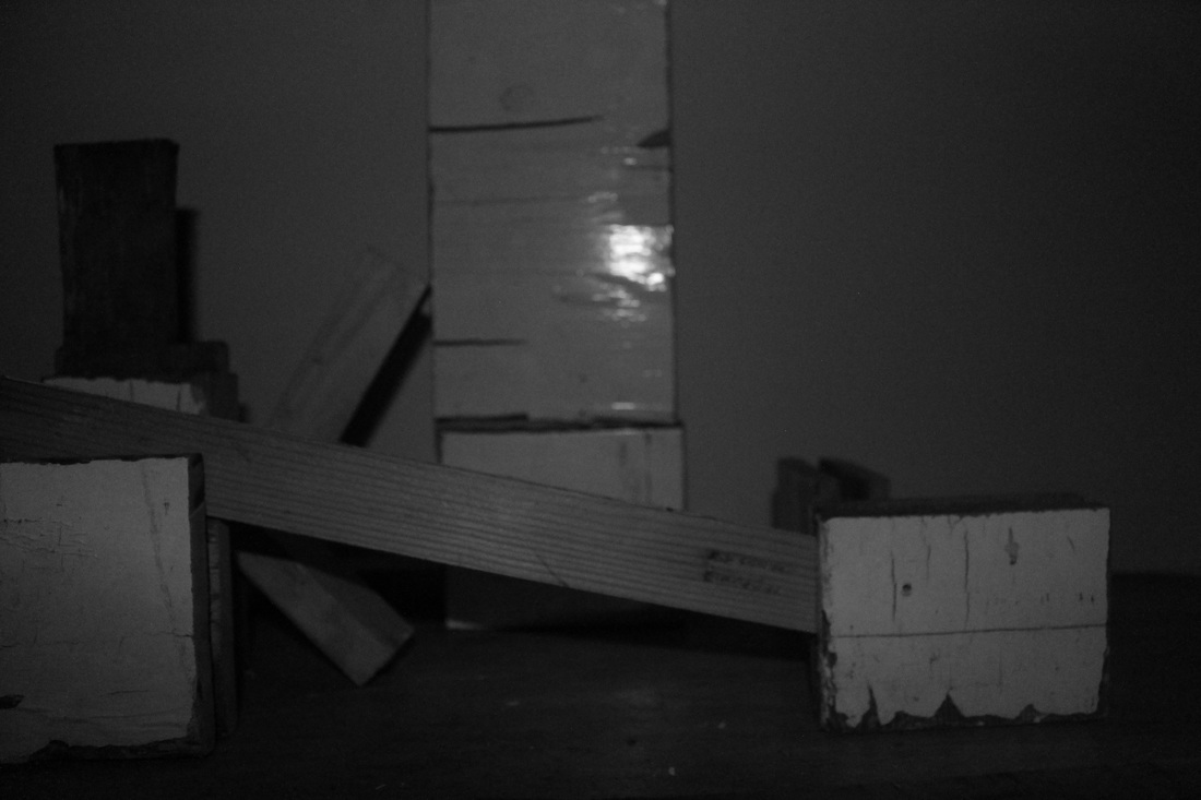

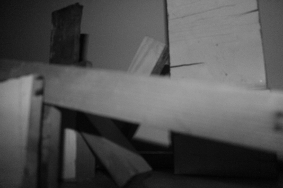
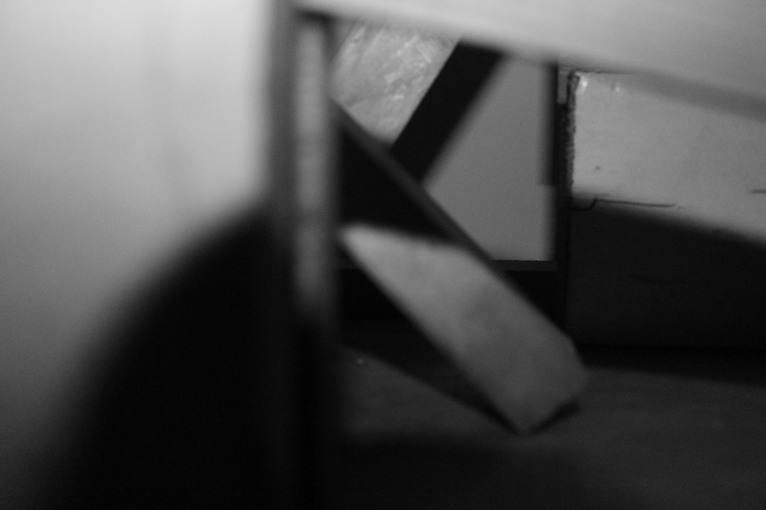
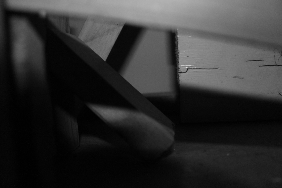
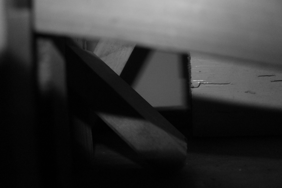
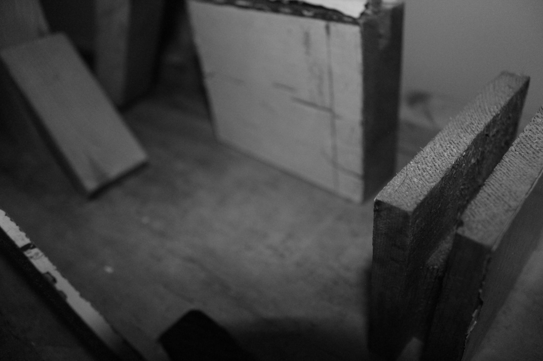
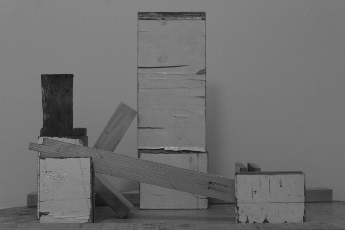
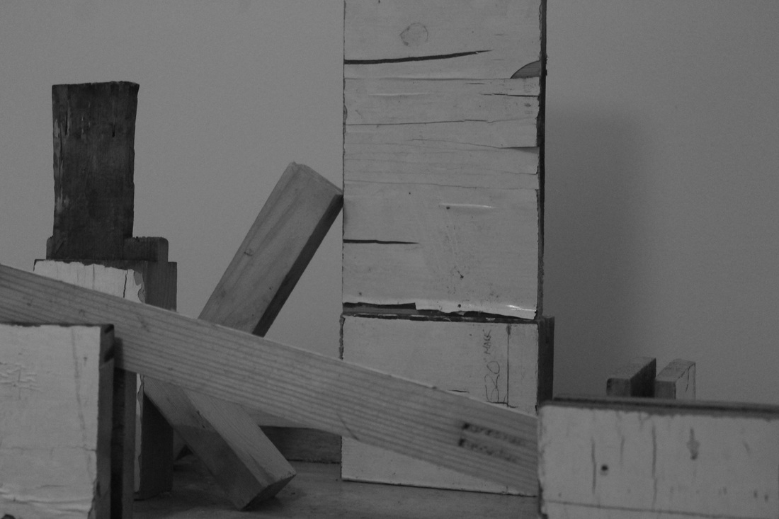
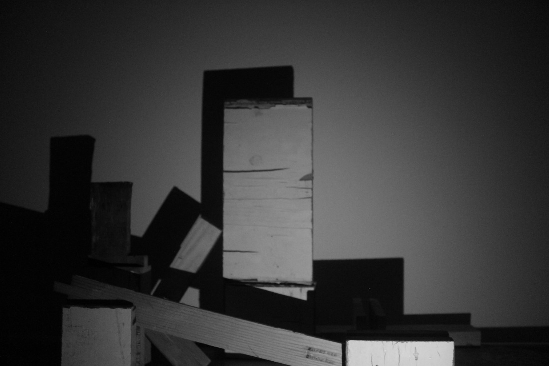
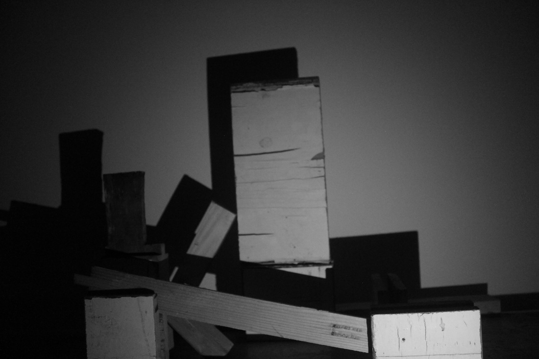
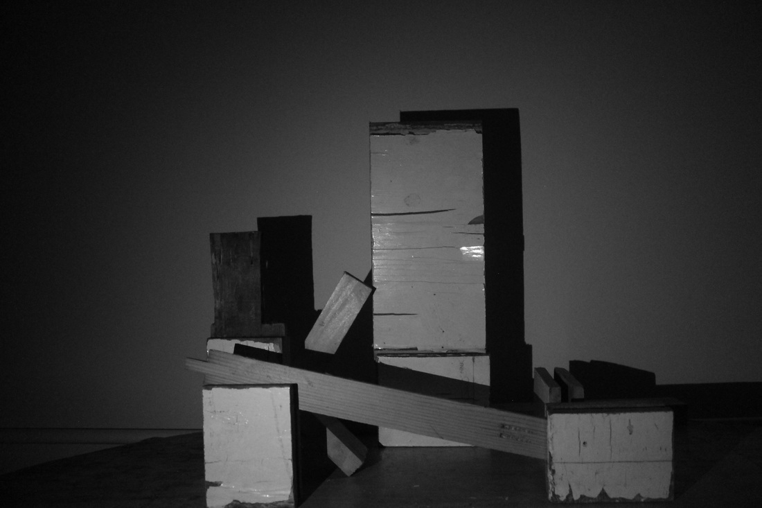
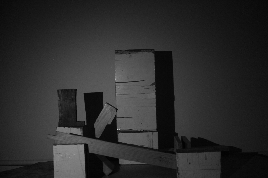
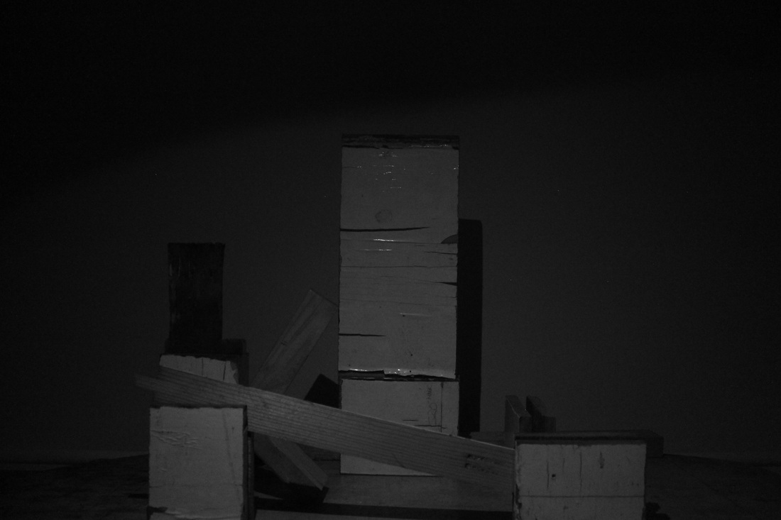
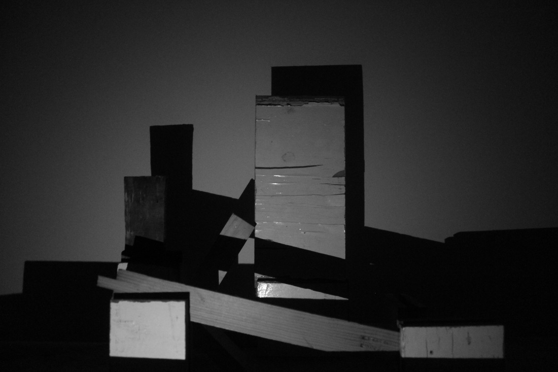
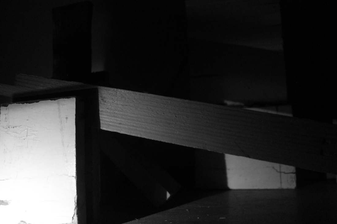
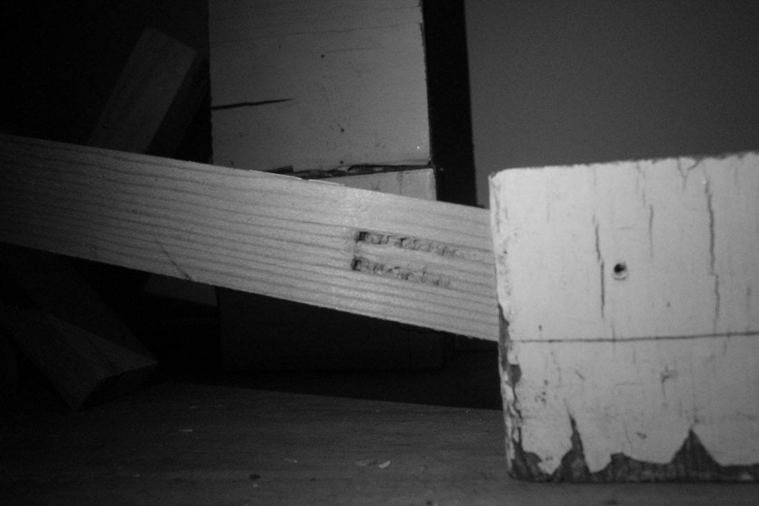
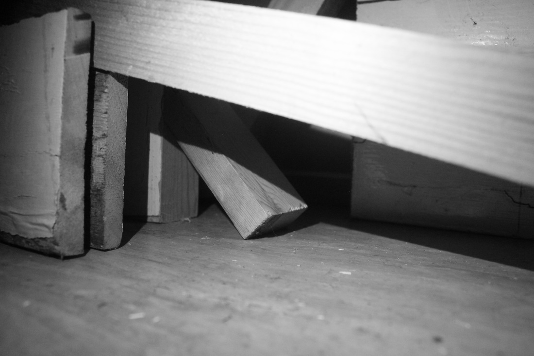
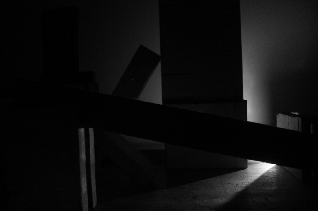
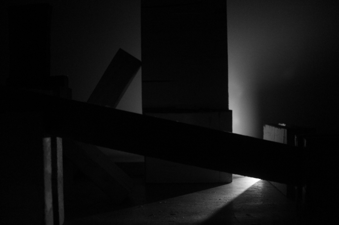
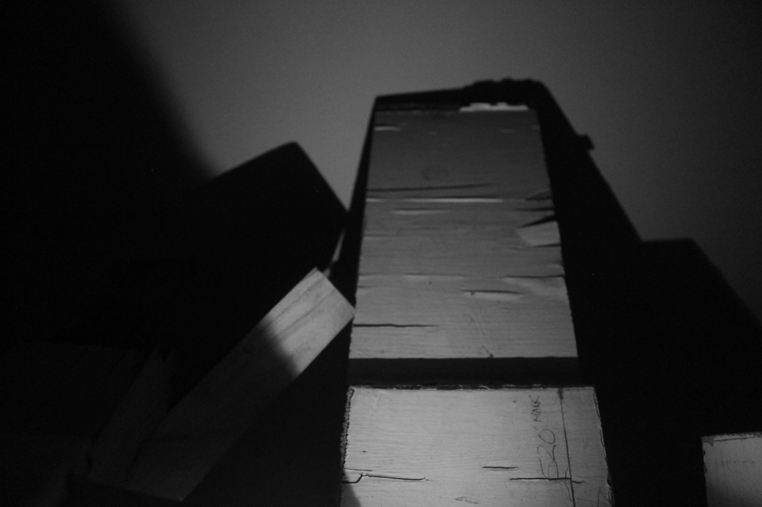
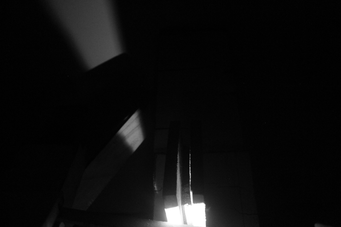
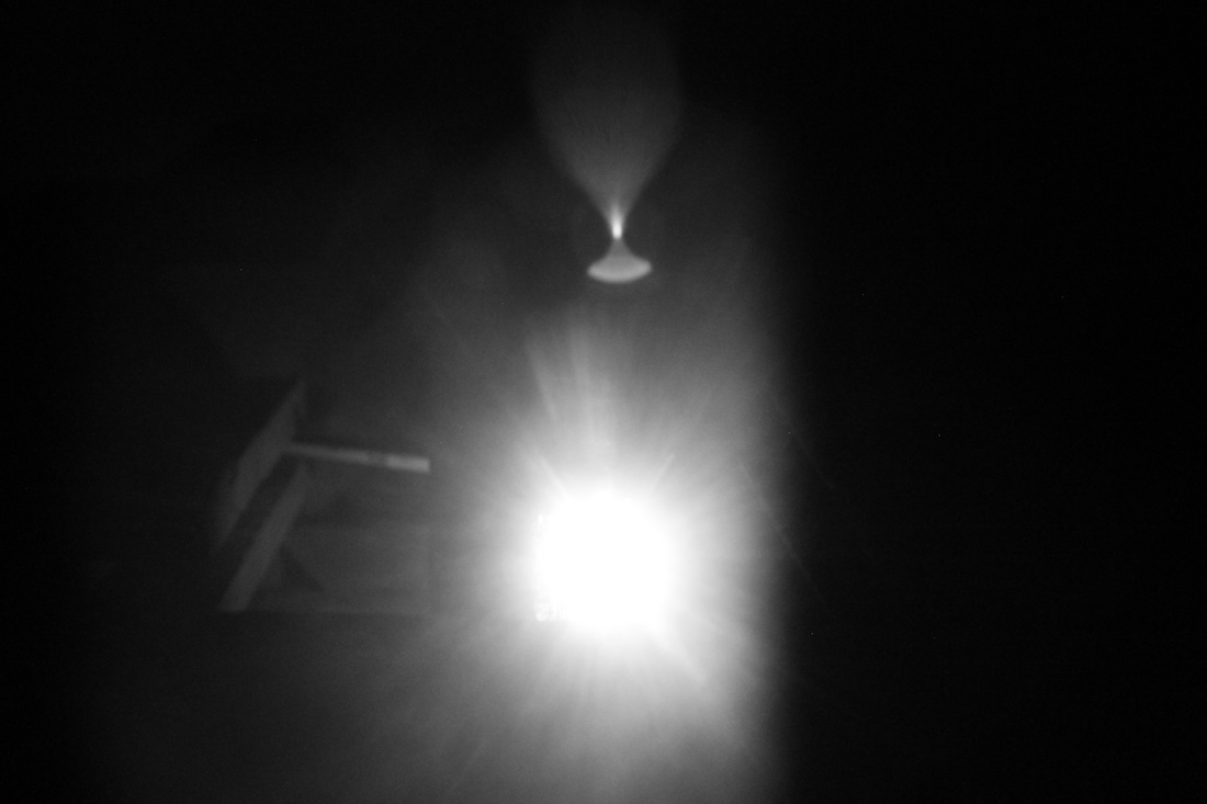
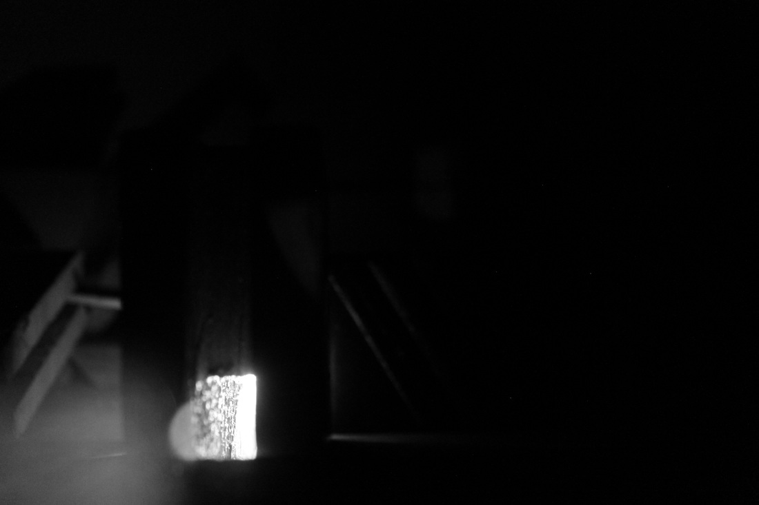
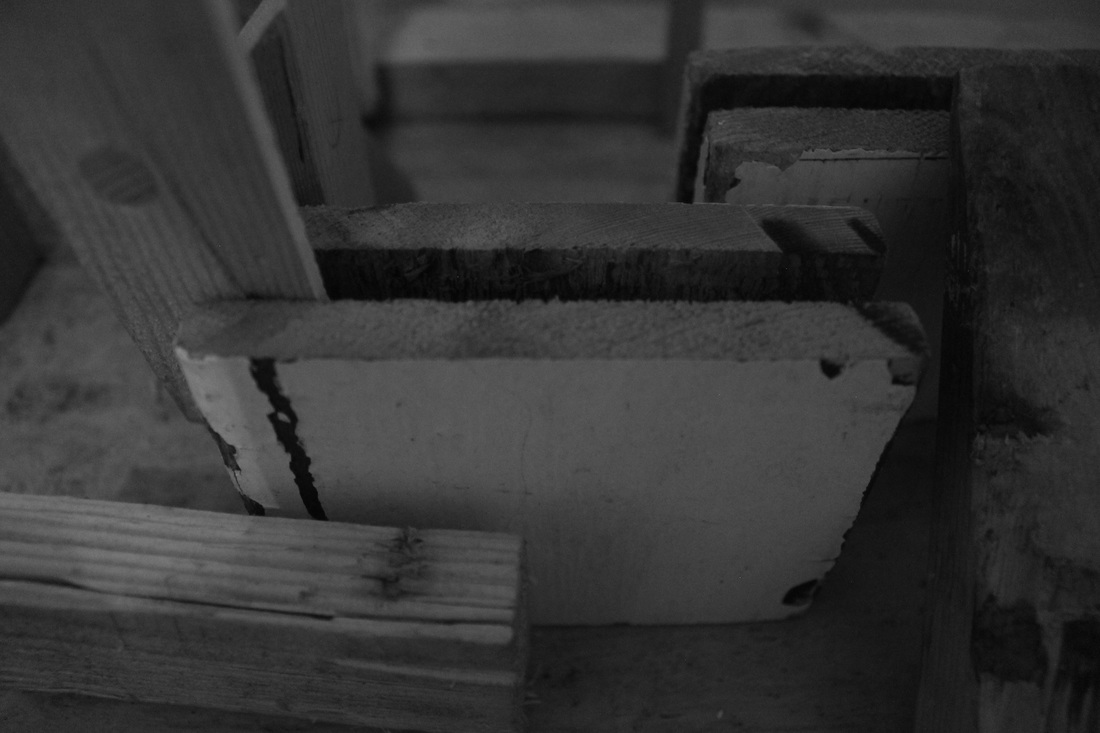
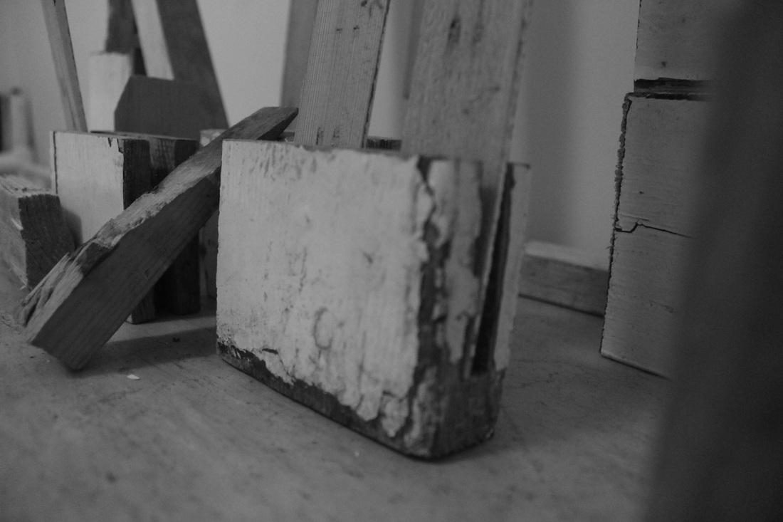
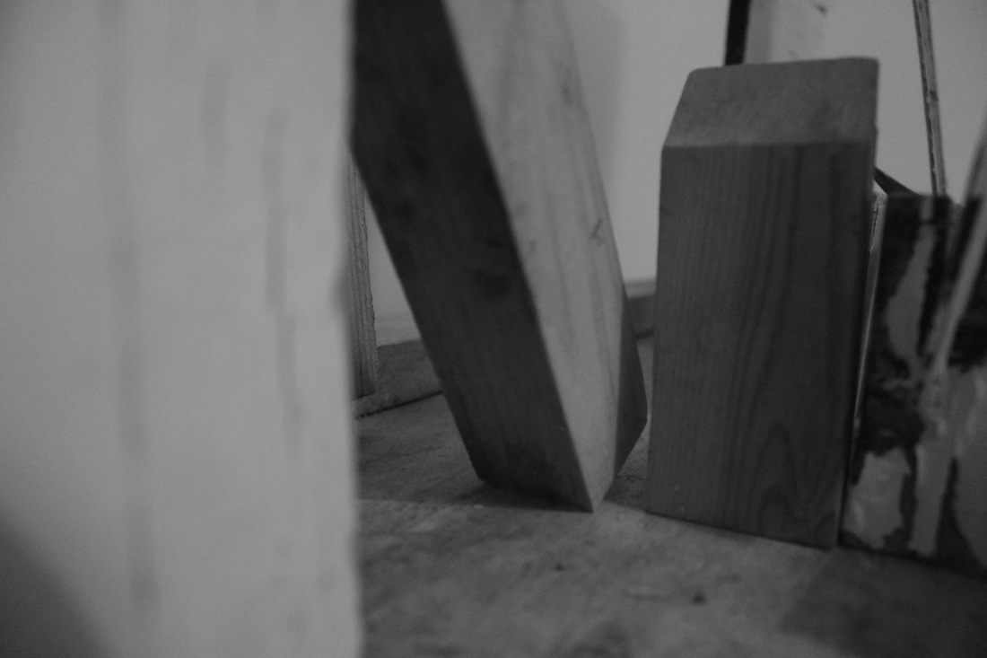
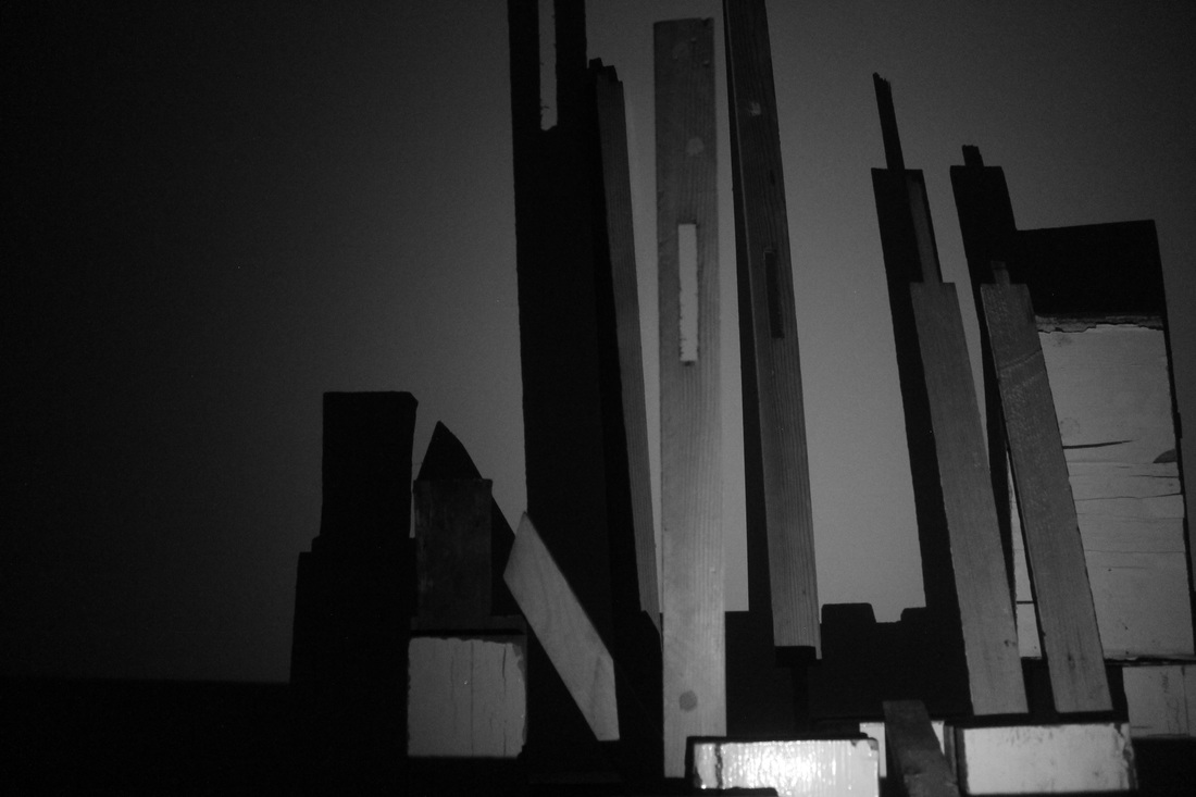
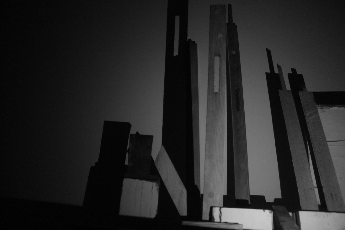
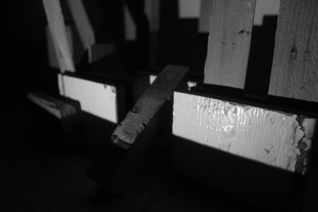
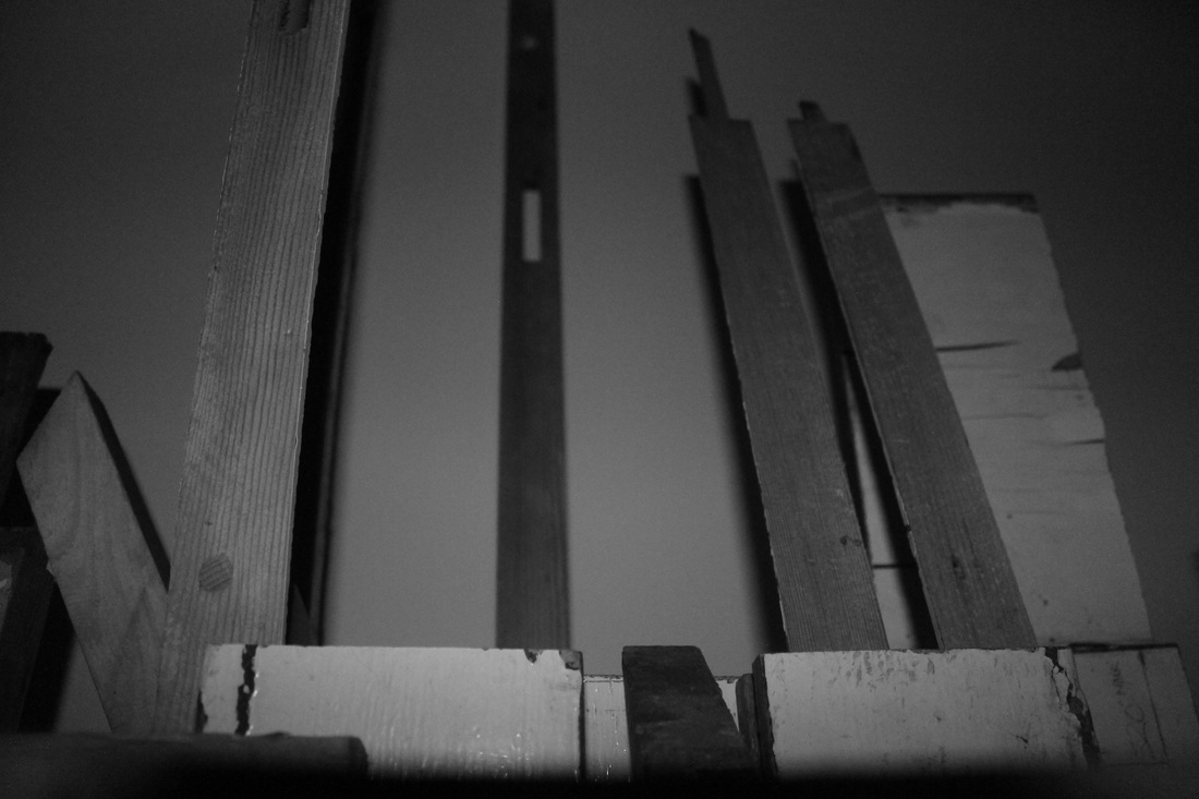
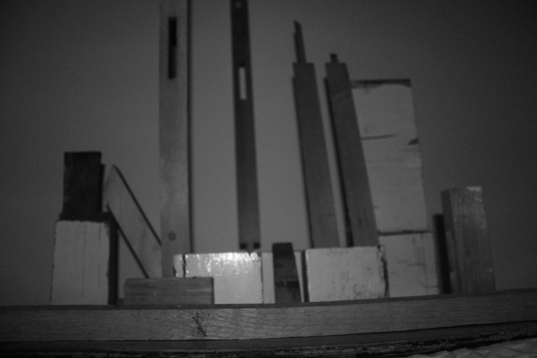
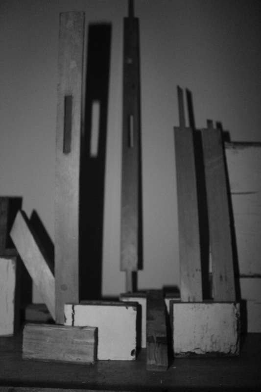
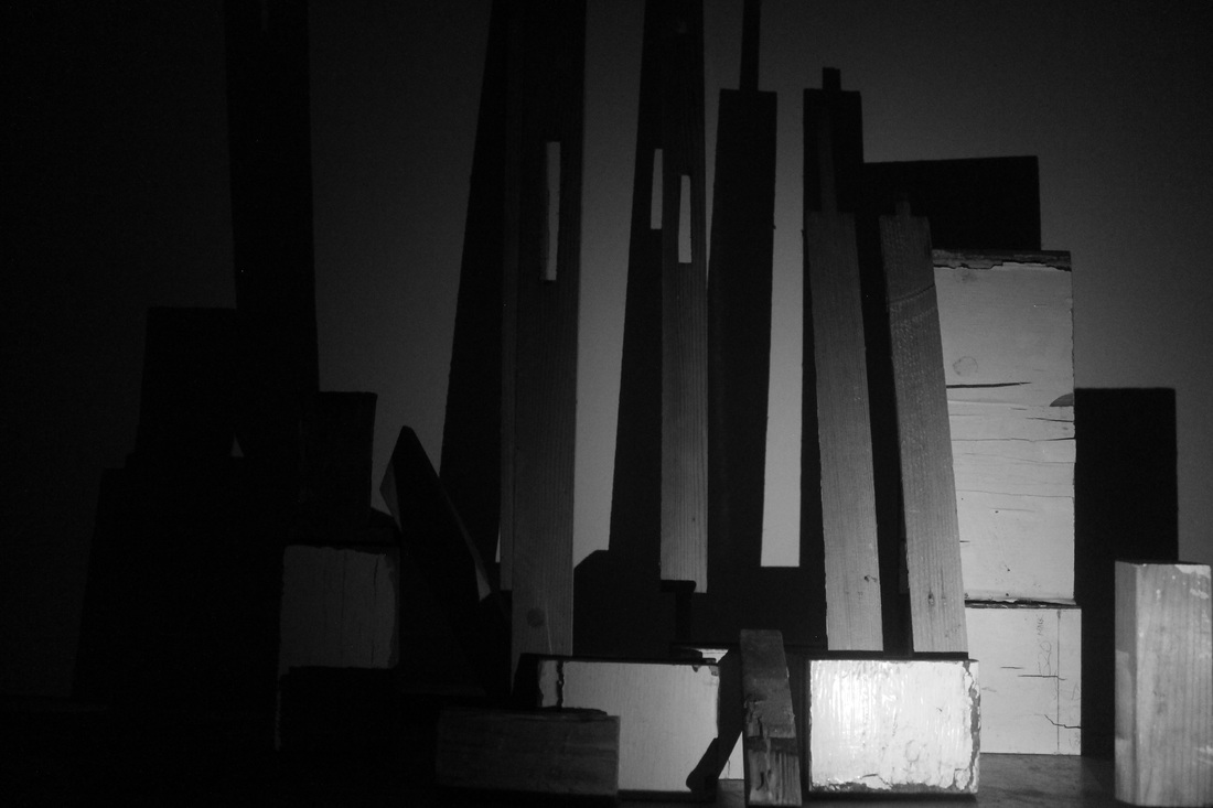
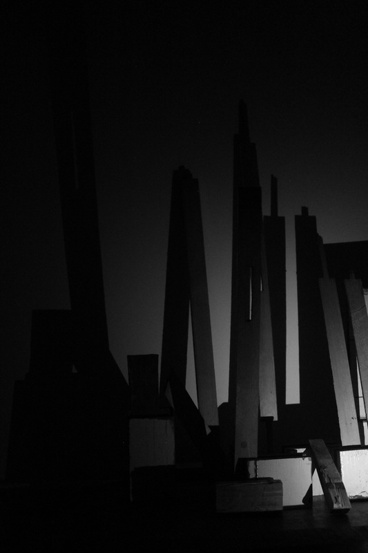
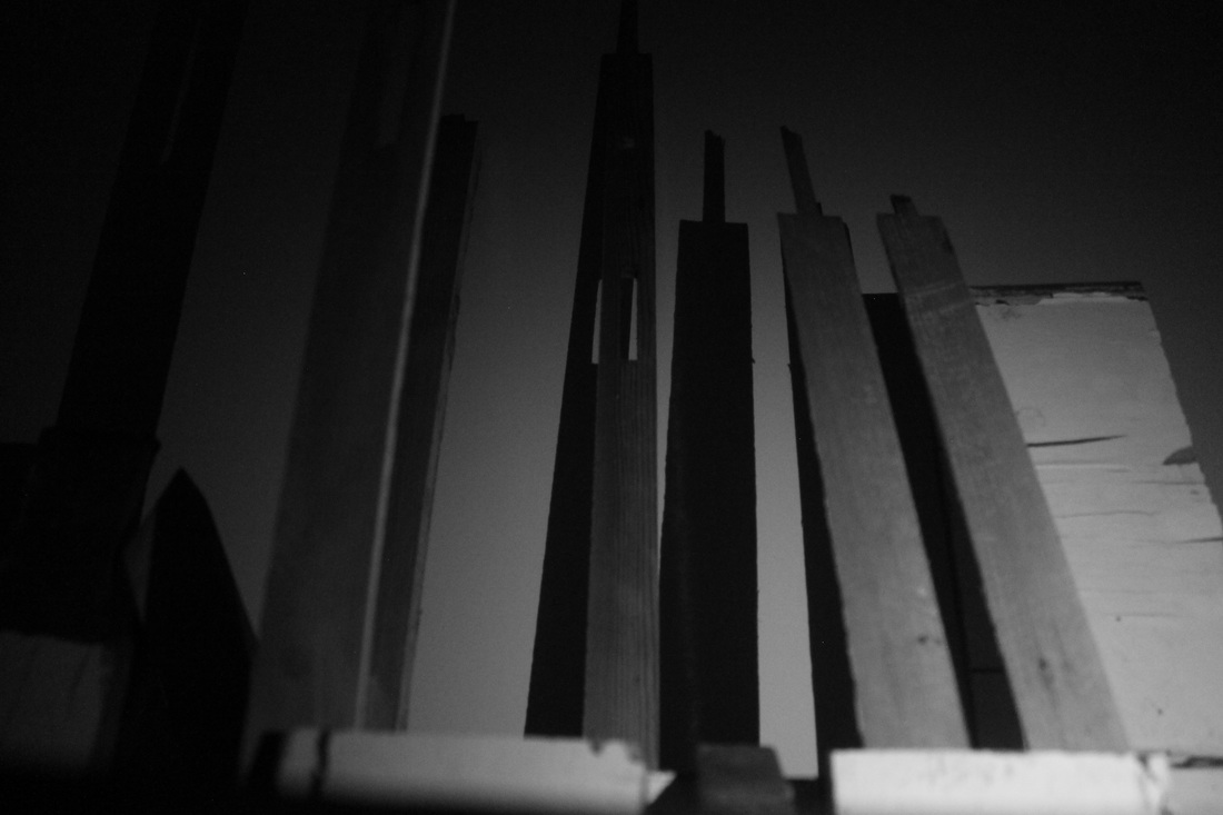
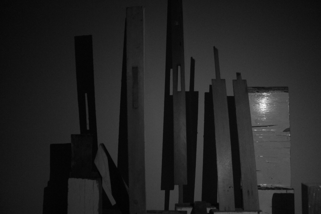
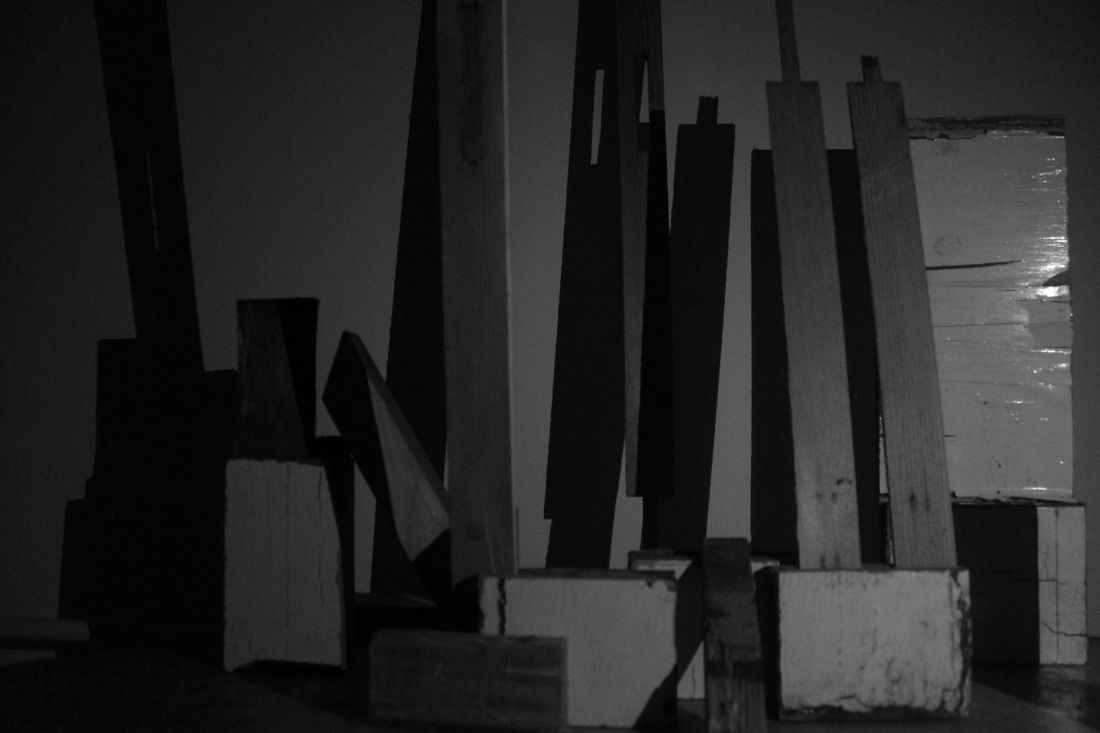


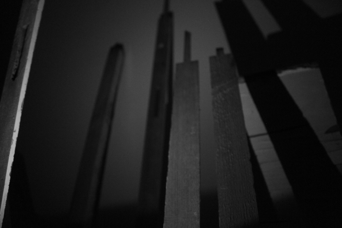
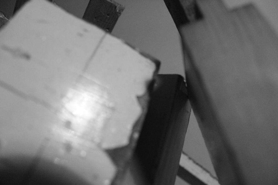
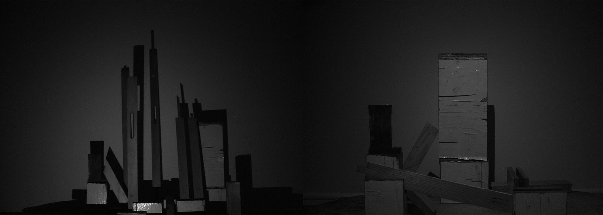
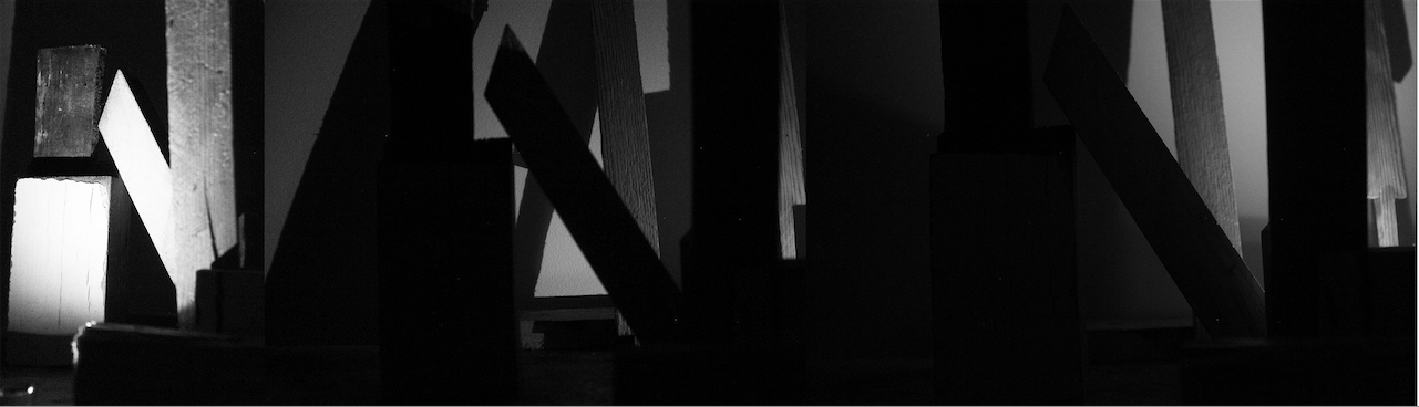
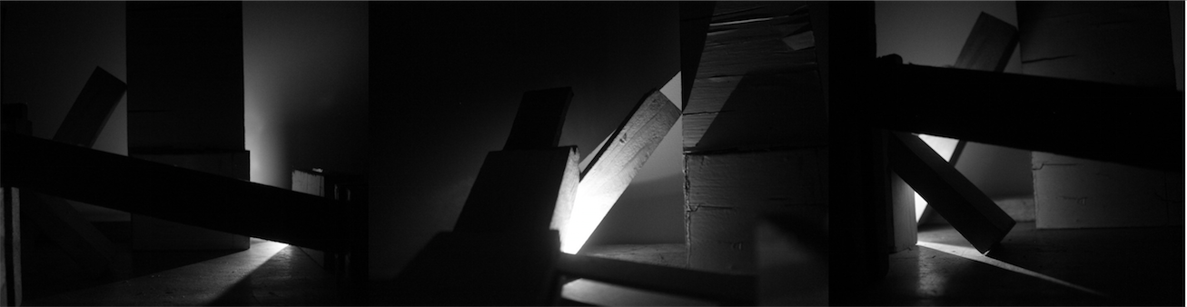
I took these images to build upon the ones I had taken previously and I was really pleased with the out come. I experimented with where I took the images , how I took the images and the shapes and structures I created out the wood. I set up the sculptures in a range of places some where set up between a shelf, some where just piled up on the floor and the larger more precarious sculptures were set up on a table with a white background. I took the images in a variety of ways, in some images I tried to capture the entire sculpture focusing more on the shapes and abstract forms and in others I zoomed in concentrating on small parts of the structures where texture was more of the focus. I also used different lightings for some the room was fully lit , others the room was dark and I used a flash and for others the room was dark and I used my phone to light it up creating interesting shadows the darker the images where the more they focused solely on the shapes and forms and the less they they focused on the materials the sculpture was made of . The sculptures are quite a mix some where quite neat and precisely stacked for others the wood was piled up quite messily and others were set up to resemble a sky line.
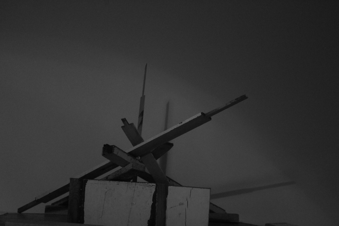
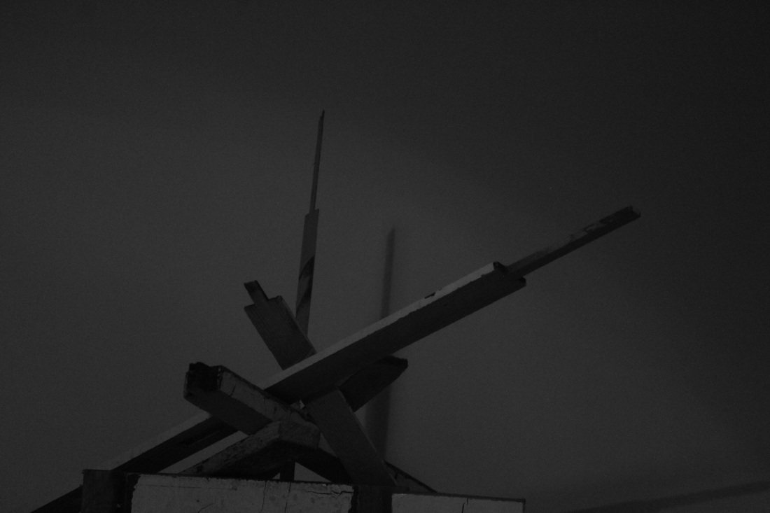
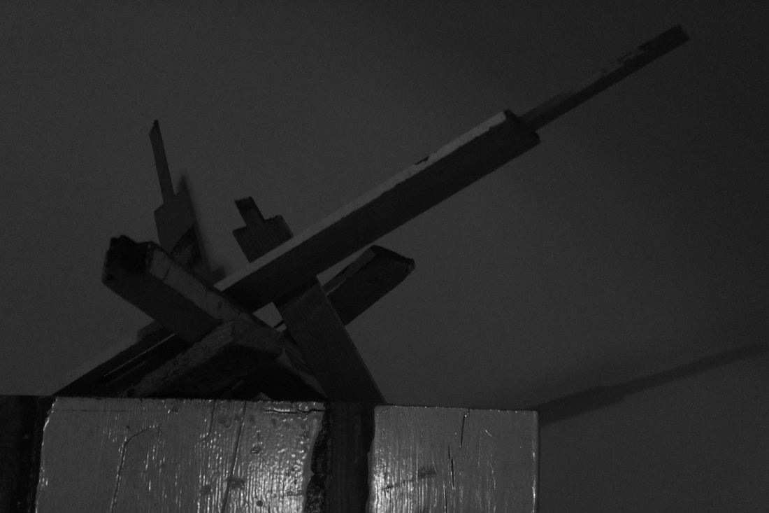
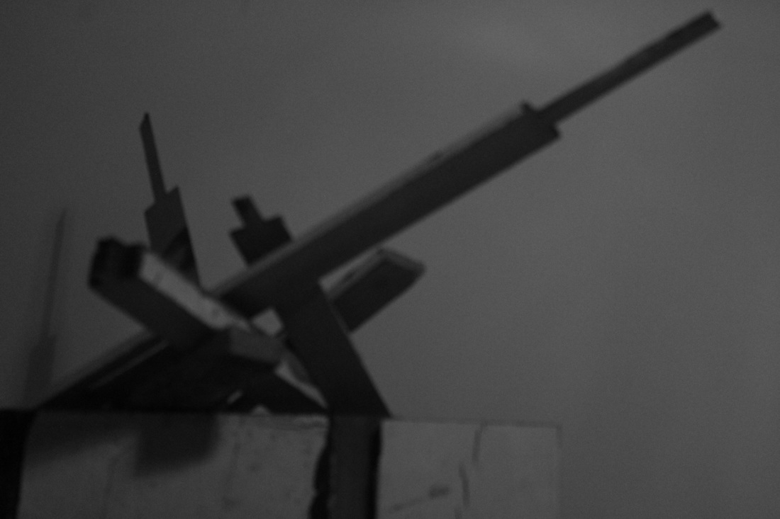
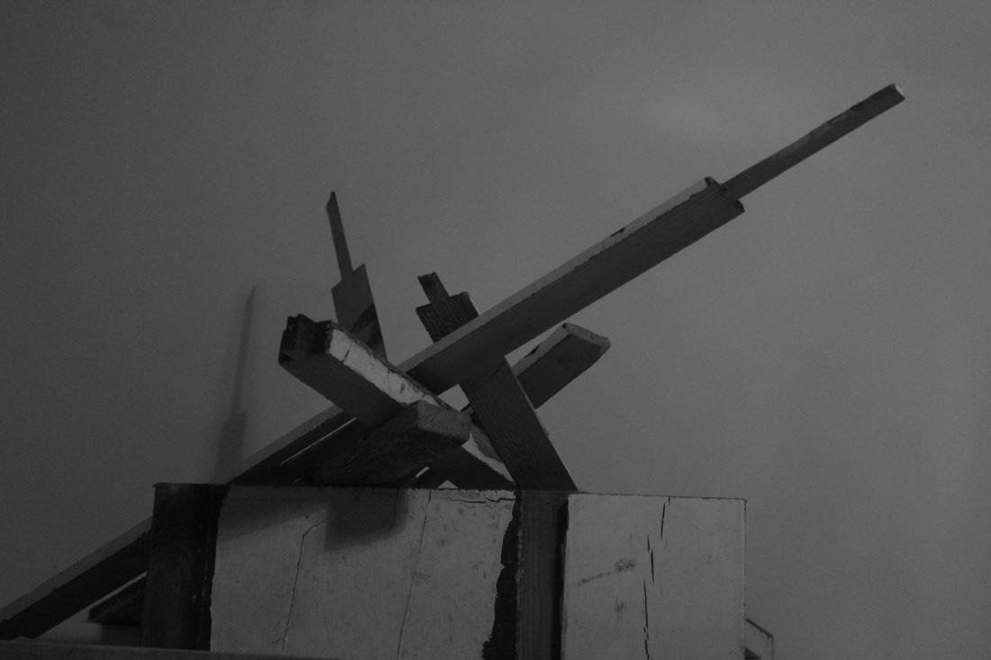
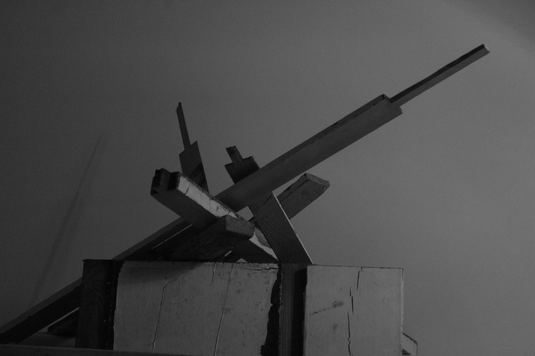
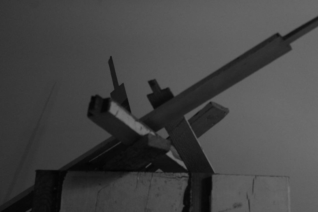
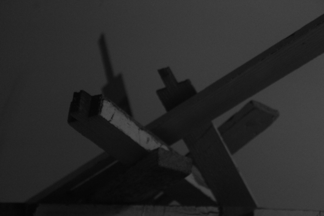

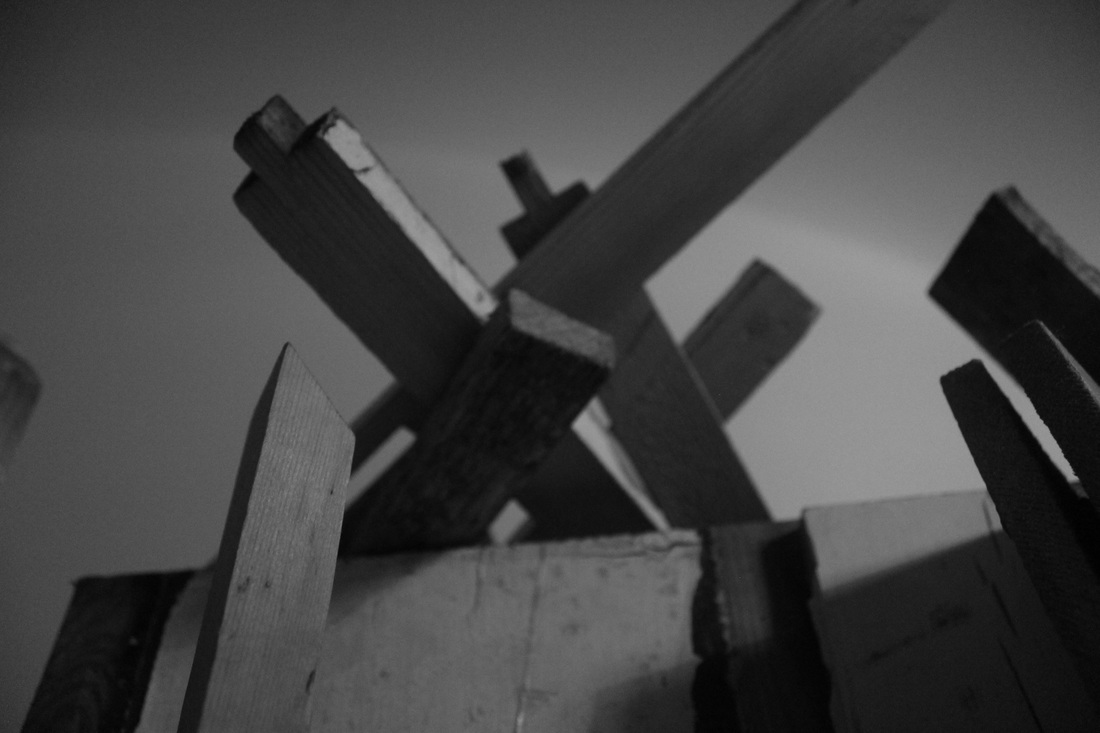
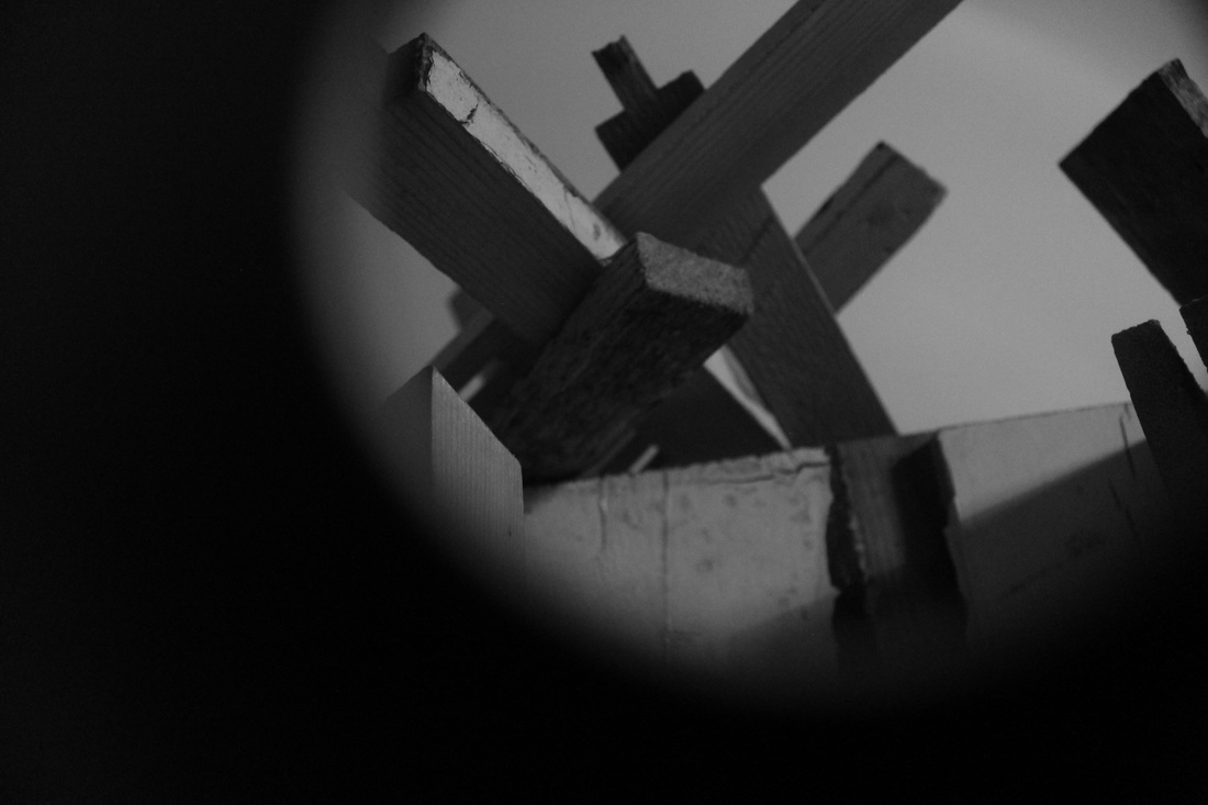
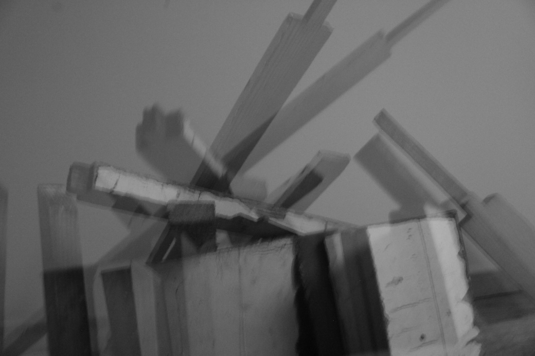

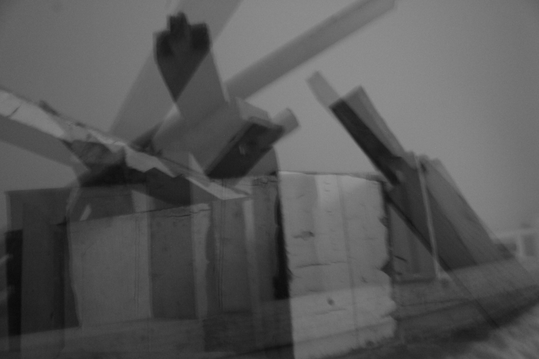
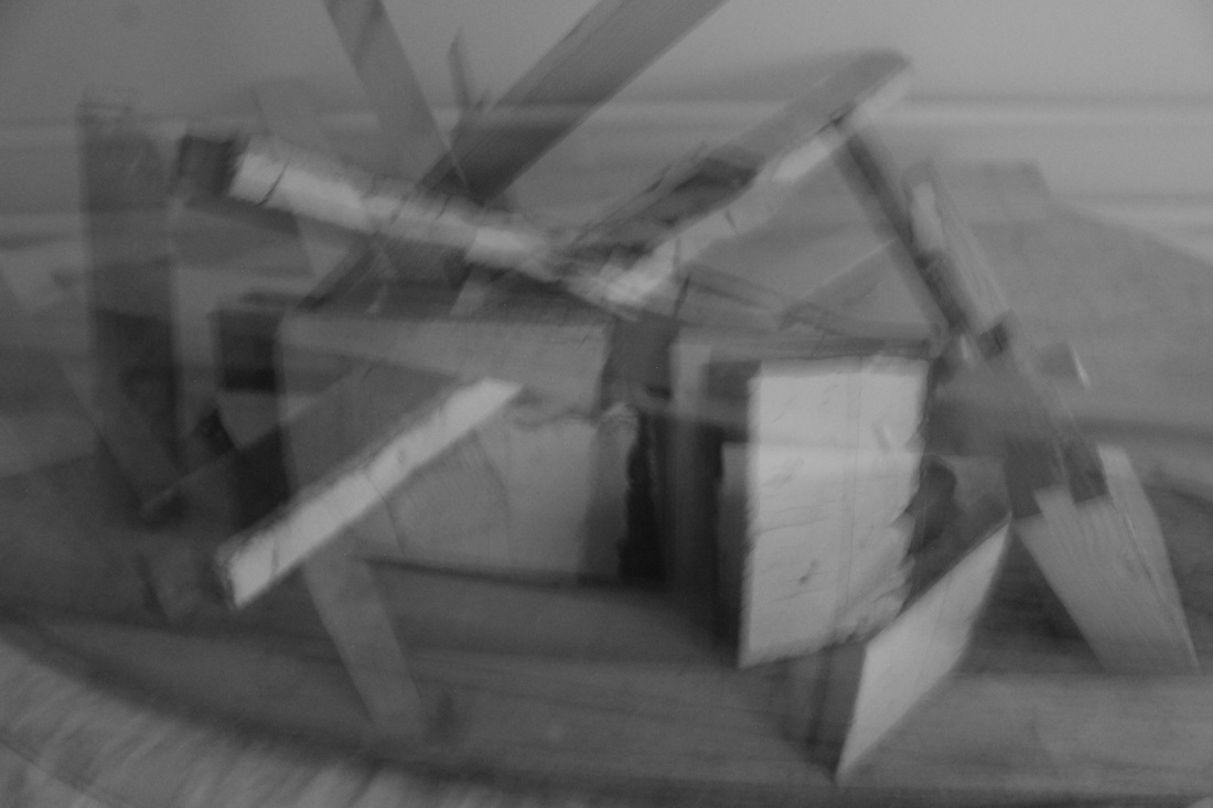
After discussing my images in class some really interesting points came up. A lot of people mentioned how they felt the images lost a sense of scale, the fact they had nothing to compare the sculptures size to in the images left people wondering whether the sculptures were tiny or massive, especially with the more zoomed in images where it almost looked like I could be walking through a room full of the wood. Building on this People mentioned how they felt the images could feel quite claustrophobic as the sculptures were quite imposing and almost felt like they were encroaching in on the viewers space. It was also mentioned how some of these images have quite a militaristic feel to them looking comparable to some kind of artillery guns with all of the wood going in different directions and angles
edits (for final pieces)


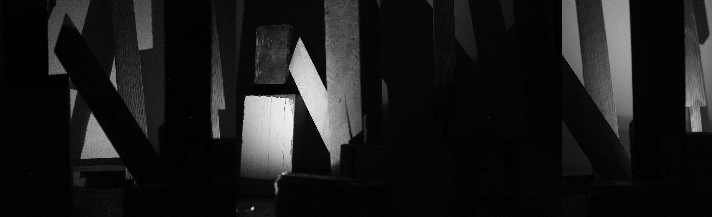
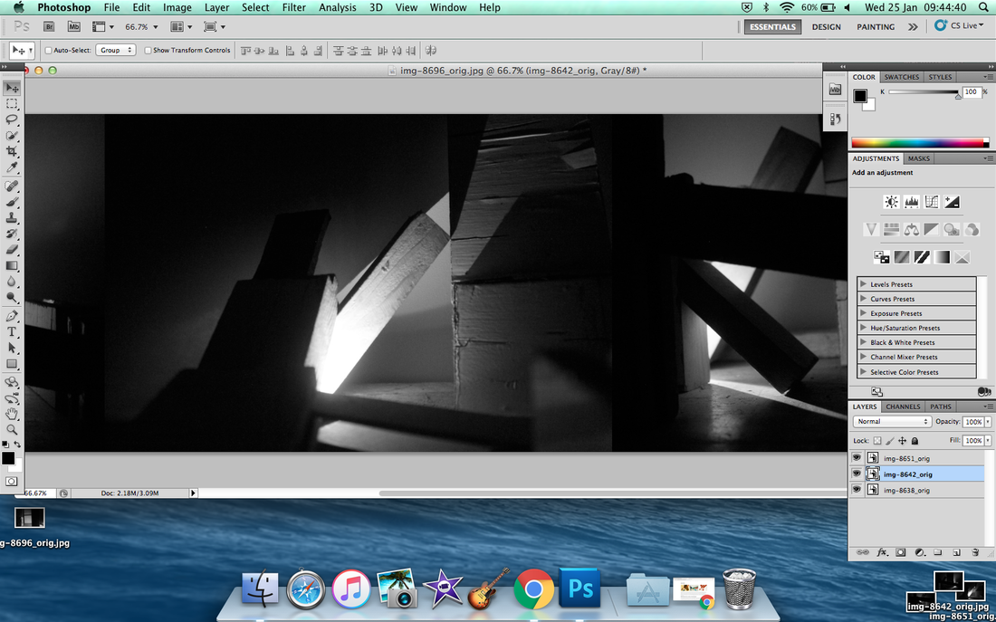
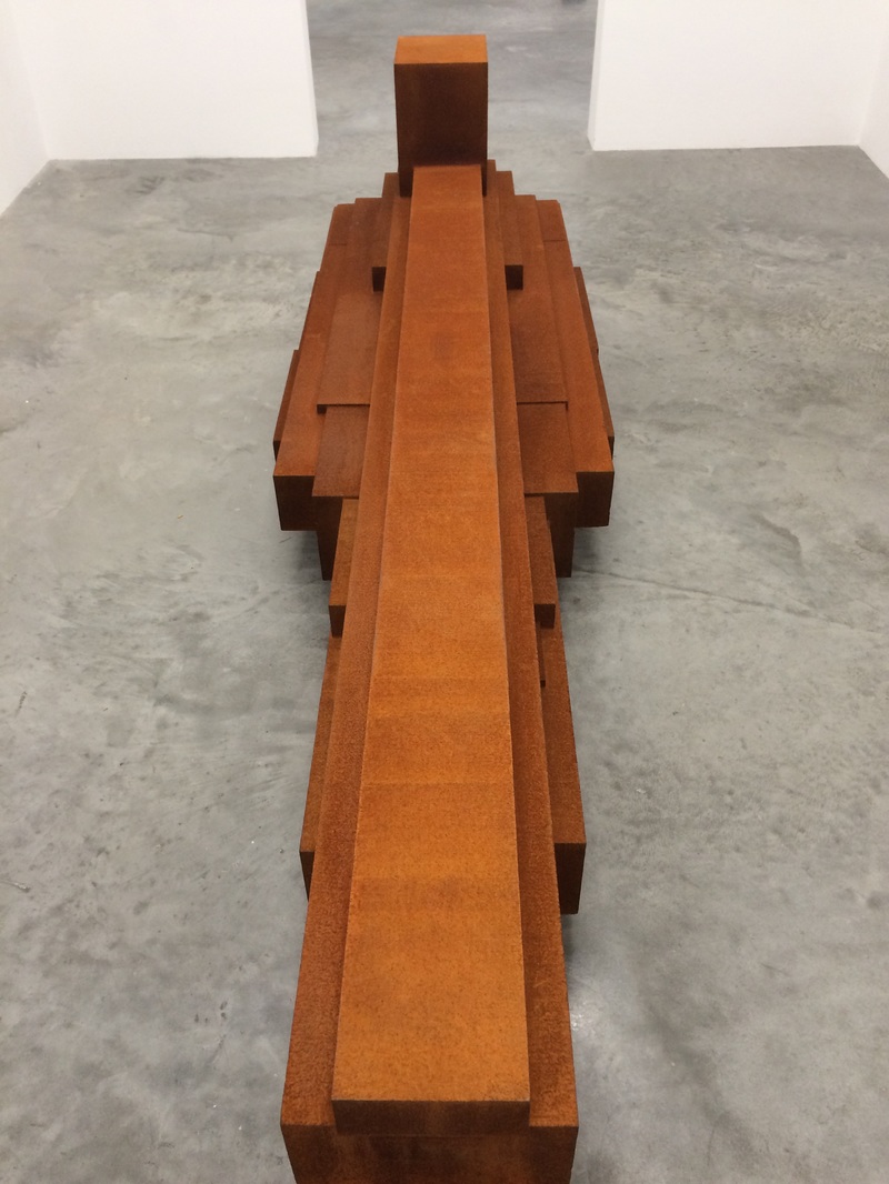
These edits are all options for my final pieces the long rectangular shaped images are my favourites. The way they've been presented add a sense of ambiguity to the images as it isn't completely clear if they are made of one image or multiple images added together. This with the earlier concept of attempting to take images in a way where they lose a sense of scale explores the nature between photography and sculpture and how the photographer can take images in a way where it controls and alters how the people viewing the photograph see the sculpture. Ive tried to blend and chop the images together as best as i can to make them look like one continuos image by trying to match the darkest parts of the images together or trying to line up the sculptures so they overlap on similar parts of the sculpture. I used photoshop to edit them I didn't do much to alter the images I increased the brightness of some and sharpened some but for the most part all I used photoshop for was compose the images and fit them together and make them the right size for printing.
Final pieces
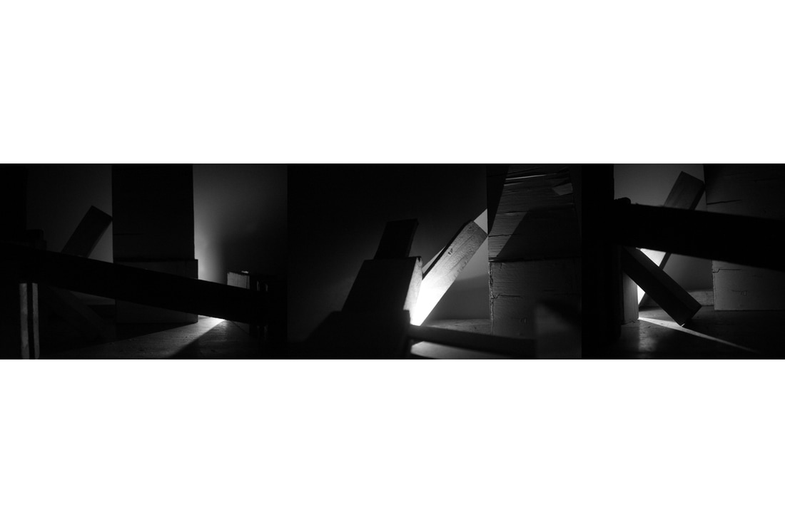
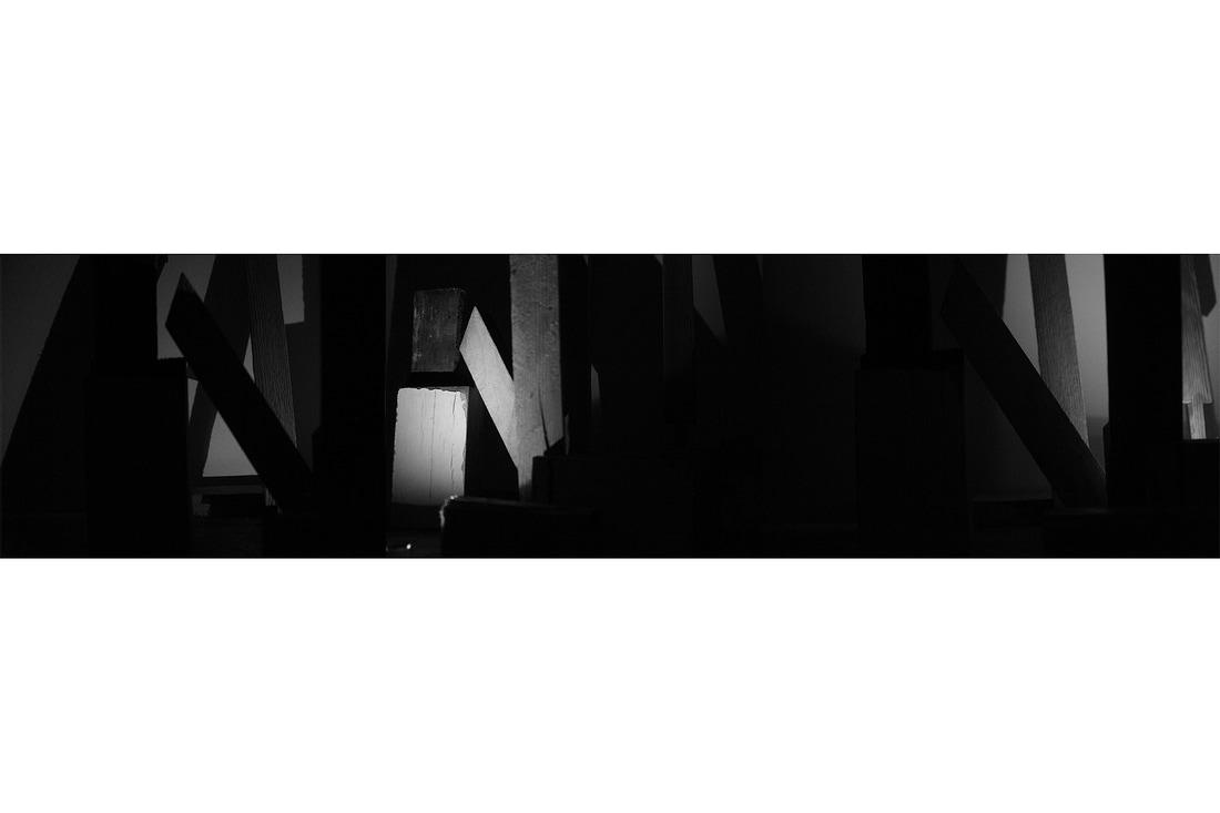
These are the images I chose to use as my final pieces, I decided not to print them off myself in school or at home and to have them sent off to be printed properly due to the size I wanted them and to improve the quality. The final size I chose for them to be printed was 60cm by 15cm.
Experiments in class
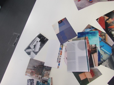
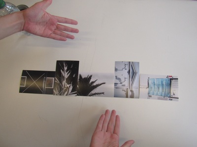
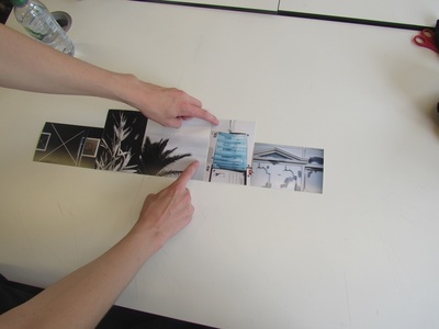
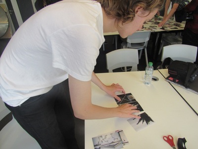
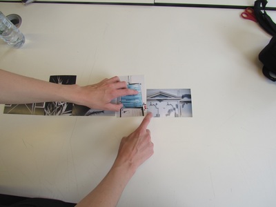
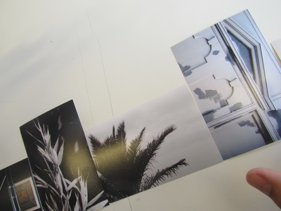
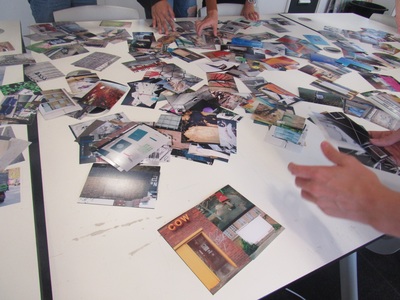
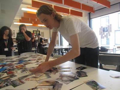
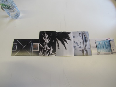
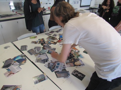

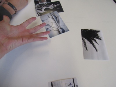
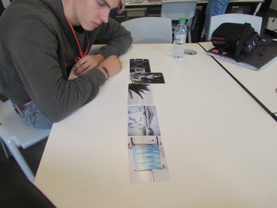
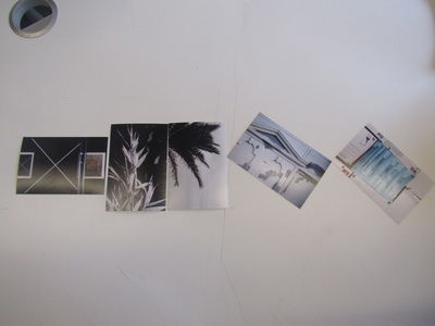
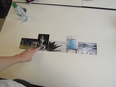
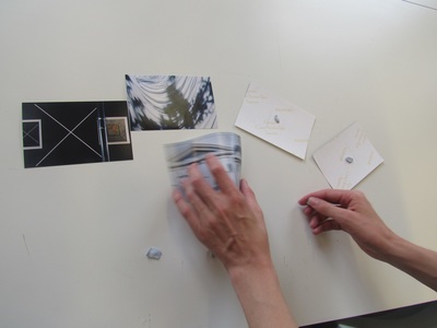
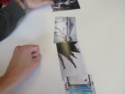
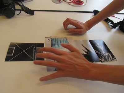
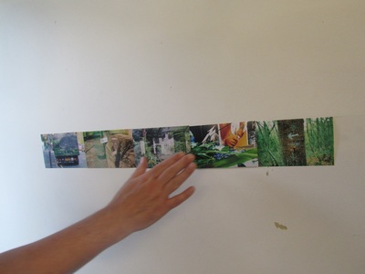
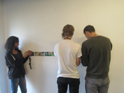
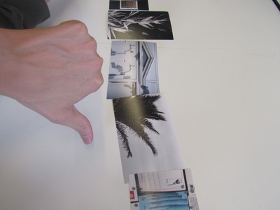
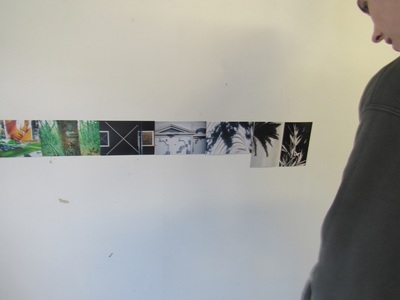
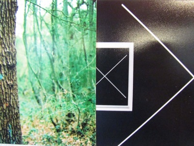
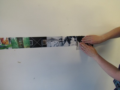
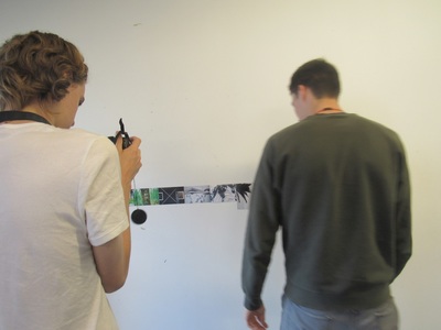
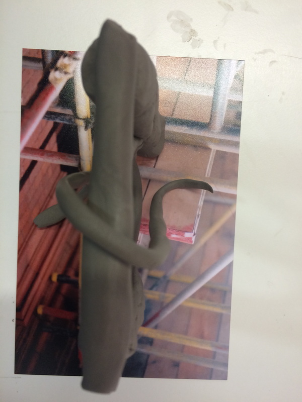
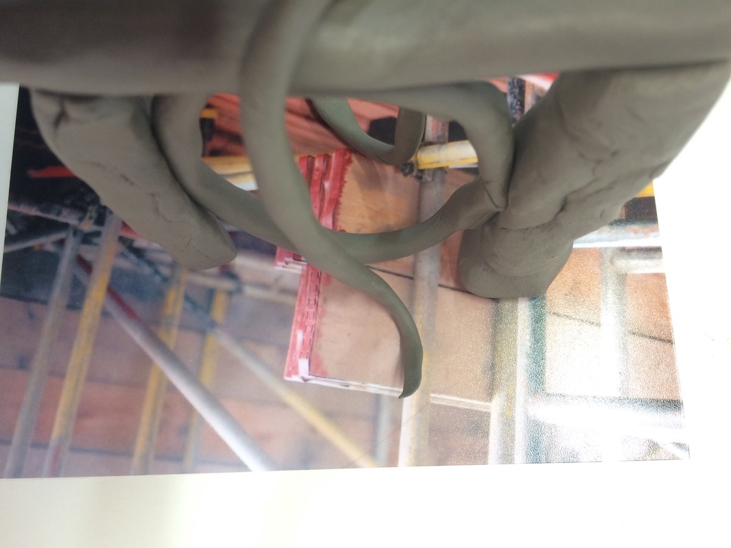
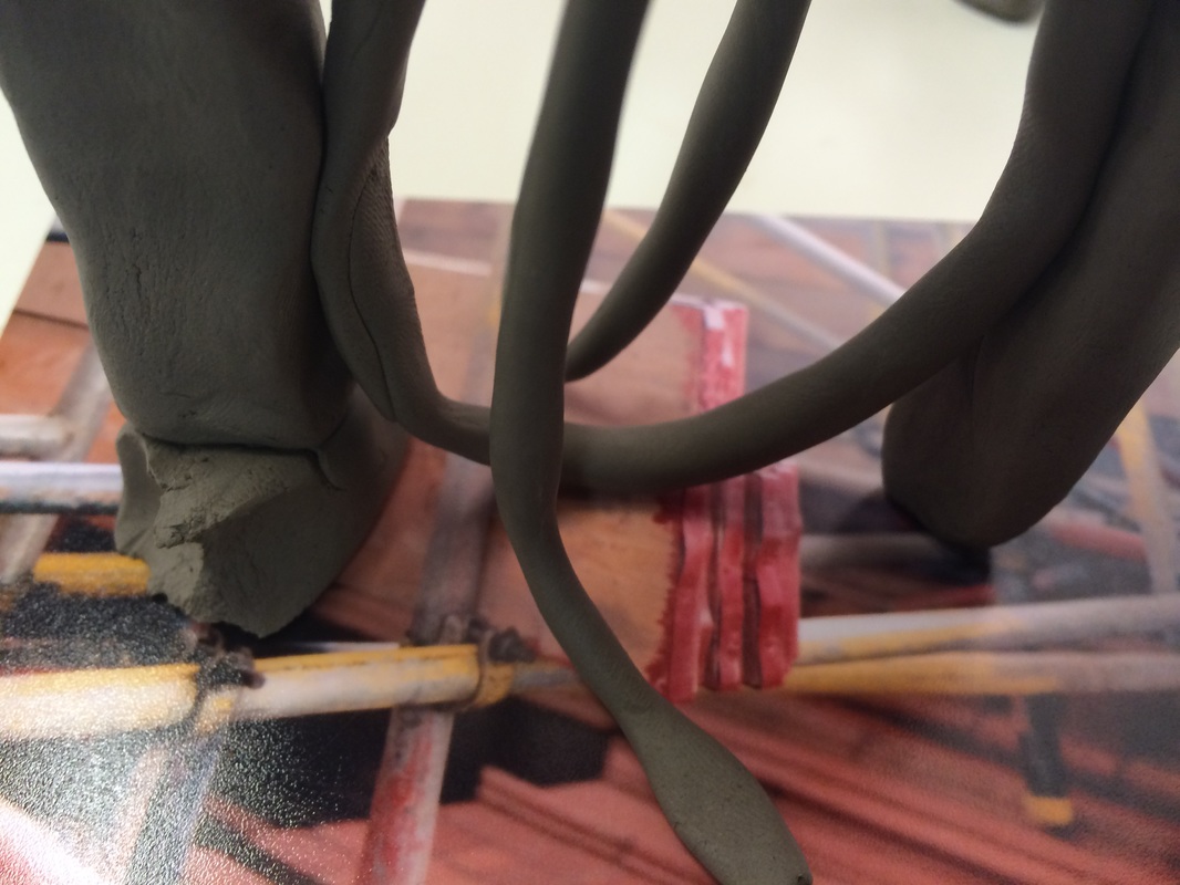
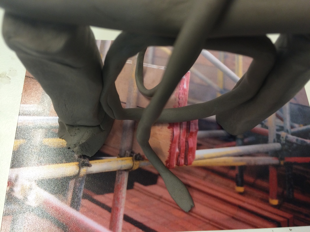
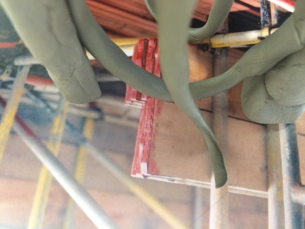
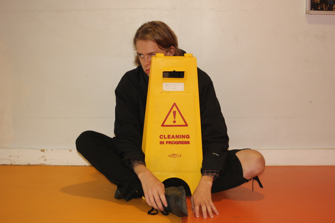
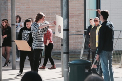
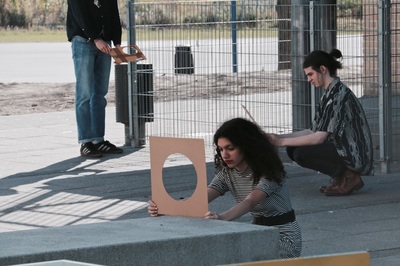
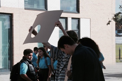
In class we were given a list of different tasks to carry out with a selection of 300 photos. The first task was done with a partner and was to select five photographs we thought worked well together and then decide in what order and lay out they worked best we had to document this process by photographing everything we did. Once we had decided how we wanted the pictures to look we had to lay everyone in the classes photos out in one big line however we weren't allowed to change the order of our own images we had to work out which images looked best next to each other and who's set of images should start and finish the line we had to document this with pictures also. Another experiment I chose to do was selecting an image and photographing it with a small clay sculpture we had made at the beginning of the lesson.
Roger Ballen
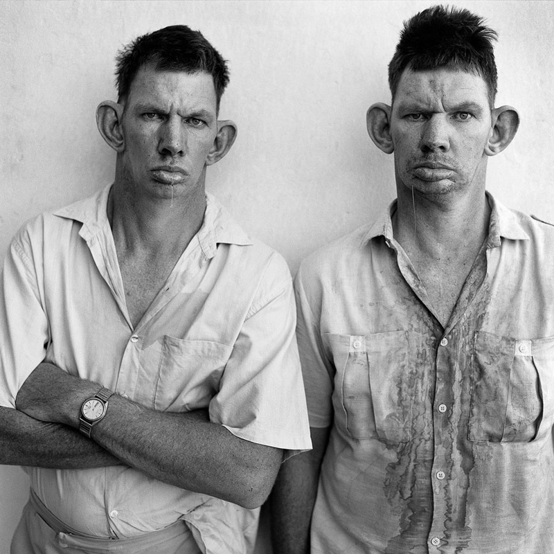
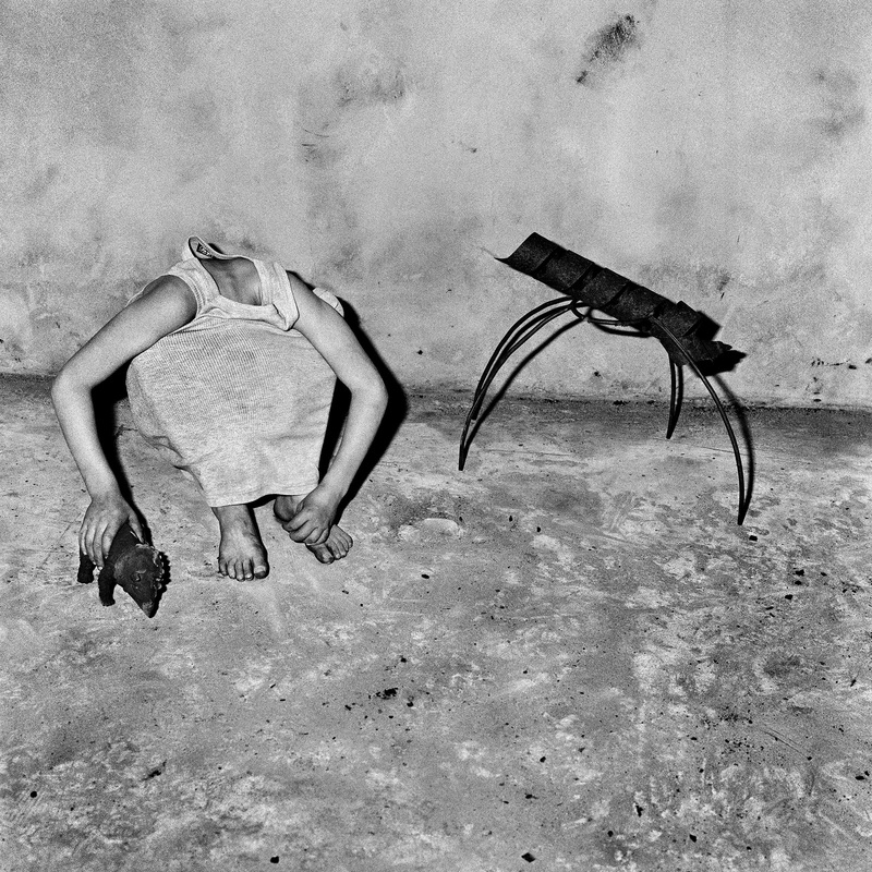
Roger Ballen is an American photographer who has lived and worked in Johannesburg for a large proportion of his life, He is a photographer but he has also directed music videos he is best known for his unique style of portraiture. His portraits concentrate on outsiders people who have been pushed almost out of normal society living in their own community's they are often homeless and some with mental health disorders. His style of portraiture varies for example from the two images above there is one that is taken in a very straight forward way almost like a mugshot of the two twins . The other portrait is different heres no face shown it but it is just as expressive and effective as the one before with the human shape replicating the object beside it.
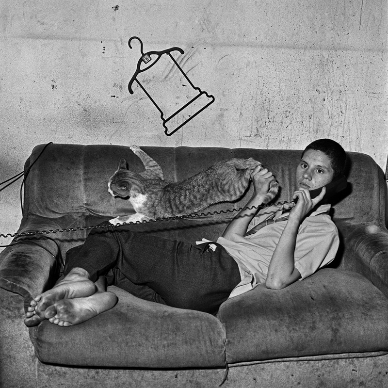
Portraits
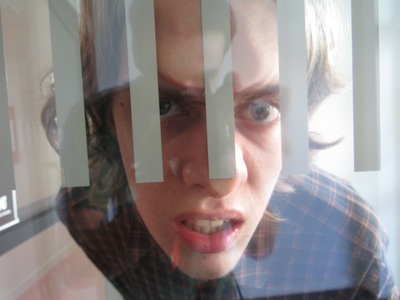
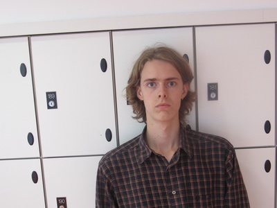
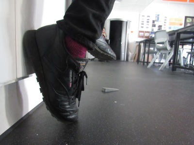
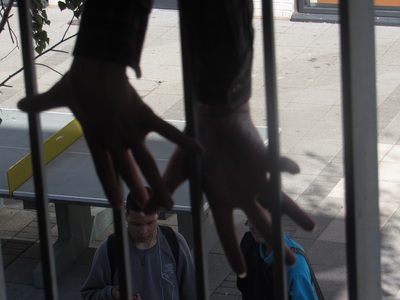
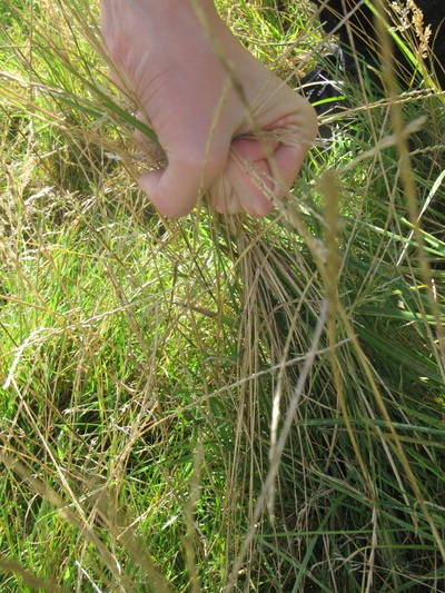
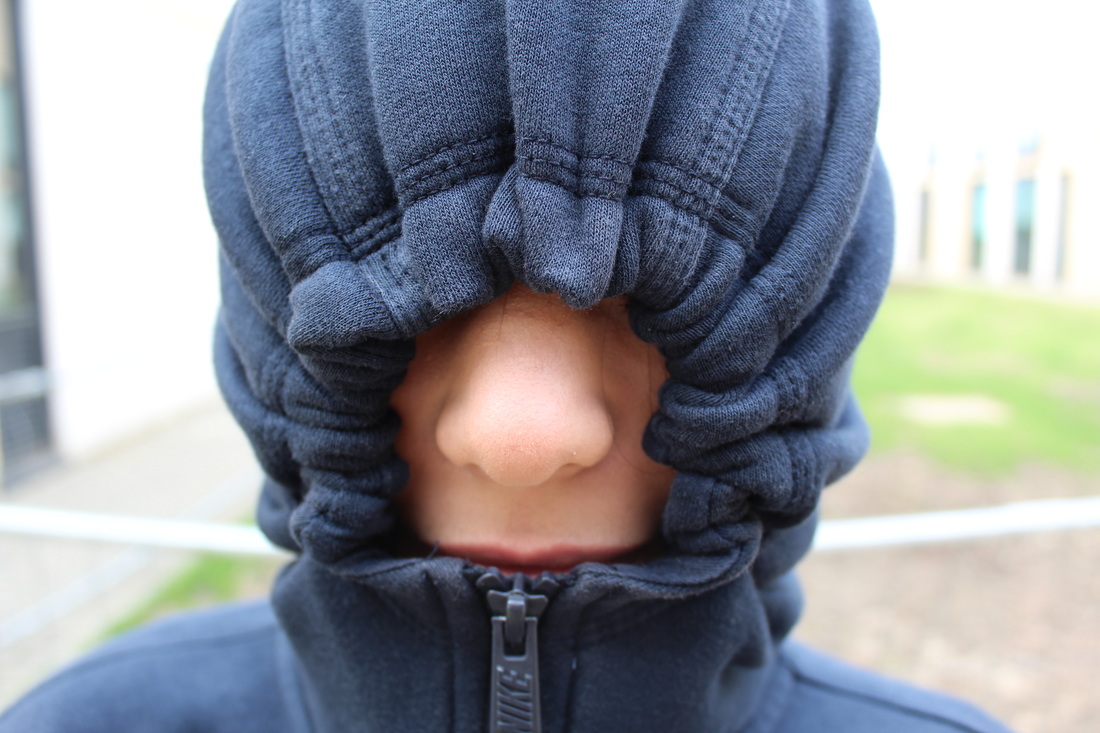
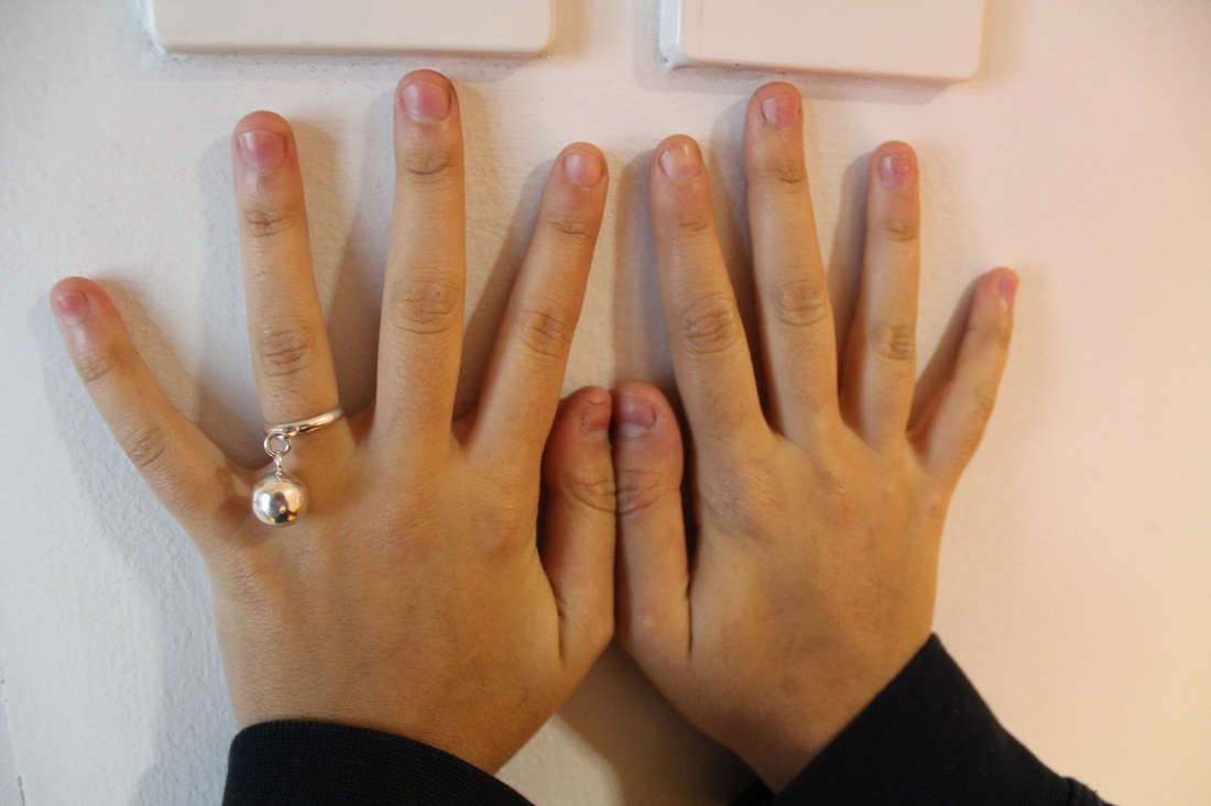
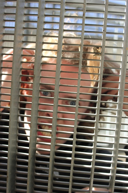
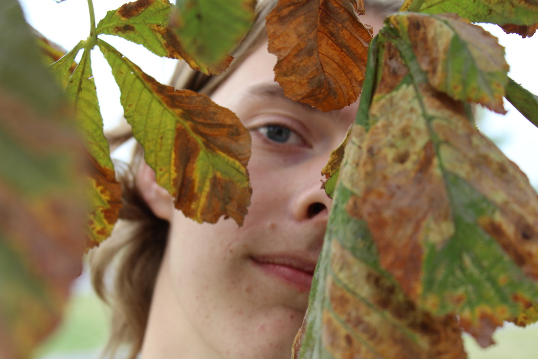
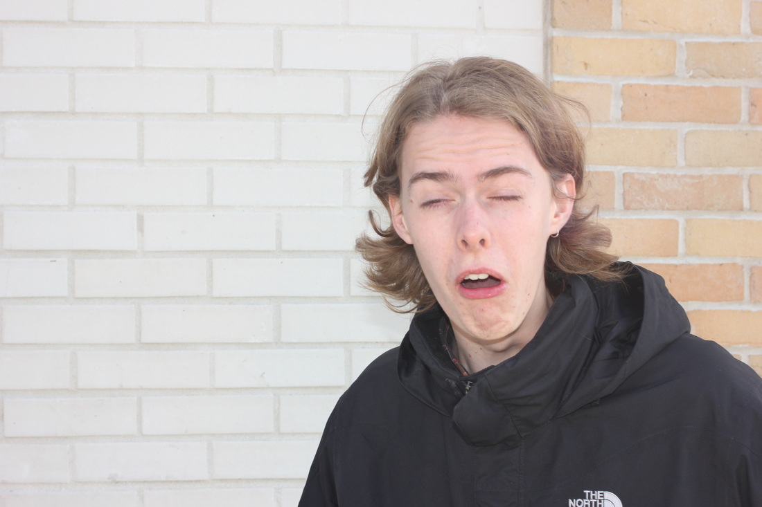
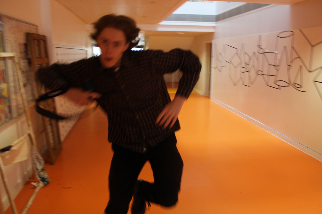
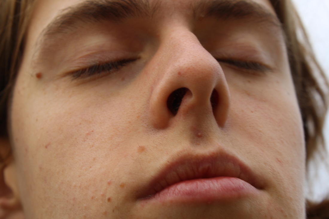
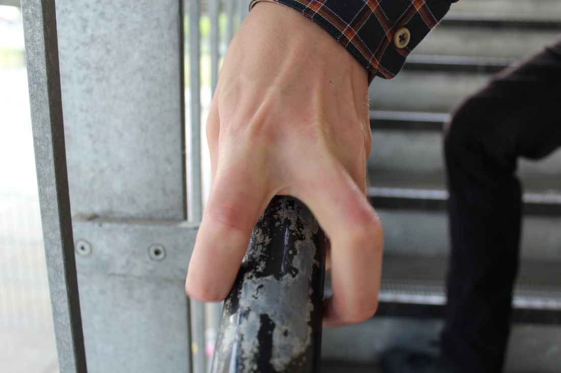
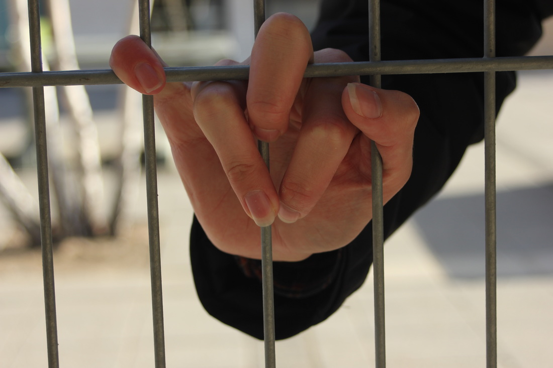
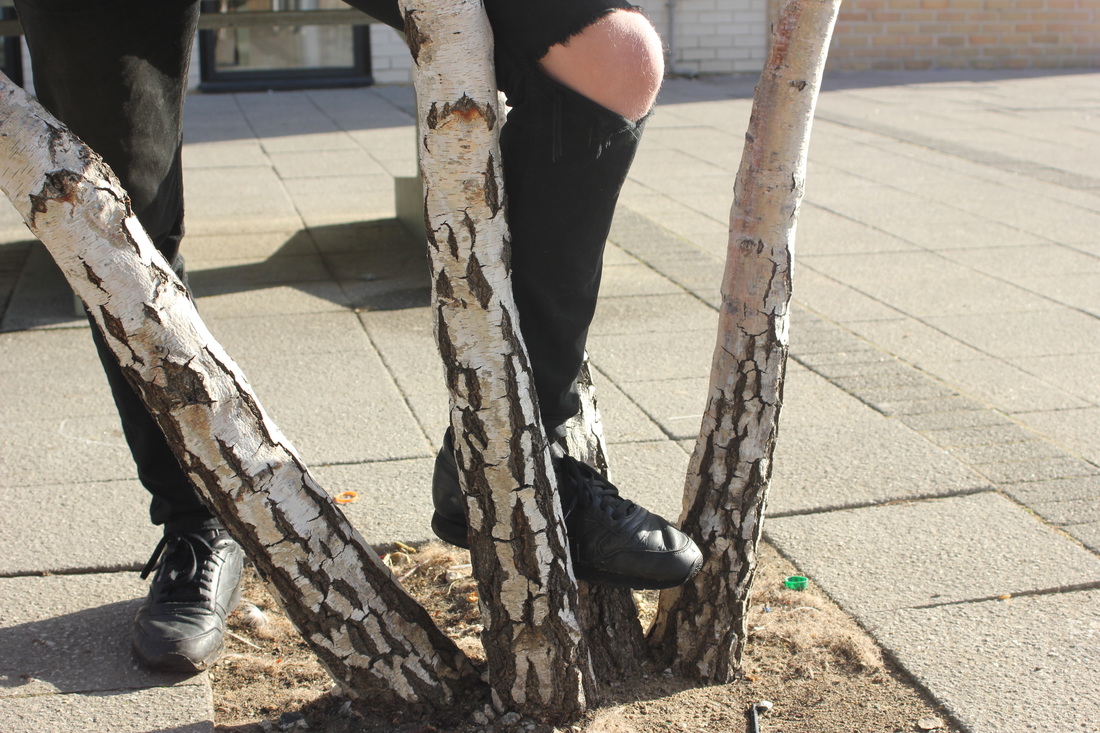
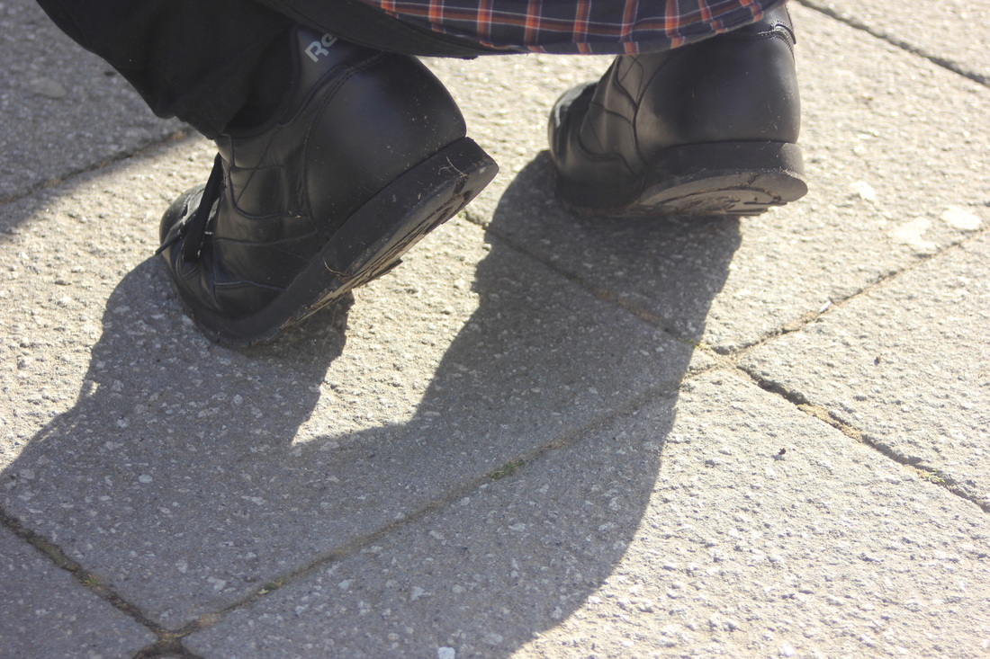
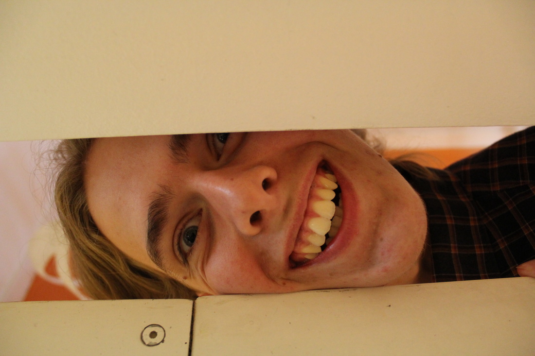
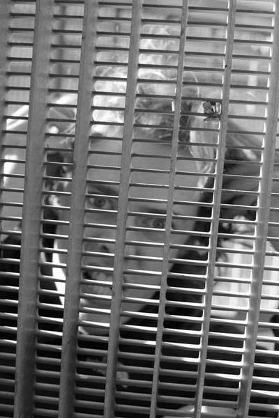
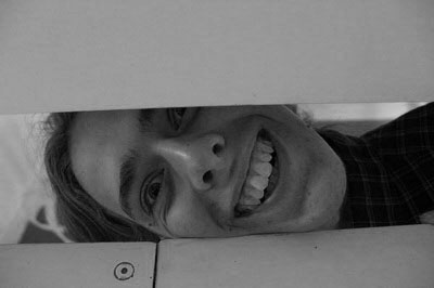

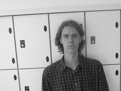
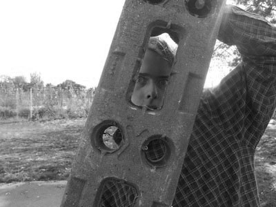
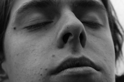
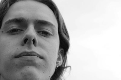
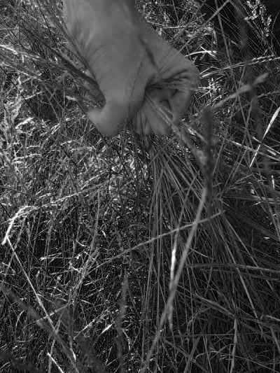
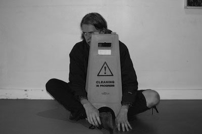
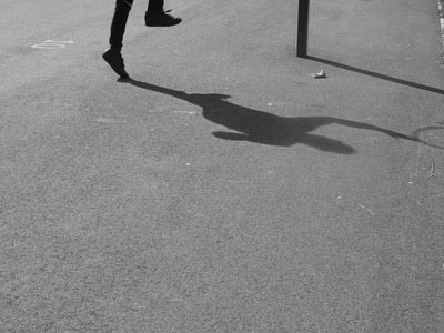
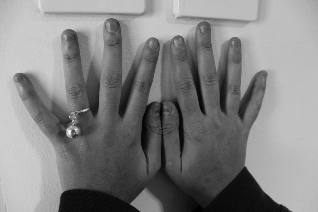
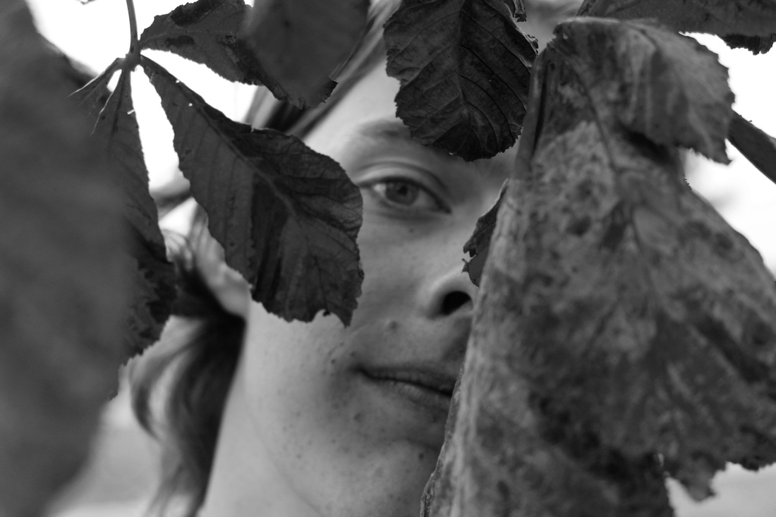
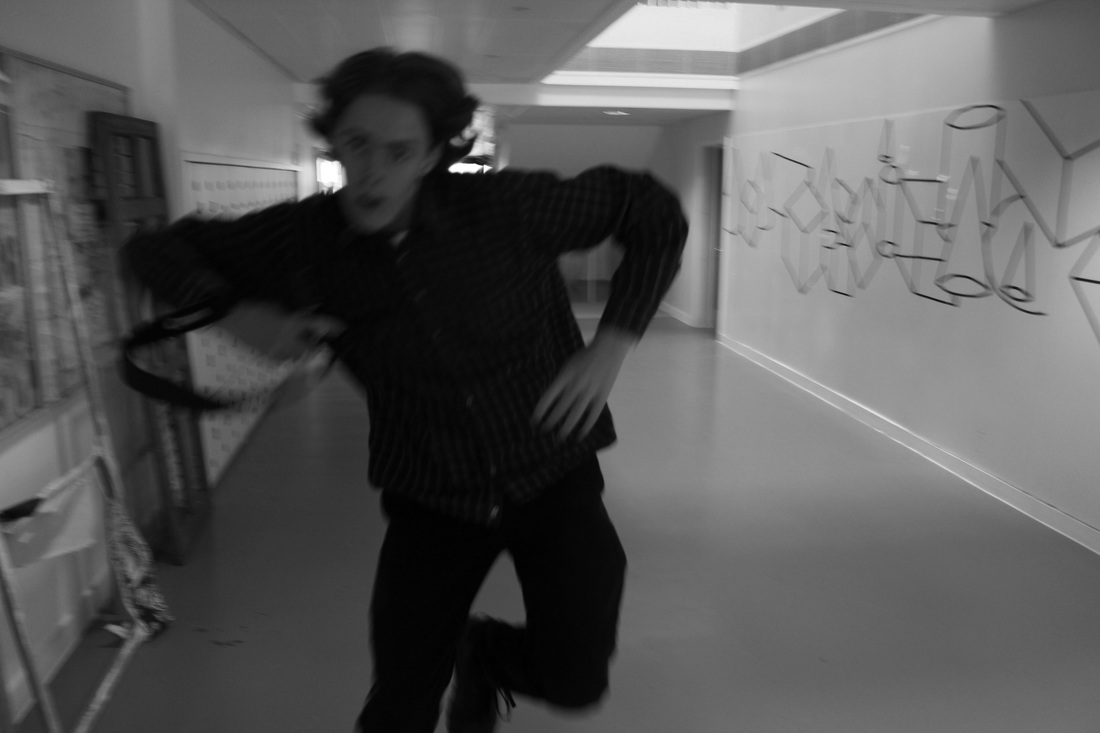
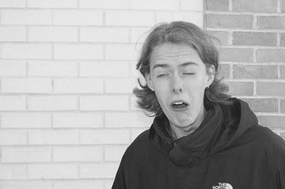
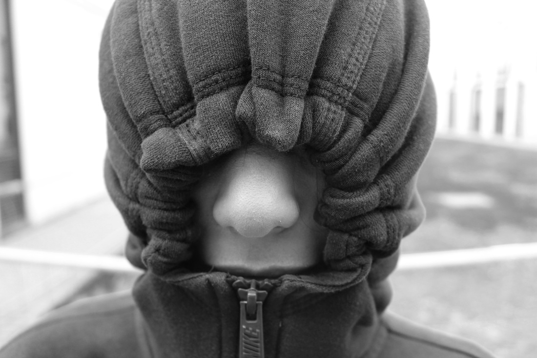
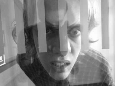
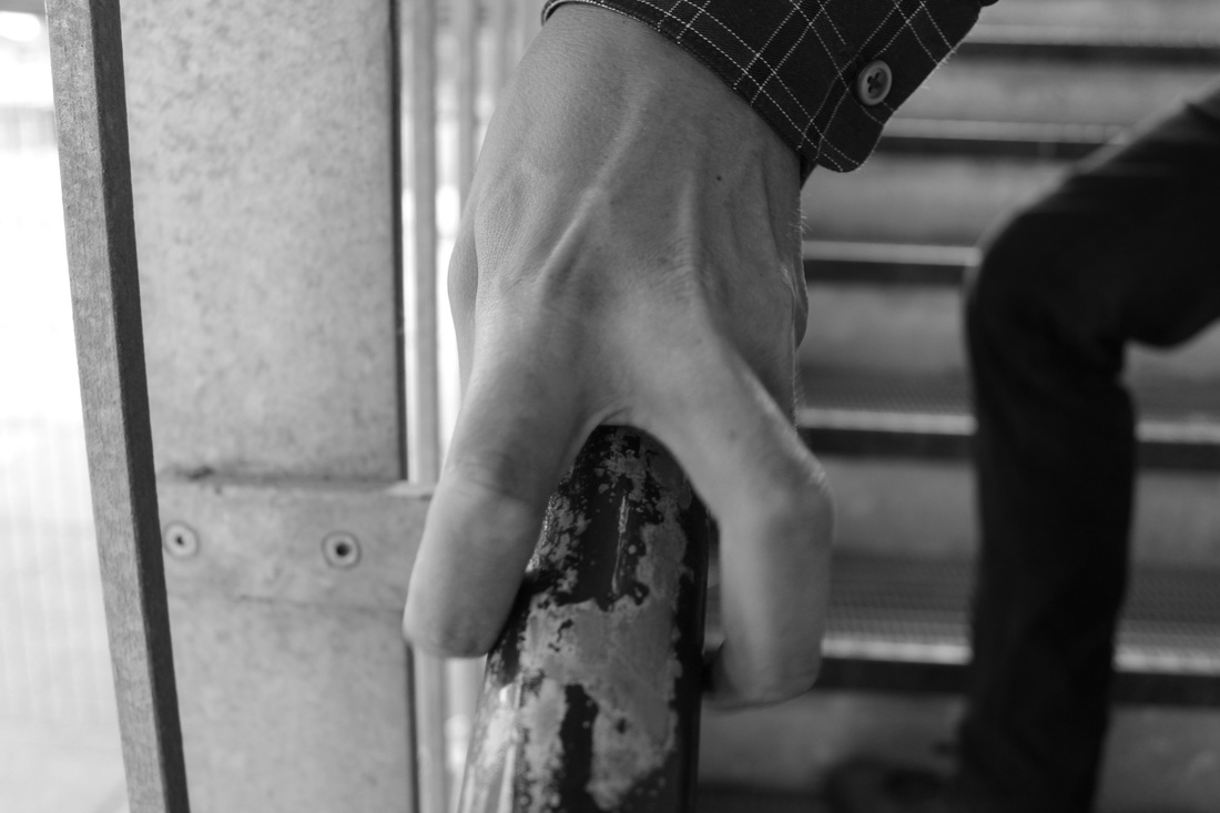
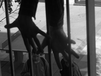

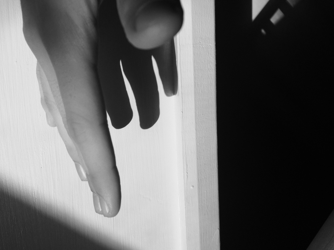
We watched a short clip in class where Roger Ballen questioned the difference between being a photographer and an artist and the different thought processes you can go through went taking images. We then had to go out and take a series of twelve portraits inspired by what we had heard in the video. I tried not to make my portraits to obvious not just head and shoulder shots of peoples faces instead I tried to include hands , feet ,shadows and obscured or partly covered faces. In keeping with Ballen's style I edited the images to make them black and white it also keeps a common theme through out all of the images linking them more. I felt this was needed as although there are similarities throughout the series the subjects are quite different from a concentration on shadows and light , movement, hands and distorted faces.
Performance experiments in school
Performance and architecture
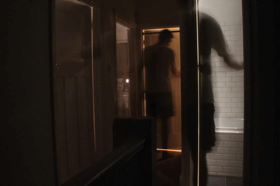

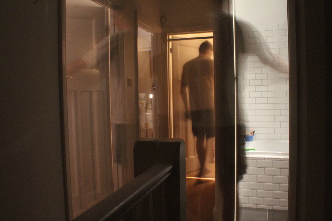
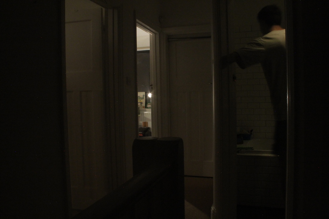
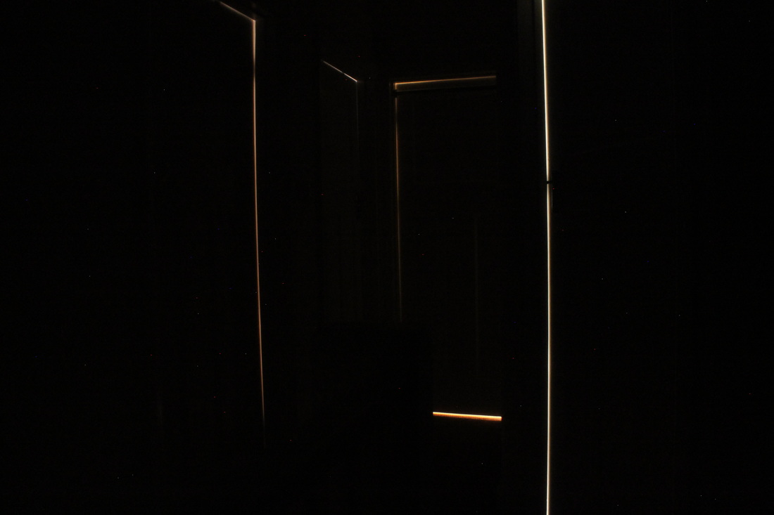
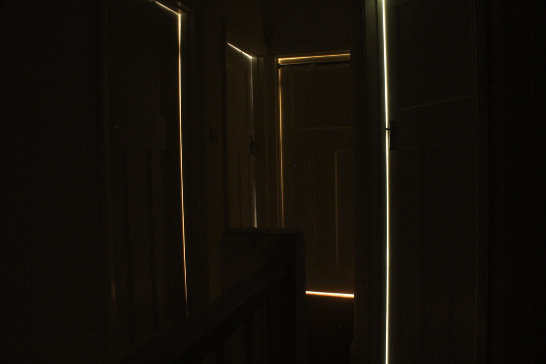
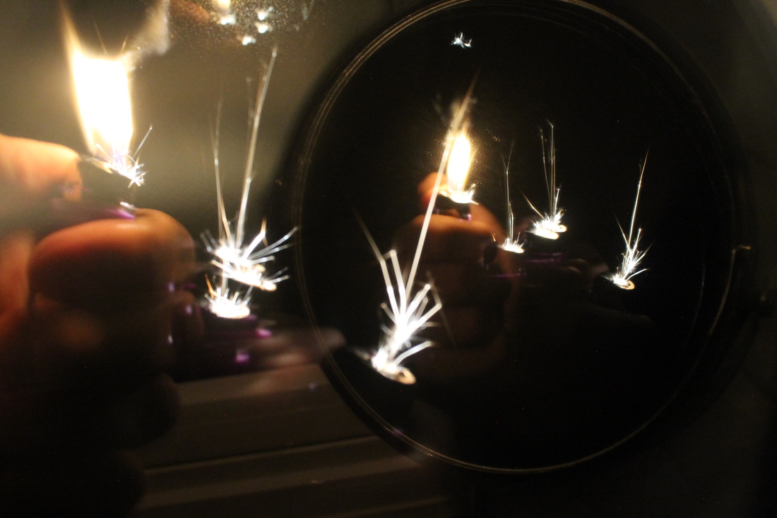
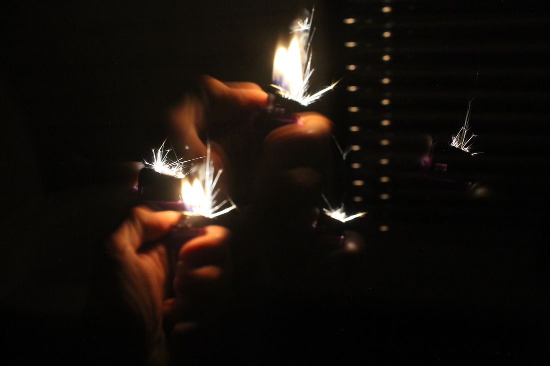
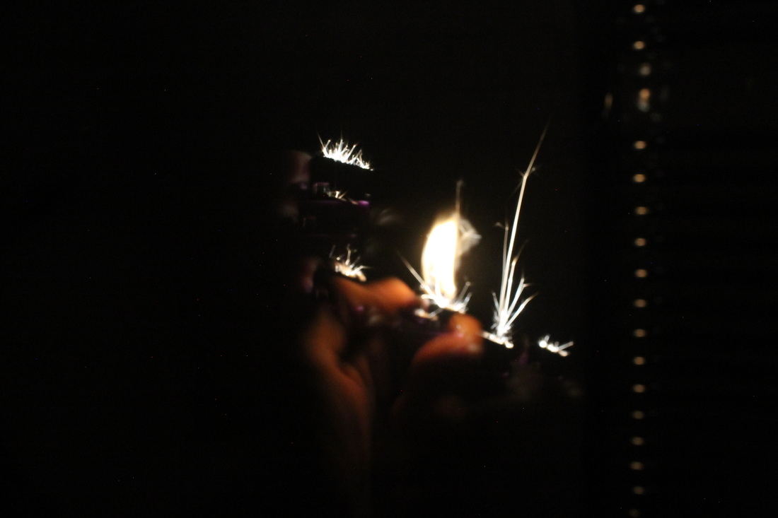
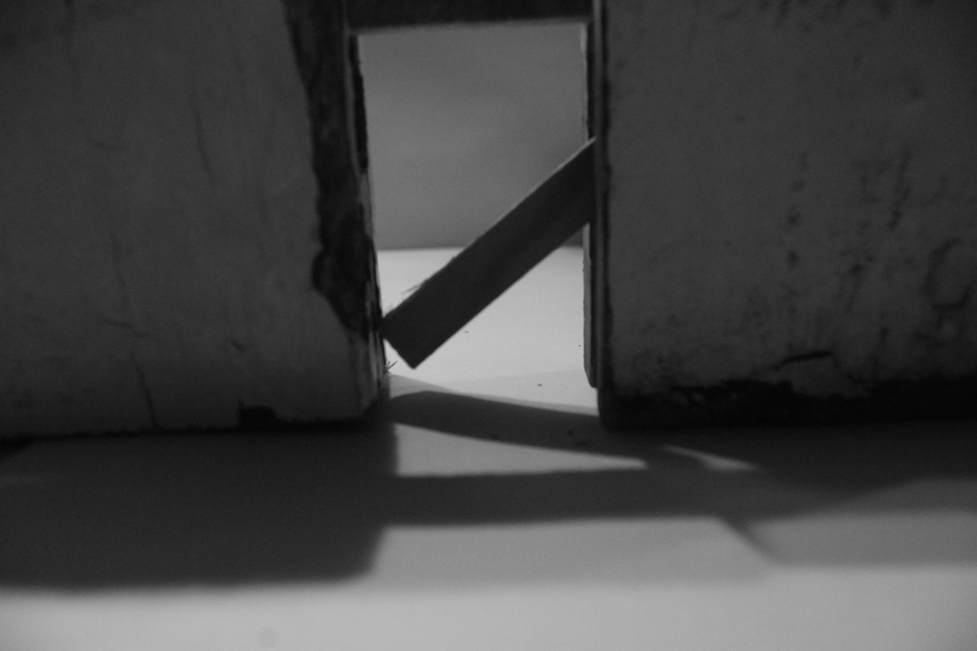
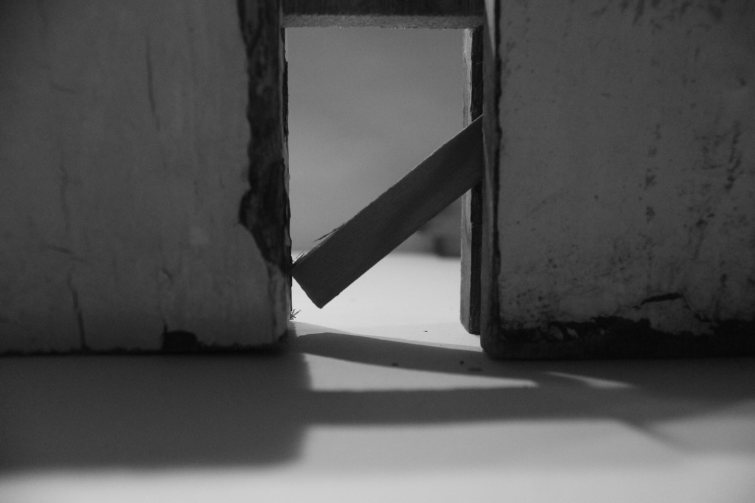
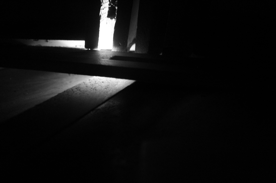
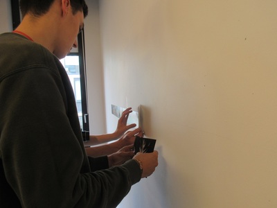
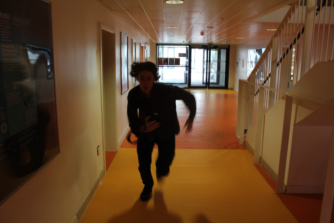
We had recently covered performance art in class and were told to record some performance art ourselves in our own time. I was struggling to think how i could link performance art with architecture I looked at the work of Bas Jan Ader but throwing myself of a roof seemed to extreme. I went for a much more basic interaction with architecture opening and closing doors. I tried to make it as interesting as possible by taking a long exposure photograph of myself opening and closing doors to well lit rooms and each time the light would add me in to the image so there would be several of myself opening every door in one image. I think it was reasonably successful however my favourite images were actually the ones where I didn't open the door and left it long exposure allowing light to seep through the gaps illuminating the door frames. I took several other images not linked to architecture just of me sparking a lighter again on long exposure recording several attempts in one image, I think they turned out well.
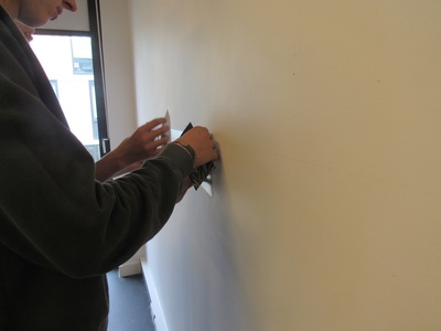
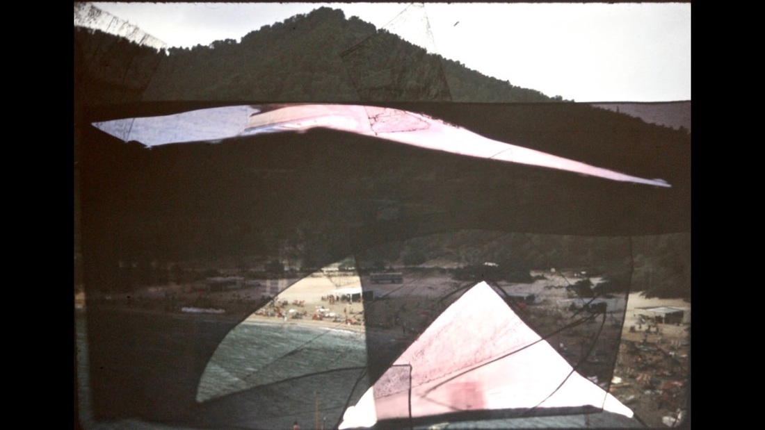
Dafna Talmor- school visit
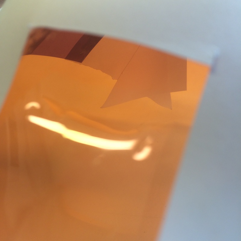
Dafna Talmor is an artist and photographer who came into school and showed us her work. She has a very interesting proccess in making her images to the extent where altering the negatives becomes just as crucial if not more than taking the actual photographs. She talked about how she started off taking lots of photos including self portraits all indoors with views to the outside obscured, after a while she became interested in taking landscape images but found all of the images she was taking weren't particularly original or exciting. So she began cutting and sticking the negatives of different landscapes together leaving in some cases large sections of dark unused space. She spoke about how having had lived in a variety of countries and travelled quite a lot came in as some inspiration for this the idea of cutting and sticking different areas together the idea of connecting up different places she has attachments to for example the top left image is made up of a picture of Israel and Yorkshire. Below are my own attempts of creating some Dafna Talmor inspired images. I really enjoyed doing this and was pleased with the out come I especially liked the effect the selotape had that was sticking the pieces of slides together.

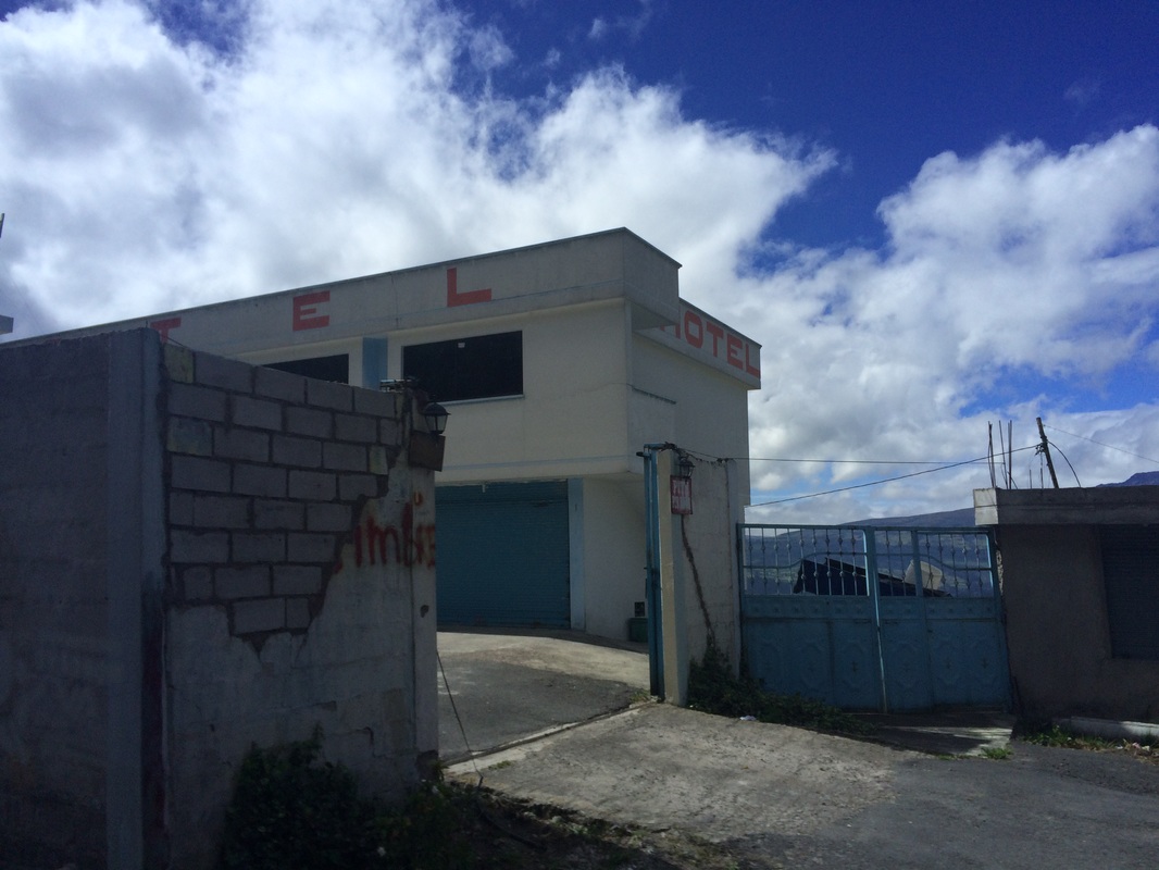
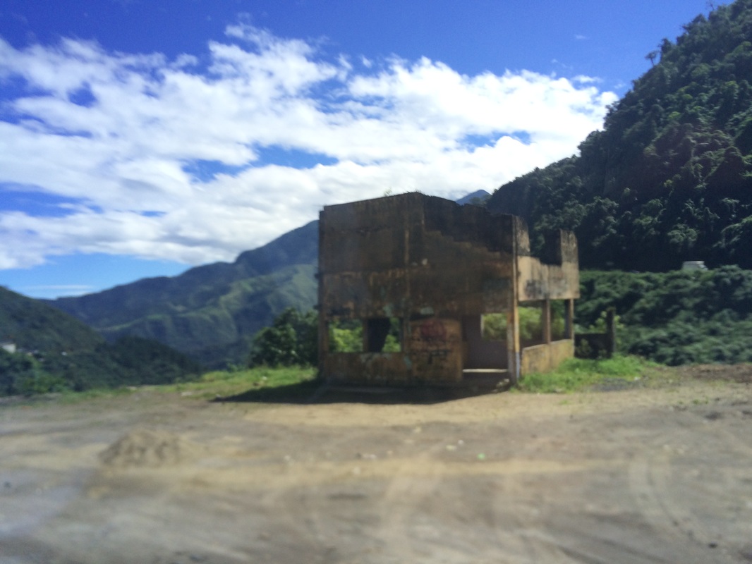
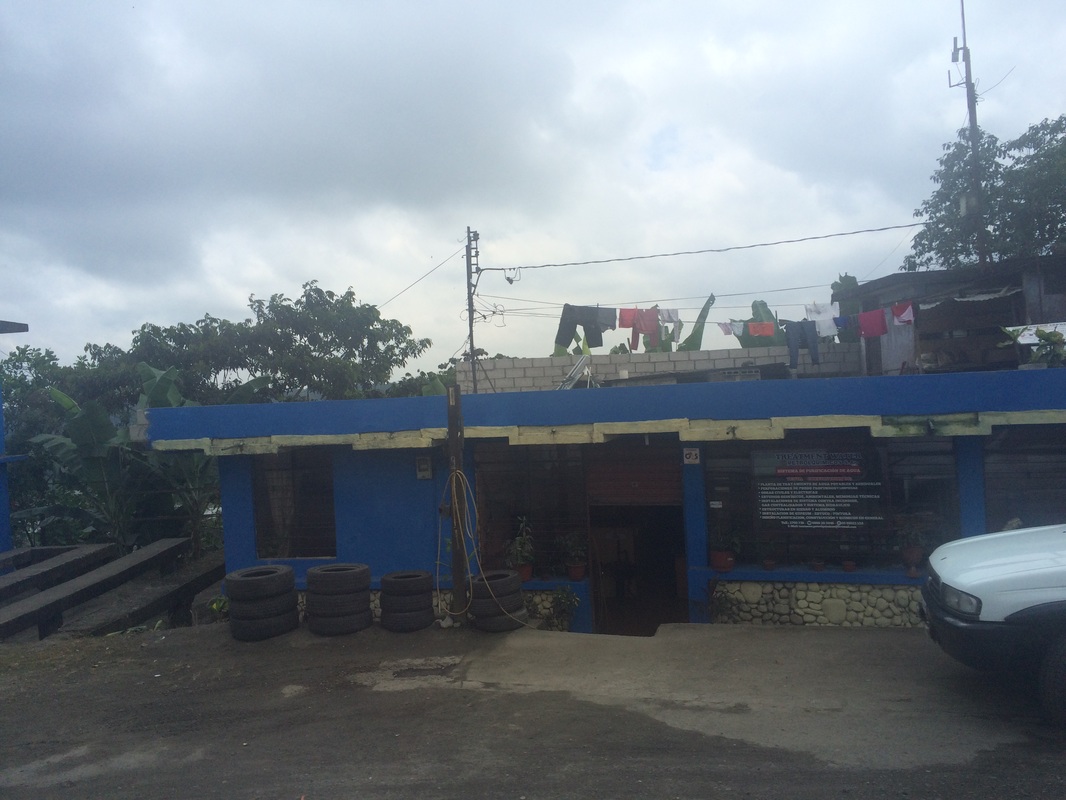
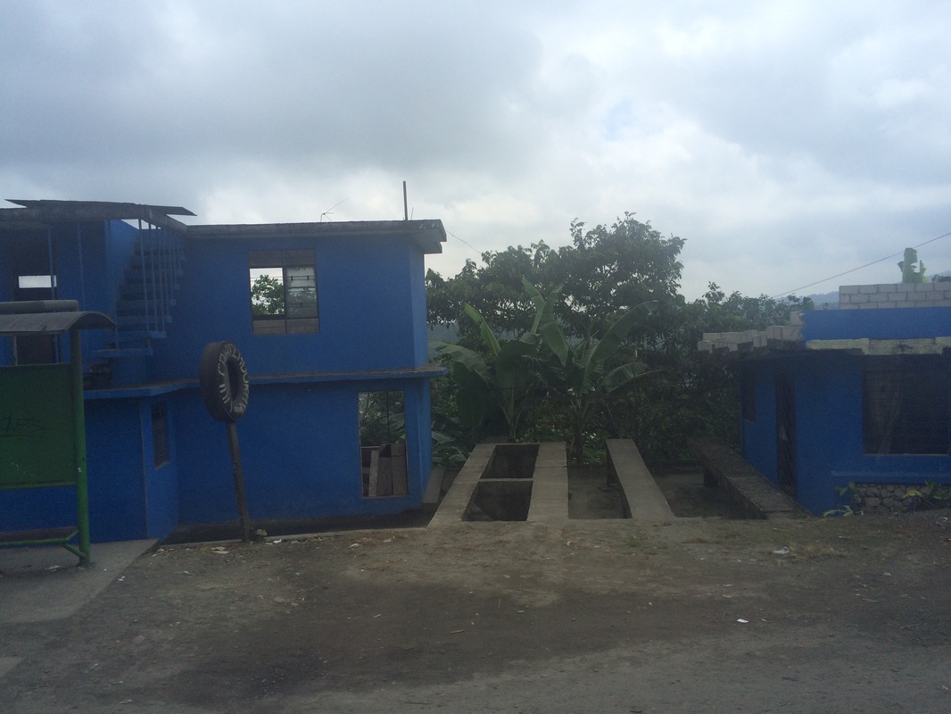
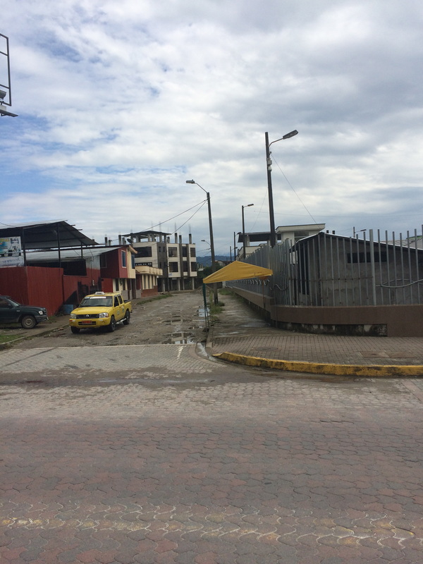
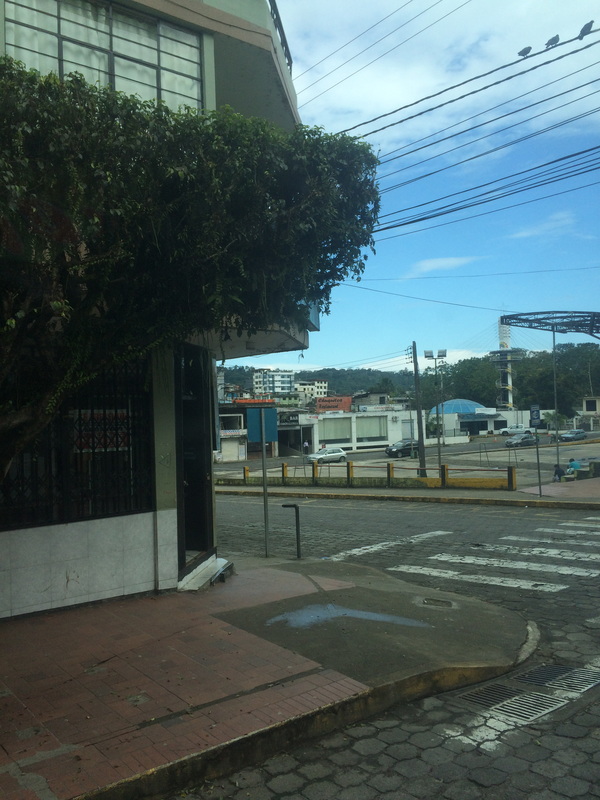
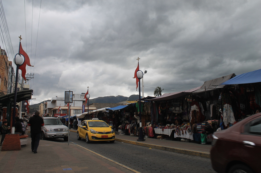
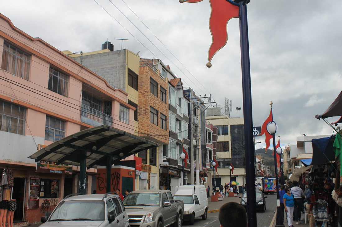
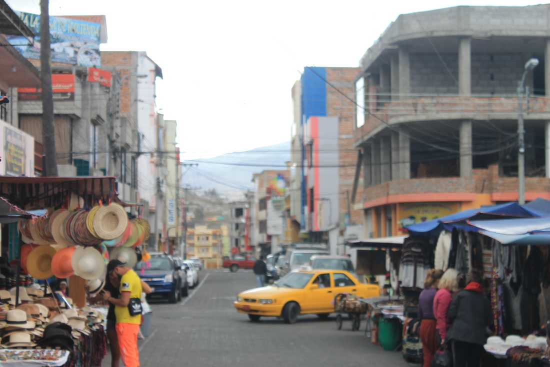
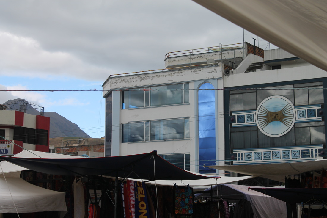
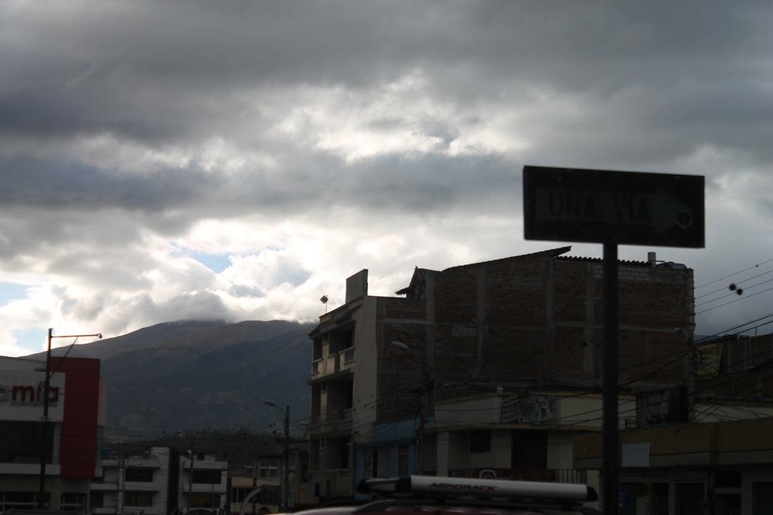
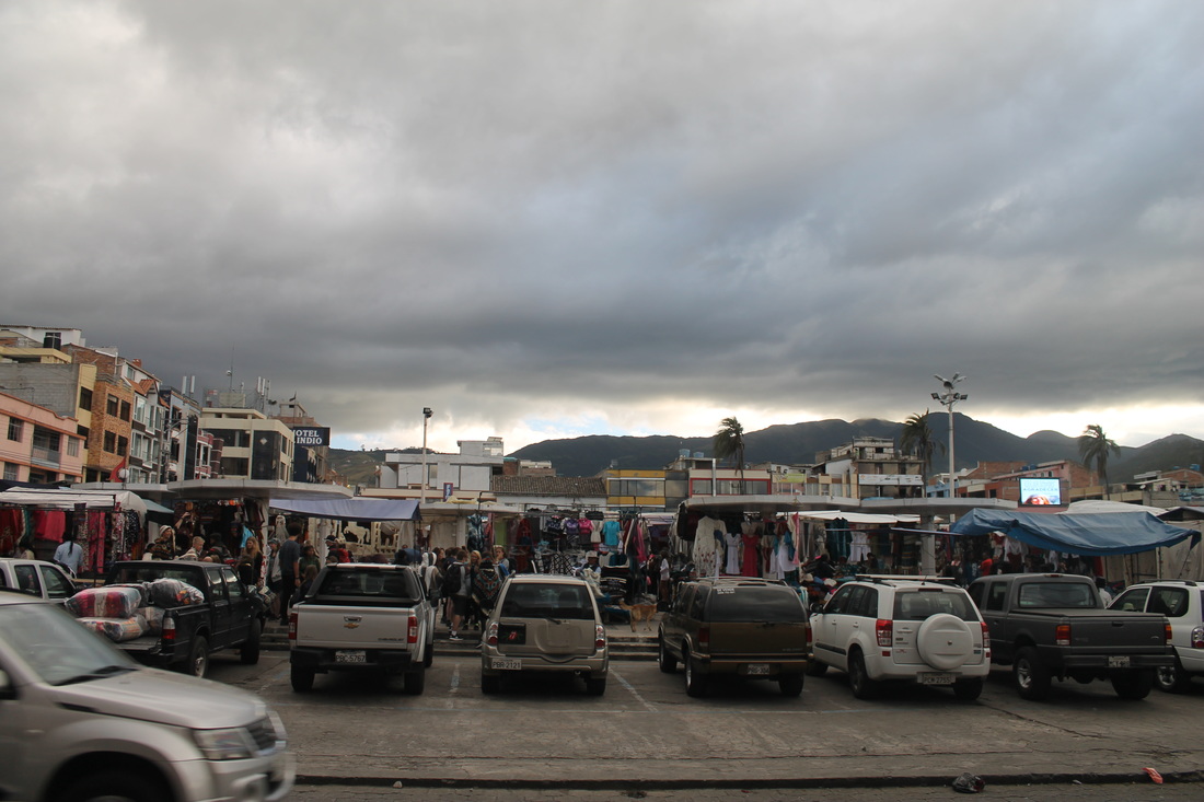
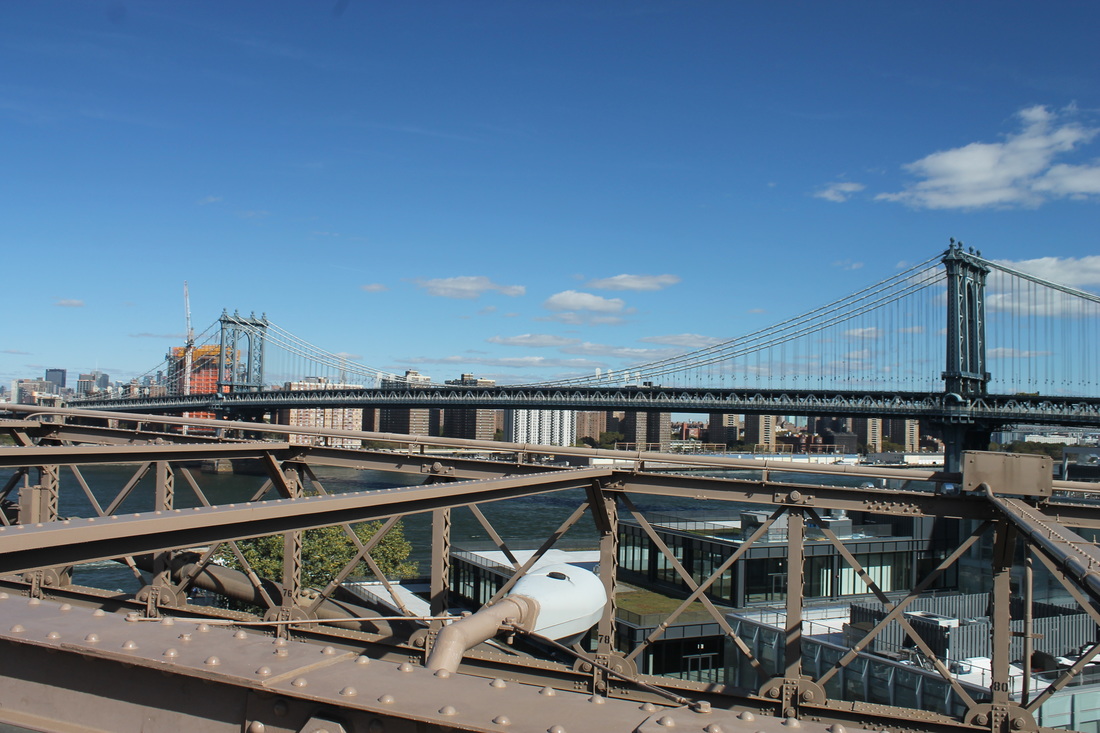
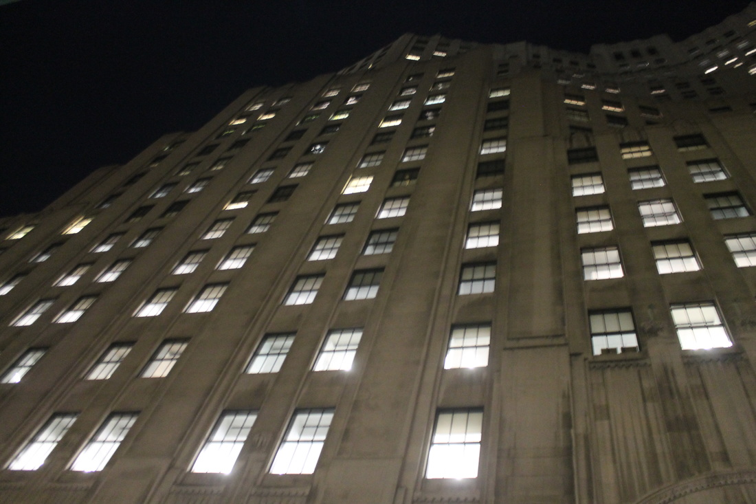
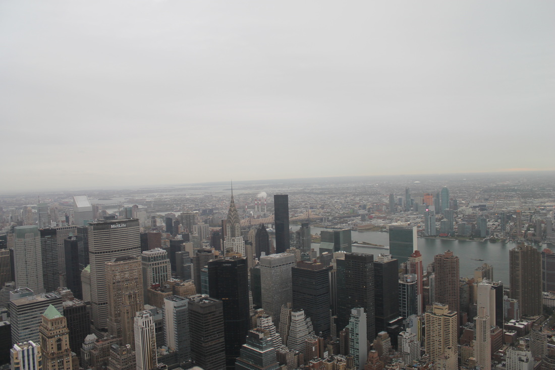
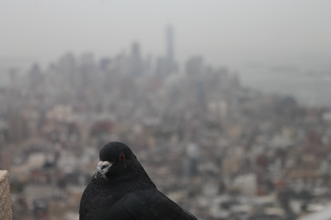
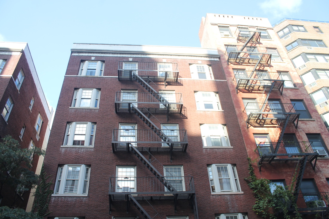
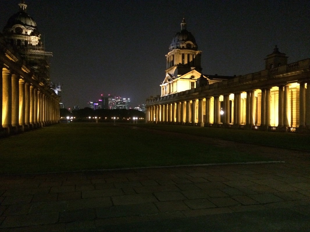
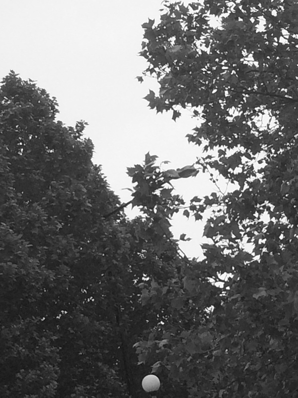
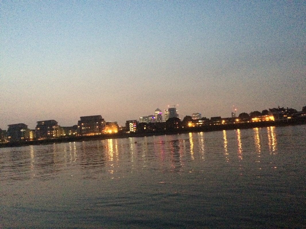
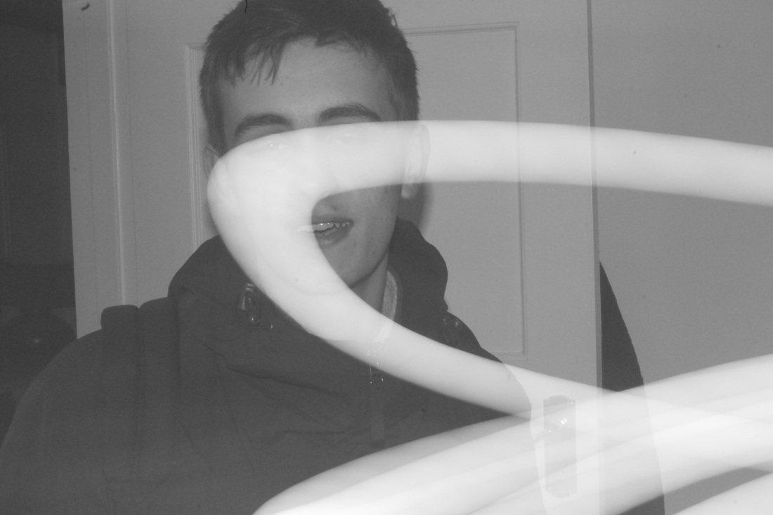
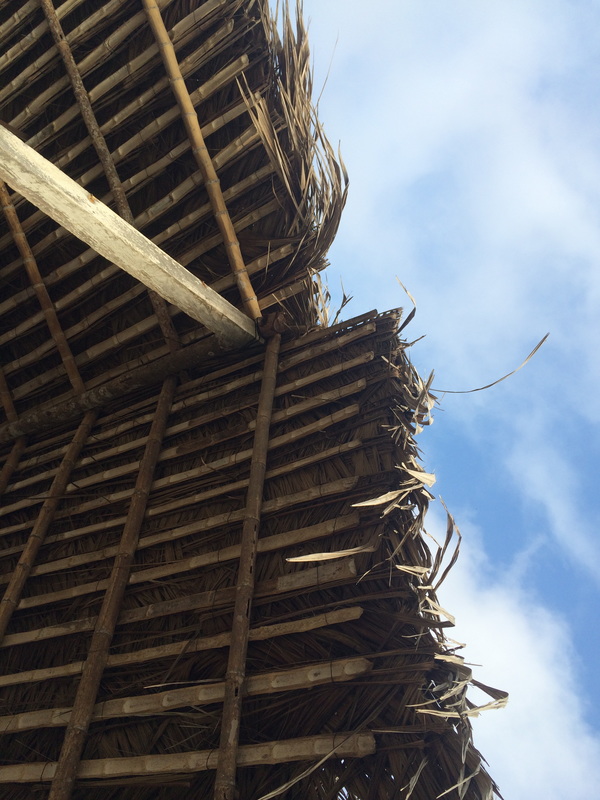
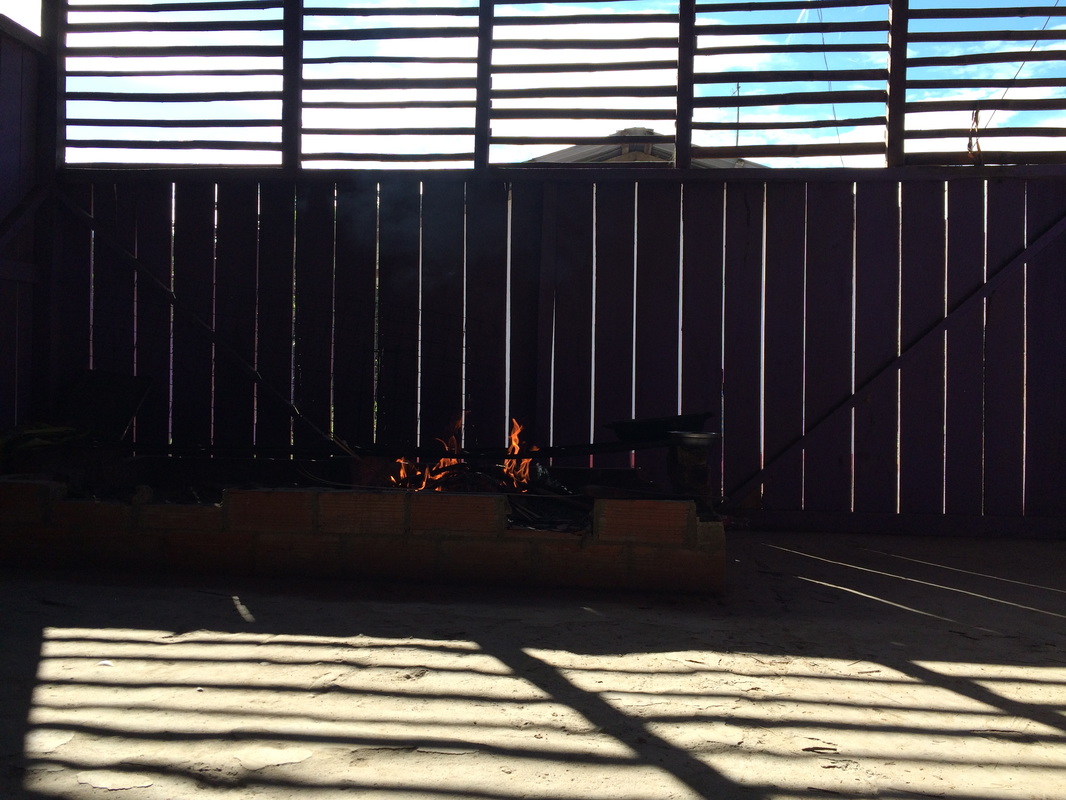
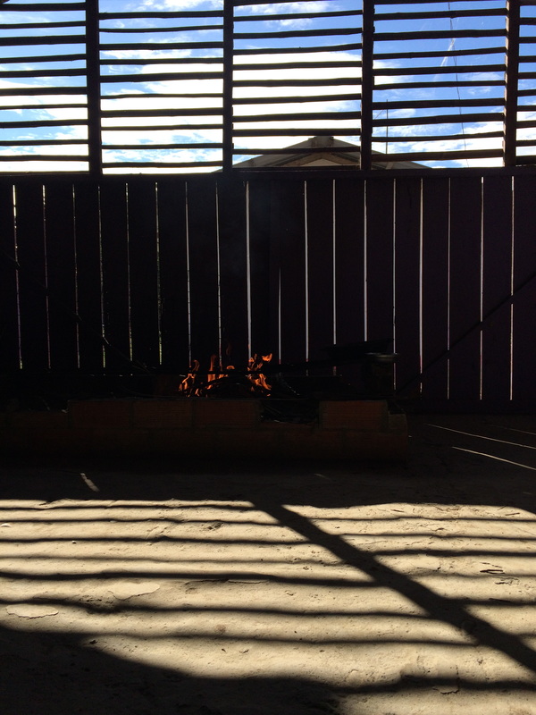
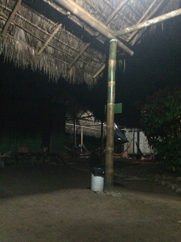
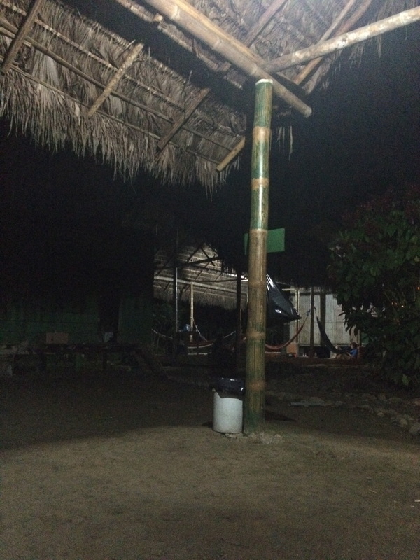
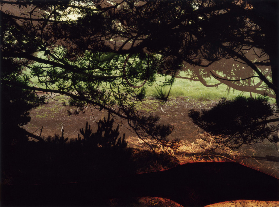
Photos from the summer
Dont have much to do with my project but I wanted to document them somewhere