Photograms
Today I practised making photograms in the dark room. Using photographic paper and exposing it to light with a enlarger with objects on top to make photos without a camera. The best objects to use for this process are the most opaque if you want clear and defined images however if you want a less clear image the more transparent the image the less it shows up. I found exposing the paper to light with an enlarger for around 5 seconds produced the best result.
Moholy Nagy
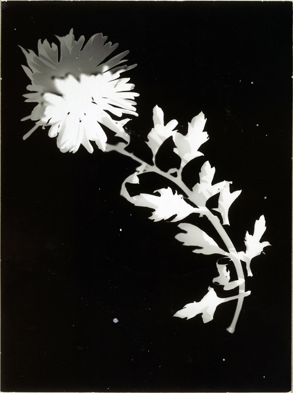
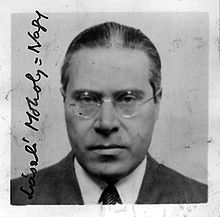
Moholy Nagy was a hungarian artist and photographer who among other things made a lot of photograms. Photograms were developed in the early 19th century Nagy started taking them in 1922 and continued to 1946 he constantly experimented with photograms in and out of dark rooms with different lights. He began to mainly use translucent and transparent objects like glass and crystals. Moholy Nagy's would probably be put into the category of abstract, in most of his work the materials used are unidentifiable
Man Ray
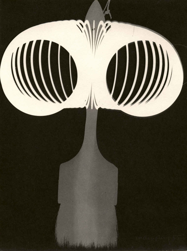
Man Ray was a visual artist from the 20th century who was American however he spent a lot of his life in France. He took lots of photograms throughout his career however he called them "rayographs" he often used everyday objects in his images however the way he styled them made them look very abstract. This gave an interesting aspect to his work as it made the viewer question what the image is of and what was used to create it making the piece more interactive with the viewer. Not only the objects he used but the way he used light to make his"rayographs" make the images more obscure exposing the image for different amounts of time and changing the angle the light hits the paper all adds to the final image.
Christian Schad
Christian Schad was a German artist who worked through out the 20th century, he was associated with the Dada and New objectivity movement. He is better known as a portrait painter however he did do a lot of experimentation with photograms, which he called Schadographs. His work is some of the earliest intentionally abstract photographs. For his work he preferred to use worn materials like scrap paper and other forms of rubbish, he is also known for using oddly shaped photographic paper for his Schadographs as he preferred this to using neat square pieces of paper.
My Photograms
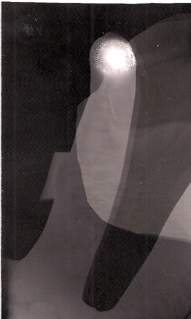
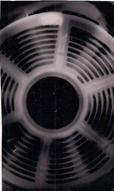
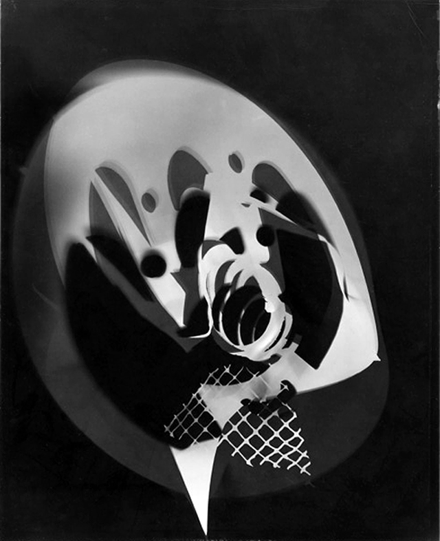
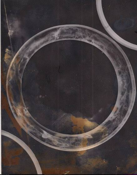
Out of all of my photograms my favourite is the furthest right image. The light used to create the image was obviously fake and came from directly above. The image was exposed to light for around 5 seconds and it has the most vivid and defined tones and shapes. The object almost looks like its glowing. I also like the object that is less clear behind the circle as it adds a sense of depth to the image I also like how the object behind is darker and blurrier as it contrasts the circle that is the opposite. The whiter part at the top of the image that curves around the circle is interesting as I didn't intentionally include it in the image but I think it adds to the image giving some different tones in the background making the image seem a bit more abstract. If I redid this image I would would try to improve the development stage of it as theres a lot of spots and scratches on the photogram which would be improved if it didn't have any of the imperfections . To improve the images I could have also experimented with the light source changing the amount of time the paper is exposed and changing the direction the light comes from as it may give a different perspective of the objects potentially creating a completely different photogram.
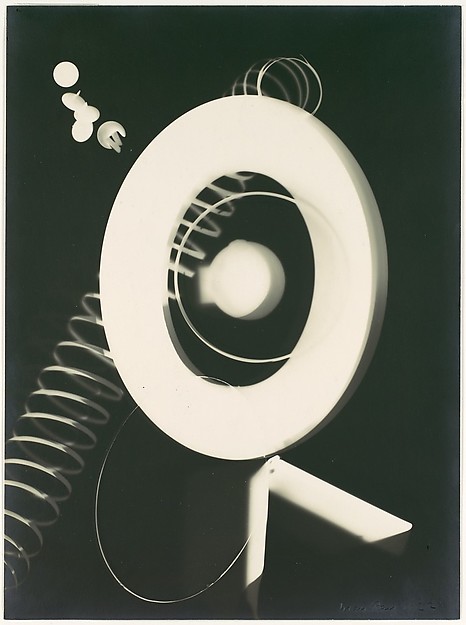
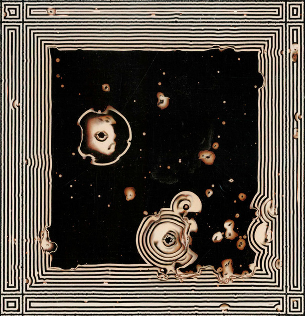
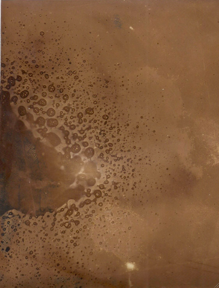
Pierre cordier
Pierre Cordier is a Belgian artist who was a pioneer in the technique of chemigrams. A chemigrams is an artistic technique where an image is made by painting something on to light sensitive paper before exposing it to light for example things like nail varnish or hand cream could be used. Below is one of Pierre Cordiers chemigrams, the first thing that comes to mind when seeing this image is that its very geometric around the outside its quite neat and intricate with for the most part very straight and neat lines. However there are quite a lot of imperfections where the chemical has splashed over making specs on the page as well as there being big lumps taken out of the outside pattern.With out these imperfections there would be a lot of empty space in the middle which would have made it interesting as the only focus of the image would be the edge of the chemigram. There isn't many different colours in the image main two colours are creme and black however some parts look more orange and almost burnt. I think this image is natural in its patterns and the way it has lots of imperfections also makes it seem more natural. If i could ask the artist questions about this chemigram it would be did he want there to be the imperfections, did he do them on purpose or did they happen by mistake?and does he think that the image would be better with or without the imperfections?
Paper Photograms
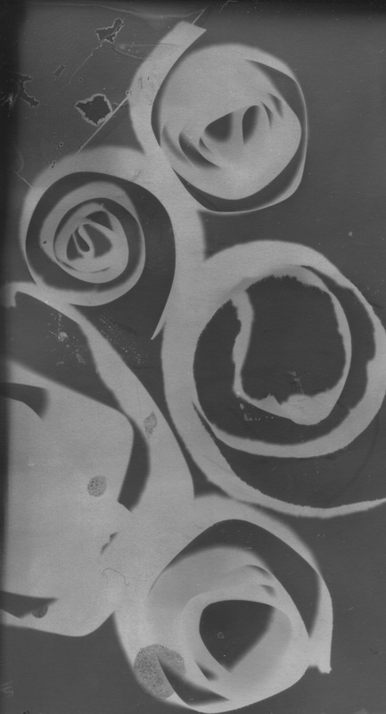
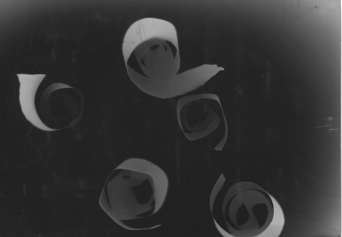
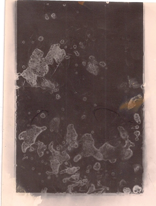
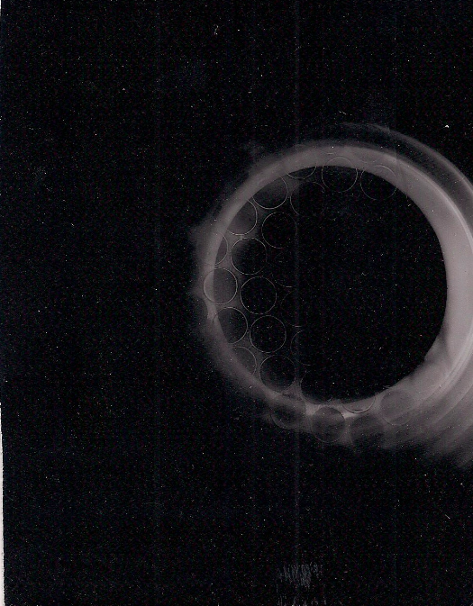
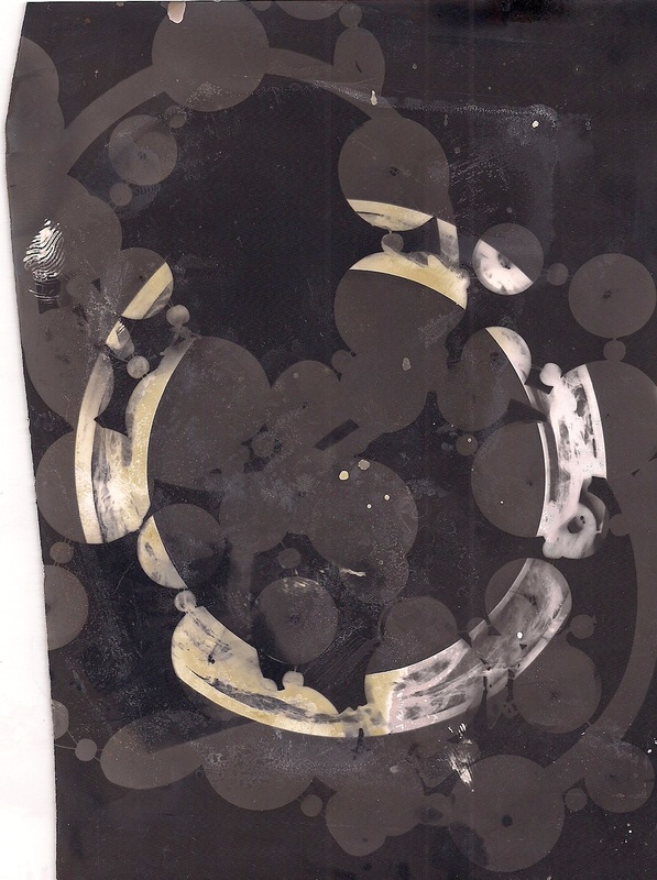
These photograms were made by tearing up paper and rolling and folding it in to different sorts of shapes. These images were exposed to light from the enlarger for around 3 to 5 seconds, My favourite out of the two is the image on the right as the black is much darker and contrasts better with the and also there is a bigger range of tones rather than just being black and white there are more greys. There is a lot of empty space in the image as there roles of paper are quite tightly rolled so they take up very little room in the photogram. The paper was actually thrown over the over photographic paper as it was exposed to light so the results were surprising as I expected the paper to come up as a blur across the image however they came out in perfect focus with good detail. The main theme in this image is curves as the most defined part of the image is the outer curves of the paper this gives the image a sense of movement as you follow the curves of each piece of paper on to the next moving your focus around the image. If i could improve this image I would change the composition and use of space around the image. I would add more pieces of paper to the image reducing the amount of empty space . I would also like to further experiment by using different types of paper and different coloured papers to see how that would affect the final out come of the image.
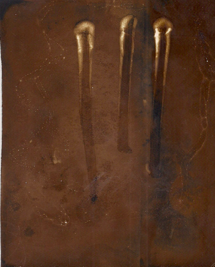
F stop photograms
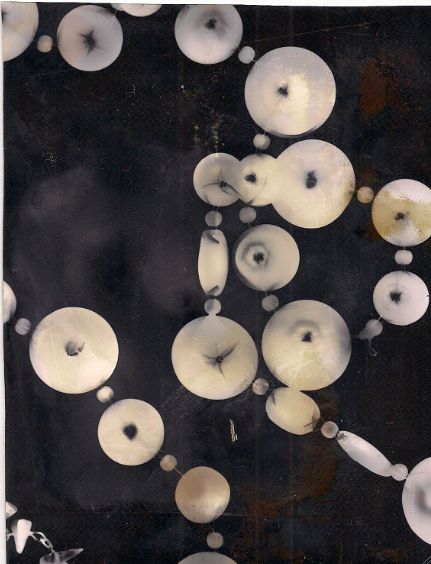

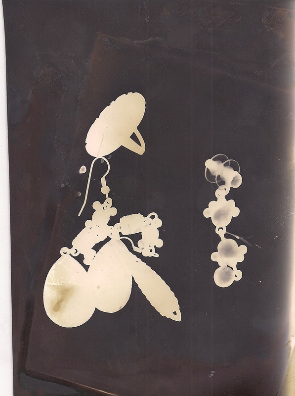
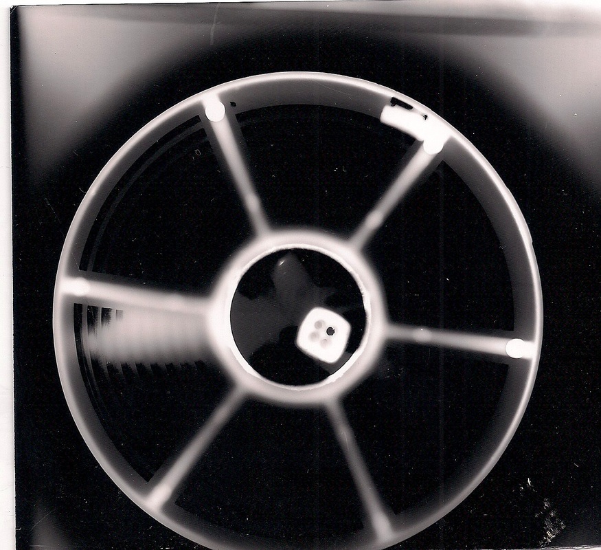
I made these photograms in the dark room using a selection of jewellery all of these photograms were made with the enlarger at F stop 20, the length of time they were exposed to light for ranges from two too four seconds. My favourite image out them all is the one in the centre. That particular image was exposed to light from the enlarger for 2 seconds and I think that was around the perfect time to expose this image in particular as it came out the most defined with the most detail. The light and tones in this image vary the left side of the image is darker than the right however that is due to mistakes in the development stage. I really like how the detail in the biggest bracelet has come out as its transparent with dye running through it and it shows all of this perfectly. There wasn't much thought into the composition of the image so the use of space could have been improved a bit however I do quite like how every thing in the image is condensed into such a small part of the image and the bigger bracelet is almost working as a frame inside the image. If I redid this image I would take more care of the picture as it has been stained by something I'm not sure whether that happened during development or whether it happened after, I feel this image would be a lot better without it though.
My Chemigrams
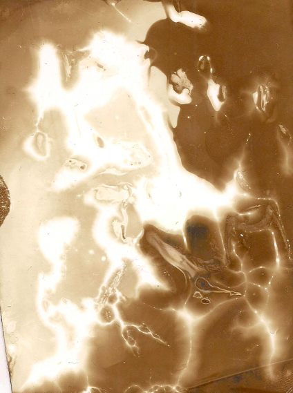
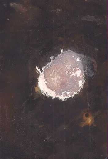
Chemigrams are made by adding substances like cream and bleach on to photographic paper and exposing it to light. I made four chemigrams using a range of substances including bleach, oil, deodorant , toilet cleaner and hand cream and they all produced a range of different effects. My favourite chemigram is the furthest left image to make this image I used toilet cleaner and exposed the paper to natural light for around 30 seconds then put it in the developer for 30 seconds then in the stop for 5 seconds. The cleaner was randomly spread across the paper by just letting it run around the paper on its own. Theres a range of light in this image one half is a lot lighter than the other the centre of the image is mainly taken up by very harsh light were the cleaning fluid was thick there are lines of softer light in the image also where there was less cleaning fluid. The shapes and light in this image remind me of lightening so it is quite natural looking however it is an abstract image. To improve this image I would try to make it on a bigger sheet of photographic paper as then there would be even more space for patterns and details to appear.
Hand made negatives
Hand made negatives can be made with acetate , food colouring , salt and vaseline. To make a hand made negative you can put a range of substances on to a piece acetate for example food colouring then you leave it to dry onto the acetate once its dry you put the section of acetate into a slide holder so its ready for use. In class a variety of hand made negatives were made the first was made by blotting ink, vaseline, water and sprinkling salt over the top and leaving it to dry the ink drys into the salt the slide a giving it a range of textures. The next slide was much simpler and was made by just blotting food colouring on to the acetate and leaving it to dry. The final slide was made by putting food colouring onto the slide and then using a compass to scratch the acetate. These slides will be put into the enlarger and exposing light through the acetate on to the paper will produce an interesting image on to the paper so in sort its a cross between chemigrams and photograms , as chemicals are used to produce the image but an enlarger is used to expose light onto the paper like a photogram. This gives an opportunity to make a more layered image as you could place things on to the paper and then have the light exposed to it through the slide already producing an image of its own.